This is the design to achieve more complex layout. It is essentially an extension of Box-model, which defines a box model of elements, and Flexbox further standardizes the relative relationship between these box models.
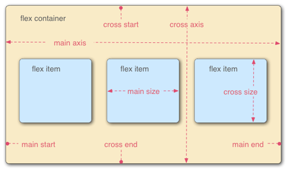
1.Flexible boxes are divided into the following eight points according to width and height:
- Horizontal spindle: main axis; vertical longitudinal axis: cross axis;
- The starting position of the longitudinal axis and the intersection of the border: cross start;
- The end position of the longitudinal axis and the intersection of the border: cross end;
- The starting position of the spindle and the intersection of the border: main strat;
- The end position of the spindle and the intersection of the border: main end;
- The space distance of a single project occupying the main axis;
- Spatial distance occupied by a single project on the longitudinal axis: cross axis
2. Basic Grammatical Concepts of Elastic Box Model
1 > Any container can specify an elastic layout
2 > After setting flex layout, all the float,clear,virtical-align styles of child elements are invalid.
3 > display: flex; or display:inline-flex;
3. Container property settings
flex-direction: The direction of the spindle (i.e. the direction of the project arrangement)
1. row(Default) The spindle is horizontal, starting at the left.
2. row-reverse The spindle is horizontal and the starting point is at the right end.
3. column The spindle is in the vertical direction with the starting point at the upper edge.
4. column-reverse The main axis is in the vertical direction with the starting point at the lower edge.
eg:flex-direction:row;
flex-wrap: How to change lines if an axis is not aligned
1. nowrap(Default: No line change.
2. wrap: New line, the first line is above.
3. wrap-reverse: Line change. The first line is below.
eg:flex-wrap: wrap;
flex-flow: Abbreviation of flex-direction and flex-wrap attributes
eg:flex-flow:row nowrap;
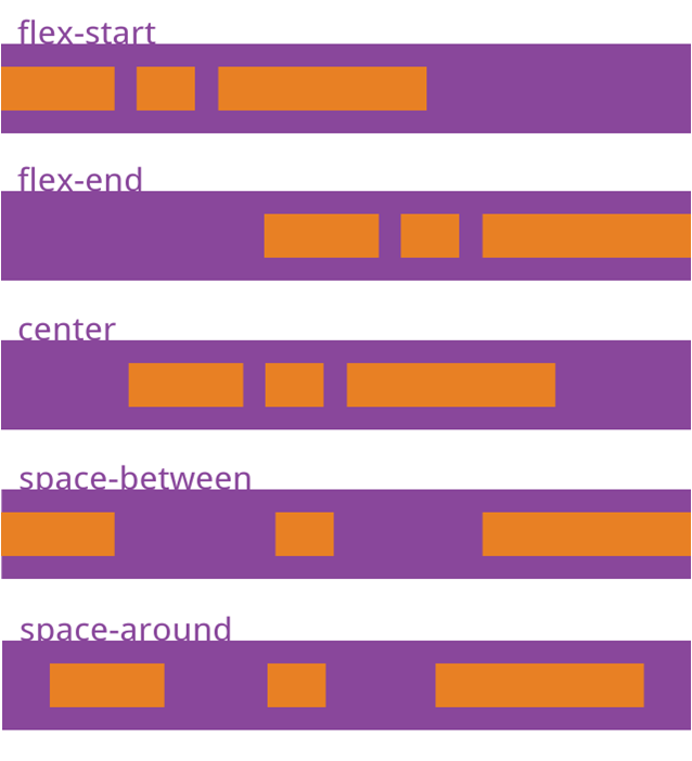
justify-content: defines the alignment of projects on the main axis
1. flex-start(Default value) Left alignment
2. flex-end Right alignment
3. center Centered
4. space-between Alignment at both ends, equal spacing between items
5. space-around Equal spacing on both sides of each project
eg: justify-content: space-around;
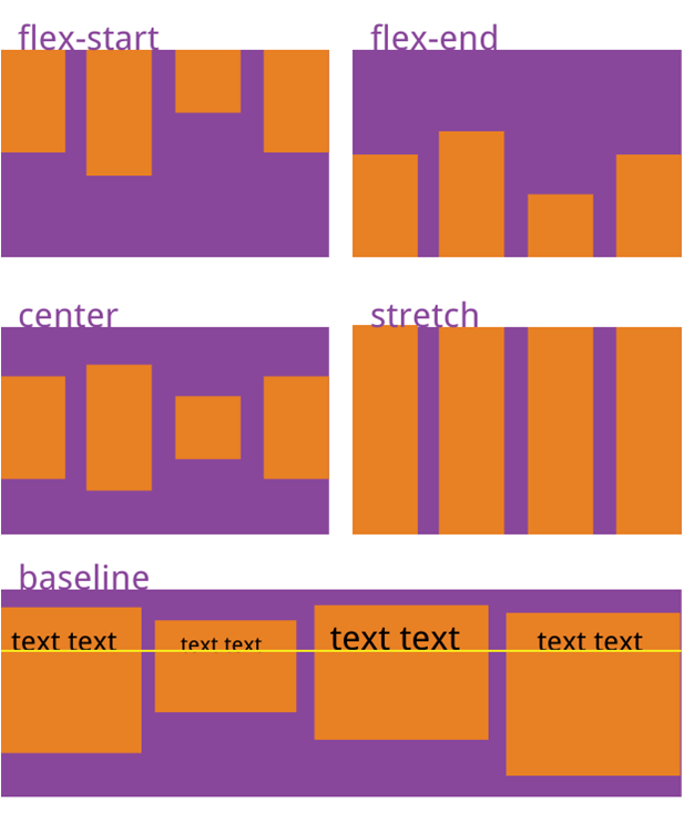
align-items: Defines how items are aligned on the intersection axis
1. flex-start Starting point alignment of cross axes.
2. flex-end End alignment of cross axes.
3. center Midpoint alignment of cross axes.
4. baseline Baseline alignment of the first line of text for the project.
5. stretch(Default value) If the project is not set to a height or set to auto,It will occupy the height of the whole container.
eg: align-items:baseline;
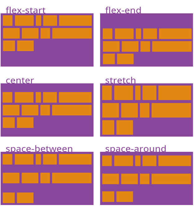
align-content: alignment of multiple axes, one axle invalid
1. flex-start Align with the starting point of the cross axis.
2. flex-end Align with the end of the cross axis.
3. center Align with the midpoint of the intersection axis.
4. space-between Aligned with the ends of the cross axes, the spacing between the axes is evenly distributed.
5. space-around The spacing on both sides of each axis is equal.
6. stretch(Default value) The axis occupies the entire intersection axis.
eg: align-content:stretch;
// The following six attributes are set on the project
order : Arrangement of items(number)
flex-grow: enlarge scale(number)
eg: flex-grow:1;
flex-shrink: Reduced Ratio (Number)
eg: flex-shrink:0;
1. If all projects flex-shrink Attributes are all 1, when space is insufficient, they will be reduced in equal proportion.
2. If a project's flex-shrink Attribute 0, other items are 1, then the former does not shrink when space is insufficient.
3. Negative values are not valid for this property.
flex-basis: the spindle space occupied by the project (px)
If set to the same value as the width or height attribute (such as 350px), the project will occupy a fixed space.
Flex-basis: flex-base can be understood as the width we set for the child elements.
The default value is auto. When the width is set to auto, the width of the box depends on the width of your elements.
Flex: flex-grow,flex-shrink and flex-base
1. This property has two shortcuts: auto (11 auto) and none (0 auto).
2. It is recommended that this property be used first instead of being written separately, and the browser will calculate the relevant values.
3. grow denotes the stretching factor and shrink denotes the contraction factor.
align-self: Allows individual projects to align differently from other projects
This attribute may take six values, except auto, all of which are identical to align-items attributes.
eg: align-self:flex-end;
Exercise: Make Nine-palace layout with elastic box model
Part html
<div id="div1">
    <div></div>
    <div></div>
    <div></div>
    <div></div>
    <div></div>
    <div></div>
    <div></div>
    <div></div>
    <div></div>
</div>
Part css
#div1{
            width:700px;
            height:700px;
            display: flex;
            justify-content: space-around;
            align-content: space-around;
            flex-wrap: wrap;
            background-color: lightblue;
        }
        #div1 div{
            width: 200px;
            height:200px;
            background-color: black;
            border-radius: 50%;
        }