catalogue
1, Properties of commonly used elastic boxes
4. Properties of the flex container
2, Use of multimedia tags in HTML5
4. How to embed multimedia files in pages
1, Properties of commonly used elastic boxes
1. flex container
Block level labels (div) with flex layout
2. flex project
Child elements of block level labels with flex layout
3. Arrangement direction
Direction, the layout direction of the flex container
4. Properties of the flex container
(1) Flex direction: layout direction
The values are: row: the default value, the horizontal direction of the spindle (horizontal layout), and the starting point is at the left end
Row reverse: the main axis is horizontal (horizontal layout), and the starting point is at the right end
column: the main axis is vertical (vertical layout), and the starting point is on the top edge
Column reverse: the main axis is vertical (vertical layout), and the starting point is at the bottom edge
<style>
    .c1{
        width: 800px;
        height: 200px;
        background-color: aquamarine;
        display: flex;
        flex-direction: row-reverse;
    }
    .c3{
        width: 200px;
        height: 200px;
        background-color: rgb(218, 170, 81);
    }
    .c4{
        width: 200px;
        height: 200px;
        background-color: rgb(240, 227, 157);
    }
</style>
<body>
    <div class="c1">
        <div class="c3"></div>
        <div class="c4"></div>
    </div>
</body>
</html> 
(2) Flex Wrap: wrap effect
The values are: nowrap: the default value, which means no line break
wrap: wrap
Wrap reverse: wrap a line. The first line is on the next side
<style>
    .c1{
        width: 800px;
        height: 200px;
        background-color: aquamarine;
        display: flex;
        flex-direction: row-reverse;
        flex-wrap: wrap;
    }
    .c3{
        width: 200px;
        height: 200px;
        background-color: rgb(218, 170, 81);
    }
    .c4{
        width: 200px;
        height: 200px;
        background-color: rgb(240, 227, 157);
    }
</style>
<body>
    <div class="c1">
        <div class="c3">1</div>
        <div class="c4">2</div>
        <div class="c3">3</div>
        <div class="c4">4</div>
        <div class="c4">5</div>
        <div class="c3">6</div>
        <div class="c4">7</div>
    </div>
</body>
</html>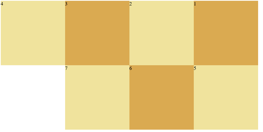
(3) Justify content: alignment
Values include: Flex start: default value, left aligned
Flex end: right justified
center: center
Space between: both ends are aligned, and the spacing between items is equal
Space around: the spacing between the two sides of the project is the same, and the spacing between the projects is twice as large as that between the two sides
<style>
    .c1{
        width: 800px;
        height: 200px;
        background-color: aquamarine;
        display: flex;
        flex-direction: row-reverse;
        justify-content: space-between;
    }
    .c3{
        width: 200px;
        height: 200px;
        background-color: rgb(218, 170, 81);
    }
    .c4{
        width: 200px;
        height: 200px;
        background-color: rgb(240, 227, 157);
    }
</style>
<body>
    <div class="c1">
        <div class="c3">1</div>
        <div class="c4">2</div>
        <div class="c3">3</div>
    </div>
</body>
</html>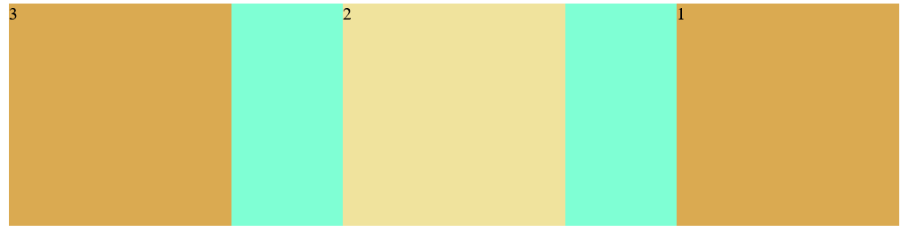
(4) Align items: the attribute defines the alignment of flex sub items in the direction of the side axis (vertical axis) of the current row of the flex container
Values: stretch: default value. Elements are stretched to fit the container
Center: the element is located in the center of the container
Flex start: the element is at the beginning of the container
Flex end: the element is at the end of the container
<style>
    .c1{
        width: 800px;
        height: 800px;
        background-color: aquamarine;
        display: flex;
        flex-direction: row-reverse;
        align-items: flex-end;
    }
    .c3{
        width: 200px;
        height: 200px;
        background-color: rgb(218, 170, 81);
    }
    .c4{
        width: 200px;
        height: 200px;
        background-color: rgb(240, 227, 157);
    }
</style>
<body>
    <div class="c1">
        <div class="c3">1</div>
        <div class="c4">2</div>
        <div class="c3">3</div>
    </div>
</body>
</html>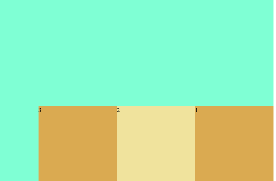
5. Project properties (itme)
(1) Order: the order of items. The smaller the number, the higher the order
(2) Flex grow: sets the project magnification
(3) Flex shrink: sets the reduction scale of the item
Scale compared to original size
6. Grail layout
Classic web layout
<style>
    .body{
        display: flex;
        flex: 1;
        /* flex-direction: column;*/
    }
    header,footer{
        flex: 1;
        background-color: darkgrey;
        text-align: center;
        line-height: 11vh;
    }
    .center{
        flex: 1;
        background-color: bisque;
        text-align: center;
        line-height: 75vh;
    }
    .nav,.ads{
        flex: 0 0 12em;
        height: 75vh;
    }
    .nav{
        order: -1;
        background-color: burlywood;
        text-align: center;
        line-height: 75vh;
    }
    .ads{
        background-color:ghostwhite;
        text-align: center;
        line-height: 75vh;
    }
</style>
<body>
    <header>#header</header>
    <div class="body">
        <div class="center">#center</div>
        <div class="nav">#side</div>
        <div class="ads">#right</div>
    </div>
    <footer>#footer</footer>
</body>
</html>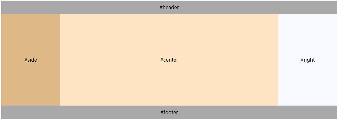
7. Length units in CSS
in: inches
Cm: cm
Mm: mm
px: pixel, relative length unit, relative to computer screen resolution
Em: relative length unit. Relative to the font size of the text in the current object, the browser's default relative font height is 16em
12px=0.75em 10px=0.625em
Pt: pounds (1pt=1/72in)
(1) vw, vh, vmin, vmax: it is the viewport unit and the relative unit, which is determined by the window size. 1 unit is similar to 1%
a. vw: percentage of window width (1vm = 1% of window width)
b. vh: percentage of window height
c. vmin: indicates the smaller value of vm and vh
d. vmax: indicates the larger value of vm and vh
(2) Difference between vw, vh and%
a. % is the proportion set relative to the size of the parent element, and vw and wh are determined by the size of the window
b. vw and vh can directly obtain the width and height of the window,% when setting, the actual width or height can not be obtained correctly according to the height of the body
(3) Use of vmin and vmax:
When developing mobile pages, vw and wh are used to set the font size. The font size displayed in vertical and horizontal screen States is different. Because vmin and vmax are currently small or large, setting the font can ensure that the font size is the same in vertical and horizontal screen states
2, Use of multimedia tags in HTML5
1. Format of video file
(1).MP4: mpeg-4
(2)webM
(3)ogg
2. Usage of Video Tags
< video SRC = "full name of video file" controls = "controls" / >
Property contains
| autoplay | Auto play |
| loop | Loop Playback |
| preload | Indicates that the video file and page are loaded at the same time, which is mutually exclusive with the autoplay attribute |
| poster | The image displayed when the video file is buffered |
3. Audio format file
(1)MP3
(2)wav
(3)ogg
< audio SRC = "full name of audio file" controls > < / audio >
4. How to embed multimedia files in pages
(1) Multimedia files from local
(2) Multimedia files from the network
5. Scroll labels
(1) Text scrolling:
< marquee direction = "scroll direction" behavior = "scroll mode" scrollamount = "scroll speed" > text < / marquee >
Value of direction property:
| left | Default, scroll left |
| right | Scroll right |
| up | scroll up |
| down | Scroll down |
Value of behavior attribute:
| scroll | Default, loop scrolling |
| slide | Scroll only once without repeating |
| width,heigth | Set scroll range |
(2) Picture scrolling
<marquee direction="Rolling direction" behavior="Scroll mode" scrollmount="Rolling speed">
       <img src=""/>
</marquee>