1. Structural elements
1.1 related concepts of document structure elements
1.1.1header element
The header element is a structural element that represents the header. It is usually used to place the title of the whole web page or a content block in the page, but it can also contain other elements, such as title (< H1 > ~ < H6 >), navigation part (< NAV >) or ordinary content (< p > and < span >).
1.1.2 article element
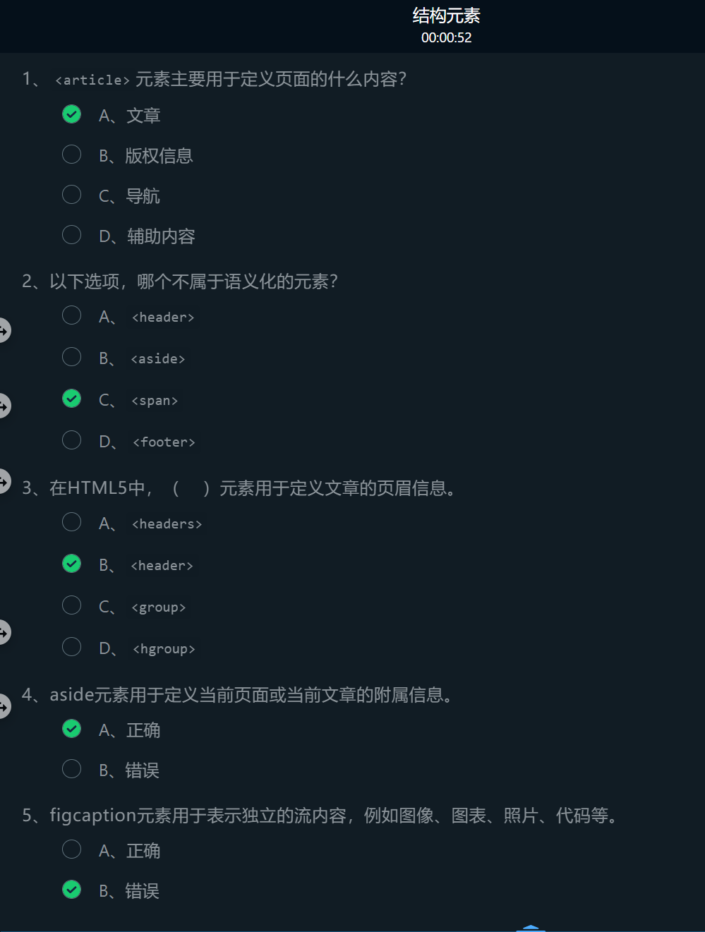
- An article element is a structural element that represents a large piece of content
- Using the article element, you can define independent and complete content in the web page, such as articles, blogs, posts, comments, etc.
1.1.3 aside element
The aside element is used to define the subsidiary information of the current page or current article, including the relevant references, sidebars, advertisements, navigation and other parts different from the main content of the current page or current article
1.1.4 footer element
The footer element is used to define the footnote part, such as adding comments in the parent content block, adding author information in the article area, adding copyright information at the bottom of the web page, and so on.
1.1.5 figure/ figcaption element
-
The figure element is used to represent independent stream content, such as images, charts, photos, code, and so on.
-
The figcaption element is used to define the title of the figure element. It should be nested in < figure >, and is usually placed at the position of the first or last child element in < figure >.

1.2 application of header element and article element
-
The article area consists of article title and article content.
-
The semantic element article in HTML5 can represent an article area, in which the header element can be nested to represent the title of the article, and the content of the article can be set by paragraph labels.
<article?
  <header>Article title</header>
  <p>Paragraph content of the article</p>
</article>
<!DOCTYPE html>
<html>
   <head>
       <title>Page structure</title>
       <style type="text/css">
          header{border-bottom:4px double #eee;
                text-align:center;
                font-size :20px
              }
       </style>
   </head>
   <body>
    <!-- ********* Begin ******* -->
       <article>
         <header><h3>Tea recommendation - Qimen black tea</h3></header>
         <p>Qimen black tea is made of local black tea,Zhongsheng tea tree production is a famous tea in Chinese history and a famous black tea boutique.</p>
       </article>
      <!-- ********* End ********* -->
</body>
</html>
1.3 application of figure element and figcaption element
To insert graphic objects that can be recognized by search engines in the article area, you can set them with the semantic element figure in HTML5. The name of the graph can be represented by a nested figcaption element, which is usually placed in the position of the first or last child element of the figure element.
<figure>
  <img src=Path of graph>
  <figcaption>Name of the diagram</figcaption>
</figure>
<!DOCTYPE html>
<html>
   <head>
       <title>Page structure 2</title>
       <style type="text/css">
          header{border-bottom:4px double #eee;
                       text-align:center;
                      font-size:20px
                      }
       </style>
   </head>
   <body>
       <article>
           <header>
               <h3>Tea recommendation - Qimen black tea</h3>
           </header>
           <p>Qimen black tea is made of local black tea,Zhongsheng tea tree production is a famous tea in Chinese history and a famous black tea boutique.</p>
      <!-- ********* Begin ******* -->
         <figure>
             <img src="https://www.educoder.net/api/attachments/1223388">
             <figcaption>Tea ceremony appreciation</figcaption>
         </figure>
      <!-- ********* End ********* -->
      </article>
</body>
</html>
2. Page node elements
2.1 related concepts of page node elements
2.1.1 section element
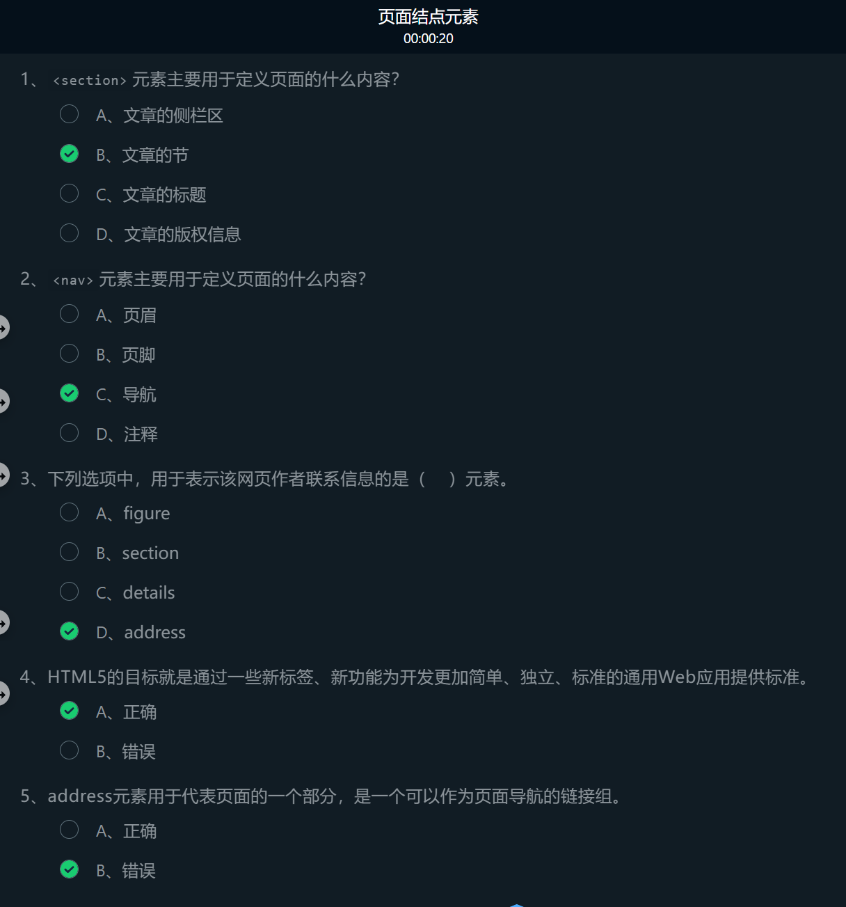
The section element is used to define a section (section) of an article, such as a chapter, header, footer, or other part of the document. It usually consists of content and its title
2.1.2 nav elements
nav element is used to represent a part of a page. It is a link group that can be used as page navigation. It is mainly used to build areas such as navigation menu, sidebar navigation, inner page navigation and page turning operation.
2.1.3 address element
The address element is generally used by the author to provide the contact information of the document. It is usually placed at the beginning or end of a web page. The most commonly used element is to include and other content in the footer element.
- The address element is inside the article element -- it represents the contact information of the author of the article content contained in the article element,
- Directly inside the body element -- represents the contact information of the author of the web page.

2.2 use of section element - article section
The semantic element section in HTML5 can represent the section of an article, in which the section title can be nested, and the content of the article section can be set by paragraph labels or other labels.
<section>
  <header>Section title of the article</header>
  <p>Paragraph content of the article</p>
</section>
<!DOCTYPE html>
<html>
   <head>
       <title>Page node element</title>
       <style type="text/css">
          #Head{border-bottom:4px double #eee;
                text-align:center;
                font-size :20px
              }
       </style>
   </head>
   <body>
      <article>
        <header id=Head>
          <h3>Tea recommendation - Qimen black tea</h3>
           </header>
      <!-- ********* Begin ******* -->
      <section>
        <header><h3>What is black tea</h3></header>
        <p>Black tea is fully fermented tea,Because the tea soup and tea after brewing are mainly red,Hence the name.</p>
      </section>
      <!-- ********* End ********* -->
      </article>
  </body>
</html>
2.3 use of Nav elements
A navigation area is set in the article area. The semantic element nav in HTML5 can represent a navigation area and nest the hyperlink tag (a) to realize jump. The common attributes of external hyperlinks are href and title. The value of href is the path of the chain destination, and the value of title is the text displayed when the mouse hovers over the chain source.
<nav>
  <a href="Path of chain sink" title="Display text">Chain source</a>
   ......
</nav>
<!DOCTYPE html>
<html>
   <head>
       <title>Page node element</title>
       <style type="text/css">
          #Head{border-bottom:4px double #eee;
                text-align:center;
                font-size :20px
              }
       </style>
   </head>
   <body>
       <article>
           <header id=Head>
               <h3>Tea recommendation - Qimen black tea</h3>
             <!-- ********* Begin ******* -->
               <nav>
                 <a href="https://Www.qmhtea. COM / "title =" home "> Home</a>
                 <a href="#"title =" scented tea and culture "> scented tea and culture</a>
               </nav>
              <!-- ********* End ********* -->
           </header>
        <section >
           <header><h3>What is black tea</h3></header>
           <p>Black tea is fully fermented tea,Because the tea soup and tea after brewing are mainly red,Hence the name.</p>
        </section >
      </article>
  </body>
</html>
2.4 use of footer element and address element
The footer element is used to define the footer of a document or section. As the footer of a document, it can usually contain the copyright information and contact information of the page.
-
Copyright information
Copyright information is usually represented by copyright symbols © And related information to display the copyright symbol in the web page © Special characters are required ©, For example, to display“ © 2008 Yang ", the corresponding code is:
©2008 Yang
-
contact information
Copyright information is usually nested in the footer area and set with the semantic element address. The text in the address element is usually displayed in italics.
<footer>
	<address>contact information </address></footer>
<!DOCTYPE html>
 <html>
  <head>
    <title>Page node element</title>
    <style type="text/css">
       #Head{border-bottom:4px double #eee;
             text-align:center;
             font-size :20px
           }
    </style>
  </head>
  <body>
    <article>
      <header id=Head>
       <h3>Tea recommendation - Qimen black tea</h3>
       <nav>
         <a href="https://Www.qmhtea. COM / "title =" home "> Home</a>
         <a href="#"title =" scented tea and culture "> scented tea and culture</a>
       </nav>
      </header>
      <section >
       <header><h3>What is black tea</h3></header>
       <p>Black tea is fully fermented tea,Because the tea soup and tea after brewing are mainly red,Hence the name.</p>
      </section >
      <hr/>
       <!-- ********* Begin ******* -->
         <footer>
           <h4>©2020 Tyut</h4>
           <address>Written by<a href="mailto:webmaster@example.com">Mingcha contact station</a></address>
         </footer>
        <!-- ********* End ********* -->
    </article>
  </body>
</html>
3. Interactive elements
3.1 related concepts of interaction elements
- progress element,
- meter element
- details/summary element
- menu element
- command element
3.1.1 progress element
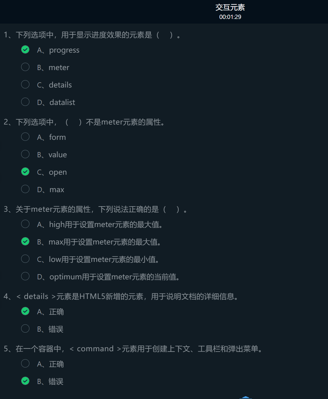
The progress element is a state interaction element. Used to indicate the progress of a task in the page.
The progress element has two attributes:
- max: indicates the total amount of tasks. The default value is 1
- value: indicates the number of completed tasks.
Application:
- Usage example 1:
<progress max=100 value=20></progress>
-
Usage example 2:
<progress value=0.5></progress>
If the max attribute is not set, it defaults to 1
-
Usage example 3:
<progress></progress>
If the properties of max and value are not set, the progress bar is in a free sliding state. When the progress bar needs to be changed dynamically, it needs to be implemented through JavaScript.
3.1.2 meter element
The meter element is a state interaction element.
Application:
- Proportion of candidates in the voting system
- Test score statistics
The meter element has the following attributes:
- Form: specifies one or more forms to which the meter element belongs, and its value is the id name defined by the form label form.
- Value: sets or gets the current value of the meter element, which must be between the min and max values.
- max: sets the maximum value of the meter element. The default value is 1
- min: sets the minimum value of the meter element. The default value is 0
- High: set an excessively high threshold. When the value value is greater than high and less than max, an excessively high color will be displayed.
- Low: set the threshold value that is too low. When the value value is less than low and greater than min, the color that is too low will be displayed.
- Optimization: set the optimal value.
Usage example:
<!DOCTYPE html>
<html>
<head>
  <meta charset="UTF-8">
</head>
<body>
<meter></meter>No attributes meter<br/>
<meter value="0.6"></meter>only value Attribute meter<br/>
<meter value="40"  min="10" low="30" high="80" max="100" ></meter>value be situated between low and high Between, metering bar green<br/>
<meter value="20"  min="10" low="30" high="80" max="100" ></meter>value less than low of meter,Metering bar yellow<br/>
<meter value="90"  min="10" low="30" high="80" max="100" ></meter>value greater than high of meter,Metering bar yellow<br/>
<meter value="40"  min="10" low="30" high="80" max="100"  optimum="90"></meter>value be situated between low and high Between, but optimum be situated between low and high In addition, the metering bar is yellow<br/>
<meter value="20"  min="10" low="30" high="80" max="100"  optimum="60"></meter>value be situated between low and high Outside, but optimum be situated between low and high Between, metering bar yellow<br/>
<meter value="20"  min="10" low="30" high="80" max="100"  optimum="90"></meter>value and optimum All between low and high In addition, the metering bar is red<br/>
<meter value="90"  min="10" low="30" high="80" max="100"  optimum="20"></meter>value and optimum All between low and high In addition, the metering bar is red<br/>
</body>
</html>
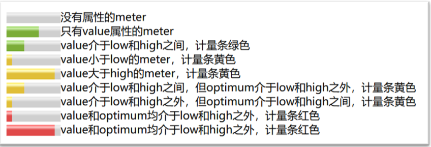
The running effect is shown in the following figure: 
Green:
- Only value attribute
- Between low and high
Yellow:
- Less than low
- Greater than high
- The two values of value and optimum are between low and high and outside
Red:
- Both value and optimization are outside low and high
3.1.3 details/summary element
The details element is used to describe the details of a document or part of a document. Under a specific browser (such as Chrome and Safari), it can produce the interactive effect of unfolding and folding like an accordion.
The summary element is usually nested in the details element as the title part of the details element. When applying, the title content in the details element is visible. When clicking the title, the details in the details element will be displayed / hidden.
The main attribute of the meter element is open:
-
Open: used to control whether the details element is displayed. When the value is true, the child elements inside the element are expanded and displayed. When the value of the open attribute is false, the child elements inside the element are shrunk and not displayed. It is not displayed by default. Usage example:
<details>
  <summary>Click to display/Hide details</summary>
  <p>Here is a detailed introduction details Knowledge involved in elements</p>
</details>
Usage example:
3.1.4 menu element
The menu element is used to create context, toolbars and pop-up menus. Current browsers only support menus that create context.
The menuitem element is used to define menu items
Two properties:
-
Label: used to set the visible label of the menu.
-
Menu: used to set the type of menu
According to the value:
- Context indicates the context menu
- Toolbar represents a toolbar
- Pop represents a pop-up menu
Usage example:
<span contextmenu="myMenu">Right click</span>
<menu type="context" id="myMenu">
<menuitem label="Click"  onclick="alert('You clicked on me')" >
</menuitem>
</menu>
3.1.5 command element
The command element is used to define various types of command buttons.
The command element mainly has the following attributes:
- icon: Specifies the image used to represent the command element.
- Label: sets the visible label that specifies the command element.
- Type: sets the type of the command element, which is "command" by default
- checkbox (check box)
- radio (single choice)
- command (operation button)
- radiogroup: sets the group name of radio type buttons.
Usage example:
<command onclick="alert('You clicked on me')"> Please click </command>
At present, mainstream browsers cannot support menu elements and command elements, that is, FireFox browsers can support partial display.

3.2 progress element
- The attribute max represents the total number of tasks
- The attribute value represents the current task quantity
<!DOCTYPE html>
<html>
 <head>
  <meta charset="utf-8"/>
  <title>progerss Use of elements</title>
 </head>
 <body>
 	Download progress:
   <!-- ********* Begin ******* -->
    <progress max="100" value="30">Progress display</progress>
   <!-- ********* End ********* -->
 </body>
</html>
3.3 meter element
- Value: current value
- max: maximum
- min: minimum
- High:: high threshold
- Low: low threshold
- optimum: optimal value
<!DOCTYPE html>
<html>
 <head>
  <meta charset="utf-8"/>
  <title>meter Use of elements</title>
 </head>
 <body>
 	Display measures:<br/>
   <!-- ********* Begin ******* -->
    <meter value="60" max="100" min="0"></meter><br/>
    <meter value="30" max="100" min="0" high="90" low="50"></meter>
   <!-- ********* End ********* -->
</html>
3.4 details/summary element
- Details describes the details of a document or part of a document in a web page
- The summary element can set the title content seen when details is collapsed
<!DOCTYPE html>
<html>
 <head>
  <meta charset="utf-8"/>
  <title>details/summary element</title>
 </head>
 <body>
   <!-- ********* Begin ******* -->
    <details>
      <summary>Chapter III</summary>
      <p>3.1 Structural elements</p>
      <p>3.2 Page node</p>
      <p>3.3 Interactive element</p>
    </details>
    <!-- ********* End ********* -->
 </body>
</html>