Preface
The ultimate goal of large data analysis is to get some form of output results, which are mostly displayed in the form of visual charts. Of course, some large data analysis does not need charts such as recommendation system.
Visual display naturally needs a set of useful graphics plug-ins. There are many plug-ins in the market that can show various graphs. Today I introduce echarts produced by Baidu. The latest version is echarts3. As an example, I use echarts2.
Introduction to echarts2
echarts is a set of lightweight chart framework based on javascript, which is very simple to use, and the presentation of the chart form is very rich, and the presentation of the chart integrated a lot of practical interactive display, such as hiding the data items in the chart according to need, supporting data dragging, can be everywhere for image format and so on.
Hands-on training
A new html file is created locally, echarts is introduced to construct the corresponding display data, and then the html file can be accessed in browser by double-clicking. It is so simple that it does not even need the support of application server and web server. Is it super lightweight?
- The basic page code is as follows:
<!DOCTYPE html>
<head>
    <meta charset="utf-8">
    <title>Data display</title>
</head>
<body>
    <!-- by ECharts Prepare a size (width and height) Dom -->
    <div id="main" style="height:400px"></div>
    <!-- ECharts Single file introduction -->
    <script src="http://echarts.baidu.com/build/dist/echarts.js"></script>
    <script type="text/javascript">
        // Path configuration
        require.config({
            paths: {
                echarts: 'http://echarts.baidu.com/build/dist'
            }
        });
         // bar module is loaded with histogram and loaded on demand
        require(
            [
                'echarts',
                'echarts/chart/bar',
                'echarts/chart/line',
        'echarts/chart/funnel' //funnel plot
            ],
            function (ec) {
            chart1(ec);  //Draw chart functions for easy viewing and independence
            }
        );
        //Draw Chart 1
        function chart1(ec){
          //See below for specific code
        }
    </script>
</body>
- Diagram of Right Angle System
2.1. Construct the drawing code of the corresponding right angle system as follows:
function chart1(ec){
    //Initialize echarts charts based on prepared dom
    var myChart = ec.init(document.getElementById('main'));
    // Transition
    myChart.showLoading({
        text: 'Efforts to read data...',    //loading speech
    });
    myChart.hideLoading();
    var option = {
        title : {
            text: '2016 Annual Daily Data Analysis',
            subtext: 'test data'
        },
        tooltip : {
            trigger: 'item',
            formatter: "{a} <br/>{b} : {c}",
            show: true
        },
        toolbox: {
            show : true,
            feature : {
                mark : {show: true},
                dataView : {show: true, readOnly: false},
                restore : {show: true},
                saveAsImage : {show: true}
            }
        },
        legend: {
            data:['Enrolment','Real name number','Recharge people',
            'Number of new registered investors on that day',"Total investment","Number of first cast",
            "Number of re investment","Repayment number","Cash withdrawals"]
        },
        xAxis : [
        {
            type : 'category',
            data : ["A 1 June","A 2 June","A 3 June","A 4 June","A 5 June",
            "A 6 June","A 7 June","A 8 June","A 9 June","A 10 June",
            "A 11 June","A 12 June","A 13 June","A 14 June","A 15 June",
            "A 16 June","A 17 June","A 18 June","A 19 June","A 20 June",
            "A 21 June","A 22 June","A 23 June","A 24 June","A 25 June",
            "A 25 June","A 25 June","A 25 June","A 29 June","A 30 June",
            "A 31 June"]
        }
        ],
        yAxis : [
        {
            type : 'value'
        }
        ],
        series : [
        {
            name:"Enrolment",
            type:'bar',
            stack:'group1',//Stacking display
            data:[12,10,11,7,4,5,16,15,27,19,13,13,15,29,18,15,23,19,
            15,8,26,30,26,22,17,17,17,17,82,70,74]
        },
        {
            name:"Real name number",
            type:'bar',
            stack:'group1',//Stacking display
            data:[7,3,4,4,1,4,7,4,16,4,6,6,4,20,7,8,17,12,4,6,13,13,
            15,14,10,10,10,10,54,58,56]
        },
        {
            name:"Recharge people",
            type:'line',
            data:[19,19,23,15,14,5,27,22,30,27,21,
            14,14,42,33,36,31,47,
            20,12,47,48,46,50,42,42,42,42,80,84,65]
        },
        {
            name:"Number of new registered investors on that day",
            type:'line',
            data:[2,2,0,2,1,0,6,1,4,2,1,4,1,17,5,6,7,8,3,4,9,4,
            7,7,7,7,7,7,39,46,44]
        },
        {
            name:"Total investment",
            type:'line',
            data:[52,66,64,61,52,66,69,77,93,59,71,71,59,113,96,80,
            75,89,77,46,113,79,112,102,82,82,82,82,148,143,96]
        },
        {
            name:"Number of first cast",
            type:'line',
            data:[3,6,3,3,5,0,8,2,7,6,2,5,1,19,7,8,7,11,4,5,13,6,
            14,10,13,13,13,13,42,58,51]
        },
        {
            name:"Number of re investment",
            type:'line',
            data:[49,61,62,60,48,66,62,75,87,54,69,66,
            58,95,90,75,70,
            80,74,41,101,74,99,93,92,92,92,92,108,87,46]
        },
        {
            name:"Repayment number",
            type:'line',
            data:[71,52,129,0,0,177,0,33,98,0,140,
            89,78,105,116,68,
            110,82,33,36,162,37,181,81,70,70,70,70,145,27,0]
        },
        {
            name:"Cash withdrawals",
            type:'line',
            data:[47,43,30,46,0,0,92,29,32,46,14,0,0,112,52,63,42,
            56,0,0,129,54,30,60,39,39,39,39,42,74,40]
        }
            ]
    };
    // Loading data for echarts objects
    myChart.setOption(option);
}
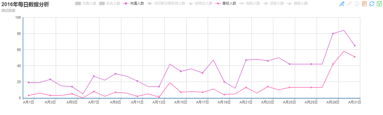
2.2. Right Angle System Effect Show Figure 1
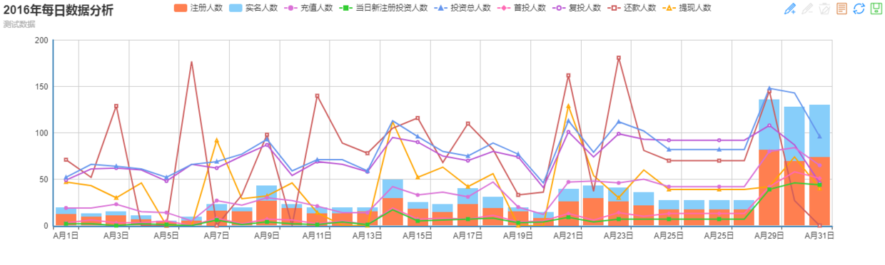
2.3. Diagram 1 of Right Angle System Effect Display
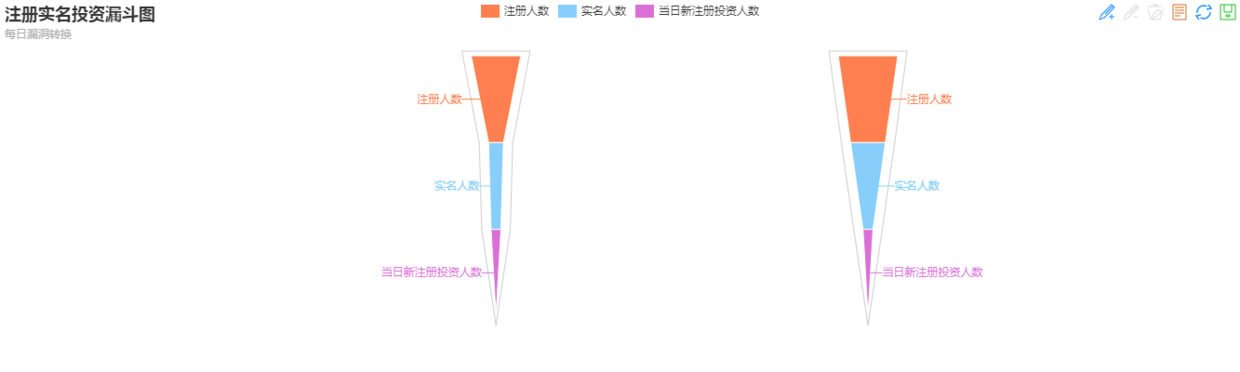
- funnel plot
3.1. Code Construction of Funnel Diagram
If you need to show funnel drawings, you first need to declare that you want'echarts/chart/funnel', and then modify the corresponding construction drawing code.
unction chartFunnel(ec){
    // Initialize echarts charts based on prepared dom
    var myChart = ec.init(document.getElementById('main3'));
    // Transition
    myChart.showLoading({
        text: 'Efforts to read data...',    //loading speech
    });
    myChart.hideLoading();
    var option = {
        title : {
            text: 'Registered real-name investment funnel chart',
            subtext: 'Daily vulnerability switching'
        },
        tooltip : {
            trigger: 'item',
            formatter: "{a} <br/>{b} : {c}",
            show: true
        },
        toolbox: {
            show : true,
            feature : {
                mark : {show: true},
                dataView : {show: true, readOnly: false},
                restore : {show: true},
                saveAsImage : {show: true}
            }
        },
        legend: {
        data:['Enrolment','Real name number','Number of new registered investors on that day']
        },
        calculable:true,//Allow drag-and-drop recalculation
        series : [
        {
            name:"A 1 January funnel",
            type:'funnel',
            sort : 'descending',
            width:'40%',
            data:[
                {value:12,name:'Enrolment'},
                {value:7,name:'Real name number'},
                {value:2,name:'Number of new registered investors on that day'}
            ]
        },
        {
            name:"A Feb. 2 funnel",
            type:'funnel',
            x : '50%',
            sort : 'ascending',
            itemStyle: {
                normal: {
                    label: {position: 'left'}
                }
            },
            width:'40%',
            data:[
                {value:10,name:'Enrolment'},
                {value:3,name:'Real name number'},
                {value:2,name:'Number of new registered investors on that day'}
            ]

        }
        ]
    };
    // Loading data for echarts objects
    myChart.setOption(option);
}
3.2. Funnel plot effect
If you encounter any problems or want to acquire learning resources, you are welcome to join the technology enthusiasts exchange group 373107565, we learn technology together!
Small summary
Basically, it's smooth and concise. And echarts provides online excel table data to javascript data or json format tools, only need to copy the table to online tools, can easily generate the corresponding data format.
Suggestion: In order to show the beauty of the chart, the ordinate data of each dimension should be within one magnitude. If the magnitude of one index is large, it will cause the ordinate of other dimensions to be too low to see the effect.