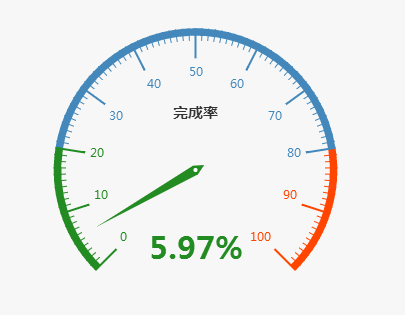
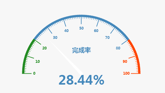
Question: I want to change the default style of the dashboard in Figure 1 to the style of the semicircle in Figure 2. In the official website, you can change the style of the dashboard by changing the theme button, but there is no actual demo ~ how to change the style?

Picture 1.png

Picture 2.png
Reference API: http://echarts.baidu.com/examples/editor.html?c=gauge
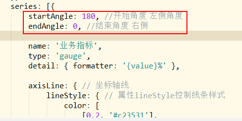
In fact, it's very simple. Just add the start angle and end angle in series:.
startAngle: 180, //Start angle left angle
endAngle: 0, //End angle right

Picture.png
Write a small demo as follows:
<!DOCTYPE html>
<html>

    <head>
        <meta charset="utf-8">
        <title>Three minute dashboard</title>
        <!-- Introduce echarts.js -->
        <script src="js/echarts.min.js"></script>
        <script src="js/jquery-1.11.3.js"></script>
    </head>

    <body>
        <!-- by ECharts Prepare a Dom -->
        <div id="main" style="width: 600px;height:400px;"></div>
        <script type="text/javascript">
            // Initialize the echarts instance based on the prepared dom
            var myChart = echarts.init(document.getElementById('main'));
            // Specify configuration items and data for the chart
            myChart.setOption({
                //backgroundColor: '#000000',
                backgroundColor: 'rgba(128, 128, 128, 0.1)', //rgba set transparency 0.1
                tooltip: {
                    formatter: "{a} <br/>{b} : {c}%"
                },
                toolbox: {
                    feature: {
                        restore: {},
                        saveAsImage: {}
                    }
                },
                series: [{
                    startAngle: 180, //Start angle left angle
                    endAngle: 0, //End angle right
                    name: 'Business indicators',
                    type: 'gauge',
                    detail: { formatter: '{value}%' },

                    axisLine: { // Axis of coordinates
                        lineStyle: { // Property lineStyle controls line style
                            color: [
                                [0.2, '#c23531'],
                                [0.8, '#63869e'],
                                [1, '#91c7ae']
                            ]
                        }
                    },

                    data: [{ value: 50, name: 'Completion rate' }]
                }]
            });

            setInterval(function() {
                option.series[0].data[0].value = (Math.random() * 100).toFixed(2) - 0;
                myChart.setOption(option, true);
            }, 2000);
        </script>
    </body>

</html>
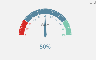
The implementation effect of this demo is as follows: a proper semicircle

Original author: miss qiche
Pay attention to the public address of "programming micro magazine", reply back to "receive resources", get IT resources and small program 500G dry goods.