Echarts quick start
- Import the echorts.js file
- Prepare a box to present the chart
- Initialize the ecarts instance object
- Prepare configuration items
- Set the configuration item to the ecarts instance object
<div style='width: 600px; height: 400px;'></div>
<script src="./lib/echarts.js"></script>
<script>
// Initialize the ecarts instance based on the prepared dom
let myChart = echarts.init(document.querySelector('div'));
// Specify configuration items and data for the chart
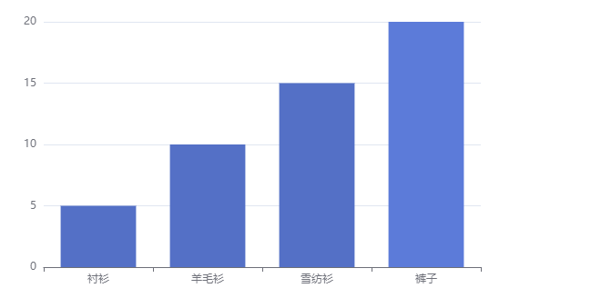
let option = {
title:{
text:'ECharts Entry example',
link:'https://jiaqicoder.com',
textStyle:{
color:'pink',
fontStyle:'normal'
}
},
xAxis:{
type:'category', // Category axis
data:['shirt','cardigan','Chiffon shirt','trousers']
},
yAxis:{
type:'value', // Numerical axis
},
series:[{
name:'sales volume',
type:'bar', //line pie
data:[5,10,15,20]
}]
}
// Display the chart using the configuration item and data you just specified.
myChart.setOption(option);
</script>
Related configuration:
- xAxis: x axis in direct coordinate system
- yAxis: y axis in rectangular coordinate system
- Series: list of series. Each series determines its own chart type by type
- title : Title component, including main title and subtitle.
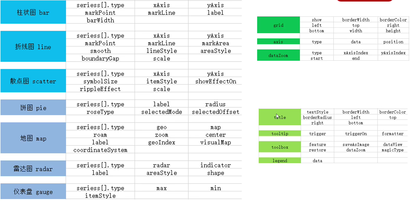
General configuration
General configuration refers to the configuration that can be used by any chart.
title
-
Text style
title:{ text:'Performance display', textStyle:{ color:'red', fontSize:'28px', fontWeight:800, }, }, -
Title border
borderWidth:5,
borderColor:'blue',
borderRadius:5
-
Title Position
title:{
  text:'Performance display',
  textStyle:{
    color:'red',
    fontSize:'28px'
  },
borderWidth:5,
borderColor:'blue',
borderRadius:5,
left:100,
top:20,
},
The value of top can be a specific pixel value such as 20, a percentage relative to the height and width of the container such as' 20% ', or' top ',' middle ',' bottom '.
If the value of top is' top ',' middle ',' bottom ', the component will be aligned automatically according to the corresponding position.
Prompt tooltip
tooltip: prompt box component, which is used to configure the display box when the mouse slides over or clicks the chart.
-
Trigger type: trigger (optional)
-
'item'
Data item graph trigger is mainly used in scatter chart, pie chart and other charts without category axis.
-
'axis'
Coordinate axis trigger is mainly used in histogram, line chart and other charts that will use category axis.
-
'none'
Nothing triggers.
-
-
Trigger timing: trigger on (optional)
-
'mousemove'
Triggered when the mouse moves.
-
'click'
Triggered when the mouse clicks.
-
'mousemove|click'
Triggered when the mouse moves and clicks at the same time.
-
-
Formatting: formatter
The prompt box floating layer content formatter supports two forms: String template and callback function.
String template:
Template variables include {a}, {b}, {c}, {d}, {e}, which respectively represent series name, data name, data value, etc. stay trigger When it is' axis', there will be multiple series of data. At this time, the index of the series can be represented by {a0}, {a1}, {a2}. The meanings of {a}, {b}, {c}, {d} under different chart types are different. Among them, variables {a}, {b}, {c}, {d} represent data under different chart types, with the following meanings:
- Broken line (area) chart, column (bar) chart, K-line chart: {a} (series name), {b} (category value), {c} (value), {d} (none)
- Scatter chart (bubble chart): {a} (series name), {b} (data name), {c} (numeric array), {d} (none)
- Map: {a} (series name), {b} (area name), {c} (combined value), {d} (none)
- Pie chart, dashboard, funnel chart: {a} (series name), {b} (data item name), {c} (value), {d} (percentage)
tooltip:{
  trigger:'axis',// 'item'
  triggerOn:'click',
  formatter:'{b} What's your score {c}', //{b} (category value), {c} (value)
}
Callback function format:
It supports returning HTML strings or creating DOM instances.
The first parameter arg is the data set required by the formatter
tooltip:{
  trigger:'axis',// 'item'
  triggerOn:'click',
  formatter:function(arg){
    console.log(arg); // You can print to see what the value is
    return `${arg[0].name}Your score is ${arg[0].data}`; // The return value will be presented in the page
  }
},
Tool button toolbox
Built in five tools: export picture, data view, dynamic type switching, data area scaling and reset.
toolbox:{
  feature:{
    saveAsImage:{}, // Save as picture
    dataView:{}, //Data view
    restore:{}, // Reset function
    dataZoom:{}, // Area scaling
    magicType:{
      type:['line','bar']    // Switch chart type
    }
  }
},

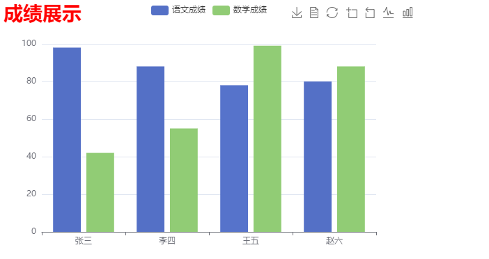
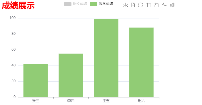
legend
Legend: legend. It is used to filter series. It needs to be used with series.
- The data in legend is an array
- The value of data in legend must be consistent with the name value of a group of data in the series array
series: [
  {
    name: 'grade scores of Chinese',
    type: 'bar',
    data: [98, 88, 78, 80]
  },{
    name:'Mathematics achievement',
    data:[42,55,99,88],
    type:'bar'
  }
],
legend:{
  data:['grade scores of Chinese','Mathematics achievement'], // If the name in the series has a value, the data in the legend may not be written
}
Common charts for ECharts
- bar chart
- Line chart
- Scatter diagram
- Pie chart
- Map
- Radar chart
- Instrument cluster diagram
Histogram
Implementation steps
-
The most basic code structure of ECharts:
Introduce js file, set DOM container, initialize object, and set options
-
x-axis data:
Data 1: ['Zhang San', 'Li Si', 'Wang Wu', 'Zhao Liu']
-
y-axis data:
Data 2: [88,92,79,79]
-
Chart type:
Set type:bar under series
<body>
  <div style="width: 600px;height: 400px;"></div>
  <script src="./lib/echarts.js"></script>
  <script>

    let myCharts = echarts.init(document.querySelector('div'));
    myCharts.setOption({
      title: {
        text:'achievement'
      },
      xAxis: {
        type: 'category',
        data: ['Zhang San','Li Si','Wang Wu','Zhao Liu']
      },
      yAxis: {
        type: 'value'
      },
      series: [{
        name: 'achievement',
        data: [5, 10, 15, 20],
        type: 'bar'
      }],
    });
  </script>
</body>
Common effects
-
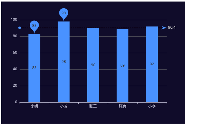
Marking:
-
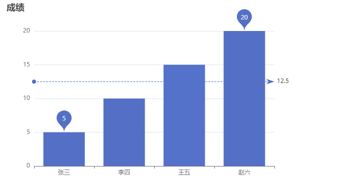
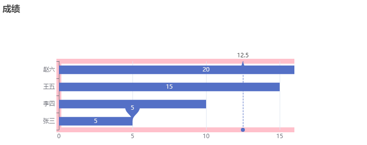
Max min (mark points with markpoints)
series: [{
  name: 'achievement',
  data: [5, 10, 15, 20],
  type: 'bar',
  markPoint:{
    data:[{
      type:'max',
      name:'Maximum'
    },{
      type:'min',
      name:'minimum value'
    }]
  }
}]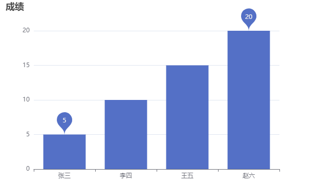
-
Average value (markLine)
```js
series: [{
name: 'achievement',
data: [5, 10, 15, 20],
type: 'bar',
markPoint:{
data:[{
type:'max',
name:'Maximum'
},{
type:'min',
name:'minimum value'
}]
},
markLine:{
data:[
{
type:'average',name:'average value'
}
]
}
}],
```
-
Display:
-
Value display (label)
series: [{
  name: 'achievement',
  data: [5, 10, 15, 20],
  type: 'bar',
  markPoint:{
    data:[{
      type:'max',
      name:'Maximum'
    },{
      type:'min',
      name:'minimum value'
    }]
  },
  markLine:{
    data:[
      {
        type:'average',name:'average value'
      }
    ]
  },
  label:{
    show:true,
  }
}],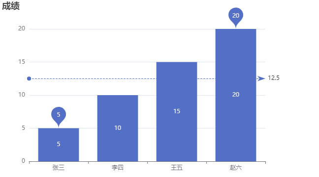
-
Column width (barWidth)
series: [{ name: 'achievement', data: [5, 10, 15, 20], type: 'bar', markPoint:{ data:[{ type:'max', name:'Maximum' },{ type:'min', name:'minimum value' }] }, markLine:{ data:[ { type:'average',name:'average value' } ] }, label:{ show:true, position:'inside' }, barWidth:'50%' // Adjust to 50% of the default width }], -
Transverse histogram
Change the histogram to horizontal:
xAxis: {
  type: 'value'
},
yAxis: {
  data: ['Zhang San', 'Li Si', 'Wang Wu', 'Zhao Liu'],
  type: 'category',
}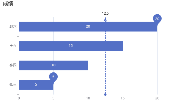
-
Line chart
Implementation steps
-
The most basic code structure of ECharts:
Introduce js file, set DOM container, initialize object, and set options
-
x-axis data:
Data 1: ['January', 'February', 'March', 'April', 'may', 'June']
-
y-axis data:
Data 2: [88,92,79,79,39,99]
-
Chart type:
Set type: line under series
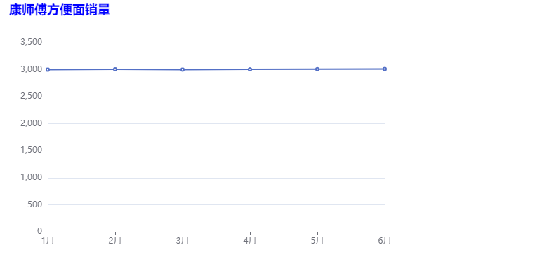
let myChart = echarts.init(document.querySelector('div'));
myChart.setOption({
  title:{
    text:'Master Kang instant noodle sales',
    textStyle:{
      color:'blue'
    }
  },
  xAxis:{
    data:['1 month','2 month','3 month','4 month','5 month','6 month'],
    type:'category'
  },
  yAxis:{
    type:'value',
  },
  series:{
    name:'Sales volume of Master Kang',
    type:'line',
    data:[35,29,38,88,69,89],
  },
  tooltip:{
    trigger:'item',
    formatter:'{b}Our sales volume is{c}'
  }
})
Common effects
-
sign
-
Max min markPoint
series:{ name:'Sales volume of Master Kang', type:'line', data:[35,29,38,88,69,89], markPoint:{ data:[ {type:'max'}, {type:'min'} ] }, }, -
Average markLine
series:{
  name:'Sales volume of Master Kang',
  type:'line',
  data:[35,29,38,88,69,89],
  markPoint:{
    data:[
      {type:'max'},
      {type:'min'}
    ]
  },
  markLine:{
    data:[
      {type:'average'}
    ]
  }
}
[the external chain image transfer fails. The source station may have an anti-theft chain mechanism. It is recommended to save the image and upload it directly (IMG ikyajfli-1632987640708) (C: \ users \ singhand \ appdata \ roaming \ typora \ user images \ image-20210924153332983. PNG)]
-
Label interval markArea
series:{
  name:'Sales volume of Master Kang',
  type:'line',
  data:[35,29,38,88,69,89],
  markPoint:{
    data:[
      {type:'max'},
      {type:'min'}
    ]
  },
  markLine:{
    data:[
      {type:'average'}
    ]
  },
  markArea:{
    data:[
      [
        {xAxis:'1 month'}, // Start month
        {xAxis:'2 month'}, // End month
      ],
      [
        {xAxis:'3 month'}, // Start month
        {xAxis:'5 month'}, // End month
      ],
    ]
  }
},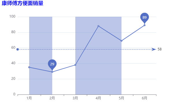
-
-
Line control:
-
smooth
series:{
  name:'Sales volume of Master Kang',
  type:'line',
  data:[35,29,38,88,69,89],
  smooth:true
},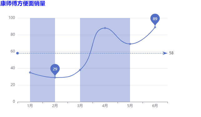
-
Line style lineStyle
series:{ name:'Sales volume of Master Kang', type:'line', data:[35,29,38,88,69,89], smooth:true, lineStyle:{ color:'green', type:'dotted', //solid dashed } }, -
Fill style areaStyle
Note the difference between and markArea.
series:{
  name:'Sales volume of Master Kang',
  type:'line',
  data:[35,29,38,88,69,89],
  smooth:true,
  lineStyle:{
    color:'green',
    type:'dotted', //solid dashed
  },
  areaStyle:{
    color:'pink'
  }
},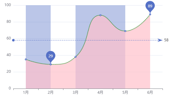
All codes: A Pen by liujiaqi222 (codepen.io)
-
Next to edge boundaryGap
By default, there is a distance from the edge. Note that the bundaryGap is placed in xAxis.
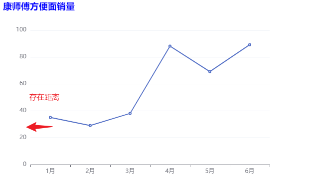
xAxis: {
  data: ['1 month', '2 month', '3 month', '4 month', '5 month', '6 month'],
  type: 'category',
  boundaryGap:false, // Set to no gap
},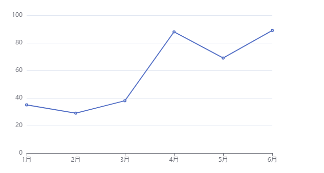
-
scale away from 0 value
If the values are almost the same and the values are large, it is found that the coordinates of the y-axis still start from 0.
At this point, you can set the value of the scale property to true to allow axis scaling.
yAxis: {
  type: 'value',
  scale:true
},
-
Stack diagram (the attribute value of stack should be set to the same)
If there are two different lines, their values fluctuate greatly, and the following overlap will occur, which is easy to dazzle people at this time.
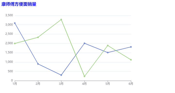
Therefore, you can set the stack attribute value of the two lines to the same value (any setting). At this time, the first line is still the first line, and the second line is the sum (superposition) of the original two lines.
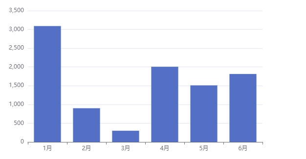
series: [{
  name: 'Sales volume of Master Kang',
  type: 'line',
  data: [3091, 900, 300, 2006, 1510, 1813],
  stack: 'all',
  // For a series with the same stack attribute value, the value of the subsequent series will be superimposed on the value of the previous series
  // Second line
}, {

  name: '',
  type: 'line',
  data: [2000, 2328, 3282, 230, 1889, 1123],
  stack: 'all',
}],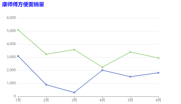
-
Scatter diagram
Scatter plot can help us infer the correlation between variables.
Implementation steps
-
Introduce js file, create DOM container, initialize object and set option
-
x-axis data and y-axis data: two-dimensional array
Array 1: [[height 1, weight 1], [height 2, weight 2], [height 3, weight 3]]
-
Chart type:
Set type:scatter under series
The type of xAxis and yAxis should be set to value
const myChart = echarts.init(document.querySelector('div'));
myChart.setOption({
  xAxis: {
    type: 'value',
    scale:true
  },
  yAxis: {
    type: 'value',
    scale:true
  },
  series: [{
    data: axisdata,
    type: 'scatter'
  }]
})
Common effects
-
Bubble chart has different effects
-
The size of scatter points is different
-
The color of scatter points is different
series: [{
  data: axisdata,
  type: 'scatter',
  // symbolSize:10, / / change the size of scatter points
  // Different elements have different sizes of scatter points
  symbolSize: function (arg) {
    const height = arg[0];
    const weight = arg[1];
    if ((weight / Math.pow(height / 100, 2) > 25)) {
      return 15;
    }
      return 5;

  },
  // Control style
  itemStyle: {
    // color:'green'
    color: function (arg) {
      const height = arg.data[0];
      const weight = arg.data[1];
      if ((weight / Math.pow(height / 100, 2) > 25)) {
      return 'pink';
    }
      return 'blue';

    }
  }
}]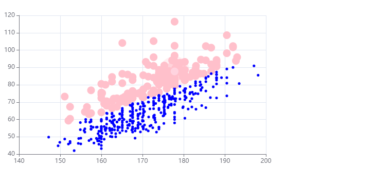
-
-
Ripple animation effect
type: effectScatter
series: [{
  data: axisdata,
  type: 'effectScatter',
  showEffectOn:'emphasis', // render (displayed after the page is loaded) emphasis (displayed when the mouse is over)
  rippleEffect:{
    scale:5
  },
}]
Common configuration of rectangular coordinate system
Rectangular coordinate system chart: bar chart, broken line chart, scatter chart
Configuration 1: grid
grid is used to control the layout and size of the direct coordinate system.
grid:{
  show:true, // Display grid
  borderWidth:10, // frame
  borderColor:'pink', //Border color
  // Location and size of grid
  top:120,
  left:120,
  width:600,
  height:140,
},
Configuration 2: axis
The coordinate axes are divided into x-axis and y-axis. There are at most two positions of x-axis and y-axis in a grid.
-
Axis type
Value: value axis, which automatically reads data from target data
Category: category axis. This type needs to set category data through data
-
Display position
xAxis: the value can be top or bottom
yAxis: can be left or right
Configuration 3: Area zoom dataZoom
dataZoom is used for data scaling and data range filtering. Both x-axis and y-axis can be owned.
dataZoom is an array, which means that multiple area scalers can be configured.
-
type
Slider: slider
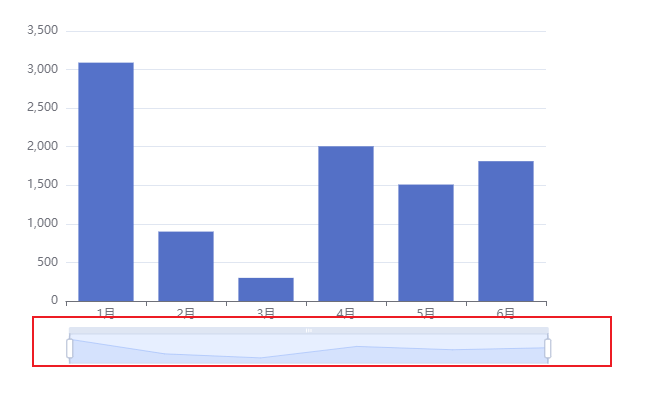
inside: built in, zoom by mouse wheel or two fingers
dataZoom:[{ type: 'inside' // slider inside: built in, zooming by mouse wheel or two fingers }], -
Indicates the axis of the dataZoom action
xAxisIndex: set which x-axis is controlled by the scaling component. Generally, write 0
yAxisIndex: set which y-axis is controlled by the scaling component. Generally, write 0
dataZoom: [ { // slider inside: built in, zooming by mouse wheel or two fingers type: 'slider', xAxisIndex:0 }, { type: 'slider', yAxisIndex:0 } ], -
Indicates the scaling of the initial state
start: the starting percentage of the data window range
End: percentage of the end of the data window range
dataZoom: [
  {
    // slider inside: built in, zooming by mouse wheel or two fingers
    type: 'slider',
    xAxisIndex:0
  },
  {
    type: 'slider',
    yAxisIndex:0,
    start:0,
    end:50 //It refers to 50% of the highest point
  }
],
Pie chart
Pie chart can help users quickly understand the proportion of data of different classifications.
Implementation steps
-
The most basic code structure of ECharts:
Introduce js file, set DOM container, initialize object, and set options
-
Data preparation:
[{name: 'Taobao', value:11232},{name: 'Xianyu', value:5632},{name: 'Jingdong', value:7885},{name: 'pinduoduo', value:4632}]
-
Chart type:
Set type:pie under series
const myChart = echarts.init(document.querySelector('div'));
myChart.setOption({
  series:[{
    type:'pie',
    data:[{name:'TaoBao',value:11232},{name:'Idle fish',value:5632},{name:'JD.COM',value:7885},{name:'Pinduoduo',value:4632}]
  }]
});
Common effects
-
Display value
label.formatter
series:[{
  type:'pie',
  data:[{name:'TaoBao',value:11232},{name:'Idle fish',value:5632},{name:'JD.COM',value:7885},{name:'Pinduoduo',value:4632}],
  label:{
    // Show label
    show:true, //The default is true
    //Determines what text is displayed
    // formatter:'{b}-{c}-{d}%', / / taobao-11232-28.23%
    formatter:function(arg){
      return `${arg.name}-${arg.value}`;
    }
  }
}]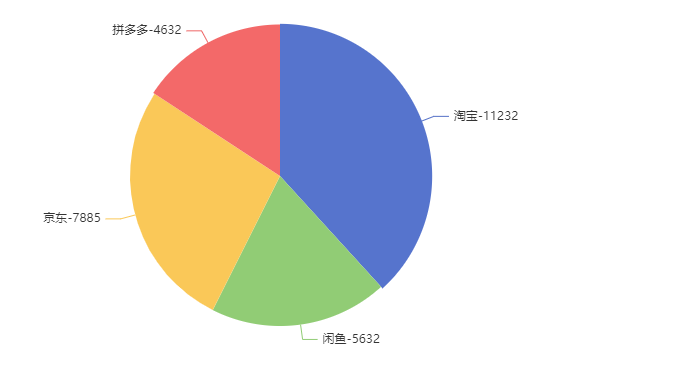
-
ring
Set two radii: ['40%,' 80% ']
series: [{
  type: 'pie',
  data: [{ name: 'TaoBao', value: 11232 }, { name: 'Idle fish', value: 5632 }, { name: 'JD.COM', value: 7885 }, { name: 'Pinduoduo', value: 4632 }],
  // 20 stands for 20px; 20% represents half the smaller value relative to the height or width of its container
  radius: ['40%', '80%'],   // The smaller circle radius is 40% and the larger is 80%

}]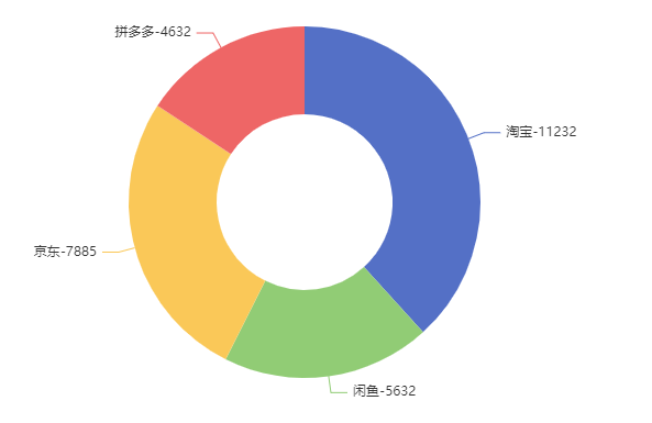
-
Nightingale map:
roseType:'radius'
myChart.setOption({
  series: [{
    type: 'pie',
    data: [{ name: 'TaoBao', value: 11232 }, { name: 'Idle fish', value: 5632 }, { name: 'JD.COM', value: 7885 }, { name: 'Pinduoduo', value: 4632 }],
    roseType: 'radius' //The radius of each piece of Nightingale pie chart is different
  }]
});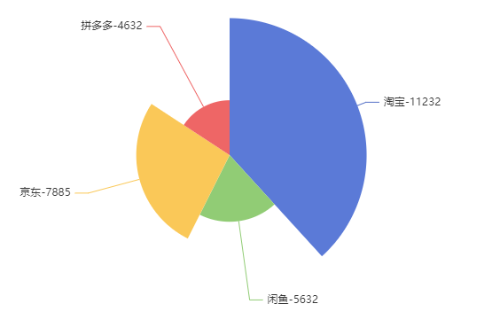
-
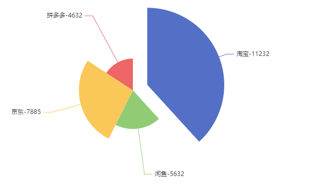
Select effect
// If set to single, the selected part will deviate from the dot by a small segment, and the other previously selected blocks will come back
// selectedMode:'single'
selectedMode:'multiple', // If other blocks are selected, the deviation will not come back
// Set the distance of deviation
selectedOffset:30
Map
Maps can help us quickly analyze the data differences in different geographical locations from a macro perspective. Official website document
How to use maps and charts:
-
Baidu map Api
You need to apply for the access key of Baidu map
-
Vector map
You need to prepare the data for the vector map
Implementation steps
-
The most basic code structure of ECharts:
Introduce js file, set DOM container, initialize object, and set options
-
Prepare the vector map json file of China and put it in the directory of json/map /
-
Get china.json using ajax
-
Register the map json data with the ecarts global object in the callback function
echarts.registerMap('chinaMap',chinaJson)
-
Set type:'map' map:'chinaMap' under the geo node
const myChart = echarts.init(document.querySelector('div'));
fetch('./JSON/map/china.json').then(res=>res.json()).then((data)=>{
  echarts.registerMap('chinaMap',data); //The ecarts global object registers the map json data
  myChart.setOption({
    geo:{
      type:'map',
      map:'chinaMap'
    }
  })
})
Common configuration
-
Zoom drag
roam
-
Name display
label
-
Initial scale
zoom
-
Map center point
center
const myChart = echarts.init(document.querySelector('div'));
fetch('./JSON/map/china.json').then(res=>res.json()).then((data)=>{
  echarts.registerMap('chinaMap',data);
  myChart.setOption({
    geo:{
      type:'map',
      map:'chinaMap',
      roam:true, // Setting allows zooming and dragging of the map
      // scale only drag move only
      label:{
        show:true, //Show all labels
      },
      zoom:1,//Set initial scale
      center:[99,40] //Set a region as the center according to longitude and latitude
    }
  })
})
Common effects
Different cities display different colors
-
Show basic map of China
-
Set urban air quality in series
-
Associate the data under series with geo
geoIndex:0 ,type:'map'
-
Combined with visual map
min max inRange
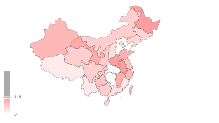
    const myChart = echarts.init(document.querySelector('div'));
    const airData = [
        { name: 'Beijing', value: 39.92 },
        { name: 'Tianjin', value: 39.13 },
        { name: 'Shanghai', value: 31.22 },
        { name: 'Chongqing', value: 66 },
        { name: 'Hebei', value: 147 },
        { name: 'Henan', value: 113 },
        { name: 'Yunnan', value: 25.04 },
        { name: 'Liaoning', value: 50 },
        { name: 'Heilongjiang', value: 114 },
        { name: 'Hunan', value: 175 },
        { name: 'Anhui', value: 117 },
        { name: 'Shandong', value: 92 },
        { name: 'Xinjiang', value: 84 },
        { name: 'Jiangsu', value: 67 },
        { name: 'Zhejiang', value: 84 },
        { name: 'Jiangxi', value: 96 },
        { name: 'Hubei', value: 273 },
        { name: 'Guangxi', value: 59 },
        { name: 'Gansu', value: 99 },
        { name: 'Shanxi', value: 39 },
        { name: 'Inner Mongolia', value: 58 },
        { name: 'Shaanxi', value: 61 },
        { name: 'Jilin', value: 51 },
        { name: 'Fujian', value: 29 },
        { name: 'Guizhou', value: 71 },
        { name: 'Guangdong', value: 38 },
        { name: 'Qinghai', value: 57 },
        { name: 'Tibet', value: 24 },
        { name: 'Sichuan', value: 58 },
        { name: 'Ningxia', value: 52 },
        { name: 'Hainan', value: 54 },
        { name: 'Taiwan', value: 88 },
        { name: 'Hong Kong', value: 66 },
        { name: 'Macao', value: 77 },
        { name: 'South China Sea Islands', value: 55 }
    ]
    fetch('./JSON/map/china.json').then(res => res.json()).then(data => {
      // console.log(data);
      echarts.registerMap('chinaMap',data);
      myChart.setOption({
        geo:{
          map:'chinaMap',
          type:'map'
        },
        series:[{
          data:airData,
          // Associate the data under series with geo
          geoIndex:0, //Associate the air quality data with the 0th geo configuration
          type:'map',
        }],
        visualMap:{
          min:0,
          max:300,
          inRange:{
            color:['white','red'] //Modify color
          }
        }
      })
    })
In addition, another attribute is calculable, which is set to true. You can filter it by dragging the handle. The following figure filters the data from 0 to 118
Map and scatter chart are used together
-
Add a new object to the series
-
Prepare the scatter data and set the data for the new object
-
Configure the type of the new object
type:effectScatter
-
Let the scatter chart use the map coordinate system
coordinateSystem:'geo'
-
Make the ripple effect more obvious
rippleEffect:{scale:10}
series: [
  {
    type: 'effectScatter',
    data: scatterData,
    coordinateSystem: 'geo', // Indicates the coordinate system used for scatter points, geo's coordinate system
    rippleEffect: {
      scale: 10, //Sets the size of the effect of the ripple animation
    }
  }
],
Radar chart
Radar chart can be used to analyze the comparison between multi-dimensional data and standard data.
Implementation steps
-
The most basic code structure of ECharts:
Introduce js file, set DOM container, initialize object, and set options
-
Define the maximum value of each dimension under the radar node
indicator:[{name: 'ease of use', max:100},{name: 'function', max:100},{name: 'taking photos', max:100},{name:' running points', max:100},{name: 'endurance', max:100}]
-
Prepare product specific data
Data: [{Name: 'Huawei mobile 1', value: [48, 88, 99, 66, 77]}, {Name: 'Xiaomi Mobile', value:[88, 90, 89, 95, 87]}]
-
Chart type
Set type:radar under series
const myChart = echarts.init(document.querySelector('div'));
myChart.setOption({
  radar: {
    indicator: [{ name: 'Ease of use', max: 100 }, { name: 'function', max: 100 }, { name: 'photograph', max: 100 }, { name: 'Run points', max: 100 }, { name: 'Endurance', max: 100 }],

  },
  series: [{
    type: 'radar',
    data: [{ name: 'Huawei mobile 1', value: [48, 88, 99, 66, 77] }, { name: 'Mi phones', value:[88, 90, 89, 95, 87] }]
  }]
})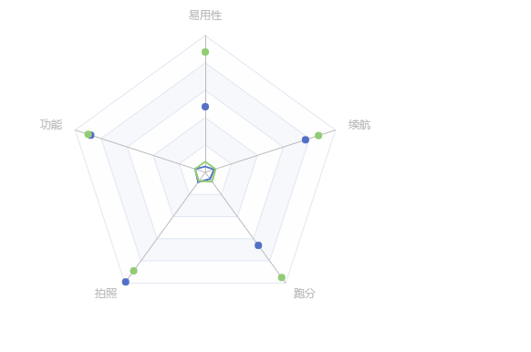
Common configuration
-
Display value
label:true
-
Area (configured under the series node)
areaStyle:{}
-
Configure the display type of the outermost layer of the radar chart (configured under the radar node)
shape: 'circle' / / polygen by default
myChart.setOption({
  radar: {
    indicator: [{ name: 'Ease of use', max: 100 }, { name: 'function', max: 100 }, { name: 'photograph', max: 100 }, { name: 'Run points', max: 100 }, { name: 'Endurance', max: 100 }],
    shape:'circle' // The default is polygon
  },
  series: [{
    type: 'radar',
    data: [{ name: 'Huawei mobile 1', value: [48, 88, 99, 66, 77] }, { name: 'Mi phones', value:[88, 90, 89, 95, 87] }],
    areaStyle:{}
  }],
  label:{
    show:true
  },
   legend:{}
})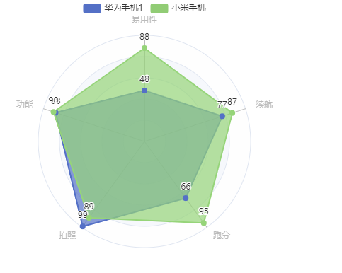
Dashboard
The instrument panel is mainly used for progress control and data range monitoring.
Implementation steps
-
The most basic code structure of ECharts:
Introduce js file, set DOM container, initialize object, and set options
-
Prepare data and set it to data under series
data: [{value:97}]
-
Chart type:
Set type:gauge under series
const myChart = echarts.init(document.querySelector('div'));
myChart.setOption({
  series: [
    {
      data: [
        { value: 97 },// Each object represents a pointer
        // Each object represents a pointer
      ],
      type: 'gauge'
    }
  ]
})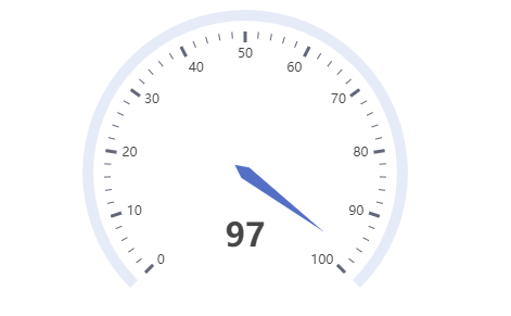
Common effects
-
Value range:
min, max to control
myChart.setOption({
  series: [
    {
      data: [
        { value: 97 },// Each object represents a pointer
        // Each object represents a pointer
      ],
      type: 'gauge',
      min:50 //Range of control instrument cluster
    }
  ],
})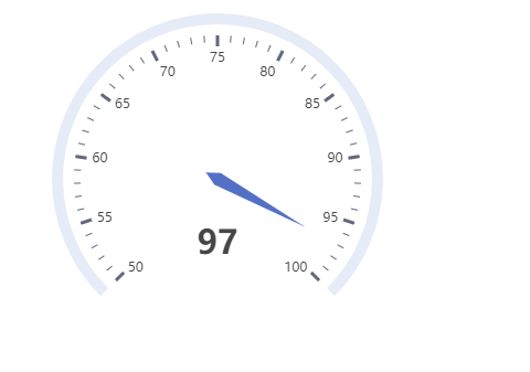
summary
Summary of characteristics
- Bar chart: the bar chart describes the classification data and shows how many are in each classification?, The meaning expressed in the chart lies in the ranking comparison of different categories of data
- Line chart: line chart is more used to show the "change trend" of data over time
- Scatter chart: scatter chart can help us infer the correlation between data of different dimensions. For example, in the previous example, we can see that height and weight are positively correlated. The higher the height, the heavier the weight; Scatter charts are also often used in map annotation.
- Pie chart: pie chart can help users quickly understand the proportion of data of different classifications
- Maps: maps can help us quickly see the differences of data in different geographical locations from a macro perspective
- Radar chart: radar chart can be used to analyze the comparison between multi-dimensional data and standard data
- Dashboard: dashboard can more intuitively show the progress or actual situation of an indicator
Configuration item summary
Echarts advanced
Display correlation
theme
Built in theme
Echarts has two built-in themes: light dark.
-
It can be declared in the initialization object method init
const chart = echarts.init(dom,'light');
Custom theme
-
stay Theme Editor Edit theme in
-
Download the theme, which is a js file
-
Import theme js file
-
Using themes in init methods
palette
Palette
It is a set of colors from which graphics and series automatically select colors.
-
Themes palette
The operation is the same as the theme defined above
-
Global palette
If configured, the theme's palette will be overwritten: myCharts.setOption({color:['red','green','blue ']})
-
Local palette
series:[{type:'bar',color:['red','green','blue']}]
Color gradient
-
Linear gradient
series: {
  data: [83, 98, 90, 89, 92],
  type: 'bar',
  markPoint: {
    data: [
      {
        type: 'max',
        name: 'Maximum'
      },
      {
        type:'min',
        name:'minimum value'
      }
    ]
  },
  markLine:{
    data:[{
      type:'average',
      name:'average value'
    }]
  },
  label:{
    show:true,
    position:'inside'
  },
  barWidth:'40%',
  itemStyle:{
    color:{
      type:'linear', // Linear gradient
      x:0, // Defines the direction of the color ramp
      y:0,
      x2:0,
      y2:1,
      colorStops:[
        {offset:0,color:'red'}, // The color at 0 percent is red
        {offset:1,color:'pink'} // The color at 100 percent is blue
      ]
    }
  }
}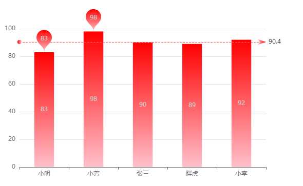
-
Radial Gradient
itemStyle:{
  // color:{
  //   type:'linear', / / linear gradient
  //   x:0, / / define the direction of the color gradient
  //   y:0,
  //   x2:0,
  //   y2:1,
  //   colorStops:[
  //     {offset:0,color:'red'}, / / the color at 0% is red
  //     {offset:1,color:'pink'} / / the color at 100% is blue
  //   ]
  // }
  color:{
    type:'radial',
    x:0.5, // x coordinate of the center of the circle
    y:0.5, // y coordinate of circle center
    r:1, // radius
    colorStops:[
      {offset:0,color:'red'},
      {offset:1,color:'blue'}
    ]

  }
}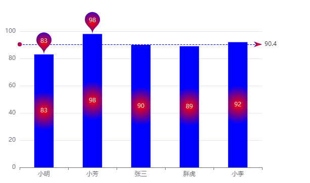
style
Direct style and highlight style, with higher priority, will override the effect of theme and palette
Direct style
itemStyle, textStyle, lineStyle, areaStyle, label
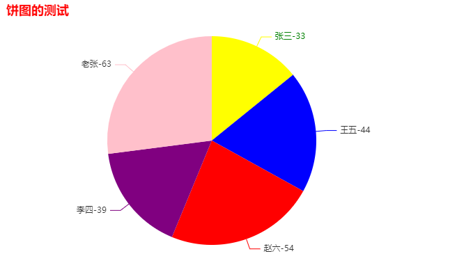
myChart.setOption({
  title:{
    text:'Test of pie chart',
    // 2.textStyle
    textStyle:{
      color:'red'
    }
  },
  series: {
    color: ['blue', 'red', 'purple', 'pink', 'green'],
    type: 'pie',
    data: [{
      name: 'Zhang San', value: 33,
      // 1.itemStyle controls the style of Zhang San area
      itemStyle: {
        color:'yellow'
      },
      // 3.label
      label:{
        color:'green'
      }
    },
    { 'name': 'Wang Wu', value: 44 },
    { 'name': 'Zhao Liu', value: 54 },
    { 'name': 'Li Si', value: 39 },
    { 'name': 'Lao Zhang', value: 63 }
    ],
    label: {
      show: true,
      formatter: '{b}-{c}',
    }
  }
})
Highlight style
Wrap itemstyle, TextStyle, linestyle, areastyle and label in emphasis
series: {
  color: ['blue', 'red', 'purple', 'pink', 'green'],
  type: 'pie',
  data: [{
    name: 'Zhang San', value: 33,
    // 1.itemStyle controls the style of Zhang San area
    itemStyle: {
      color:'yellow'
    },
    // 3.label
    label:{
      color:'green'
    },
    // Highlight style
    emphasis:{
      itemStyle:{color:'pink'},
      label:{color:'black'}
    }
  },
  { 'name': 'Wang Wu', value: 44 },
  { 'name': 'Zhao Liu', value: 54 },
  { 'name': 'Li Si', value: 39 },
  { 'name': 'Lao Zhang', value: 63 }
  ],
  label: {
    show: true,
    formatter: '{b}-{c}',
  }
}
})
self-adaption
When the size of the browser changes, the chart can adapt and change accordingly.
-
Listen for window size change events (resize)
-
The resize in the Echarts instance object can be called in the event handler.
window.addEventListener('resize',()=>{
    myChart.resize();
})
Use of animation
Load animation
Ecarts has built-in animation for loading data. We just need to show or hide it at the right time
-
Show load animation
myChart.showLoading()
-
Hide loading animation
myChart.hideLoading()
const myChart = echarts.init(document.querySelector('div'));
myChart.showLoading();
fetch('./Json/data.json').then(res => res.json()).then(data =>{
  myChart.hideLoading();
  const dataArr = data.map(item =>[item.height,item.weight]);
  myChart.setOption({
    xAxis:{
      type:'value',
      scale:true
    },
    yAxis:{
      type:'value',
      scale:true,
    },
    series:{
      type:'scatter',
      data:dataArr
    }
  })
})
Incremental animation
All data updates are implemented through setOption, without considering what changes have taken place in the data.
The old and new options do not cover each other, but are integrated with each other. When setting a new option, you only need to consider the changed part.
const btnmodify = document.querySelector('#modify');
const btnadd = document.querySelector('#add');
btnmodify.addEventListener('click', () => {
  const newData = [25, 33, 55, 66];
  // The old and new option s do not cover each other, but are integrated with each other
  // When setting a new option, you only need to consider the changed part.
  myCharts.setOption({
    series: [{
      data: newData,

    }],
  });
})
btnadd.addEventListener('click', () => {
  const newData = [66, 72, 65, 88, 43];
  const newName = ['Zhang San', 'Li Si', 'Wang Wu', 'Zhao Liu', 'Xiao Wu'];
  myCharts.setOption({
    xAxis: {
      data: newName
    },
    series: [{
      data: newData,

    }],
  })
})
All codes: https://codepen.io/liujiaqi222/pen/ZEyPGNp
Animation configuration
-
Turn on animation
animation:true
-
Animation duration
animationDuration:1000 (in milliseconds)
-
Jog animation
animationEasing:'bounceOut'
myCharts.setOption({ animation: true, animationDuration: function (arg) { console.log(arg); // The index value of the animation element is printed return arg * 2000; }, animationEasing: 'bounceOut', // linear wait }); -
Animation threshold
animationThreshold:10 / / only 10 animations of the same type are displayed at most
Interactive API
Global ecarts object
overall situation Ecarts object It is an object that can be used directly after importing the echorts.js file
-
init initializes the ecarts instance object and uses the topic
-
registerTheme registers a topic. Only registered topics can be used in the init method
-
registerMap register map data
fetch('./JSON/map/china.json').then(res=>res.json()).then((data)=>{ // Register map echarts.registerMap('chinaMap',data); myChart.setOption({ geo:{ type:'map', map:'chinaMap', roam:true, // Setting allows zooming and dragging of the map // scale only drag move only label:{ show:true, //Show all labels }, zoom:1,//Set initial scale center:[99,40] //Set a region as the center according to longitude and latitude } }) }) -
connect
There can be multiple independent charts in a page, and each chart corresponds to an ECharts instance object.
connect can realize multi graph Association. The incoming linkage target is the ECharts instance object and supports arrays. When saving the picture, it will automatically splice, refresh button, reset button, prompt box linkage, legend selection, data range modification, etc.
echarts.connect([mychart1,mychart2])
echartsInstance object
Ecartsinstance object Is the return value after calling the eckarts.init method
-
setOption
Set or modify the configuration items and data of the chart instance. You can call the setOption method multiple times (the new configuration and the old configuration will be merged).
-
resize
Recalculate and chart
const myChart = echarts.init(dom); window.addEventListener('resize',()=>{ myChart.resize(); }) -
Bind or unbind event handler
-
Mouse event
// Listen to events myChart.on('click',function(arg){ console.log(arg); console.log('click...'); }); -
ECharts event
Common events: legendSelectChanged, 'dataZoom', 'pieSelectChanged', 'mapSelectChanged', etc
myChart.on('legendSelectChanged',function(arg){
  console.log(arg); //Print selected status
})
-
-
Trigger certain behaviors (use code to simulate user behavior)
mCharts.dispatchAction({ type:'hightlight', //Event type seriesIndex:0, //Chart index dataIndex:1 //Which item in the chart is highlighted }) -
clear
Clearing the current instance will remove all components and charts in the instance;
After clearing, you can setOption again
myChart.clear(); // The entire chart will not be displayed
myChart.setOption(option); // The chart will be displayed again
-
dispose
Destroy the instance. After the instance is destroyed, it can no longer be used
myChart.clear();
myChart.setOption(option);   // Will report an error
Map',
roam:true, / / set allow zoom and drag map
//scale only drag move only
label:{
show:true, / / show all tags
},
zoom:1, / / set the initial zoom scale
center:[99,40] / / set a region as the center according to longitude and latitude
}
})
})
- connect

There can be multiple independent charts in a page, and each chart corresponds to one ECharts Instance object.

connect Multi graph association can be realized, and the incoming linkage target is ECharts Instance object, support array. When saving the picture, it will automatically splice, refresh button, reset button, prompt box linkage, legend selection, data range modification, etc.

```js
echarts.connect([mychart1,mychart2])
echartsInstance object
Ecartsinstance object Is the return value after calling the eckarts.init method
-
setOption
Set or modify the configuration items and data of the chart instance. You can call the setOption method multiple times (the new configuration and the old configuration will be merged).
-
resize
Recalculate and chart
const myChart = echarts.init(dom); window.addEventListener('resize',()=>{ myChart.resize(); }) -
Bind or unbind event handler
-
Mouse event
// Listen to events myChart.on('click',function(arg){ console.log(arg); console.log('click...'); }); -
ECharts event
Common events: legendSelectChanged, 'dataZoom', 'pieSelectChanged', 'mapSelectChanged', etc
myChart.on('legendSelectChanged',function(arg){
  console.log(arg); //Print selected status
})
-
-
Trigger certain behaviors (use code to simulate user behavior)
mCharts.dispatchAction({ type:'hightlight', //Event type seriesIndex:0, //Chart index dataIndex:1 //Which item in the chart is highlighted }) -
clear
Clearing the current instance will remove all components and charts in the instance;
After clearing, you can setOption again
myChart.clear(); // The entire chart will not be displayed
myChart.setOption(option); // The chart will be displayed again
-
dispose
Destroy the instance. After the instance is destroyed, it can no longer be used
myChart.clear();
myChart.setOption(option);   // Will report an error