Matplotlib is a Python 2-D Drawing Library, which generates publishing quality level graphics in various hard copy formats and cross-platform interactive environments [1] .
With Matplotlib, developers can generate drawings, histograms, power spectra, bar graphs, error graphs, scatter plots and so on with only a few lines of code.
1. Drawing polygons
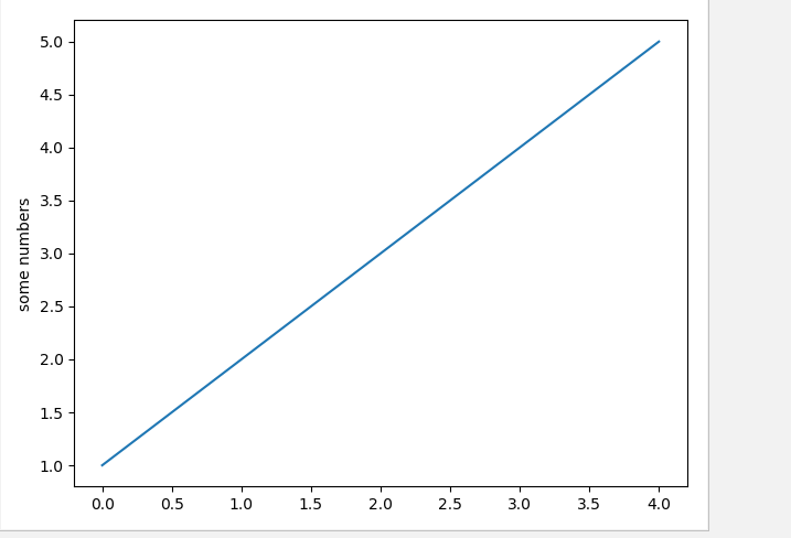
import matplotlib.pyplot as plt
plt.plot([1,2,3,4,5])
plt.ylabel('some numbers')
plt.show()
The effect is shown as follows:
The above is just a simple line chart. Here are some common drawing methods.
- plt.figure() sets the image size (figsize = None, dpi = None, facecolor = None, edgecolor = None, linewidth = 0.0, frameon = None, subplotpars = None, tight_layout = None, constrained_layout = None)
But usually the first two figsize s are set to (20,8) and the DPI is set to 80.
- plt.savefig() saves pictures in parentheses and generally fills in the saved path and format
- plt.xticks() sets the scale on the x axis and the font properties string to set the subgraph style
- plt.yticks() sets the scale and string on the y axis
- plt.xticks() solves the problem of sparse scale and dense scale
- plt.label(title,xlabel,ylabel) sets the label of the title, xy axis
- font_manager() Sets font to display Chinese font
- plt.grid(alpha=0.4) Draws grid alpha to represent grid transparency.
- plt.plot(label=") and plt.legend() add legends note that adding legends must be a two-step process
import matplotlib.pyplot as plt
import random
import matplotlib.font_manager
#
# font = {'family': 'MicroSoft YaHei',
# 'weight': 'bold',
# 'size': 'larger'}
# matplotlib.rc("font",**font)
#Setting font style
my_font=matplotlib.font_manager.FontProperties(fname="C:\Windows\Fonts\simsun.ttc")
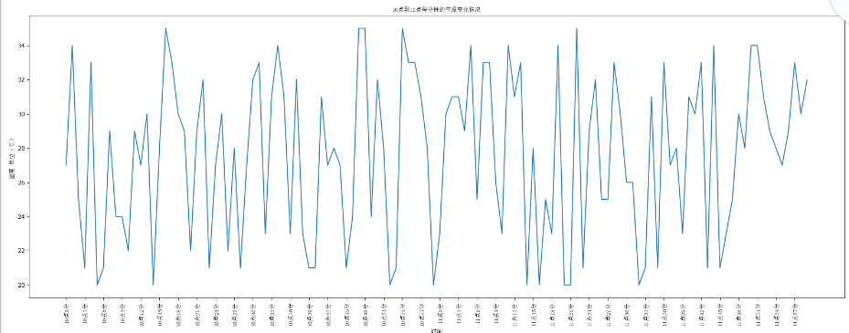
x=range(0,120)
y=[random.randint(20,35) for i in range(120)]
plt.figure(figsize=(20,8),dpi=80)
plt.plot(x,y)
#Adjust the scale of the x-axis
_x=list(x)
_xtick_labels=["10 spot{}branch".format(i) for i in range(60)]
_xtick_labels+=["11 spot{}branch".format(i) for i in range(60)]
#Step size, numbers and strings correspond one by one, the length of data is the same.
plt.xticks(_x[::3],_xtick_labels[::3],rotation=90,fontproperties=my_font) #The degree of ratation rotation
#Adding Description Information
plt.xlabel("time",fontproperties=my_font)
plt.ylabel("Unit of temperature℃)",fontproperties=my_font)
plt.title("10 Temperature variations from 1:00 to 12:00 per minute",fontproperties=my_font)
plt.show()The effect is as follows:
2. Use plt.hist() to draw histogram.
Firstly, group spacing is determined, and then the number of groups is calculated according to group spacing.
The code is as follows:
#Drawing Histogram
from matplotlib import pyplot as plt
from matplotlib import font_manager
a=[131,98,125,131,124,139,131,117,128,108,135,138,131,102,107,114,119,128,121,142]
#Number of calculation groups
d=5 #Group distance
num_bins=(max(a)-min(a))//d

plt.hist(a,num_bins)
#Setting the scale of the x-axis
plt.xticks(range(min(a),max(a),d))
plt.show()
The operation effect is as follows:

3. Drawing scatter plots
The scatter plotting method is shown above.
The code is as follows:
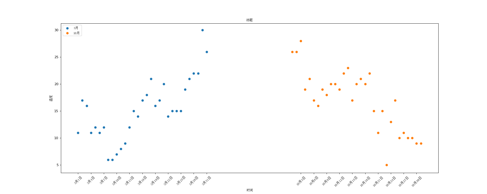
#Drawing scatter plots
from matplotlib import pyplot as plt
from  matplotlib import  font_manager
my_font=font_manager.FontProperties(fname="C:\Windows\Fonts\simsun.ttc")
y_3=[11,17,16,11,12,11,12,6,6,7,8,9,12,15,14,17,18,21,16,17,20,14,15,15,15,19,21,22,22,30,26]
y_10=[26,26,28,19,21,17,16,19,18,20,20,19,22,23,17,20,21,20,22,15,11,15,5,13,17,10,11,10,10,9,9]
x_3=range(1,32)
x_10=range(51,82)
#Setting Graphic Size
plt.figure(figsize=(20,8),dpi=80)
#scatter plotting
plt.scatter(x_3,y_3,label="3 month")
plt.scatter(x_10,y_10,label="10 month")
#Adjust the scale of the x-axis
_x=list(x_3)+list(x_10)
_xtick_labels=["3 month{}day".format(i) for i in x_3]
_xtick_labels+=["10 month{}day".format(i-50) for i in x_10]
plt.xticks(_x[::3],_xtick_labels[::3],fontproperties=my_font,rotation=45)
#Adding Description Information
plt.xlabel("time",fontproperties=my_font)
plt.ylabel("temperature",fontproperties=my_font)
plt.title("Title",fontproperties=my_font)
#Add legend
plt.legend(prop=my_font,loc="upper left")

#Exhibition
plt.show()
Operation effect:
4. Drawing bars
Using plt.bar to draw bar graph
The code is as follows:
#Draw bar charts
from matplotlib import pyplot as plt
from  matplotlib import font_manager
my_font=font_manager.FontProperties(fname="C:\Windows\Fonts\simsun.ttc")

a=["Wolf 2","Speed and Passion 8","Kung Fu Yoga","The Devil of the Westward Journey","Transformers 5:The Last Knight","Wrestling.!Dad","Pirates of the Caribbean 5:There was no testimony of witness after the conspirator passed away","King Kong: Skeleton Island","Extreme agent:Ultimate return","Biochemical Crisis 6:Final chapter","Ride the wind and waves","God steals Daddy 3","Wisdom gains prestige in Mount Tiger","Make a scene of Tianzhu","Wolverine 3:Desperate war","Spider-Man:Return of Heroes","Wu Kong Biography","Guardians of the Galaxy 2","Love saint","The Mummy",]
b=[56.01,26.94,17.53,16.49,15.45,12.96,11.8,11.61,11.28,11.12,10.49,10.3,8.75,7.55,7.32,6.99,6.88,6.86,6.58,6.23]
#Setting Graphic Size
plt.figure(figsize=(20,15),dpi=80)
#Draw bar charts
plt.bar(range(len(a)),b,width=0.3)
plt.xticks(range(len(a)),a,fontproperties=my_font,rotation=90)
plt.show()
The operation effect is as follows:
Draw horizontal bar charts
Use plt.barh code as follows:
#Draw horizontal bar charts
from matplotlib import pyplot as plt
from  matplotlib import font_manager
my_font=font_manager.FontProperties(fname="C:\Windows\Fonts\simsun.ttc")

a=["Wolf 2","Speed and Passion 8","Kung Fu Yoga","The Devil of the Westward Journey","Transformers 5:The Last Knight","Wrestling.!Dad","Pirates of the Caribbean 5:There was no testimony of witness after the conspirator passed away","King Kong: Skeleton Island","Extreme agent:Ultimate return","Biochemical Crisis 6:Final chapter","Ride the wind and waves","God steals Daddy 3","Wisdom gains prestige in Mount Tiger","Make a scene of Tianzhu","Wolverine 3:Desperate war","Spider-Man:Return of Heroes","Wu Kong Biography","Guardians of the Galaxy 2","Love saint","The Mummy",]
b=[56.01,26.94,17.53,16.49,15.45,12.96,11.8,11.61,11.28,11.12,10.49,10.3,8.75,7.55,7.32,6.99,6.88,6.86,6.58,6.23]
#Setting Graphic Size
plt.figure(figsize=(20,15),dpi=80)
#Draw bar charts
plt.barh(range(len(a)),b,height=0.3,color='orange')
plt.yticks(range(len(a)),a,fontproperties=my_font,color='orange')
plt.grid(alpha=0.3)
plt.show()
The operation effect is as follows:

Draw multiple bar graphs, pay attention to width setting
The code is as follows:
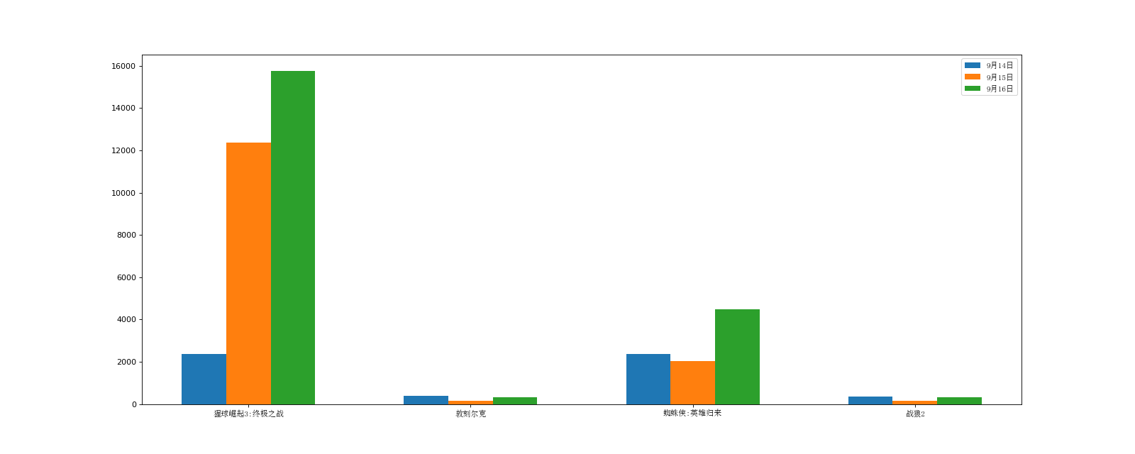
from matplotlib import pyplot as plt
from  matplotlib import font_manager
my_font=font_manager.FontProperties(fname="C:\Windows\Fonts\simsun.ttc")
a=["The Rise of the Orangutan 3:Ultimate battle","Dunkirk","Spider-Man:Return of Heroes","Wolf 2"]
b_16=[15746,312,4497,319]
b_15=[12357,156,2045,168]
b_14=[2358,399,2358,362]
x_14=list(range(len(a)))
x_15=[i+0.2 for i in x_14]
x_16=[i+0.2*2 for i in x_14]
#Setting Graphic Size
plt.figure(figsize=(20,8),dpi=80)
plt.bar(range(len(a)),b_14,width=0.2,label="9 14 June")
plt.bar(x_15,b_15,width=0.2,label="9 15 June")
plt.bar(x_16,b_16,width=0.2,label="9 16 June")
plt.legend(prop=my_font)
#Setting the scale of the x-axis
plt.xticks(x_15,a,fontproperties=my_font)
plt.show()
The operation effect is as follows: