For Android developers, custom control sounds like a big thing, but at the same time, it also makes most developers feel timid. It's not difficult for them to understand. As long as they learn and practice, custom control is also very simple. Recently, the NBA is playing a hot game. Today, simply draw a basketball and feel the paper tiger of custom control.
First, the effect map is shown.
2. Take three steps:
1. Custom Properties
2. Custom View
3. Use custom View
Step 1: Customize attributes
At res - > values Next, create a new attrs.xml file (with or without new ones), code as follows:
<resources>

    <declare-styleable name="CustomProgressBar">
        <attr name="firstColor" format="color" />
        <attr name="secondColor" format="color" />
        <attr name="circleWidth" format="dimension" />
        <attr name="speed" format="integer" />
    </declare-styleable>

</resources>
Explain the above:
1. name= "Custom ProgressBar": This name value can be written freely without specific requirements, but it is usually written as the class name of a custom View (described later) for easy identification.
2. <attr name= "first color" format= "color"/>: each represents an attribute, which is used in layout; name is the attribute name, format is the type definition of the attribute, which defines whether the attribute is a color type, a size type, a picture, or other type.
4. Custom View:
package com.dapeng.demo;

import android.content.Context;
import android.content.res.TypedArray;
import android.graphics.Canvas;
import android.graphics.Color;
import android.graphics.Paint;
import android.graphics.RectF;
import android.util.AttributeSet;
import android.view.View;

import java.util.Timer;
import java.util.TimerTask;

/**
 * Created by dapeng on 2017/6/13.
 */

public class CustomProgressBar extends View {
    //Background color
    private int mFirstColor;
    //The color of progress
    private int mSecondColor;
    //Width of circle
    private int mCircleWidth;
    //Paint brush
    private Paint mPaint;
    //Current progress
    private int mProgress;
    //speed
    private int mSpeed;

    public CustomProgressBar(Context context, AttributeSet attrs) {
        this(context, attrs, 0);
    }

    public CustomProgressBar(Context context) {
        this(context, null);
    }

    /**
     * Necessary initialization to get some custom values
     *
     * @param context
     * @param attrs
     * @param defStyle
     */
    public CustomProgressBar(Context context, AttributeSet attrs, int defStyle) {
        super(context, attrs, defStyle);

        //Get the value of a custom property
        TypedArray arrs = context.obtainStyledAttributes(attrs, R.styleable.CustomProgressBar, defStyle, 0);
        mFirstColor = arrs.getColor(R.styleable.CustomProgressBar_firstColor, Color.GREEN);
        mSecondColor = arrs.getColor(R.styleable.CustomProgressBar_secondColor, Color.RED);
        mCircleWidth = arrs.getDimensionPixelSize(R.styleable.CustomProgressBar_circleWidth, 20);
        mSpeed = arrs.getInt(R.styleable.CustomProgressBar_speed, 100);
        arrs.recycle();

        mPaint = new Paint();
        mProgress = 0;

        startDraw();

    }

    /**
     * Drawing with a timer
     */
    private void startDraw() {
        final Timer timer = new Timer();
        TimerTask task = new TimerTask() {
            @Override
            public void run() {
                if (mProgress == 360) {
                    timer.cancel();
                    return;
                }
                mProgress++;
                postInvalidate();
            }
        };
        timer.schedule(task, 0, mSpeed);
    }


    @Override
    protected void onDraw(Canvas canvas) {
        float centreX = getWidth() / 2; // x-coordinates of the center of a circle
        float centreY = getHeight() / 2; // y coordinates of the center of a circle
        float radius = centreX - 20;// radius
        mPaint.setStrokeWidth(mCircleWidth); // Set the width of the brush (that is, the width of the circle)
        mPaint.setAntiAlias(false); // Anti-aliased
        mPaint.setStyle(Paint.Style.STROKE); // Hollow
        mPaint.setStrokeCap(Paint.Cap.ROUND); // Set the two ends of the brush line to be round

        mPaint.setColor(mFirstColor); // Set the background color
        canvas.drawCircle(centreX, centreY, radius, mPaint); // Draw a circle
        RectF oval2 = new RectF(centreX - radius, centreY - radius / 2, centreX + radius, centreY + radius / 2); // Used to define the boundaries of the shape and size of an arc
        canvas.drawOval(oval2, mPaint);//Draw an ellipse
        canvas.drawLine(centreX - radius, centreY, centreX + radius, centreY, mPaint);//Draw straight lines

        mPaint.setColor(mSecondColor); // Setting the color of progress
        RectF oval = new RectF(centreX - radius, centreY - radius, centreX + radius, centreY + radius); // Used to define the boundaries of the shape and size of an arc
        canvas.drawArc(oval, 0, mProgress, false, mPaint); // Draw an arc according to schedule
        canvas.drawArc(oval2, 0, mProgress, false, mPaint); // Draw an arc according to schedule
        canvas.drawLine(centreX - radius, centreY, centreX - radius + (radius * 2) / 360 * mProgress, centreY, mPaint);//Draw a straight line according to progress
    }
}
The annotations in the code are clear enough, so let me briefly explain here:
Using this custom View in the xml layout file calls the constructor with two parameters, in which it calls the constructor with three parameters, obtains the value of the custom attribute in the constructor, and then draws the basketball continuously with the timer. If you want to draw basketball into the mobile phone interface, you have to rewrite the onDraw() method, put the action of drawing basketball in onDraw(), and postInvalidate() in startDraw(); the function is to call onDraw() method to redraw constantly.
The code in the Ondraw() method is very simple, but there is a RectF class that I have to introduce to you.
The comment in the source code explains this: RectF holds four float coordinates for a rectangle. A rectangle is represented by four coordinates of its sides (left, top and bottom right). These fields can be accessed directly. Use width() and height() to retrieve the width and height of the rectangle. Note: Most methods do not check whether coordinates are properly aligned (for example, left is less than or equal to right and top is less than or equal to bottom).
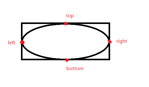
As shown in the figure, this class defines a range for the arc to be drawn. Four parameters, left,top,right,bottom, are passed in to determine a rectangle, and then a tangent ellipse is drawn inside the rectangle.
canvas.drawArc(oval, 0, mProgress, false, mPaint); this code is used to draw arcs. The first parameter is RectF type, which is to determine the overall trajectory of the arc to be drawn; the second parameter is the starting point, which is where you want the arc to start (0 represents the starting point at right, and -90 represents the starting point at top); the third parameter is the angle between the two points of the arc. Degree determines the length of the arc; the fourth parameter indicates whether to draw a radius, false means to draw only one arc, true will also draw two radii, that is, a sector; the fifth parameter is the brush.
5. Use custom View in layout
<?xml version="1.0" encoding="utf-8"?>
<RelativeLayout xmlns:android="http://schemas.android.com/apk/res/android"
    xmlns:dapeng="http://schemas.android.com/apk/res-auto"
    android:layout_width="match_parent"
    android:layout_height="match_parent">

    <com.dapeng.demo.CustomProgressBar
        android:id="@+id/CustomProgressBar"
        android:layout_width="wrap_content"
        android:layout_height="wrap_content"
        dapeng:circleWidth="10dp"
        dapeng:firstColor="#FF000000"
        dapeng:secondColor="#FFA7433C"
        dapeng:speed="30" />
</RelativeLayout>
Note to add this line of code: xmlns:dapeng="http://schemas.android.com/apk/res-auto", otherwise the keyword Dapeng will not work. Of course, you can also change the fields you want.