First, let's go on the renderings. After all, there is no renderings. I don't know if it's the effect you want. When I see half of them, I find they are not very annoying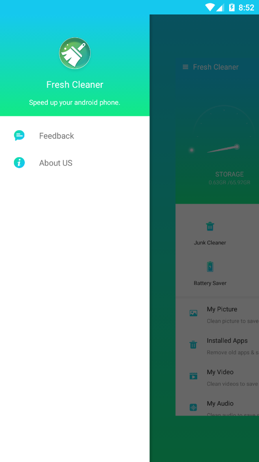
Add dependency
implementation 'com.android.support:design:28.0.0'
Use in layout
<?xml version="1.0" encoding="utf-8"?>
<android.support.v4.widget.DrawerLayout xmlns:android="http://schemas.android.com/apk/res/android"
    xmlns:app="http://schemas.android.com/apk/res-auto"
    android:id="@+id/main_drawer_layout"
    android:layout_width="match_parent"
    android:layout_height="match_parent"
    android:background="@color/colorWhite"
    android:fitsSystemWindows="true">

    <!-- Content part -->
    <FrameLayout
        android:id="@+id/fl"
        android:layout_width="fill_parent"
        android:layout_height="fill_parent"
        android:background="@drawable/welcome_bck" />

    <android.support.design.widget.NavigationView
        android:id="@+id/navigation_header_container"
        android:layout_width="wrap_content"
        android:layout_height="match_parent"
        android:layout_gravity="start"
        android:background="@color/colorWhite"
        app:headerLayout="@layout/heard_drawer_main"
        app:itemIconTint="@drawable/drawer_icon_select"
        app:itemTextColor="@color/colorDrawerItem"
        app:menu="@menu/drawer_main" />

</android.support.v4.widget.DrawerLayout>
Now let's talk about DrawerLayout.
DrawerLayout has nothing to say. It is used to implement the sideslip menu. It is mainly divided into two parts. The first part is the code of the main page, and the next part is the code of the sideslip menu. Remember to set the android:layout_gravity="start" attribute. left and right represent the sideslip in different directions.
Turn DrawerLayout on and off manually
Open left
mDrawerLayout.openDrawer(Gravity.START);
Open right
mDrawerLayout.openDrawer(Gravity.END);
Close one side
mDrawerLayout.closeDrawer(Gravity.START);
Close all
mDrawerLayout.closeDrawers();
Gravity.START specifies which one to turn on, the same way to turn off.
Monitor
       //Monitor
       //setDrawerListener
        mDrawerLayout.addDrawerListener(new DrawerLayout.DrawerListener() {
            @Override
            public void onDrawerSlide(@NonNull View view, float v) {
                Log.i("---", "Sliding");
            }

            @Override
            public void onDrawerOpened(@NonNull View view) {
                Log.i("---", "open");
            }

            @Override
            public void onDrawerClosed(@NonNull View view) {
                Log.i("---", "Close");
            }

            @Override
            public void onDrawerStateChanged(int i) {
                Log.i("---", "State change");
            }
        });
Here is a brief introduction to NavigationView
First, let's see what the above properties can do
**1.**app:headerLayout="@layout/heard_drawer_main"
Set resource file for head layout
Board > drawer > main code
<?xml version="1.0" encoding="utf-8"?>
<RelativeLayout xmlns:android="http://schemas.android.com/apk/res/android"
    android:layout_width="match_parent"
    android:layout_height="190dp"
    android:background="@drawable/welcome_bck">

    <ImageView
        android:id="@+id/heard_iv"
        android:layout_width="60dp"
        android:layout_height="60dp"
        android:layout_centerHorizontal="true"
        android:layout_marginTop="50dp"
        android:src="@mipmap/clean" />

    <TextView
        android:id="@+id/app_name"
        android:layout_width="wrap_content"
        android:layout_height="wrap_content"
        android:layout_below="@id/heard_iv"
        android:layout_centerHorizontal="true"
        android:textColor="@color/colorWhite"
        android:layout_marginTop="10dp"
        android:text="@string/app_name"
        android:textSize="20sp" />

    <TextView
        android:id="@+id/app_introduce"
        android:layout_width="wrap_content"
        android:layout_height="wrap_content"
        android:layout_below="@id/app_name"
        android:layout_centerHorizontal="true"
        android:textColor="@color/colorWhite"
        android:layout_marginTop="8dp"
        android:text="Speed up your android phone" />
</RelativeLayout>
2. app:menu="@menu/drawer_main"
Option Item
<?xml version="1.0" encoding="utf-8"?>
<menu xmlns:android="http://schemas.android.com/apk/res/android">

    <item
        android:id="@+id/feed_back"
        android:icon="@mipmap/feedback"
        android:title="FeedBack"/>


    <item
        android:id="@+id/about_us"
        android:icon="@mipmap/svg_about"
        android:title="About US"/>
</menu>
**3.**app:itemTextColor="
@color/colorDrawerItem"
Set item text color
Stepped in pit: the icon color of the item will be changed to the same color as the text
Solution
Scenario 1... app:itemIconTint="@drawable/drawer_icon_select"
Used to set icon color
Here's a selector for him
selector code
<selector xmlns:android="http://schemas.android.com/apk/res/android">
    <item android:color="@color/cardview_dark_background" android:state_pressed="true" />
    <item android:color="@color/color_drawer_icon" />
</selector>
Scheme 2: I have not tested the method I saw in the evening
NavigationView navigationView = (NavigationView) findViewById(R.id.navigation_view);
navigationView.setItemIconTintList(null);
In the menu, put the corresponding item into a group and give the group an id
<?xml version="1.0" encoding="utf-8"?>
<menu xmlns:android="http://schemas.android.com/apk/res/android">

    <group android:id="@+id/g1">

        <item
            android:id="@+id/favorite"
            android:icon="@mipmap/ic_launcher"
            android:title="Collection" />

        <item
            android:id="@+id/wallet"
            android:icon="@mipmap/ic_launcher"
            android:title="wallet" />
    </group>

    <group android:id="@+id/g2">
Head click event
//Get header layout file
 View headerView = navigationView.getHeaderView(0);
Then, you can find the control of the header by calling the findViewById method in the headerView, and set the click event.
item click event
navigationView.setNavigationItemSelectedListener(new NavigationView.OnNavigationItemSelectedListener() {
            @Override
            public boolean onNavigationItemSelected(MenuItem item) {
                //Handle item click event here
                return true;
            }
        });
Some common properties of NavigationView:
NavigationView sets various properties of item property
OK, that's how to use NavigationView and DrawerLayout
What to do if you want to achieve the sideslip effect of the opening
In the sideslip monitoring event, this method is set as follows
   @Override
    public void onDrawerSlide(@NonNull View view, float slideOffset) {
        // Continuously callback slideOffset during sliding: 0 ~ 1
        View content = mMainDrawer.getChildAt(0);
        View menu = view;
        float scale = 1 - slideOffset;//1~0
        float leftScale = (float) (1 - 0.3 * scale);
        float rightScale = (float) (0.7f + 0.3 * scale);//0.7~1
        menu.setScaleX(leftScale);//1~0.7
        menu.setScaleY(leftScale);//1~0.7
        content.setScaleX(rightScale);
        content.setScaleY(rightScale);
        content.setTranslationX(menu.getMeasuredWidth() * (1 - scale));//0~width
    }

