Drawer (drawer component)
1. Overview
Scalfold is a common layout Widget used by the Flutter MaterialApp. It accepts a Drawer attribute and supports the configuration of the Drawer. It can pull out the navigation panel from the side bar. The advantage is to fold up some function menus. Generally, the Drawer is used in combination with the Listview component or Column for vertical layout. The Listview components are arranged vertically, and can slide up and down.
[note] if the leading property of the AppBar is not set, an icon button will be automatically displayed when using the Drawer to tell the user that there is a sidebar (usually three horizontal icons on Android).
2. Common properties of the Drawer component
child: Widget type, you can place any displayable object
elevation: double type, Z coordinate order of components
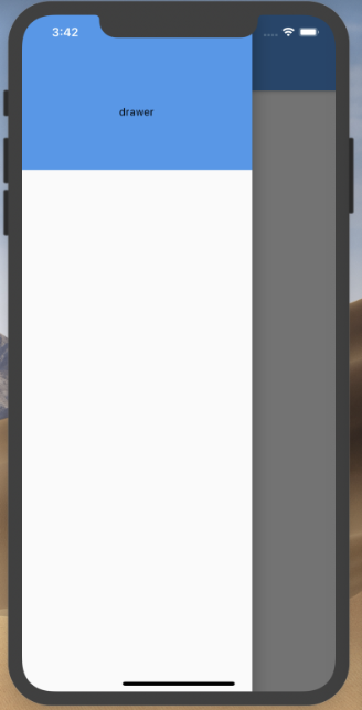
import 'package:demo_app/pages/drawer/drawer.dart';
import 'package:flutter/material.dart';

class Home extends StatelessWidget {
  @override
  Widget build(BuildContext context) {
    return Scaffold(
      appBar: AppBar(),
      body: Container(),
      drawer: DrawLayout()
    );
  }
}
import 'package:flutter/material.dart';

class DrawLayout extends StatelessWidget {
  @override
  Widget build(BuildContext context) {
    return Drawer(
      child: Text('drawer')
    );
  }
}
3. Drawer can add head effects
- DrawerHeader: display the basic information of the header
- UserAccountsDrawerHeader: display user's Avatar, user name, email and other information
4. DrawerHeader common properties
- child: Widget type, the content control displayed in the Header
- padding,margin
- Decoration: decoration type, the decoration of the header area, which is usually used to set the background color or background picture.
import 'package:flutter/material.dart';

class DrawLayout extends StatelessWidget {
  @override
  Widget build(BuildContext context) {
    return Drawer(
      child: ListView(
        padding: EdgeInsets.all(0.0),
        children: <Widget>[
          DrawerHeader(
            child: Center(
              child: Text('drawer')
            ),
            decoration: BoxDecoration(
              color: Colors.blue
            ),
          )
        ]
      )
    );
  }
}
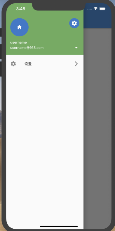
5. UserAccountsDrawerHeader common properties
- currentAccountPicture: Widget type, used to set the current user's Avatar
- accountName: Widget type, name of current user
- accountEmail: Widget type, Email of current user
- onDetailsPressed: VoidCallback type, the callback function triggered when accountName or accountEmail is clicked, which can be used to display other additional information
- Otheraccountsipictures: List type, used to set the avatar of other accounts of the current user
- Decoration: decoration type, the decoration of the header area, which is usually used to set the background color or background picture.
- margin
import 'package:flutter/material.dart';

class DrawLayout extends StatelessWidget {
  @override
  Widget build(BuildContext context) {
    return Drawer(
      child: ListView(
        padding: EdgeInsets.all(0.0),
        children: <Widget>[
          UserAccountsDrawerHeader(
            accountName: Text('username'),
            accountEmail: Text('username@163.com'),
            currentAccountPicture: CircleAvatar(
              child: Icon(Icons.home),
            ),
            onDetailsPressed: (){},
            otherAccountsPictures: <Widget>[
              CircleAvatar(
                child: Icon(Icons.settings)
              ),
            ],
            decoration: BoxDecoration(
              color: Colors.green
            ),
          ),
          ListTile(
            title: Text('Set up'),
            leading: Icon(Icons.settings),
            trailing: Icon(Icons.arrow_forward_ios)
          )
        ]
      )
    );
  }
}