Physical pixel & Physical pixel ratio
- Physical pixels refer to the smallest particles displayed on the screen, which are physically real. It's set at the factory. (resolution)
- When we develop, 1px is not necessarily equal to 1 Physical pixel
- On the PC side page, one px is equal to one physical pixel, but the mobile side is different
- The number of pixels that can be displayed by 1 px is called physical pixel ratio or screen pixel ratio
Physical pixel ratio = physical pixels (resolution) / independent pixels (CSS pixels)
For example, the physical pixel ratio of iPhone X is 3
| Screen size | Independent pixels (CSS pixels) | Physical pixel (resolution) | ppi/dpi (pixel density) | dpr (magnification) |
|---|---|---|---|---|
| 5.8 inches | 812×375 | 2436×1125 | 458 | 3 |
Reasons for physical pixel ratio:
- In the early days, both PC and mobile terminals were: 1CSS pixel = 1 Physical pixel
- With the popularization of Retina display technology, more physical pixels can be compressed into one screen, so as to achieve higher resolution and improve the fineness of screen display.
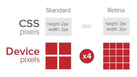
Multiple graph
- For a 50px*50px picture, open it in the Retina screen of the mobile phone. It will be magnified according to the physical pixel ratio just now, which will cause the picture to be blurred
- In the standard viewport settings, the image magnification is used to improve the image quality and solve the blur problem in HD devices
- Diploid is usually used because of the impact of iPhone 6, but there are still three times and four times. This depends on the actual development needs
- Pay attention to the scaling of background pictures
- The font does not need to consider the scaling problem, because the font is vector and will not be distorted
/* Under iPhone 8 */
  img {
      /* Original picture 100*100px */
      width: 50px;
      height: 50px;
  }

  .box {
      /* Original picture 100*100px */
      background-size: 50px 50px;
  }
Case:
<!DOCTYPE html>
<html lang="en">

<head>
    <meta charset="UTF-8">
    <meta name="viewport" content="width=device-width, initial-scale=1.0">
    <meta http-equiv="X-UA-Compatible" content="ie=edge">
    <title>03-Double graph method</title>
    <style>
        /* We need a 50 * 50 pixel (css pixel) image. If we put it directly into our iPhone 8, it will be magnified twice and 100 * 100 will be blurred */
        /* What we do is put a 100 * 100 picture, and then manually reduce the picture to 50 * 50 (css pixels)*/
        /* The size of the picture we prepared is twice as large as what we actually need. This is the way to double the picture */
        img:nth-child(2) {
            width: 50px;
            height: 50px;
        }
    </style>
</head>

<body>
    <!-- Vague -->
    <img src="images/apple50.jpg" alt="">
    <!-- We take a 2-fold graph -->
    <img src="images/apple100.jpg" alt="">
</body>

</html>
Background scaling
The background size property specifies the size of the background image
Background size: background picture width and background picture height;
- Unit: length | percentage | cover | contain
- cover expands the background image to be large enough so that the background image completely covers the background area
- contain expands the image to its maximum size so that its width and height fully fit the content area
be careful:
- When it is in length, only one parameter is written, and the other parameter will be automatically adapted
- When it is in percentage, its reference object is the parent box. Only one parameter is written, and the other parameter will be automatically adapted
[background zoom case]
<!DOCTYPE html>
<html lang="en">

<head>
    <meta charset="UTF-8">
    <meta name="viewport" content="width=device-width, initial-scale=1.0">
    <meta http-equiv="X-UA-Compatible" content="ie=edge">
    <title>05-Background picture 2x</title>

    <style>
        /* 1. We have a 50 * 50 box and need a background picture, but according to the analysis, this picture still needs to be prepared twice, 100 * 100 */
        /* 2. We need to scale the picture in half, that is, 50 * 50 background size*/
        div {
            width: 50px;
            height: 50px;
            border: 1px solid red;
            background: url(images/apple100.jpg) no-repeat;
            background-size: 50px 50px;
        }
    </style>
</head>

<body>
    <div></div>
</body>

</html>
Multiple graph cut net cutter man
Export multiple multiples of pictures at one time