I. Preface
1. Sources of inspiration
I usually prefer to make some records and summaries of some things, including some components. When the amount of accumulation is large, I find that scattered accumulation is not suitable for management.
So I began to think, what is a good way to regulate these scattered things? If components are managed in the form of component libraries, will they be more suitable for their own accumulation and facilitate future work?
So I started referring to some of the best UI component libraries on the market, such as element-ui,vux, vant After reading its source code and understanding its architecture, a set of mobile UI component library is sorted out. vui .
I am active in the major technical communities in my spare time, and often have some small partners who work for a period of time or are still looking for internships to ask the author some questions: how to precipitate themselves and make their own framework, wheels, storehouse? How to make a component library? Have you done a component library by yourself? Will it be the highlight of your resume? Can you write some articles about component library development?
In the spirit of answering questions and sharing, this blog was born.
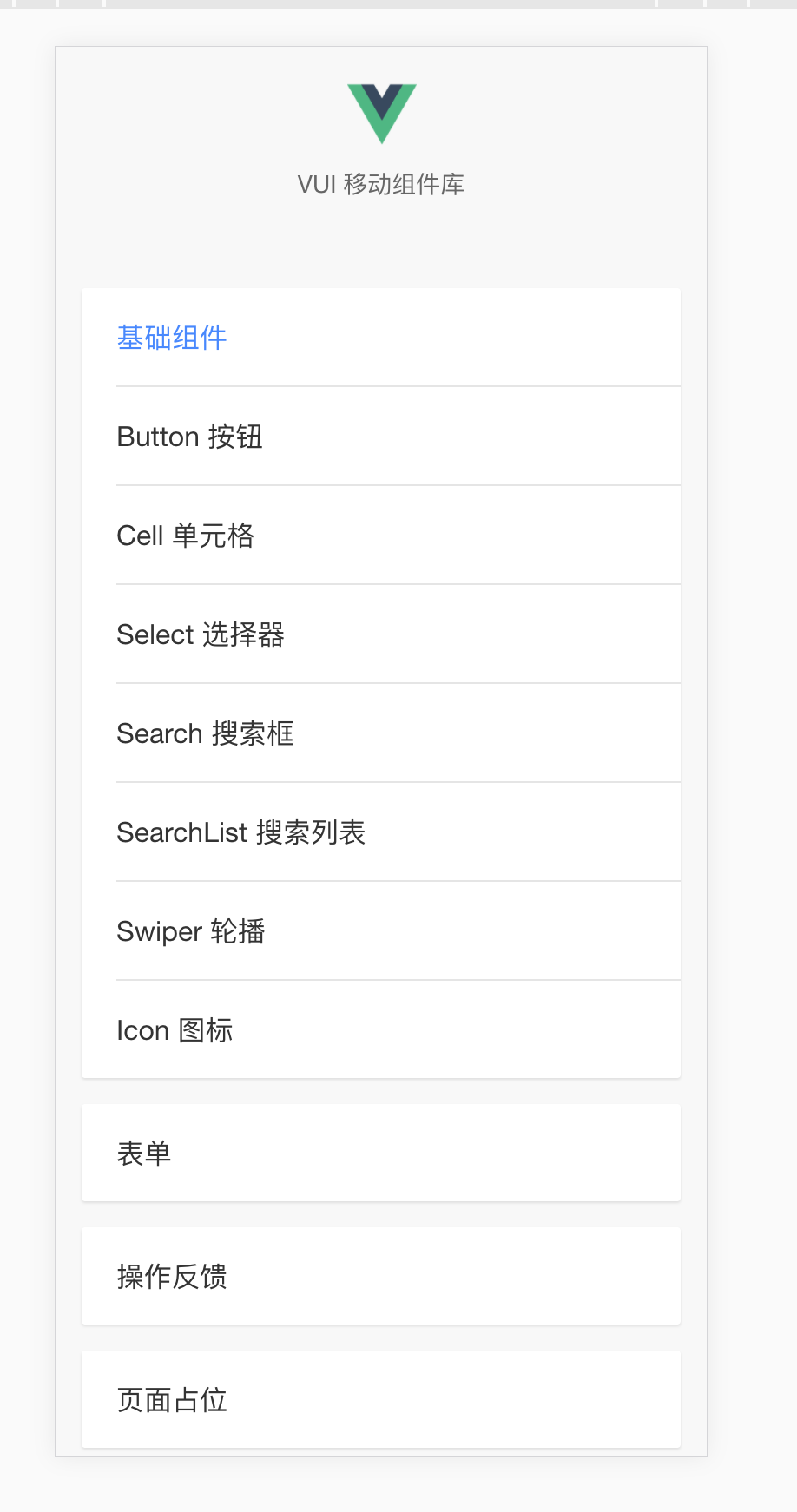
2. Final Effect Chart
3. Problem Exchange
If you have any questions when reading the articles, please join the discussion group to discuss them.
Front-end hodgepodge: 731175396
github: https://github.com/xuqiang521
Not much nonsense. Next, let's go straight to the actual combat chapter.~
II. Environmental Construction
1. Building NODE Environment
Here I'll just talk about the installation of NODE under Mac and Windows
Installation under Mac
-
If you haven't installed the mac package manager homebrew, the first step is to install it
/usr/bin/ruby -e "$(curl -fsSL https://raw.githubusercontent.com/Homebrew/install/master/install)" -
Installing node using homebrew
brew install node
Ii. Installation under Windows
Windows Entry node official website Download the corresponding version, and then click on the next crazy step to install it.
After installation, check the node and npm versions
node -v
# v9.6.1
npm -v
# 5.6.0
Since then, the node environment on your computer has been built. Next, we need to install component libraries to build dependent scaffolding.
2. Building a vue project
i. Installing vue-cli
# Global installation
npm i -g vue-cli
# View vue-cli usage
vue -h
# View version
vue -V
# 2.9.3
ii. Building projects with vue-cli
Initialize a project named personal-components-library using the init instruction of vue-cli
# The project is based on webpack
vue init webpack personal-components-library
Scaffolding will allow you to fill in some descriptions and dependencies of the project when you build it. Just refer to the content I choose below.
# entry name
Project name? personal-components-library
# Project description
Project description? A Personal Vue.js components Library project
# Project author
Author? qiangdada
# Project build vue version (select default)
Vue build? standalone
# Whether to download vue-router (later used, here select Yes)
Install vue-router? Yes
# Do you download eslint?
Use ESLint to lint your code? Yes
# Install default standard eslink rules
Pick an ESLint preset? Standard
# Constructing test cases
Set up unit tests? Yes
# Install test dependencies (select karma + mocha)
Pick a test runner? karma
# Building e2e test cases (No)
Setup e2e tests with Nightwatch? No
# Whether to install dependencies after project initialization (npm)
Should we run `npm install` for you after the project has been created? (recom
mended) npm
Once you've chosen it, you can wait. vue-cli will help you build your project and install it reliably.
The structure of the initialization project is as follows:
- Build web packages and local service files are in them
 - Configuration of different environments is here
 - index.html entry html
 - The dependency packages for node_modules NPM installation are all in this
 - package.json Project Configuration Information
 -README.md Project Introduction
 -src Our Source Code
 - App. Vue main entry file
 _ - assets resource storage (as shown in the picture)
_ - components can be reused in this module
 _ - main.js entrance JS
 router Routing Management
 - webpack. config. JS webpack configuration file
 -static repository address of copy ed static resources
 - Testing documents and cases
If you use npm to download dependencies too slowly or some resources are walled, it is recommended to use cnpm to download dependencies
# Global Installation of cnpm
npm install -g cnpm --registry=https://registry.npm.taobao.org
# Dependency Installation Using cnpm
cnpm i
Depending on the installation, you can start your vue project~
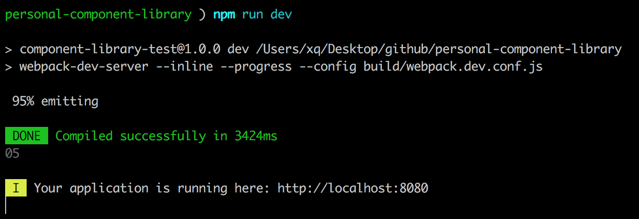
npm run devThen visit http://localhost:8080 to successfully access the Vue project built through vue-cli, so that the development environment that your component library relies on has been installed.
3. Constructing a New Catalogue
First, we need to clarify the purpose of this section. We need to modify the directory to better develop the component library.
We built the vue project in the last section, but the directory of the initialized project can not satisfy the subsequent development and maintenance of a component library. So what we need to do in this chapter is to transform the directory of the initialized vue project into the directory needed by the component library. Let's move on.
1. Component Library Directory
- build: This directory is mainly used to store build-related files
- packages: This directory is mainly used to store all components
- examples: This directory is mainly used to store all the related files of demo and documents for component libraries.
- src: This directory is mainly used to manage the main entry of component registration, tools, mixins, etc. (For this we need to modify the initialized src directory)
- Test: This directory is used to store test cases (continue with the initialized directory)
- lib: directory of packaged component libraries
- github: As an open source component library, if you want to develop with others, this directory is also very good for storing some development rule guidelines you define.
OK, start modifying the catalog of the projects you initialize.
2. Let the project run again
i. Modifying examples directory
As we know before, when we start the local service, the main entry file of the page is index.html. Now the first step is to move the main entry HTML and js to the examples directory. The examples directory is as follows
- assets css, pictures and other resources are here
 - All pages in pages routing
├── src
_ - The reusable modules in component demo are placed here.
_ - index.js entry js
 _ - index.tpl page entry
 - App. Vue main entry file
 router.config.js routing js
The modified code for each file is as follows
-
index.js
import Vue from 'vue' import App from './App' import router from './router.config' Vue.config.productionTip = false /* eslint-disable no-new */ new Vue({ el: '#app-container', router, components: { App }, template: '<App/>' }) -
index.tpl
<!DOCTYPE html> <html lang="en"> <head> <meta charset="UTF-8"> <meta name="viewport" content="width=device-width, initial-scale=1.0, maximum-scale=1.0, minimum-scale=1.0"> <title>My Component Library</title> </head> <body> <div id="app-container"> <app></app> </div> </body> </html> -
App.vue
<template> <div id="app"> <router-view/> </div> </template> <script> export default { name: 'App' } </script> -
router.config.js
import Vue from 'vue'
import Router from 'vue-router'
import hello from '../pages/hello'  // Please create a hello.vue under pages to facilitate later testing.

Vue.use(Router)

export default new Router({
routes: [
  {
    path: '/',
    component: hello
  }
]
})
ii. Modification of src directory
src directory is mainly used to store the registered main entry files, tool methods, mixins and other files of components. As we can see from the example directory above, some files in the original src need to be deleted. The modified directory is as follows.
-mixins mixins method is stored here
 -utils Some commonly used auxiliary methods are stored here
 - index.js Component Register Main Entry
iii. Modify some packaged files in the build directory
Think of the little buddies who see this, and they should also know what we need to do now. Yes, that's to modify the entry file for the local service. If you can just run, then modify the js entry in entry and the page entry reference of html-webpack-plugin. The code is as follows (key code only)
entry: {
  'vendor': ['vue', 'vue-router'],
  'vui': './examples/src/index.js'
},
// ...
plugins: [
  // ...
  // Change the entry to examples/src/index.tpl
  new HtmlWebpackPlugin({
    chunks: ['vendor', 'vui'],
    template: 'examples/src/index.tpl',
    filename: 'index.html',
    inject: true
  })
]
OK, revised. Reexecute npm run dev once, and your project can run under the new entry file
3. Using components locally
In this section, we need to implement a locally started service that can use the components under packages. Now let's develop a simplest hello component to explain.
i. Create a hello component under packages
In order to have a good constraint, here we restrict: a component must have a prescribed directory and file name for unified management before it starts writing. The files under the hello component in the packages directory are as follows
├── hello
│   ├── hello.vue
hello.vue reads as follows
<template>
  <div class="v-hello">
    hello {{ message }}
  </div>
</template>

<script>
export default {
  name: 'v-hello',
  props: {
    message: String
  }
}
</script>
ii. Register components in src/index.js
The sec/index.js file is also mentioned above. It is mainly used to manage the registration of all components in our component library.
import Hello from '../packages/hello'

const install = function (Vue) {
  if (install.installed) return

  Vue.component(Hello.name, Hello)
}

if (typeof window !== 'undefined' && window.Vue) {
  install(window.Vue)
}

export default {
  install,
  Hello
}
iii. Reference in examples/src/index.js entry JS file
Next, I need to refer to our written hello component in the example modified in the previous section.
import vui from 'src/index.js'
// Full reference
Vue.use(vui)
// Independent citation
const { Hello } = vui
Vue.component(Hello.name, Hello)
iv. Direct use in examples/pages/hello.vue
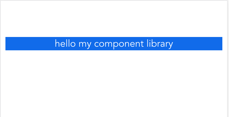
In examples/pages, we need to create a demo file with the same name as the component and use the component
<v-hello message="my component library"></v-hello>
Congratulations when you run the same results as the one shown above. You've taken another step towards the development of component libraries.~
See here, I need readers to be able to centralize the management of files according to their own preferences (of course, you can also refer to the demo I gave above), only in this way can we make the subsequent development of our component library smoothly.
In the next section, we will optimize the package file under build, and publish the developed components to npm official website with you, so that your component library can be used more conveniently by people!
4. Revamping Packing Documents and Publishing npm Packages
As a rule, before the text begins, we need to understand what this chapter needs to do and why.
Because the initial scaffolding project has only one centrally packaged file webpack.prod.conf.js for the build file
-
In order to use our component library better later, we need to pack all the modules corresponding to the component library into a file named vui.js (what do you like and what do you want). Then we can refer to our component library in the following way
import Vue from 'vue'
import vui from 'x-vui'
Vue.use(vui)
We also need to package and manage the related files in examples, because we have to develop the document official network of component libraries later, and the relevant entries of document official network are all in examples.
1. Modify build package file
i. Integration of Local Service Files
As you can see from the initialization project, the web Pack files in the build file are as follows
- webpack.base.conf.js basic configuration file
 - webpack.dev.conf.js local service configuration file
 - webpack.prod.conf.js packaging configuration file
 - webpack.test.conf.js test configuration file (not described too much here)
The directory of the initial package output output output is dist, which is the output directory of the whole project after packaging, not the directory required by our component library. Since it's not what we want, what kind of catalogue do we want?
- Component library main entry JS file lib/vui.js (component library JS main file)
- The main entry CSS file lib/vui-css/index.css (component library CSS main file, which we do not describe too much about CSS packaging in this chapter, will be explained separately in later chapters)
- Example / dist (the main entrance to the post-document official website)
Now that the goal is set, the next thing we need to do is to sort out the relevant web packages, as follows
- The basic configuration file of webpack.base.conf.js (partially integrated with the configuration of webpack.dev.conf.js)
- webpack.dev.conf.js local service configuration file (corresponding deletion of pure configuration file)
- Packing configuration file for webpack.build.js component library entry file (rename webpack.prod.conf.js)
- Web pack. build. min. JS examples display file packaging configuration file (new file)
1,webpack.base.conf.js
Before we begin to transform the webpack.base.conf.js file, we need to understand what the two packaged files need to do.
- webpack.build.js: output lib/vui.js component library JS main file, using webpack.base.conf.js and webpack.dev.conf.js related configuration
- webpack.build.min.js: Output examples/dist document related files, using webpack.base.conf.js and webpack.dev.conf.js related configuration
Since both webpack packages use webpack.base.conf.js and webpack.dev.conf.js-related configurations, why don't we integrate some of the same files into webpack.base.conf.js files? The goal is clear. Let's follow me.
'use strict'
const path = require('path')
const utils = require('./utils')
const config = require('../config')
const vueLoaderConfig = require('./vue-loader.conf')
const webpack = require('webpack')
const CopyWebpackPlugin = require('copy-webpack-plugin')
const HtmlWebpackPlugin = require('html-webpack-plugin')

function resolve (dir) {
  return path.join(__dirname, '..', dir)
}

const HOST = process.env.HOST
const PORT = process.env.PORT && Number(process.env.PORT)
const createLintingRule = () => ({
  test: /\.(js|vue)$/,
  loader: 'eslint-loader',
  enforce: 'pre',
  include: [resolve('src'), resolve('test')],
  options: {
    formatter: require('eslint-friendly-formatter'),
    emitWarning: !config.dev.showEslintErrorsInOverlay
  }
})
module.exports = {
  context: path.resolve(__dirname, '../'),
  // File entry
  entry: {
    'vendor': ['vue', 'vue-router'],
    'vui': './examples/src/index.js'
  },
  // Output directory
  output: {
    path: path.join(__dirname, '../examples/dist'),
    publicPath: '/',
    filename: '[name].js'
  },
  resolve: {
    extensions: ['.js', '.vue', '.json'],
    // Some alias alias aliases have been added here
    alias: {
      'vue$': 'vue/dist/vue.esm.js',
      '@': resolve('src'),
      'src': resolve('src'),
      'packages': resolve('packages'),
      'lib': resolve('lib'),
      'components': resolve('examples/src/components')
    }
  },
  // Extend most of the original configuration
  module: {
    rules: [
      // The original configuration...
      // Integrating css-related configurations in webpack.dev.conf.js
      ...utils.styleLoaders({ sourceMap: config.dev.cssSourceMap, usePostCSS: true })
    ]
  },
  // Continue with the original configuration
  node: {
    // ...
  },
  devtool: config.dev.devtool,
  // Integrate devServer options in webpack.dev.conf.js
  devServer: {
    clientLogLevel: 'warning',
    historyApiFallback: {
      rewrites: [
        { from: /.*/, to: path.posix.join(config.dev.assetsPublicPath, 'index.html') },
      ],
    },
    hot: true,
    contentBase: false, // since we use CopyWebpackPlugin.
    compress: true,
    host: HOST || config.dev.host,
    port: PORT || config.dev.port,
    open: config.dev.autoOpenBrowser,
    overlay: config.dev.errorOverlay
      ? { warnings: false, errors: true }
      : false,
    publicPath: config.dev.assetsPublicPath,
    proxy: config.dev.proxyTable,
    quiet: true, // necessary for FriendlyErrorsPlugin
    watchOptions: {
      poll: config.dev.poll,
    }
  },
  // Integrate plugins options in webpack.dev.conf.js
  plugins: [
    new webpack.DefinePlugin({
      'process.env': require('../config/dev.env')
    }),
    new webpack.HotModuleReplacementPlugin(),
    new webpack.NamedModulesPlugin(),
    new webpack.NoEmitOnErrorsPlugin(),
    // Page Main Entry
    new HtmlWebpackPlugin({
      chunks: ['manifest', 'vendor', 'vui'],
      template: 'examples/src/index.tpl',
      filename: 'index.html',
      inject: true
    })
  ]
}
2,webpack.dev.conf.js
Only the configuration integrated into webpack.base.conf.js needs to be deleted to avoid code duplication.
'use strict'
const utils = require('./utils')
const config = require('../config')
const baseWebpackConfig = require('./webpack.base.conf')
const FriendlyErrorsPlugin = require('friendly-errors-webpack-plugin')
const portfinder = require('portfinder')

module.exports = new Promise((resolve, reject) => {
  portfinder.basePort = process.env.PORT || config.dev.port
  portfinder.getPort((err, port) => {
    if (err) {
      reject(err)
    } else {
      process.env.PORT = port
      baseWebpackConfig.devServer.port = port

      baseWebpackConfig.plugins.push(new FriendlyErrorsPlugin({
        compilationSuccessInfo: {
          messages: [`Your application is running here: http://${baseWebpackConfig.devServer.host}:${port}`],
        },
        onErrors: config.dev.notifyOnErrors
        ? utils.createNotifierCallback()
        : undefined
      }))

      resolve(baseWebpackConfig)
    }
  })
})
After adjusting the webpack.base.conf.js and webpack.dev.conf.js files, execute npm run dev again
The chart above shows that your local service files have been successfully modified as expected at this time.~
ii. Modifying Packaging Documents
1,webpack.build.js
The main purpose of this document is to package all the components related files in the component library together and output the lib/vui.js master file.
'use strict'
const webpack = require('webpack')
const config = require('./webpack.base.conf')
// Modify the entry file
config.entry = {
  'vui': './src/index.js'
}
// Modify the output directory
config.output = {
  filename: './lib/[name].js',
  library: 'vui',
  libraryTarget: 'umd'
}
// Configure externals options
config.externals = {
  vue: {
    root: 'Vue',
    commonjs: 'vue',
    commonjs2: 'vue',
    amd: 'vue'
  }
}
// Configure plugins options
config.plugins = [
  new webpack.DefinePlugin({
    'process.env': require('../config/prod.env')
  })
]
// Delete devtool configuration
delete config.devtool

module.exports = config
2,webpack.build.min.js
The main purpose of this file is to open a single package address and export the related files in examples to examples/dist directory (i.e. the official portal of subsequent documents)
const path = require('path')
const webpack = require('webpack')
const merge = require('webpack-merge')
const baseWebpackConfig = require('./webpack.base.conf')
const config = require('../config')
const ExtractTextPlugin = require('extract-text-webpack-plugin')

const webpackConfig = merge(baseWebpackConfig, {
  output: {
    chunkFilename: '[id].[hash].js',
    filename: '[name].min.[hash].js'
  },
  plugins: [
    new webpack.optimize.UglifyJsPlugin({
      compress: {
        warnings: false
      },
      output: {
        comments: false
      },
      sourceMap: false
    }),
    // extract css into its own file
    new ExtractTextPlugin({
      filename: '[name].[contenthash].css',
      allChunks: true,
    }),
    // keep module.id stable when vendor modules does not change
    new webpack.HashedModuleIdsPlugin(),
    // enable scope hoisting
    new webpack.optimize.ModuleConcatenationPlugin(),
    // split vendor js into its own file
    new webpack.optimize.CommonsChunkPlugin({
      name: 'vendor',
      minChunks (module) {
        // any required modules inside node_modules are extracted to vendor
        return (
          module.resource &&
          /\.js$/.test(module.resource) &&
          module.resource.indexOf(
            path.join(__dirname, '../node_modules')
          ) === 0
        )
      }
    }),
    new webpack.optimize.CommonsChunkPlugin({
      name: 'manifest',
      minChunks: Infinity
    }),
    new webpack.optimize.CommonsChunkPlugin({
      name: 'app',
      async: 'vendor-async',
      children: true,
      minChunks: 3
    }),
  ]
})

module.exports = webpackConfig
When we have all these files ready, the last step is to write the package command to package.json's scripts.
"scripts": {
  "build:vui": "webpack --progress --hide-modules --config build/webpack.build.js && rimraf examples/dist && cross-env NODE_ENV=production webpack --progress --hide-modules --config build/webpack.build.min.js"
},
Execute the command, npm run build:vui, let's go
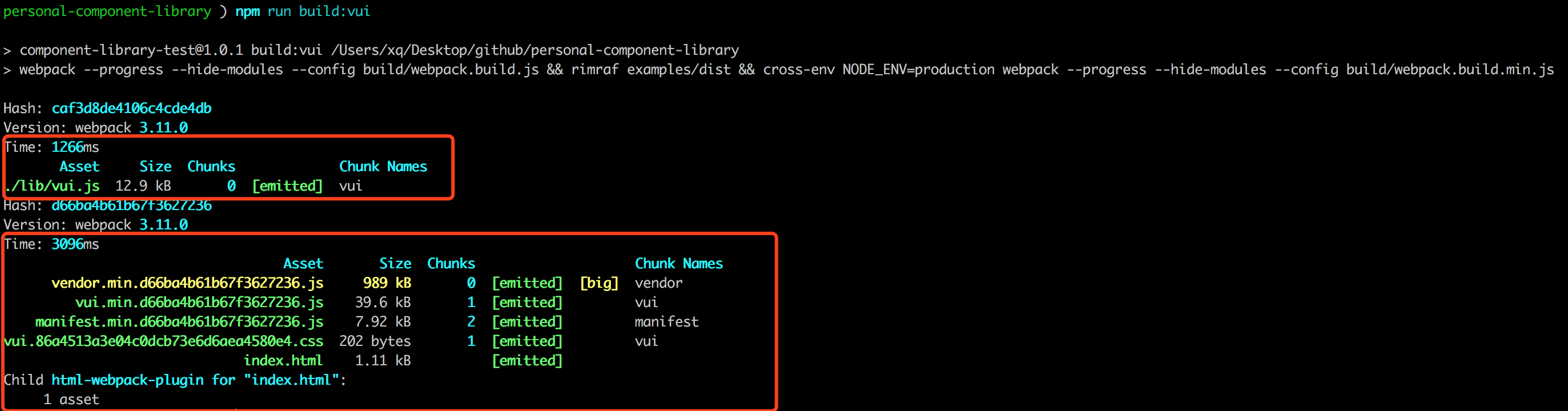
So far, the local service and two packaged files have been transformed. Now let's try to use npm.~
2. Publish npm packages
Note that if you don't have your own npm account, please go to the npm website to register an account. Click here to register on the official website The registration procedure is relatively simple. Here I just describe more. If you have any questions, you can ask me in the Wechat group.
i. Let's start with the simplest demo.
mkdir qiangdada520-npm-test
cd qiangdada520-npm-test
# npm package main entry js file
touch index.js
# npm package home page introduction (specific content you can write on your own)
touch README.md
npm init
# package name: (qiangdada520-npm-test)
# version: (1.0.0)
# description: npm test
# entry point: (index.js) index.js
# test command:
# git repository:
# keywords: npm test
# author: qiangdada
# license: (ISC)
Then determine that the package.json will be generated, as follows
{
  "name": "qiangdada-npm-test",
  "version": "1.0.0",
  "description": "npm test",
  "main": "index.js",  // npm package main entry js file
  "scripts": {
    "test": "echo \"Error: no test specified\" && exit 1"
  },
  "keywords": [
    "npm",
    "test"
  ],
  "author": "qiangdada",
  "license": "MIT"
}
Next, we need to connect our registered npm account locally.
npm adduser
# Username: Fill in your own npm account
# Password: npm account password
# Email: (this IS public) Authenticated mailbox for your npm account
# Logged in as Xuqiang 521 on https://registry.npmjs.org/. Connection successful
Execute npm publish to start publishing
npm publish
# + qiangdada-npm-test@1.0.0
At this time, you can go to the npm website to search and see the package you just released.~
ii. Publishing Component Library
At present, we have written the simplest hello component in the component library, but this has no effect on our publishing it to npm official website, and the publishing steps are as simple as the examples above.
Modify part of the description in package.json file
// npm package js entry file changed to lib/vui.js
"main": "lib/vui.js",
// Files contained in packages published by npm
"files": [
  "lib",
  "src",
  "packages"
],
// Change package attributes to publicly available
"private": false,
Note that when testing npm package release, remember that version version version in package.json is higher than the previous one.
Start publishing
# Packing, output lib/vui.js
npm run build:vui
# Release
npm publish
# + component-library-test@1.0.1
iii. Use the components we publish to npm
Select a locally existing vue project and enter the project
npm i component-library-test
# or
cnpm i component-library-test
Registration of components in project entry files
import Vue from 'vue'
import vui from 'component-library-test'
Vue.use(vui)
Use on the page
<v-hello message="component library"></v-hello>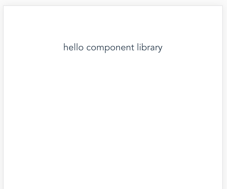
So far, we have successfully transformed the local service file, realized the package of the main file of component library and the package of the main entrance of document official website, and finally learned how to use npm to publish the project.
In the next chapter, I will explain the packaging of css files in component libraries.
5. css file management and packaging
In the last section, we have packaged the js files. But for component libraries, we need to manage not only js files, but also css files, so as to ensure the subsequent use of component libraries.
In this section, I'll show you how to rationally use gulp to package and manage css files separately in a web pack-based infrastructure project.
Before we begin, we need to define two goals:
- How to manage component-related css files in component libraries, where to put them for unified management and how to write them
- How will the css file be packaged and how will a single component output a corresponding single css
1. css file management
To facilitate management, when creating a new component, we need to create a corresponding css file to manage the component style, so as to achieve a single management.
i. css directory
Here, we will store all the CSS files in the packages/vui-css directory with the following structure
├── src
- Common stores common css files for components
 -mixins store css files of some mixins
 _ - index. CSS CSS main entry file
 - hello.css corresponds to a single css file of the hello component
 - gulpfile.js CSS packaging configuration file
 - Relevant version dependencies for package.json
Ii. Writing method of CSS file
Before we start writing components'css, we need to clarify some points:
- When users introduce and use component libraries, component styles cannot conflict with styles in user project development
- Users can override component styles in some special cases, and can easily modify them.
In line with these two situations, I think the better way in the current market is to manage components with a single css, and use BEM to write css. To get to know bem's classmates, click on the following link
- BEM
- How to view the naming of BEM in CSS? (This was a problem several years ago, but it still has some reference value.)
Next, let's talk about a simple hello component. Before we start, let's put in the contents of hello.vue.
<template>
  <div class="v-hello">
    <p class="v-hello__message">hello {{ message }}</p>
  </div>
</template>

<script>
export default {
  name: 'v-hello',
  props: {
    message: String
  }
}
</script>
Create hello.css in the packages/vui-css/src directory
@b v-hello {
  color: #fff;
  transform: scale(1);

  @e message {
    background: #0067ED;
  }
}
Then introduce the hello.css file into the main entry index.css
@import './hello.css';Introduce Component Library Style in examples/src/index.js
import 'packages/vui-css/src/index.css'But from the content of hello.css, we can see that this is a typical bem writing, normal can not be parsed. We need to introduce the corresponding postcss plug-in to parse the bem syntax. Here we will use the postcss-salad plug-in developed by the hungry team to parse the bem grammar. Secondly, this sass-like style CSS file also needs a plug-in called precss. First, install the dependency~
npm i postcss-salad precss -DAfter the dependency installation is complete, we need to create a new salad.config.json in the project root directory to configure the bem rules, as follows
{
  "browsers": ["ie > 8", "last 2 versions"],
  "features": {
    "bem": {
      "shortcuts": {
        "component": "b",
        "modifier": "m",
        "descendent": "e"
      },
      "separators": {
        "descendent": "__",
        "modifier": "--"
      }
    }
  }
}
Next we need to use the postcss-salad and precss plug-ins in the. postcssrc file initialized by the project, as follows
module.exports = {
  "plugins": {
    "postcss-import": {},
    "postcss-salad": require('./salad.config.json'),
    "postcss-url": {},
    "precss": {},
    "autoprefixer": {},
  }
}
OK, when you run the project again, you can see that the css takes effect, as shown in the figure
2. css file packaging
In order to better manage the css files in the component library, users can also introduce the corresponding css files when they only want to introduce one or several components in the component library. So we need to pack the css file separately. Here we need to use gulp to do the corresponding packing operation. Before you start to work out the packing details, please make sure that you have installed gulp globally. If not, please install gulp.
npm i gulp -g
# View version
gulp -v
# CLI version 3.9.1
Next, let's look at what dependencies need to be used in the packages/vui-css/package.json file
{
  "name": "vui-css",
  "version": "1.0.0",
  "description": "vui css.",
  "main": "lib/index.css",
  "style": "lib/index.css",
   // As with component publishing, directories need to be specified
  "files": [
    "lib",
    "src"
  ],
  "scripts": {
    "build": "gulp build"
  },
  "license": "MIT",
  "devDependencies": {
    "gulp": "^3.9.1",
    "gulp-cssmin": "^0.2.0",
    "gulp-postcss": "^7.0.1",
    "postcss-salad": "^2.0.1"
  },
  "dependencies": {}
}
We can see that the dependency on css files in component libraries is almost the same, but here is the postcss plug-in based on gulp. Before you start configuring gulpfile.js, don't forget to perform npm i dependency installation.
Next we start configuring gulpfile.js, as follows
const gulp = require('gulp')
const postcss = require('gulp-postcss')
const cssmin = require('gulp-cssmin')
const salad = require('postcss-salad')(require('../../salad.config.json'))

gulp.task('compile', function () {
  return gulp.src('./src/*.css')
    // Using postcss-salad
    .pipe(postcss([salad]))
    // css compression
    .pipe(cssmin())
    // Output to'. / lib'directory
    .pipe(gulp.dest('./lib'))
})

gulp.task('build', ['compile'])
Now you can start executing the gulp build command to package the css file. Of course, for the convenience and better execution of the package command, we now need to add a css build command to package.json in the project root directory, as follows
"scripts": {
"build:vui-css": "gulp build --gulpfile packages/vui-css/gulpfile.js && rimraf lib/vui-css && cp-cli packages/vui-css/lib lib/vui-css && rimraf packages/vui-css/lib"
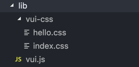
}Execute npm run build:vui-css, go ahead, and finally pack the js and CSS files of the component library as shown in the following figure
OK, now you can introduce components and their styles separately. Finally, in order to enable users to directly use your component's css, don't forget to publish it to the npm website. The steps are as follows
# Enter the vui-css directory
cd packages/vui-css
# Release
npm publish
So far, we have completed the management of css files and packaging separately, and completed the single output of css files. In this way, we can develop and manage the component library css file in a better way, and at the same time, we can facilitate the use of the component library!
Unit Testing
So far, we have built the new directory of component library, packaged the js file and css file, and we have also improved the pre-work of component library development. We have made more substantial preparations, but we still need to do some very important pre-work to facilitate the development and maintenance of the component library's subsequent components.
For front-end testing, it is an important branch of front-end engineering, so how can we get rid of such an important corner in our component library? For unit testing, there are two main types
- TDD (Test-Driven Development): Test-driven development, focusing on output results.
- BDD (Behavior Driven Development): Behavior-driven development, focusing on test logic.
In this chapter, I will lead you to unit test the components in our component library using the Karma + Mocha framework that comes with project initialization.
1. Framework Introduction
For Karma + Mocha frameworks, I believe most people who have been exposed to unit testing are familiar with them, but here I think it is necessary to give a brief introduction to the two frameworks in a separate section.
i. Karma framework
- Karma is a Node.js-based JavaScript test execution process management tool (Test Runner)
- Karma is a testing tool that allows your code to be tested in a browser environment
- Karma lets your code run automatically in multiple browsers, such as chrome, firefox, ie, etc.
In order to enable our component library components to run in the major mainstream Web browsers for testing, we chose Karma. Most importantly, Karma is a unit testing framework recommended by vue-cli. If you want to know more about Karma, please check it out by yourself. Karma official website
ii. Mocha framework
- Mocha is a simple, flexible, fun testing framework
- Mocha supports asynchronous likelihood use cases, such as Promise
- Mocha Support Code coverage Test Report
- Mocha allows you to use any assertion library you want to use, such as chai ,should.js (BDD style) expect.js Wait
- Mocha provides four hook functions, before (), after (), before Each (), and after Each (), to facilitate us to set up different operations at different stages to better complete our tests.
Here I introduce three basic uses of mocha and four hook functions (life cycle) of describe.
-
describe(moduleName, function): Describe is nestable to describe whether the test case is correct
describe('Description of Test Module', () => { // .... }); -
it(info, function): an it corresponds to a unit test case
it('Description of unit test cases', () => { // .... }) -
Usage of assertion Library
expect(1 + 1).to.be.equal(2) -
describe's life cycle
describe('Test Hooks', function() {

 before(function() {
   // Execute before all test cases in this block
 });

 after(function() {
   // Execute after all test cases in this block
 });

 beforeEach(function() {
   // Execute before each test case in this block
 });

 afterEach(function() {
   // Execute after each test case in this block
 });

 // test cases
});
Students who want to know more about mocha operation can click on the link below for reference.
2. Unit Test Practice
In the preceding section, I'll give you a brief introduction to Karma and Mocha, the testing frameworks officially recommended by Vue, and I hope you can have a simple understanding of unit testing and common testing frameworks when you see them here.
i. Unit testing of hello components
Before unit testing starts, let's look at Karma's configuration. Here we look directly at the configuration in the karma.conf.js file initialized by the vue-cli scaffold (I commented on the specific use).
var webpackConfig = require('../../build/webpack.test.conf')

module.exports = function karmaConfig (config) {
  config.set({
    // Browser
    browsers: ['PhantomJS'],
    // Test framework
    frameworks: ['mocha', 'sinon-chai', 'phantomjs-shim'],
    // Test report
    reporters: ['spec', 'coverage'],
    // Test entry file
    files: ['./index.js'],
    // Preprocessor karma-webpack
    preprocessors: {
      './index.js': ['webpack', 'sourcemap']
    },
    // Web pack configuration
    webpack: webpackConfig,
    // webpack Middleware
    webpackMiddleware: {
      noInfo: true
    },
    // Test coverage report
    coverageReporter: {
      dir: './coverage',
      reporters: [
        { type: 'lcov', subdir: '.' },
        { type: 'text-summary' }
      ]
    }
  })
}
Next, let's do a simple test of our own Hello components (write only one test case), create a new hello.spec.js file in test/unit/specs, and write the following code
import Vue from 'vue' // Importing Vue to generate Vue instances
import Hello from 'packages/hello' // Import components
// A test script should contain one or more description blocks, called test suite s.
describe('Hello.vue', () => {
  // Each description block should contain one or more it blocks, called test case s.
  it('render default classList in hello', () => {
    const Constructor = Vue.extend(Hello) // Get an instance of Hello component
    const vm = new Constructor().$mount() // Hang components on DOM
    // Assertion: DOM contains elements with class v-hello
    expect(vm.$el.classList.contains('v-hello')).to.be.true
    const message = vm.$el.querySelector('.v-hello__message')
    // Assertion: DOM contains elements with class v-hello__message
    expect(message.classList.contains('v-hello__message')).to.be.true
  })
})
After the test example is written, the next step is to test it. Execute npm run test, go ahead, output results
hello.vue
    ✓ render default classList in hello
ii. Optimizing unit testing
As you can see from the test example of the hello component above, we need to instantiate the component as a Vue instance, and sometimes mount it on the DOM.
const Constructor = Vue.extend(Hello)
const vm = new Constructor({
  propsData: {
    message: 'component'
  }
}).$mount()
If each component has more than one unit test instance later, this writing will cause our final test to be bloated. Here we can refer to the encapsulated element. Unit testing tool util.js . We need to encapsulate some of the common methods Vue uses in unit testing, and I'll list some of the methods provided in the tools below.
/**
 * Recycling vm is usually executed after each test script test is completed.
 * @param  {Object} vm
 */
exports.destroyVM = function (vm) {}

/**
 * Create an instance object of Vue
 * @param  {Object|String}  Compo     - Component configuration to pass template directly
 * @param  {Boolean=false}  mounted   - Whether to add to DOM
 * @return {Object} vm
 */
exports.createVue = function (Compo, mounted = false) {}

/**
 * Create a test component instance
 * @param  {Object}  Compo          - Component object
 * @param  {Object}  propsData      - props data
 * @param  {Boolean=false} mounted  - Whether to add to DOM
 * @return {Object} vm
 */
exports.createTest = function (Compo, propsData = {}, mounted = false) {}

/**
 * Trigger an event
 * Note: In general, the vm.$nextTick method is used to determine the completion of event triggering after triggering event.
 * mouseenter, mouseleave, mouseover, keyup, change, click etc.
 * @param  {Element} elm      - element
 * @param  {String} name      - Event name
 * @param  {*} opts           - Configuration item
 */
exports.triggerEvent = function (elm, name, ...opts) {}

/**
 * Trigger "mouseup" and "mousedown" events, both triggering click events.
 * @param {Element} elm     - element
 * @param {*} opts          - configuration option
 */
exports.triggerClick = function (elm, ...opts) {}
Next, we will use the defined test tool method to modify the test instance of Hello component and the hello.spec.js file.
import { destroyVM, createTest } from '../util'
import Hello from 'packages/hello'

describe('hello.vue', () => {
  let vm
  // Destroy instances after test case execution
  afterEach(() => {
    destroyVM(vm)
  })
  it('render default classList in hello', () => {
    vm = createTest(Hello)
    expect(vm.$el.classList.contains('v-hello')).to.be.true
    const message = vm.$el.querySelector('.v-hello__message')
    expect(message.classList.contains('v-hello__message')).to.be.true
  })
})
Re-execute npm run test and output results
hello.vue
    ✓ render default classList in hello
iii. Use of more unit tests
We introduced the usage of static determinations in the unit test section above, and then we will test some asynchronous use cases and some interactive events. Before testing, we need to change the code of our hello component slightly, as follows
<template>
  <div class="v-hello" @click="handleClick">
    <p class="v-hello__message">hello {{ message }}</p>
  </div>
</template>

<script>
export default {
  name: 'v-hello',
  props: {
    message: String
  },
  methods: {
    handleClick () {
      return new Promise((resolve) => {
        resolve()
      }).then(() => {
        this.$emit('click', 'this is click emit')
      })
    }
  }
}
</script>
Next, we will test whether the hello component can successfully emit information through Promise. The test case is as follows.
it('create a hello for click with promise', (done) => {
  let result
  vm = createVue({
    template: `<v-hello @click="handleClick"></v-hello>`,
    methods: {
      handleClick (msg) {
        result = msg
      }
    }
  }, true)
  vm.$el.click()
  // Asserting that the message is emit ted asynchronously
  expect(result).to.not.exist
  setTimeout(_ => {
    expect(result).to.exist
    expect(result).to.equal('this is click emit')
    done()
  }, 20)
})
Restart the test, execute npm run test, and output the results
hello.vue
    ✓ render default classList in hello
    ✓ create a hello for click with promise
So far, we have learned the configuration of unit tests and some common usage. If you need more details about unit testing, follow the links I provided earlier to get into more depth.
7. Development of Document Official Website (Part I)
Following me, my friends have put the first five chapters into practice and built the basic framework of our component development. Next, I will take you all together to complete the official website of documents with high important components in the component library.
As you all know, a good open source project must have a Document Official Website, so in order to make our UI library an excellent one, we should also build our own Document Official Website.
A good official document website needs two points.
- Sort out API s for your own open source projects so that users can use them more comfortably
- demo is an example that allows users to see the effect online
Since the component library I'm leading you to develop in this blog is suitable for the mobile end, how can we make our document official website have both API document description and mobile end sample Demo? This requires us to develop two sets of pages for adaptation. We need to do the following things:
- PC-side Display Component API Documents
- Demo, Display Component on Mobile
- Routing Dynamic Generation
Before the war begins, let's look at the directory structure that we need to use in this chapter.
- assets css, pictures and other resources are here
 - The dist packaged files are all here.
- The markdown files that need to be displayed on the docs PC side are all here.
- All demo s on pages mobile are here
├── src
_ - The reusable modules in component demo are placed here.
_ - index.tpl page entry
 -is-mobile.js judging device
 _ - index. js PC main entrance js
 - App.vue PC Entry File
 mobile.js Mobile Terminal Main Entrance JS
 MobileApp.vue Mobile Entry File
 -nav.config.json routing control file
 router.config.js Dynamic Registered Routing
In this chapter, we mainly take you to realize the transformation of markdown files, as well as the routing adaptation of different devices.
After clearing the train of thought, let's continue to develop our official document website.
1. markdown File Conversion
From the directory I gave above, you can see that all the markdown files are stored in the docs folder, and each markdown file corresponds to an API document of a component. The result we want is to transform every markdown file in docs into one Vue component and register the transformed Vue component into the routing so that it can access every markdown file through routing.
For markdown files parsed into Vue components, there are many tripartite webpack plug-ins on the market. Of course, if you have a deep knowledge of webpack, you can try to build one yourself. Am I hungry for direct use here, developed by the team? vue-markdown-loader .
i. Using vue-markdown-loader
The first step is to rely on installation
npm i vue-markdown-loader -DThe second step is to use vue-markdown-loader in webpack.base.conf.js file
{
  test: /\.md$/,
  loader: 'vue-markdown-loader',
  options: {
    // Prevent extracting scripts and style tags
    preventExtract: true
  }
}
The third step is try. First add the hello.md file to the docs, and then write the instructions for the use of the Hello component.
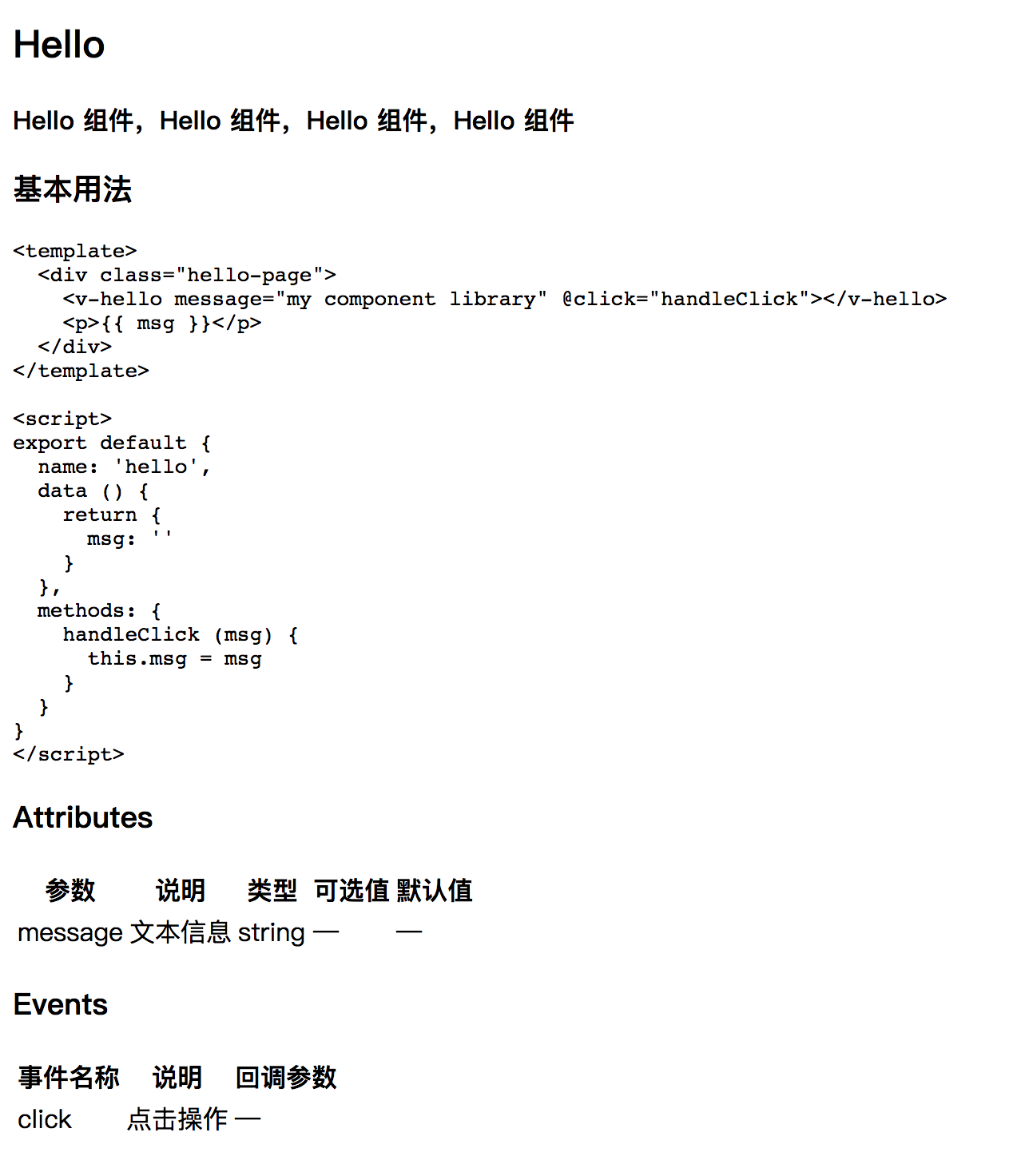
## Hello
**Hello Component, Hello Component, Hello Component, Hello assembly**
### Basic Usage
```html
<template>
<div class="hello-page">
<v-hello message="my component library" @click="handleClick"></v-hello>
<p>{{ msg }}</p>
</div>
</template>
<script>
export default {
name: 'hello',
data () {
return {
msg: ''
}
},
methods: {
handleClick (msg) {
this.msg = msg
}
}
}
</script>
```
### Attributes
| parameter | Explain | type | Optional value | Default value |
|---------- |-------- |---------- |------------- |-------- |
| message | Text information | string | — | — |
### Events
| Event name | Explain | Callback Arguments |
|---------- |-------- |---------- |
| click | Click operation | — |The fourth step is to register hello.md into the routing
route.push({
  path: '/component/hello',
  component: require('../docs/hello.md')
})
Finally, visit the page. At this point, you can see that the content of hello.md has been converted into a Vue component and can be accessed by routing loading, but the page is ugly and ugly ~like this
ii. Highlighting themes and styles for md
Of course, I don't need to explain this situation, you probably know. Yes, the parsed markdown file is so ugly, just because we have neither highlighted the theme of our markdown file nor set up the basic style of the document page. So, next, we need to add beautiful highlighted themes and concise basic styles to our markdown file.
For themes, we will use highlight.js Inside atom-one-dark Theme.
The first step is to install highlight.js
npm i highlight -DThe second step is to introduce topics in examples/src/App.vue, and to set the basic style of the document, we also need to modify the layout of App.vue.
<template>
  <div class="app">
    <div class="main-content">
      <div class="page-container clearfix">
        <div class="page-content">
          <router-view></router-view>
        </div>
      </div>
    </div>
  </div>
</template>

<script>
import 'highlight.js/styles/atom-one-dark.css'
export default {
  name: 'App'
}
</script>
The third step is to set the basic style of the document. Create docs.css in assets and write the initial style. Because the amount of code is too large, we will not paste it here. You can copy it by yourselves. docs.css The code is then introduced into the local docs.css file in examples/src/index.js
import '../assets/docs.css'Finally, by modifying the markdown parsing rules, vue-markdown-loader provides a preprocess interface for us to operate freely. Next, let's define the structure of the parsed markdown file and write it in webpack.base.conf.js file.
// Define the auxiliary function wrap and add the < code > label to the class named'hljs'.
function wrap (render) {
  return function() {
    return render.apply(this, arguments)
      .replace('<code v-pre class="', '<code class="hljs ')
      .replace('<code>', '<code class="hljs">')
  }
}
// ...
{
  test: /\.md$/,
  loader: 'vue-markdown-loader',
  options: {
    preventExtract: true,
    preprocess: function(MarkdownIt, source) {
      // Add a class named'table'to the table tag
      MarkdownIt.renderer.rules.table_open = function() {
        return '<table class="table">'
      };
      MarkdownIt.renderer.rules.fence = wrap(MarkdownIt.renderer.rules.fence);
      return source;
    }
  }
}
Then, re-access localhost:8080/#/component/hello
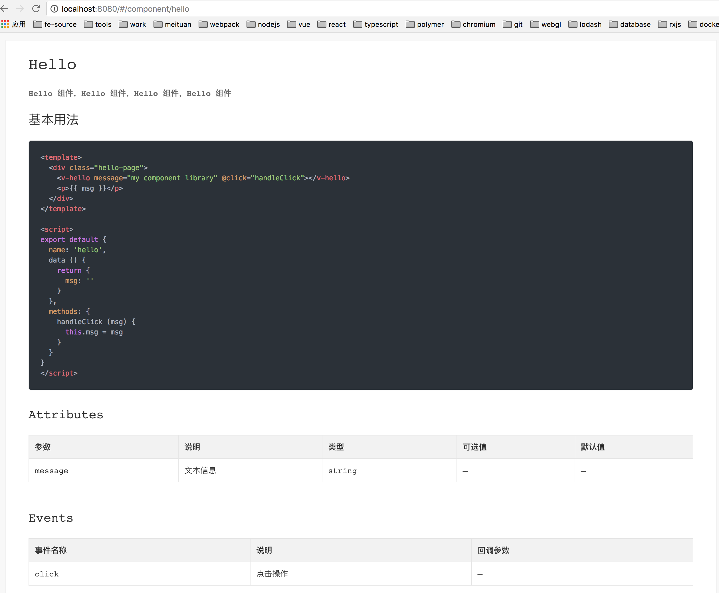
OK, our md files have been successfully parsed into Vue components, with beautiful highlighted themes and concise basic styles~
2. Routing adaptation in different device environments
As I said before, the component library developed by us in this paper is suitable for the mobile side, so we need to display documents on the PC side and Demo on the mobile side.
In this section, I will take you through the adaptation of different end routes. Of course, this thing is not difficult, mainly using web pack to build multi-page features, so how to do it? Okay, let's get down to it.
i. Entry Document Registration
The first step is to register the js entry file and write it in the webpack.base.conf.js file.
entry: {
  // ...
  'vui': './examples/src/index.js',  // PC Entry js
  'vui-mobile': './examples/src/mobile.js'  // Mobile entrance js
}
The second step is to register the page entry and write it in the webpack.base.conf.js file.
plugins: [
  // ...
  // PC-side page entry
  new HtmlWebpackPlugin({
    chunks: ['manifest', 'vendor', 'vui'],
    template: 'examples/src/index.tpl',
    filename: 'index.html',
    inject: true
  }),
  // Mobile page entry
  new HtmlWebpackPlugin({
    chunks: ['manifest', 'vendor', 'vui-mobile'],
    template: 'examples/src/index.tpl',
    filename: 'mobile.html',
    inject: true
  })
]
ii. Equipment environment determination
Entry file registration is completed, and what we need to do next is to determine the device environment. Here, I will use navigator.userAgent with regular expressions to determine whether our component library runs in a PC or mobile environment.
The first step is to write the following code in the examples/src/is-mobile.js file
/* eslint-disable */
const isMobile = (function () {
  var platform = navigator.userAgent.toLowerCase()
  return (/(android|bb\d+|meego).+mobile|kdtunion|weibo|m2oapp|micromessenger|avantgo|bada\/|blackberry|blazer|compal|elaine|fennec|hiptop|iemobile|ip(hone|od)|iris|kindle|lge |maemo|midp|mmp|mobile.+firefox|netfront|opera m(ob|in)i|palm( os)?|phone|p(ixi|re)\/|plucker|pocket|psp|series(4|6)0|symbian|treo|up\.(browser|link)|vodafone|wap|windows (ce|phone)|xda|xiino/i).test(platform) ||
  (/1207|6310|6590|3gso|4thp|50[1-6]i|770s|802s|a wa|abac|ac(er|oo|s\-)|ai(ko|rn)|al(av|ca|co)|amoi|an(ex|ny|yw)|aptu|ar(ch|go)|as(te|us)|attw|au(di|\-m|r |s )|avan|be(ck|ll|nq)|bi(lb|rd)|bl(ac|az)|br(e|v)w|bumb|bw\-(n|u)|c55\/|capi|ccwa|cdm\-|cell|chtm|cldc|cmd\-|co(mp|nd)|craw|da(it|ll|ng)|dbte|dc\-s|devi|dica|dmob|do(c|p)o|ds(12|\-d)|el(49|ai)|em(l2|ul)|er(ic|k0)|esl8|ez([4-7]0|os|wa|ze)|fetc|fly(\-|_)|g1 u|g560|gene|gf\-5|g\-mo|go(\.w|od)|gr(ad|un)|haie|hcit|hd\-(m|p|t)|hei\-|hi(pt|ta)|hp( i|ip)|hs\-c|ht(c(\-| |_|a|g|p|s|t)|tp)|hu(aw|tc)|i\-(20|go|ma)|i230|iac( |\-|\/)|ibro|idea|ig01|ikom|im1k|inno|ipaq|iris|ja(t|v)a|jbro|jemu|jigs|kddi|keji|kgt( |\/)|klon|kpt |kwc\-|kyo(c|k)|le(no|xi)|lg( g|\/(k|l|u)|50|54|\-[a-w])|libw|lynx|m1\-w|m3ga|m50\/|ma(te|ui|xo)|mc(01|21|ca)|m\-cr|me(rc|ri)|mi(o8|oa|ts)|mmef|mo(01|02|bi|de|do|t(\-| |o|v)|zz)|mt(50|p1|v )|mwbp|mywa|n10[0-2]|n20[2-3]|n30(0|2)|n50(0|2|5)|n7(0(0|1)|10)|ne((c|m)\-|on|tf|wf|wg|wt)|nok(6|i)|nzph|o2im|op(ti|wv)|oran|owg1|p800|pan(a|d|t)|pdxg|pg(13|\-([1-8]|c))|phil|pire|pl(ay|uc)|pn\-2|po(ck|rt|se)|prox|psio|pt\-g|qa\-a|qc(07|12|21|32|60|\-[2-7]|i\-)|qtek|r380|r600|raks|rim9|ro(ve|zo)|s55\/|sa(ge|ma|mm|ms|ny|va)|sc(01|h\-|oo|p\-)|sdk\/|se(c(\-|0|1)|47|mc|nd|ri)|sgh\-|shar|sie(\-|m)|sk\-0|sl(45|id)|sm(al|ar|b3|it|t5)|so(ft|ny)|sp(01|h\-|v\-|v )|sy(01|mb)|t2(18|50)|t6(00|10|18)|ta(gt|lk)|tcl\-|tdg\-|tel(i|m)|tim\-|t\-mo|to(pl|sh)|ts(70|m\-|m3|m5)|tx\-9|up(\.b|g1|si)|utst|v400|v750|veri|vi(rg|te)|vk(40|5[0-3]|\-v)|vm40|voda|vulc|vx(52|53|60|61|70|80|81|83|85|98)|w3c(\-| )|webc|whit|wi(g |nc|nw)|wmlb|wonu|x700|yas\-|your|zeto|zte\-/i).test(platform.substr(0, 4));
})()
// Returns whether the device is in a mobile environment with a boolean value
export default isMobile
The second step is to write the following decision rules in the JS entry file examples/src/index.js on the PC side
import isMobile from './is-mobile'
// Is it a production environment?
const isProduction = process.env.NODE_ENV === 'production'
router.beforeEach((route, redirect, next) => {
  if (route.path !== '/') {
    window.scrollTo(0, 0)
  }
  // Get the address of Demo in different environments
  const pathname = isProduction ? '/vui/mobile' : '/mobile.html'
  // If the device environment is mobile, load the mobile Demo address directly
  if (isMobile) {
    window.location.replace(pathname)
    return
  }
  document.title = route.meta.title || document.title
  next()
})
The third step is to write a decision rule similar to the previous step in the mobile JS entry file examples/src/mobile.js.
import isMobile from './is-mobile'
const isProduction = process.env.NODE_ENV === 'production'
router.beforeEach((route, redirect, next) => {
  if (route.path !== '/') {
    window.scrollTo(0, 0)
  }
  // Get the corresponding address of PC in different environments
  const pathname = isProduction ? '/vui/mobile' : '/mobile.html'
  // If the device environment is not mobile, load the address of the PC directly.
  if (!isMobile) {
    window.location.replace(pathname)
    return
  }
  document.title = route.meta.title || document.title
  next()
})
Finally, the examples/src/mobile.js file and the mobile page entry MobileApp.vue file are improved.
Write the following code in examples/src/mobile.js
import Vue from 'vue'
import VueRouter from 'vue-router'
import MobileApp from './MobileApp'
import Vui from 'src/index'
import isMobile from './is-mobile.js'
import Hello from '../pages/hello.vue'

import 'packages/vui-css/src/index.css'

Vue.use(Vui)
Vue.use(VueRouter)

const isProduction = process.env.NODE_ENV === 'production'
const router = new VueRouter({
  base: isProduction ? '/vui/' : __dirname,
  routes: [{
    path: '/component/hello',
    component: Hello
  }]
})
router.beforeEach((route, redirect, next) => {
  if (route.path !== '/') {
    window.scrollTo(0, 0)
  }
  const pathname = isProduction ? '/vui/' : '/'
  if (!isMobile) {
    window.location.replace(pathname)
    return
  }
  document.title = route.meta.title || document.title
  next()
})

new Vue({
  el: '#app-container',
  router,
  components: { MobileApp },
  template: '<MobileApp/>'
})
Write in MobileApp.vue
<template>
  <div class="mobile-container">
      <router-view></router-view>
  </div>
</template>
Next, you can go to the browser to try out the effect and see if different device environments can display the corresponding content.~
At this point, the plan we have worked out in this chapter has been completed. Perfect transformation of md files and routing adaptation in different device environments. The development of Document Official Website (above) is coming to an end. In the next chapter, we will continue to complete the remaining development work of Document Official Website.
8. Development of Document Official Website (Part II)
In the last chapter, we have completed:
- The transformation of markdown files with beautiful highlighted themes and styles
- Adaptation of Document Official Network in Different Device Environments
In this chapter, we will improve the details of document official website and develop a complete document official website.
1. Routing Management
From the directory given in the previous chapter, we can see that the docs directory is used to store the md files that the PC needs to display, and the pages directory is used to store the Demo files on the mobile side. So how can components display their corresponding files in different device environments (PC side shows the corresponding md files of components, mobile side shows the corresponding vue files of components)? In this case, how to manage the routing of our component library reasonably? Next, we will continue the following development on these issues. Here is sure to use is-mobile.js to determine the device environment, the specific work you follow me slowly to do
The first step is to create a new file nav.config.json under examples/src and write the following
{
  // For later Multilingualization of component documents
  "zh-CN": [
    {
      "name": "Vui assembly",
      "showInMobile": true,
      "groups": [
        {
          // Manage all components of the same type
          "groupName": "Basic components",
          "list": [
            {
              // Relative paths to access components
              "path": "/hello",
              // Component description
              "title": "Hello"
            }
          ]
        }
      ]
    }
  ]
}
The second step is to improve the router.config.js file and change it into an auxiliary function for routing registration.
const registerRoute = (navConfig, isMobile) => {
  let route = []
  // At present, only the Chinese version of the document is available.
  let navs = navConfig['zh-CN']
  // Traverse the routing files and register one by one
  navs.forEach(nav => {
    if (isMobile && !nav.showInMobile) {
      return
    }

    if (nav.groups) {
      nav.groups.forEach(group => {
        group.list.forEach(nav => {
          addRoute(nav)
        })
      })
    } else if (nav.children) {
      nav.children.forEach(nav => {
        addRoute(nav)
      })
    } else {
      addRoute(nav)
    }
  })
  // Routing registration
  function addRoute (page) {
    // Introducing corresponding routing files into different device environments
    const component = isMobile
      ? require(`../pages${page.path}.vue`)
      : require(`../docs${page.path}.md`)
    route.push({
      path: '/component' + page.path,
      component: component.default || component
    })
  }

  return route
}

export default registerRoute
The third step is to register the routing in the main entry JS file examples/src/index.js of PC and the main entry JS file examples/src/mobile.js of mobile, and write the following code
import registerRoute from './router.config'
import navConfig from './nav.config'

const routesConfig = registerRoute(navConfig)
const router = new VueRouter({
  routes: routesConfig
})
Then visit our component library documentation website now.
2. PC API Display
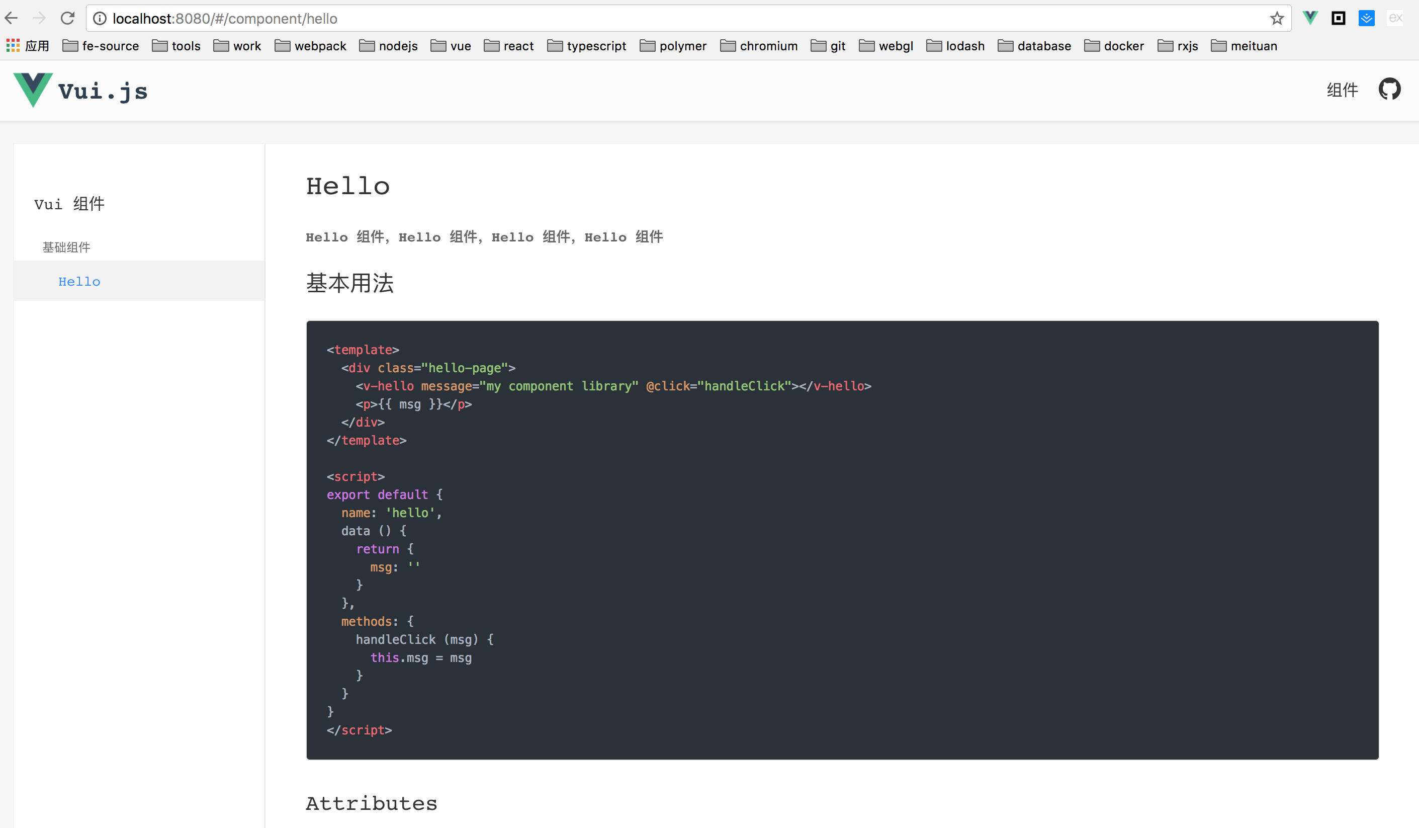
As can be seen from the final results of the previous chapter, the PC end is divided into three parts, namely:
- Header, simple description of component libraries, and links to project github
- Left sidebar, component routing and title display
- Right sidebar, component API document presentation
Next, let's start with the presentation of the PC-side API.
i. head
Headers are relatively simple. We just need to create a new page-header.vue file under examples/src/components to write the following
<template>
  <div class="page-header">
    <div class="page-header__top">
      <h1 class="page-header__logo">
        <a href="#">Vui.js</a>
      </h1>
      <ul class="page-header__navs">
        <li class="page-header__item">
          <a href="/" class="page-header__link">assembly</a>
        </li>
        <li class="page-header__item">
          <a href="https://github.com/Brickies/vui" class="page-header__github" target="_blank"></a>
        </li>
        <li class="page-header__item">
          <span class="page-header__link"></span>
        </li>
      </ul>
    </div>
  </div>
</template>
Specific style, please visit directly page-header.vue Check it out
ii. Left sidebar
The left sidebar is where we show component routing and headings. In fact, it is to analyze and display examples/src/nav.config.json.
We create a new side-nav.vue file under examples/src/components. The normal structure of the file is as follows
<li class="nav-item">
  <a href="javascript:void(0)">Vui assembly</a>
  <div class="nav-group">
    <div class="nav-group__title">Basic components</div>
    <ul class="pure-menu-list">
      <li class="nav-item">
        <router-link
           active-class="active"
           :to="/component/hello"
           v-text="navItem.title">Hello
        </router-link>
      </li>
    </ul>
  </div>
</li>
But now we need to parse examples/src/nav.config.json based on the current structure. The code is as follows.
<li class="nav-item" v-for="item in data">
  <a href="javascript:void(0)" @click="handleTitleClick(item)">{{ item.name }}</a>
  <template v-if="item.groups">
    <div class="nav-group" v-for="group in item.groups">
      <div class="nav-group__title">{{ group.groupName }}</div>
      <ul class="pure-menu-list">
        <template v-for="navItem in group.list">
          <li class="nav-item" v-if="!navItem.disabled">
            <router-link
              active-class="active"
              :to="base + navItem.path"
              v-text="navItem.title" />
          </li>
        </template>
      </ul>
    </div>
  </template>
</li>
Full code point here side-nav.vue
iii. App.vue
We use our page-header.vue and side-nav.vue files in App.vue.
<template>
  <div class="app">
    <page-header></page-header>
    <div class="main-content">
      <div class="page-container clearfix">
        <side-nav :data="navConfig['zh-CN']" base="/component"></side-nav>
        <div class="page-content">
          <router-view></router-view>
        </div>
      </div>
    </div>
  </div>
</template>

<script>
import 'highlight.js/styles/atom-one-dark.css'
import navConfig from './nav.config.json'
import PageHeader from './components/page-header'
import SideNav from './components/side-nav'

export default {
  name: 'App',
  components: { PageHeader, SideNav },
  data () {
    return {
      navConfig: navConfig
    }
  }
}
</script>
Then, visit the page again, and the result is as follows
3. Mobile Demo
Mobile Demo and PC are similar in principle and have to parse nav.config.json files for display.
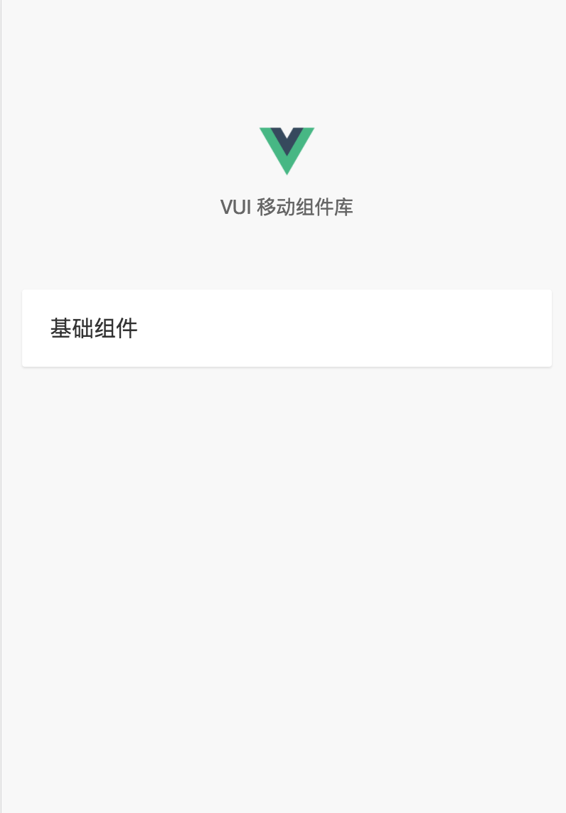
i. Mobile Home Page Component
At present, except for the main entry page MobileApp.vue, there is no dependence on the root directory component. Next, we will complete the development of the root directory component, create a new demo-list.vue file under examples/src/components, and write some content.
<template>
  <div class="side-nav">
    <h1 class="vui-title"></h1>
    <h2 class="vui-desc">VUI Mobile Component Library</h2>
  </div>
</template>
Then we need to refer to it in the routing and write it in the mobile.js file.
import DemoList from './components/demo-list.vue'
routesConfig.push({
  path: '/',
  component: DemoList
})
Then start refining the demo-list.vue file
<template>
  <div class="side-nav">
    <h1 class="vui-title"></h1>
    <h2 class="vui-desc">VUI Mobile Component Library</h2>
    <div class="mobile-navs">
      <div v-for="(item, index) in data" :key="index">
        <div class="mobile-nav-item" v-if="item.showInMobile">
          <mobile-nav v-for="(group, s) in item.groups" :group="group" :base="base" :key="s"></mobile-nav>
        </div>
      </div>
    </div>
  </div>
</template>

<script>
import navConfig from '../nav.config.json';
import MobileNav from './mobile-nav';

export default {
  data() {
    return {
      data: navConfig['zh-CN'],
      base: '/component'
    };
  },

  components: {
    MobileNav
  }
};
</script>

<style lang="postcss">
.side-nav {
  width: 100%;
  box-sizing: border-box;
  padding: 90px 15px 20px;
  position: relative;
  z-index: 1;

  .vui-title,
  .vui-desc {
    text-align: center;
    font-weight: normal;
    user-select: none;
  }

  .vui-title {
    padding-top: 40px;
    height: 0;
    overflow: hidden;
    background: url(https://raw.githubusercontent.com/xuqiang521/vui/master/src/assets/logo.png) center center no-repeat;
    background-size: 40px 40px;
    margin-bottom: 10px;
  }

  .vui-desc {
    font-size: 14px;
    color: #666;
    margin-bottom: 50px;
  }
}
</style>
Here we refer to the mobile-nav.vue file, which is also the Demo list display component for the mobile side that we are going to complete next.
ii. nav list
Create a new mobile-nav.vue file under examples/src/components, parse the nav.config.json file, and display the Demo list.
<template>
  <div class="mobile-nav-group">
    <div
      class="mobile-nav-group__title mobile-nav-group__basetitle"
      :class="{
        'mobile-nav-group__title--open': isOpen
      }"
      @click="isOpen = !isOpen">
      {{group.groupName}}
    </div>
    <div class="mobile-nav-group__list-wrapper" :class="{ 'mobile-nav-group__list-wrapper--open': isOpen }">
      <ul class="mobile-nav-group__list" :class="{ 'mobile-nav-group__list--open': isOpen }">
        <template v-for="navItem in group.list">
          <li
            class="mobile-nav-group__title"
            v-if="!navItem.disabled">
            <router-link
              active-class="active"
              :to="base + navItem.path">
              <p>
                {{ navItem.title }}
              </p>
            </router-link>
          </li>
        </template>
      </ul>
    </div>
  </div>
</template>

<script>
export default {
  props: {
    group: {
      type: Object,
      default: () => {
        return [];
      }
    },
    base: String
  },
  data() {
    return {
      isOpen: false
    };
  }
};
</script>
Then write the list style
<style lang="postcss">
@component-namespace mobile {
  @b nav-group {
    border-radius: 2px;
    margin-bottom: 15px;
    background-color: #fff;
    box-shadow: 0 1px 1px 0 rgba(0, 0, 0, 0.1);

    @e basetitle {
      padding-left: 20px;
    }

    @e title {
      font-size: 16px;
      color: #333;
      line-height: 56px;
      position: relative;
      user-select: none;

      @m open {
        color: #38f;
      }

      a {
        color: #333;
        display: block;
        user-select: none;
        padding-left: 20px;
        -webkit-tap-highlight-color: rgba(0, 0, 0, 0);

        &:active {
          background: #ECECEC;
        }

        > p {
          border-top: 1px solid #e5e5e5;
        }
      }
    }

    @e list-wrapper {
      height: 0;
      overflow: hidden;

      @m open {
        height: auto;
      }
    }

    @e list {
      transform: translateY(-50%);
      transition: transform .2s ease-out;

      @m open {
        transform: translateY(0);
      }
    }

    li {
      list-style: none;
    }

    ul {
      padding: 0;
      margin: 0;
      overflow: hidden;
    }
  }
}
</style>
Next, re-visit http://localhost:8080/mobile.html No surprise, you'll be able to access the results we expect.
So far, our "crude" component library shelves have been completely built.
The blog is almost over here. All the code in this article has been hosted on github. I will write an article later, with some details of building and gradually improving our component library, so that our component library can be more perfect.
github address: https://github.com/xuqiang521/personal-component-library
Another wave of advertisements at the end of the article~~~
Front-end communication group: 731175396
If you are interested, you are welcome to set up a foundation. The way to send your resume is explained in the exchange group.~
What are you waiting for, buddies? Let's give the article some Pozan first, then pay attention to me, and then join the group to communicate with the big guys.~~~