There are three ways to add rounded border effects
1. Use pictures
2. Use the border-radius attribute of CSS3
3. Pure use of CSS border color settings to achieve the effect of rounded border
One way to use pictures is to use four triangular pictures of the same size (the size of triangle depends on the size of the corner box) as the background, and set the background color to the triangle picture color to achieve the effect of the corner background, or directly use the corner picture as the background...
The following two approaches are emphasized:
border-radius attribute
The border-radius property is used to set the div label border to make the div label circle, and the z-index property is used to set the hierarchical relationship of the label, so as to achieve the effect of the Olympic rings.
<!DOCTYPE html>
<html>
<head>
    <meta charset="utf-8">
    <title>Five rings</title>
    <style>
        .circles{
            position: relative;
            float: left;
            margin:0;
        }
        .circles div{
            border-radius: 50px;
            height: 80px;
            width: 80px;
            border: 7px solid red;
            position: absolute;
            z-index: -1;
        }
        .circles .blue{
            border-color: blue;
            z-index: 0;
        }
        .circles .yellow{
            border-color: yellow;
            top: 50px;
            left: 50px;
            z-index: 1;
        }
        .circles .black{
            border-color: black;
            left: 100px;
            z-index: 0;
        }
        .circles .green{
            border-color: green;
            left: 150px;
            top: 50px;
            z-index: 1;
        }
        .circles .red{
            border-color: red;
            left: 200px;
            z-index: 0;
        }
        .circles .leftbig{
            border-right-color: transparent;
        }
        .circles .rightsmall{
            border-left-color: transparent;
            border-top-color: transparent;
            border-bottom-color: transparent;
        }
        .circles .blue.rightsmall{
            z-index: 2;
        }
        .circles .yellow.rightsmall{
            z-index: -1;
        }
        .circles .black.rightsmall{
            z-index: 2;
        }
        .circles .green.rightsmall{
            z-index: -1;
        }
        .circles .red.rightsmall{
            z-index: 0;
        }
    </style>
</head>
<body>
<div class="circles">
    <div class="blue leftbig"></div>
    <div class="blue rightsmall"></div>
    <div class="yellow leftbig"></div>
    <div class="yellow rightsmall"></div>
    <div class="black leftbig"></div>
    <div class="black rightsmall"></div>
    <div class="green leftbig"></div>
    <div class="green rightsmall"></div>
    <div class="red leftbig"></div>
    <div class="red rightsmall"></div>
</div>
</body>
</html>
Olympic rings: 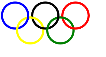
Code analysis:
1. When designing a circle, the border-radius value must be large enough to make the div tag appear circular, preferably larger than half the height.
2. Divides are classified into two categories, one is transparent color with three-quarters on the left (class attribute contains rightsmall), and the other is transparent color with one-quarter on the right (class attribute contains leftbig). Then set their z-index attributes according to the div tags (the value of z-index needs to be calculated from right to left one by one).
3. Location problem: Because the position attribute of the parent node of 10 divs is relative, the 10 div tags locate with the upper left corner of their direct parent node as a circle.
Set the div border and margin property to set the rounded border effect
<!DOCTYPE html>
<html>
<head>
<meta charset="utf-8">
<title>Design rounded corners by setting background</title>
<style>
#frm{
float: left;
}
#frm *{
clear: both;
text-align: center;
}
.top div{
border: 1px solid #0f6;
border-width: 0;
border-top-width: 1px;
}
.top .l1{
margin:0 5px;
border-color: #f9fcfe;
}
.top .l2{
margin:0 3px;
border-color: #f8fbfe;
}
.top .l3{
margin:0 2px;
border-color: #f7fafe;
}
.top .l4{
margin:0 1px;
border-color: #f6f9fe;
}
.title{
background-image: -moz-linear-gradient(top,#f4f7fc,#ebf0fa);
background-image: -webkit-gradient(linear,left top,left bottom,color-stop(0,#f4f7fc),color-stop(1,#ebf0fa));
}
.content{
border: 1px solid #c5d5e4;
}
.content div{
width: 200px;
height: 80px;
padding:20px;
text-align: left;
}
</style>
</head>
<body>
<div id="frm">
<div class="top">
<div class="l1"></div>
<div class="l2"></div>
<div class="l3"></div>
<div class="l4"></div>
</div>
<div class="title">Title ></div>
<div class="content">
<div> Cascading style sheets for short CSS,Usually also known as "style sheet", it is used for web page style design.</div>
</div>
</div>
</body>
</html>Design rounded corners by setting the background: 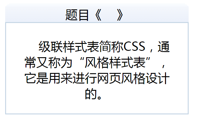
Key points:
The div sub-node with class attribute top is used to draw horizontal rounded corner effect. It contains four div sub-nodes. In the CSS code section, the upper boundaries of the four div sub-nodes are set (i.e. lines, or no boundaries, instead of setting height to 1px and setting background color), and the four div sub-nodes contain gradient left and right margin values.