
Since the Extensions component library was released, Data Grid has become the most used and consulted component. At the beginning, the design of Data Grid was very simple. After some refactoring, the quality of components has been improved.
Extensions component library: https://github.com/ng-matero/extensions
Data Grid example: https://ng-matero.github.io/extensions/data-grid
More than two months have passed since the reconstruction of the Extensions Data Grid. Due to the busy work, the details of the Extensions Data Grid have not been introduced. In recent days, I have reconstructed the official website example again. The current API documents are placed in the gitbook For the moment, it has not been integrated with the official website, and domestic visits will be slow. This article will introduce the usage of Data Grid and some better function realization. To put it another way, the biggest difficulty in developing a plug-in lies not in the realization of functions, but in how to design plug-ins.
What is a Data Grid?
Data Grid is essentially a plug-in for rendering tables through data + column definition + configuration items. This is much simpler than writing a bunch of DOM structures, which can be said to be one of the big killers in CRUD business. At present, the most functional Data Grid on the market is ag-grid Many component libraries also have their own Data Grid implementations, such as Ignite UI,Kendo UI . However, these excellent plug-ins in the market are basically charged. In addition, when encountering abnormal demands, the function customization of third-party plug-ins will encounter many problems. This is also the original intention of my self-developed Data Grid.
Angular Material is flexible enough to encapsulate the table, but the definition of template is still very tedious and lacks many functions. The Extensions Data Grid integrates almost all the functions of the Angular Material table, while adding many practical functions.
About Extensions Data Grid
The function implementation of Extensions Data Grid refers to Ag grid and other plug-ins. During the reconstruction, the variable and parameter names are carefully studied. At present, the functions of Extensions Data Grid are as follows:
- Paging (including front-end and back-end paging)
- Sorting (currently only single sorting is supported)
- sticky columns
- column hiding
- Check box selection
- row selection
- cell selection
- expandable row
- customized cell
- column moving
- Data Formatting
- Various templates
Due to the limited space of the article, this paper mainly introduces some key functions, and other functions can refer to the examples on the official website.
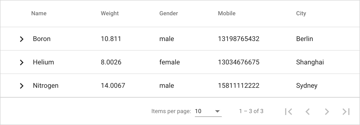
Basic Usage
Example of official website: Basic
Define component parameters
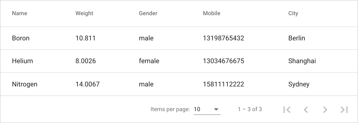
<mtx-grid [data]="list"
          [columns]="columns">
</mtx-grid>
Define data and columns
export class AppComponent {
  columns: MtxGridColumn[] = [
    { header: 'Name', field: 'name' },
    { header: 'Weight', field: 'weight' },
    { header: 'Gender', field: 'gender' },
    { header: 'Mobile', field: 'mobile' },
    { header: 'City', field: 'city' },
  ];

  list = EXAMPLE_DATA;
}
In addition, there are two ways for Data Grid to define columns on the market:
1. JS definition, such as Ag grid
var gridOptions = {
    // define 3 columns
    columnDefs: [
        { headerName: 'Athlete', field: 'athlete' },
        { headerName: 'Sport', field: 'sport' },
        { headerName: 'Age', field: 'age' }
    ],

    // other grid options here...
}
2. Template definitions, such as Ignite UI
<igx-grid igxPreventDocumentScroll #grid1 [data]="data | async" [height]="'500px'" width="100%" [autoGenerate]='false' [allowFiltering]="true">
    <igx-column [field]="'Category'" [width]="'120px'"></igx-column>
    <igx-column [field]="'Type'" [width]="'150px'" [filterable]='false'></igx-column>
    <igx-column [field]="'Open Price'" [width]="'120px'" dataType="number" [formatter]="formatCurrency">
    </igx-column>
    <igx-column [field]="'Price'" [width]="'120px'" dataType="number" [formatter]="formatCurrency"></igx-column>
</igx-grid>
Considering the advantages and disadvantages, the first definition method is selected for the Extensions Data Grid. The interface definition is as follows:
export interface MtxGridColumn {
  field: string;
  header?: string;
  hide?: boolean;
  disabled?: boolean;
  pinned?: 'left' | 'right';
  left?: string;
  right?: string;
  width?: string;
  resizable?: boolean;
  sortable?: boolean | string;
  type?: 'tag' | 'button' | 'link' | 'image' | 'number' | 'currency' | 'percent' | 'boolean';
  tag?: MtxGridColumnTag;
  buttons?: MtxGridColumnButton[];
  formatter?: (rowData: any, colDef?: any) => void;
  cellTemplate?: TemplateRef<any> | null;
  showExpand?: boolean;
  description?: string;
  i18n?: string;
  summary?: ((colData: any, colDef?: any) => void) | string;
}
Template
Template is an extremely flexible function of angular component. Most excellent third-party components have the ability to customize templates, and templates are an indispensable function in the Data Grid. The template function of Extensions Data Grid has been improved. In addition to the basic methods, cell template also adds more simple and easy-to-use methods.
Common method
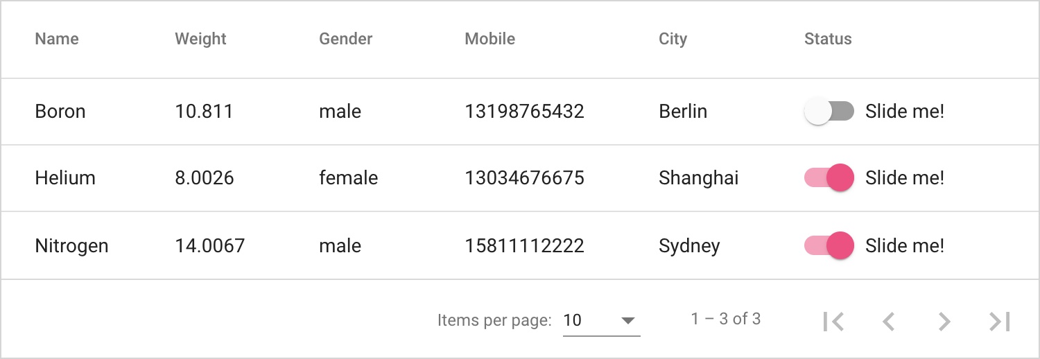
<mtx-grid [data]="list"
          [columns]="columns">
</mtx-grid>

<ng-template #statusTpl let-row let-index="index" let-col="colDef">
  <mat-slide-toggle [checked]="row.status">Slide me!</mat-slide-toggle>
</ng-template>
export class AppComponent implements OnInit {
  @ViewChild('statusTpl', { static: true }) statusTpl: TemplateRef<any>;

  columns: MtxGridColumn[] = [];

  list = EXAMPLE_DATA;

  ngOnInit() {
    this.columns = [
      { header: 'Name', field: 'name' },
      { header: 'Weight', field: 'weight' },
      { header: 'Gender', field: 'gender' },
      { header: 'Mobile', field: 'mobile' },
      { header: 'City', field: 'city' },
      { header: 'Status', field: 'status', cellTemplate: this.statusTpl },
    ];
  }
}
Official website example: Custom cell template
It is a common idea to reference template instances, but the disadvantage is that the column definition must be written in ngOnInit, and the user-defined template instances used must be referenced first. This kind of writing is very inflexible.
Upgrade plan
<mtx-grid [data]="list"
          [columns]="columns"
          [cellTemplate]="{ city: cityTpl }">
</mtx-grid>

<ng-template #cityTpl let-row let-index="index" let-col="colDef">
  <button mat-raised-button color="primary">{{row.city}}</button>
</ng-template>
Official website example: Custom cell template 2
This method directly defines the template instance [celltemplate] = "{City: citytpl}" in the component parameter, where city is the field in the column definition, and no other code is needed, which is very simple!
In addition to the cell template, there are headerTemplate, summaryTemplate, toolbarTemplate, etc., which can meet most of the personalized needs. See the official website for details.
selection
Official website example: Row selectable
Table row selection is a very common requirement, which is widely used. Cell selection is turned on by default. You can set [cellselectable] = false "to turn off cell selection.
You can enable row selection by [rowSelectable]="true".
<mtx-grid [data]="list"
          [columns]="columns"
          [rowSelectable]="rowSelectable"
          (rowSelectionChange)="log($event)"
          (cellSelectionChange)="log($event)">
</mtx-grid>
Multiple selection rows can be set by [multiselectable] = true. Here's a detail. Hold down ctrl and click to select multiple items, or click checkbox directly. If you need to hide the checkbox, just set [hideRowSelectionCheckbox]="true".
If you want to select some rows by default when initializing tables, you only need to define [rowSelected] = [...].
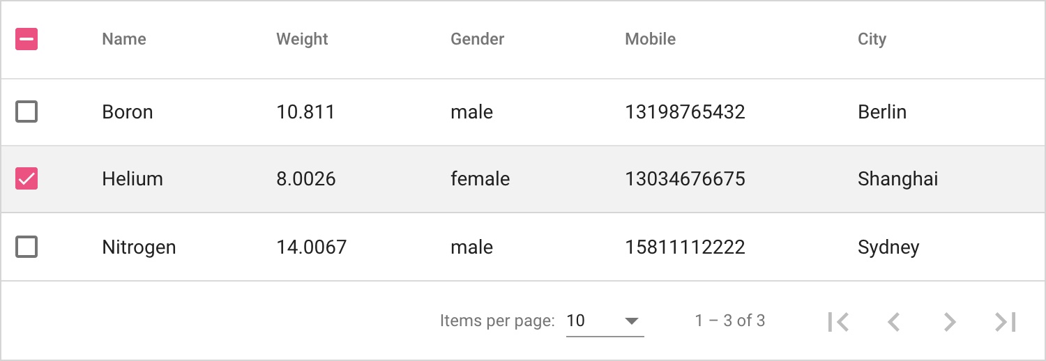
Unselectable
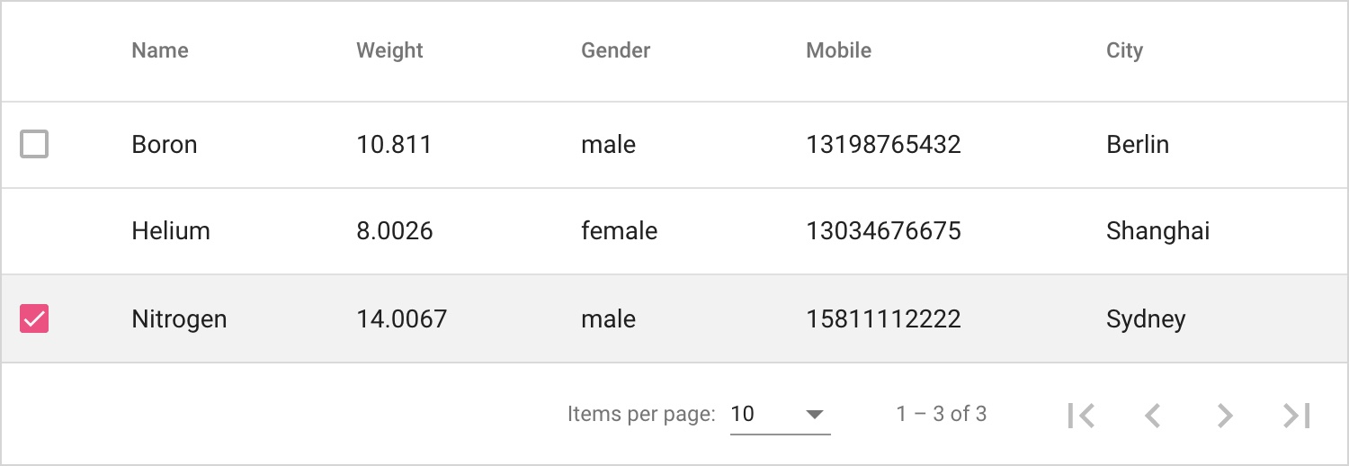
There are two ways to set non optional row fetching: one is to set the checkbox to disabled, and the other is to hide the checkbox. The configuration is very simple. You only need to filter the data through rowSelectionFormatter.
<mtx-grid [data]="list"
          [columns]="columns"
          [rowSelectable]="true"
          [rowSelectionFormatter]="rowSelectionFormatter">
</mtx-grid>
export class AppComponent {
  columns: MtxGridColumn[] = [
    { header: 'Name', field: 'name' },
    { header: 'Weight', field: 'weight' },
    { header: 'Gender', field: 'gender' },
    { header: 'Mobile', field: 'mobile' },
    { header: 'City', field: 'city' },
  ];

  list = EXAMPLE_DATA;

  rowSelectionFormatter: MtxGridRowSelectionFormatter = {
    disabled: (data) => data.name === 'Boron',
    hideCheckbox: (data) => data.name === 'Helium',
  };
}
Row expansion
Example of official website: Expandable row
With the help of the multiTemplateDataRows parameter of the Angular Material table, the implementation of row expansion has many details. The code of Data Grid is as follows:
Set expandable and expandiontemplate
<mtx-grid [data]="list"
          [columns]="columns"
          [expandable]="true"
          [expansionTemplate]="expansionTpl">
</mtx-grid>

<ng-template #expansionTpl let-row>
  {{row.name}}
</ng-template>
Set showExpand in the column definition to determine which column to display the expansion symbol in.
export class AppComponent {
  columns: MtxGridColumn[] = [
    { header: 'Name', field: 'name', showExpand: true },
    { header: 'Weight', field: 'weight' },
    { header: 'Gender', field: 'gender' },
    { header: 'Mobile', field: 'mobile' },
    { header: 'City', field: 'city' },
  ];

  list = EXAMPLE_DATA;
}
Column operation
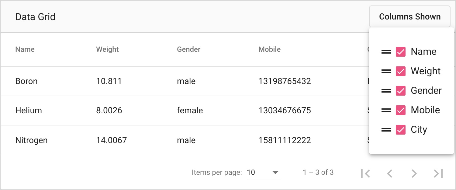
Official website example: Column hiding & moving
Column display, hiding and sorting are very common requirements, which have been tortured by product managers countless times. At present, the column operation UI is only in the menu mode, and the UI of the sidebar will be added later. The horizontal dragging of columns is not supported for the moment.
Column operations can be moved out of components. It is not necessary to use Data Grid integrated functions to implement column operations by setting columns.
summary
Due to the limited space, many functions of the Extensions Data Grid are not described in detail. From the requirements I met, the current data grid can cover 90% of the requirements. There are many advanced functions under development. Welcome to put forward constructive suggestions. If you have problems using components, you can submit them in GitHub issues Or ask questions in the discussion group.