preface
we introduced the data generation methods through three articles, mainly including Installation of matplotlib,Application of random walk as well as Use pygal to simulate rolling dice . Next, this paper introduces the data - download data. As we all know, in data analysis and data visualization, data is the most fundamental. Analysis and visualization are based on data. Therefore, in addition to generating our data, we can also download data from the Internet. we will access and visualize data stored in two common formats: CSV and json. We will use Python module CSV to process the weather data stored in CSV (comma separated value) format and find out the maximum and minimum temperatures in two different regions over a period of time. Then, we will use matplotlib to create a chart based on the downloaded data to show the temperature changes in two different regions. First, let's introduce the CSV file format:
1, CSV file format
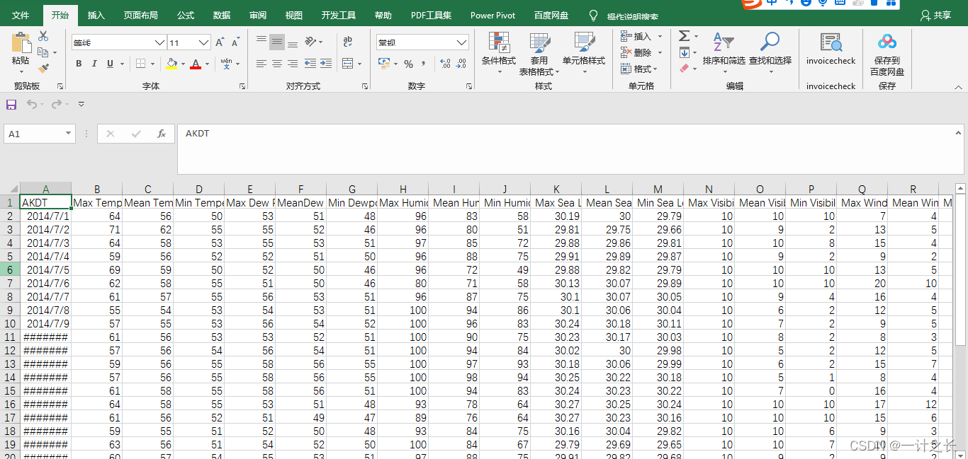
the simplest way to store data in a text file is to write the data into the file as a series of comma separated values (CSV). This file type is called CSV file. Specifically, we use the weather data in CSV format:
2014-1-5,61,44,26,18,7,-1,56,30,34,30.27,30.15,,,,10,4,,0.00,0,195
the above is the weather data of hitka, Alaska on January 5, 2014, including the maximum temperature and minimum temperature of that day, as well as many other data. CSV files are troublesome for people to read, but our program can easily extract and quickly process the values, which helps to speed up the process of data analysis. we will first process a small amount of Hitler card's CSV format weather data, which can be used download of The downloaded files are as follows:
let's open it to see the format of the data, as follows:
1. Analyze CSV file headers
the CSV module is included in the Python standard library and can be used to analyze the data rows in the CSV file, so that we can quickly extract the values of interest. Before that, we first copy the downloaded data file to the project file. Note that it is at the same directory level as our code, as follows:
the specific framework in the code is as follows:

let's look at the first line of the file, which contains a series of descriptions of the data:
import csv
filename = 'sitka_weather_07-2014.csv'
with open(filename) as f:
reader = csv.reader(f)
header_row = next(reader)
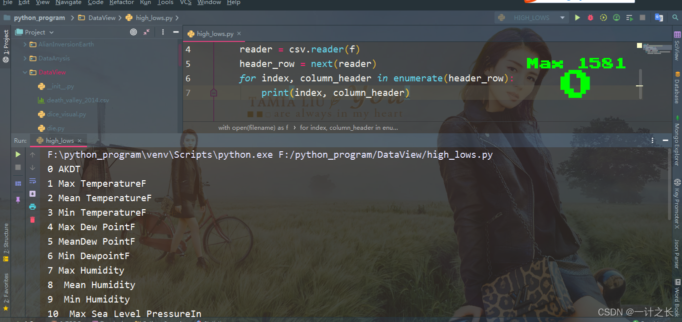
print(header_row)after importing CSV, we store the file name we want to use in filename. Next, we open this file and store the result file object in f. Then we call csv.reader() and pass the previously stored file object as an argument to it, creating a reader object associated with the file. We store this reader object in the reader. the module CSV contains the function next(). When you call it and pass the reader object to it, it will return the next line of the file. In the previous code, we only call next() once, so we get the first line of the file, which contains the file header. We store the returned data in the header_rows, as we can see, header_ The row contains file headers related to weather, indicating the data contained in each line. The specific implementation effects are as follows:

the reader processes the first row of data separated by commas in the file and stores each item of data in the list as an element. The opening file AKDT represents Alaska daylight time, and its position indicates that the first value of each line is a date or time. The header Max TemperatureF indicates that the second value of each line is the highest Fahrenheit temperature of the day. Here we need to note that the format of file headers is not always consistent. Spaces and units may appear in strange places. This is very common in the original data file, but it has no impact on our next analysis data and data visualization.
2. Print file header and its location
to make the header data easier to understand, print out each header and its position in the list:
import csv
filename = 'sitka_weather_07-2014.csv'
with open(filename) as f:
    reader = csv.reader(f)
    header_row = next(reader)
    for index, column_header in enumerate(header_row):
        print(index, column_header)
we call enumerate() on the list to get the index and value of each element (what we need to pay attention to here is that we annotate the code line print(header_row) and display this more detailed version instead). The output is as follows, which indicates the index of each file header. The specific effects are as follows:
from the above effect, the date and maximum temperature are stored in column 0 and column 1 respectively. In order to study these data, we will deal with sitka_weather_07-2014.csv and extract the values with indexes 0 and 1.
3. Extract and read data
after we understand the data we need through the previous knowledge, let's read the maximum temperature every day. The specific implementation is as follows:
import csv
# Get maximum temperature from file
filename = 'sitka_weather_07-2014.csv'
with open(filename) as f:
reader = csv.reader(f)
header_row = next(reader)
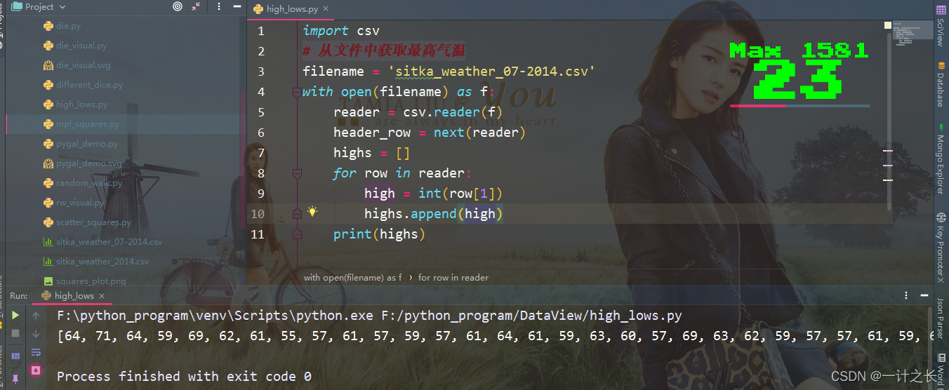
highs = []
for row in reader:
highs.append(row[1])
print(highs)we create an empty list called heights, and then traverse the remaining rows in the file. The reader object continues to read the CSV file from where it stays, and each time it automatically returns to the next line of the current location. Since we have read the header line of the file, the loop will start with the second line -- starting with the actual data. Each time we execute the row loop, we append the index data to the end of heights. Next, we show the data now stored in heights:

we can see from the effect that we extract the maximum temperature every day and store them neatly in a list as strings. Next, we use int() to convert these strings into numbers so that matplotlib can read it:
import csv
# Get maximum temperature from file
filename = 'sitka_weather_07-2014.csv'
with open(filename) as f:
    reader = csv.reader(f)
    header_row = next(reader)
    highs = []
    for row in reader:
        high = int(row[1])
        highs.append(high)
    print(highs)
we only need to convert the column to int type and then store it in the list. In this way, the final list will include the daily maximum temperature expressed in numbers:
the next step is to visualize these data.
4. Draw temperature chart
to visualize these temperature data, we first use matplotlib to create a simple graph showing the daily maximum temperature. The specific implementation is as follows:
import csv
from matplotlib import pyplot as plt
# Get maximum temperature from file
filename = 'sitka_weather_07-2014.csv'
with open(filename) as f:
reader = csv.reader(f)
header_row = next(reader)
highs = []
for row in reader:
high = int(row[1])
highs.append(high)
# Drawing graphics from data
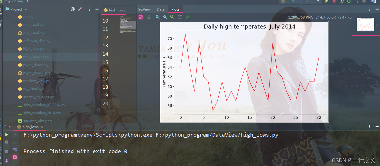
fig = plt.figure(dpi=128, figsize=(10, 6))
plt.plot(highs, c='red')
# Format drawings
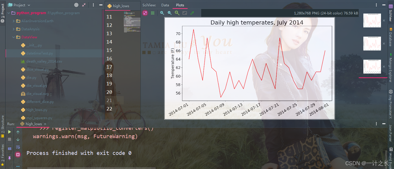
plt.title("Daily high temperates, July 2014", fontsize=24)
plt.xlabel('', fontsize=16)
plt.ylabel("Temperature (F)", fontsize=16)
plt.tick_params(axis='both', which='major', labelsize=16)
plt.show()we pass the maximum temperature list to plot(), and pass c='red 'to draw the data points in red (red shows the maximum temperature and blue shows the minimum temperature). Next, we set some other formats, such as font size and label. Since we haven't introduced how to add a date, we haven't added a label to the x-axis, but plt.xlabel() does modify the font size to make our default label easier to see. We use a simple line chart, It shows the daily maximum temperature in hitka, Alaska in July 2014. The specific effects are as follows:
5. Module datetime
next, we add dates to the chart to make it more useful. In the weather data file, the first date is on the second line:
2014-7-1,64,56,50,53,51,48,96,83,58,30.19,...
when reading the data, we get the first string, because we need to try our best to convert the string '2014-7-1' into an object representing the corresponding date. To create an object representing July 1, 2014, use the method strptime() in the module datatime. Let's look at how stripome () works:
from datetime import datetime
first_date = datetime.strptime('2021-12-4', '%Y-%m-%d')
print(first_date)
the specific implementation results are as follows:
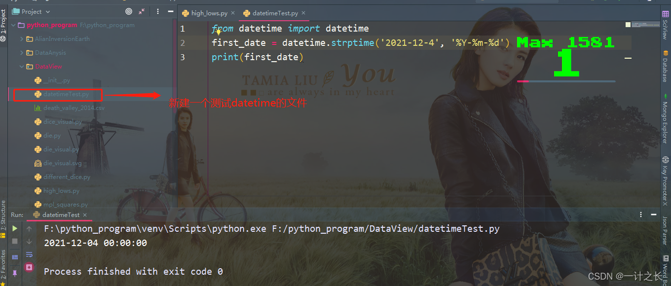
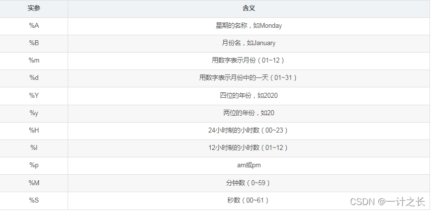
We first import the datetime class in module datetime, then call the method strptime (), and take the string containing the required date as the first argument. The second argument tells Python how to format the date. In this example,% Y - let Python treat the part before the first hyphen in the string as a four digit year;% m - let Python treat the part before the second hyphen as a number representing the month; And% d lets Python treat the last part of the string as a day in the month. What we need to know here is that the method 'strptime()' can accept various arguments and decide how to interpret the date according to them. The specific parameters are as follows:
6. Add date to chart
after we know how to handle the date in the CSV file, we can improve the air temperature graph, that is, extract the date and maximum air temperature and pass them to plot(). The specific implementation is as follows:
import csv
from matplotlib import pyplot as plt
from datetime import datetime
# Get maximum temperature from file
filename = 'sitka_weather_07-2014.csv'
with open(filename) as f:
    reader = csv.reader(f)
    header_row = next(reader)
    dates, highs =[], []
    for row in reader:
        current_date = datetime.strptime(row[0], "%Y-%m-%d")
        dates.append(current_date)
        high = int(row[1])
        highs.append(high)
# Drawing graphics from data
fig = plt.figure(dpi=128, figsize=(10, 6))
plt.plot(dates, highs, c='red')
# Format drawings
plt.title("Daily high temperates, July 2014", fontsize=24)
plt.xlabel('', fontsize=16)
fig.autofmt_xdate()
plt.ylabel("Temperature (F)", fontsize=16)
plt.tick_params(axis='both', which='major', labelsize=16)
plt.show()
we created two empty lists to store the date and maximum temperature extracted from the file. Then we convert the data containing date information into a datetime object and append it to the end of the list dates. In addition, we pass the date and maximum temperature values to plot(). Finally, we call fig.autofmt_xdate() to control oblique date labels to prevent them from overlapping each other. The specific effects are as follows:
7. Longer coverage
after setting up the chart, let's add more data to form a more complex Hitler weather map. As before, we will sitka_weather_2014.csv is placed in the same position. This file provides Hitler weather data for the whole year. We can now create weather maps covering the whole year:
import csv
from matplotlib import pyplot as plt
from datetime import datetime
# Get maximum temperature from file
filename = 'sitka_weather_2014.csv'
with open(filename) as f:
reader = csv.reader(f)
header_row = next(reader)
dates, highs =[], []
for row in reader:
current_date = datetime.strptime(row[0], "%Y-%m-%d")
dates.append(current_date)
high = int(row[1])
highs.append(high)
# Drawing graphics from data
fig = plt.figure(dpi=128, figsize=(10, 6))
plt.plot(dates, highs, c='red')
# Format drawings
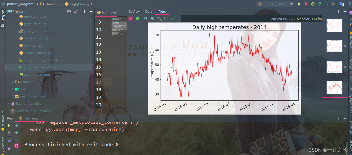
plt.title("Daily high temperates - 2014", fontsize=24)
plt.xlabel('', fontsize=16)
fig.autofmt_xdate()
plt.ylabel("Temperature (F)", fontsize=16)
plt.tick_params(axis='both', which='major', labelsize=16)
plt.show()we modified the file name to use the new data file sitka_weather_2014.csv, specific implementation process:
8. Draw another data series
the above figure shows a large number of far-reaching data, but we can add the minimum temperature data to make it more useful. For this purpose, it is necessary to extract the minimum temperature from the data file and add them to the chart. The specific implementation is as follows:
import csv
from matplotlib import pyplot as plt
from datetime import datetime
# Get the date, maximum temperature and minimum temperature from the file
filename = 'sitka_weather_2014.csv'
with open(filename) as f:
reader = csv.reader(f)
header_row = next(reader)
dates, highs, lows =[], [], []
for row in reader:
current_date = datetime.strptime(row[0], "%Y-%m-%d")
dates.append(current_date)
high = int(row[1])
highs.append(high)
low = int(row[3])
lows.append(low)
# Drawing graphics from data
fig = plt.figure(dpi=128, figsize=(10, 6))
plt.plot(dates, highs, c='red')
plt.plot(dates, lows, c='blue')
# Format drawings
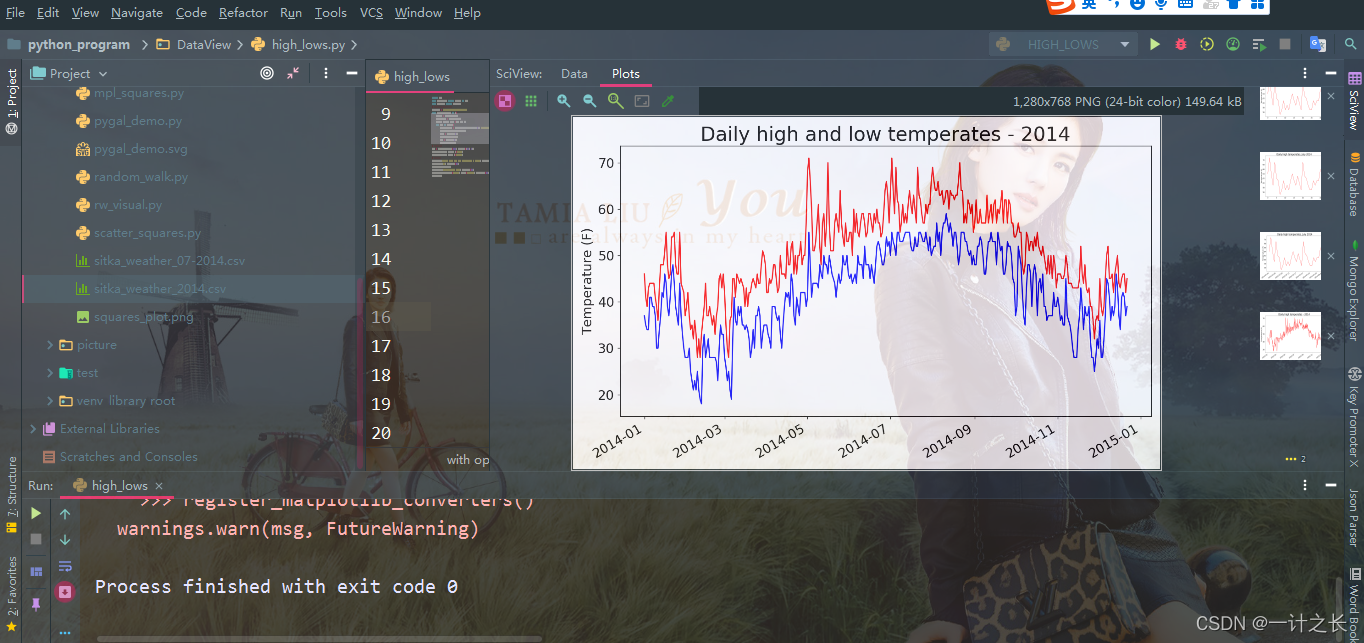
plt.title("Daily high and low temperates - 2014", fontsize=24)
plt.xlabel('', fontsize=16)
fig.autofmt_xdate()
plt.ylabel("Temperature (F)", fontsize=16)
plt.tick_params(axis='both', which='major', labelsize=16)
plt.show()we first added the empty list low to store the minimum temperature. Next, we extract the daily minimum temperature from column 4 (rows[3]) of each row and store them. Then we added a call to plot() to plot the minimum temperature in blue. Finally, we modify the title, and the specific effects are as fol lows:
9. Drawing chart area coloring
after adding two data series, we can understand the daily temperature range. Next, make a final modification to the chart, and color it to show the daily temperature range. To do this, we will use fill_between(), which accepts one x-value series and two y-value series and fills the space between the two y-value series:
import csv
from matplotlib import pyplot as plt
from datetime import datetime
# Get the date, maximum temperature and minimum temperature from the file
filename = 'sitka_weather_2014.csv'
with open(filename) as f:
    reader = csv.reader(f)
    header_row = next(reader)
    dates, highs, lows =[], [], []
    for row in reader:
        current_date = datetime.strptime(row[0], "%Y-%m-%d")
        dates.append(current_date)
        high = int(row[1])
        highs.append(high)
        low = int(row[3])
        lows.append(low)
# Drawing graphics from data
fig = plt.figure(dpi=128, figsize=(10, 6))
plt.plot(dates, highs, c='red', alpha=0.5)
plt.plot(dates, lows, c='blue', alpha=0.5)
plt.fill_between(dates, highs, lows, facecolor='blue', alpha=0.1)
# Format drawings
plt.title("Daily high and low temperates - 2014", fontsize=24)
plt.xlabel('', fontsize=16)
fig.autofmt_xdate()
plt.ylabel("Temperature (F)", fontsize=16)
plt.tick_params(axis='both', which='major', labelsize=16)
plt.show()
the argument alpha in our code specifies the transparency of the color. An alpha value of 0 indicates complete transparency and 1 indicates complete opacity. We generally set alpha to 0.5. In this way, the colors of red and blue polylines can look lighter. in addition, we report to fill_between() passes an x-value series: the list dates, and two y-value series: highs and lows. The actual parameter facecolor specifies the color of the filled area. We also set alpha to a smaller value of 0.1, so that the filled area connects the two data series without distracting the observer. The specific effects are as follows:
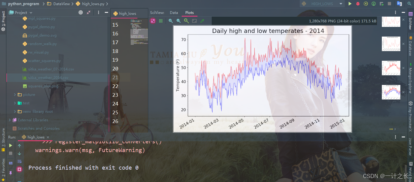
make the area between two data sets obvious by coloring.
10. Error checking
we should be able to run high using weather data from anywhere_ The code in low.py, but some weather stations occasionally fail to collect part or all of the data they should collect. Missing data may cause exceptions, and if not handled properly, it may also cause the program to crash. for example, let's look at what happened when we generated the temperature map of death valley, California. Set the file death_ valley_ 2014. Copy CSV to the folder of your own program. As before, let's first look at death_ valley_ Corresponding data of 2014.csv:

next, we generate the temperature map of death valley through code:
import csv
from matplotlib import pyplot as plt
from datetime import datetime
# Get the date, maximum temperature and minimum temperature from the file
filename = 'death_valley_2014.csv'
with open(filename) as f:
    reader = csv.reader(f)
    header_row = next(reader)
    dates, highs, lows =[], [], []
    for row in reader:
        current_date = datetime.strptime(row[0], "%Y-%m-%d")
        dates.append(current_date)
        high = int(row[1])
        highs.append(high)
        low = int(row[3])
        lows.append(low)
# Drawing graphics from data
fig = plt.figure(dpi=128, figsize=(10, 6))
plt.plot(dates, highs, c='red', alpha=0.5)
plt.plot(dates, lows, c='blue', alpha=0.5)
plt.fill_between(dates, highs, lows, facecolor='blue', alpha=0.1)
# Format drawings
plt.title("Daily high and low temperates - 2014", fontsize=24)
plt.xlabel('', fontsize=16)
fig.autofmt_xdate()
plt.ylabel("Temperature (F)", fontsize=16)
plt.tick_params(axis='both', which='major', labelsize=16)
plt.show()
when we run this program, an error occurs, as shown in the last line of the following output:

this error is actually that Python cannot handle the highest climate of one day because it cannot convert an empty string ('') to an integer. We just need to look at death_valley_2014.csv, you can find the problems:
2014-2-16,,,,,,,,,,,,,0.00,,,-1
it seems that there is no data recorded on February 16, 2014, and the string indicating the maximum temperature is empty. To solve this problem, when reading values from CSV files, we execute error checking codes to handle possible exceptions when analyzing data sets. The specific implementation is as follows:
import csv
from matplotlib import pyplot as plt
from datetime import datetime
# Get the date, maximum temperature and minimum temperature from the file
filename = 'death_valley_2014.csv'
with open(filename) as f:
    reader = csv.reader(f)
    header_row = next(reader)
    dates, highs, lows =[], [], []
    for row in reader:
        try:
            current_date = datetime.strptime(row[0], "%Y-%m-%d")
            high = int(row[1])
            low = int(row[3])
        except ValueError:
            print(current_date, 'missing data')
        else:
            dates.append(current_date)
            highs.append(high)
            lows.append(low)
# Drawing graphics from data
fig = plt.figure(dpi=128, figsize=(10, 6))
plt.plot(dates, highs, c='red', alpha=0.5)
plt.plot(dates, lows, c='blue', alpha=0.5)
plt.fill_between(dates, highs, lows, facecolor='blue', alpha=0.1)
# Format drawings
title = "Daily high and low temperates - 2014\nDeath Valley, CA"
plt.title(title, fontsize=20)
plt.xlabel('', fontsize=16)
fig.autofmt_xdate()
plt.ylabel("Temperature (F)", fontsize=16)
plt.tick_params(axis='both', which='major', labelsize=16)
plt.show()
for each row, we try to extract the date, maximum temperature and minimum temperature. As long as one of the data is missing, Python will throw a ValueError exception, and we can do this by printing an error message indicating the date of the missing data. After printing the error message, the loop will then process the next line. If no error occurs when getting all the data for a specific date, the else code block is run and the data is appended to the end of the corresponding list. Since we used information about another place when drawing, we modified the title and pointed out this place in the chart. The specific implementation results are as follows:
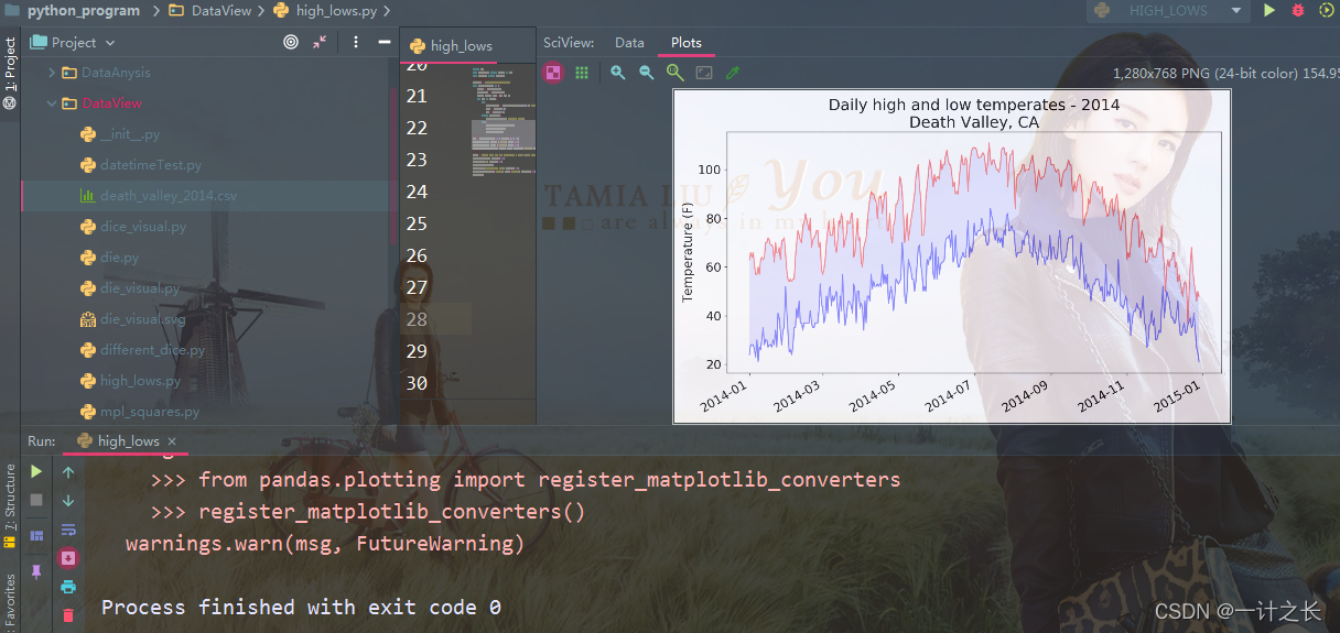
by comparing this chart with Hitler's chart, we can see that in general, Death Valley is warmer than southeastern Alaska, which may be expected, but the daily temperature difference in the desert is greater, which can be clearly seen from the height of the colored area. many data sets used may be missing data, incorrect data format or incorrect data itself. In this case, we can use try exception else in Python to deal with the problem of real data. Of course, we can also skip these data through continue, or remove() and del() to delete the extracted data. We can take any effective method, as long as we can carry out accurate and meaningful visualization.
summary
we introduced the data generation methods through three articles, mainly including Installation of matplotlib,Application of random walk as well as Use pygal to simulate rolling dice . This paper introduces the CSV data downloaded from the Internet. Specifically, it introduces the relevant analysis of CSV files in Python, reading data, drawing corresponding charts, adding dates to charts, coloring chart areas, and processing of corresponding missing data. Python is a language that pays attention to practical operation. It is the simplest and the best entry among many programming languages. When you learn the language, it's easier to learn java, go and C. Of course, Python is also a popular language, which is very helpful for the implementation of artificial intelligence. Therefore, it is worth your time to learn. Life is endless and struggle is endless. We work hard every day, study hard, and constantly improve our ability. I believe we will learn something. come on.