The concept of data analysis: count and sort out a large amount of data, draw conclusions, and provide data support for subsequent decision-making.
Why learn matplotlib?
1. Be able to visualize the data and present it more intuitively
2. Make the data more objective and persuasive
I. Chinese display
from pylab import mpl
mpl.rcParams["font.sans-serif"]=["SimHei"]
mpl.rcParams["axes.unicode_minus"]=False
II. Draw line chart
About the use of pyplot function in matplotlib
import matplotlib
import matplotlib.pyplot as plt
import random
from pylab import mpl
mpl.rcParams["font.sans-serif"]=["SimHei"]
mpl.rcParams["axes.unicode_minus"]=False
x_1=range(60)
x_2=range(60)
y=[random.randint(20,30) for i in range(120)]
plt.figure(figsize=(200,80),dpi=80) #Set picture size and resolution
plt.plot(range(120),y,label="Qingdao") #Draw a line chart
plt.xlabel("time")#Representation of x coordinate
plt.ylabel("temperature")#Representation of y coordinate
x_label=["10 spot{}branch".format(i) for i in x_1]
x_label+=["11 spot{}branch".format(i) for i in x_2]
plt.xticks(list(range(120))[::4],x_label[::4],rotation=45)#Setting the scale rotation is to set the text rotation
plt.legend()#Show Legend
plt.grid()#show grid
plt.title("Temperature time diagram") #show heading
plt.savefig("./picture.png")#Set to save to current directory
plt.show()
About image drawing style

III. comparison of common statistical charts
Line chart: a statistical chart showing the increase or decrease of statistical quantity with the rise or fall of line
Features: it can display the change trend of data and reflect the change of things. 
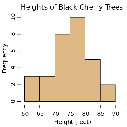
Histogram: a series of longitudinal stripes or line segments with different heights represent the data distribution. Generally, the horizontal axis represents the data range and the vertical axis represents the distribution.
Features: draw continuous data and display the distribution of one or more groups of data (Statistics)
Bar chart: data arranged in columns or rows of a worksheet can be drawn into a bar chart.
Features: draw continuous discrete data, can see the size of each data at a glance, and compare the differences between data. (Statistics)
Scatter diagram: use two groups of data to form multiple coordinate points, investigate the distribution of coordinate points, judge whether there is some correlation between the two variables, or summarize the distribution mode of coordinate points.
Features: judge whether there is quantitative correlation trend between variables and display outliers (distribution law)
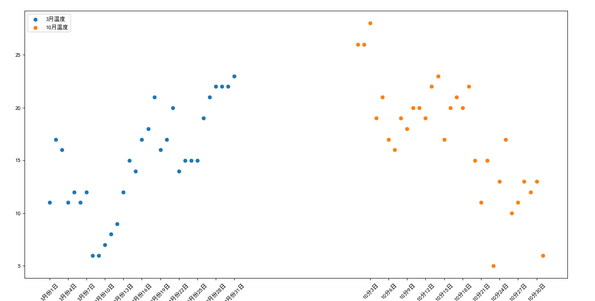
IV. plot scatter diagram
import matplotlib
from matplotlib import pyplot as plt
from pylab import mpl
mpl.rcParams["font.sans-serif"]=["SimHei"]
mpl.rcParams["axes.unicode_minus"]=False
a = [11,17,16,11,12,11,12,6,6,7,8,9,12,15,14,17,18,21,16,17,20,14,15,15,15,19,21,22,22,22,23]
b = [26,26,28,19,21,17,16,19,18,20,20,19,22,23,17,20,21,20,22,15,11,15,5,13,17,10,11,13,12,13,6]
x_a=[i for i in range(1,32)]
x_b=[i for i in range(51,82)]
x=x_a+x_b
plt.figure(figsize=(200,80),dpi=80)
plt.scatter(x_a,a,label="3 Monthly temperature")
plt.scatter(x_b,b,label="10 Monthly temperature")
x_label=["3 month{}day".format(i) for i in x_a]
x_label+=["10 branch{}day".format(i-50) for i in x_b]
plt.xticks(x[::3],x_label[::3],rotation=45)
plt.legend(loc="upper left")#Sets the location of the legend
plt.show()
V. draw bar chart
Simple independent bar chart
import matplotlib
from matplotlib import pyplot as plt
from pylab import mpl
mpl.rcParams["font.sans-serif"]=["SimHei"]
mpl.rcParams["axes.unicode_minus"]=False
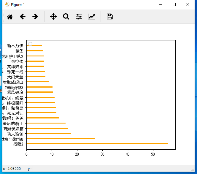
a = ["Warwolf 2","Speed and passion 8","Kung Fu Yoga","Journey to the West subdues demons chapter","Transformers 5: The Last Knight",\
"Wrestle, Dad","Pirates of the Caribbean 5: dead without proof","King Kong: Skeleton Island","Extreme agent: ultimate return","Biochemical crisis 6: final chapter",\
"ride the wind and waves","Stealing daddy 3","Outwit Weihu mountain","Make trouble in Tianzhu","Wolverine 3: battle to death","Spider Man: Hero returns","Wukong biography","Galaxy guard 2",\
"Love saint","The Mummy ",]
b=[56.01,26.94,17.53,16.49,15.45,12.96,11.8,11.61,11.28,11.12,10.49,10.3,8.75,7.55,7.32,6.99,6.88,6.86,6.58,6.23]
plt.figure(figsize=(200,80),dpi=80)
x=range(len(a))
plt.bar(x,b,width=0.2,color="orange")
plt.xticks(x,a,rotation=270)
plt.show()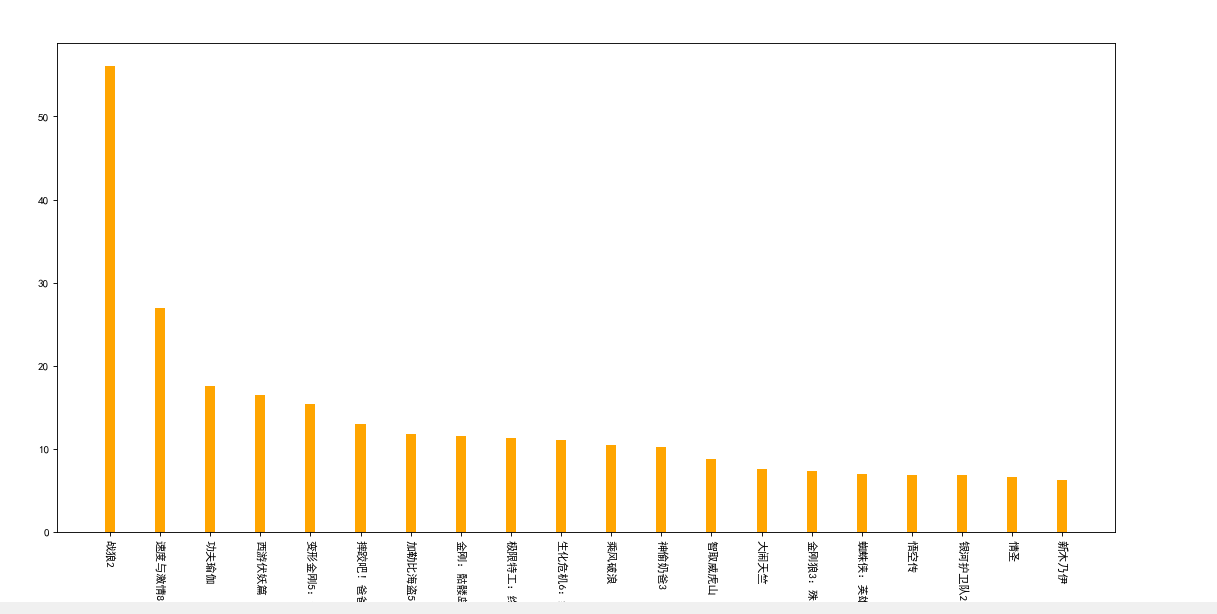
import matplotlib
from matplotlib import pyplot as plt
from pylab import mpl
mpl.rcParams["font.sans-serif"]=["SimHei"]
mpl.rcParams["axes.unicode_minus"]=False
a=["Warwolf 2","Speed and passion 8","Kung Fu Yoga","Journey to the West subdues demons chapter","Transformers 5: The Last Knight","Wrestle, Dad","Pirates of the Caribbean 5: dead without proof","King Kong: Skeleton Island","Extreme agent: ultimate return","Biochemical crisis 6: final chapter","ride the wind and waves","Stealing daddy 3","Outwit Weihu mountain","Make trouble in Tianzhu","Wolverine 3: battle to death","Spider Man: Hero returns","Wukong biography","Galaxy guard 2","Love saint","The Mummy ",]
b=[56.01,26.94,17.53,16.49,15.45,12.96,11.8,11.61,11.28,11.12,10.49,10.3,8.75,7.55,7.32,6.99,6.88,6.86,6.58,6.23]
plt.barh(range(len(a)),b,height=0.2)#Draw a horizontal bar chart
plt.yticks(range(len(a)),a)
plt.legend(loc="upper left")#Sets the location of the legend
plt.show()
Examples
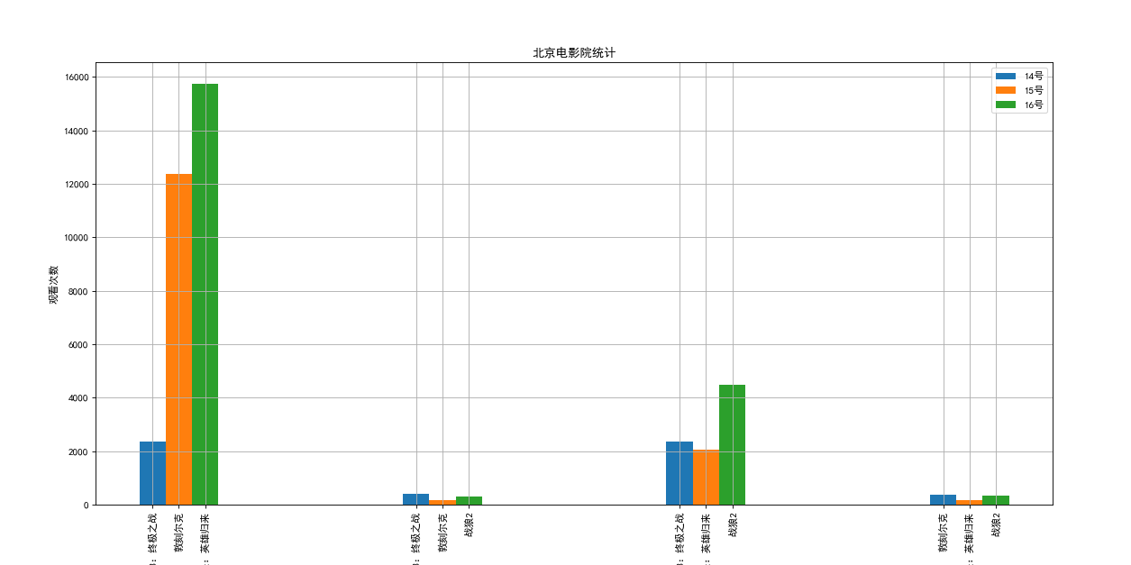
Suppose you know the box office of the films in list a on September 14, 2017 (b_14), September 15, 2017 (b_15) and September 16, 2017 (b_16), how can you present the data more intuitively in order to show the box office of the films in the list and the comparison with the data of other films?
a = ["the rise of the scarlet ball 3: the ultimate battle", "Dunkirk", "spider man: the return of heroes", "warwolf 2"]
b_16 = [15746,312,4497,319]
b_15 = [12357,156,2045,168]
b_14 = [2358,399,2358,362]
import matplotlib
from matplotlib import pyplot as plt
from pylab import mpl
mpl.rcParams["font.sans-serif"]=["SimHei"]
mpl.rcParams["axes.unicode_minus"]=False
a = ["The rise of the scarlet ball 3: the ultimate battle","The rise of the scarlet ball 3: the ultimate battle","The rise of the scarlet ball 3: the ultimate battle",
     "Dunkirk","Dunkirk","Dunkirk",
     "Spider Man: Hero returns","Spider Man: Hero returns","Spider Man: Hero returns",
     "Warwolf 2","Warwolf 2","Warwolf 2"]

b_16 = [15746,312,4497,319]
b_15 = [12357,156,2045,168]
b_14 = [2358,399,2358,362]
bar_width=0.1
x_14=[i for i in range(4)]
x_15=[i+bar_width for i in range(4)]
x_16=[i+bar_width*2 for i in range(4)]
x=x_14+x_15+x_16
plt.figure(figsize=(20,8),dpi=80)
plt.bar(x_14,b_14,width=bar_width,label="14 number")
plt.bar(x_15,b_15,width=bar_width,label="15 number")
plt.bar(x_16,b_16,width=bar_width,label="16 number")
plt.xticks(x,a,rotation=90)
plt.legend()
plt.grid()
plt.xlabel("film")
plt.ylabel("Viewing times")
plt.title("Beijing cinema statistics")
plt.show()
The code is incorrect, only for demonstration effect
Vi. draw histogram
Histogram is used to count the quantity. It is used only when the data quantity is not counted
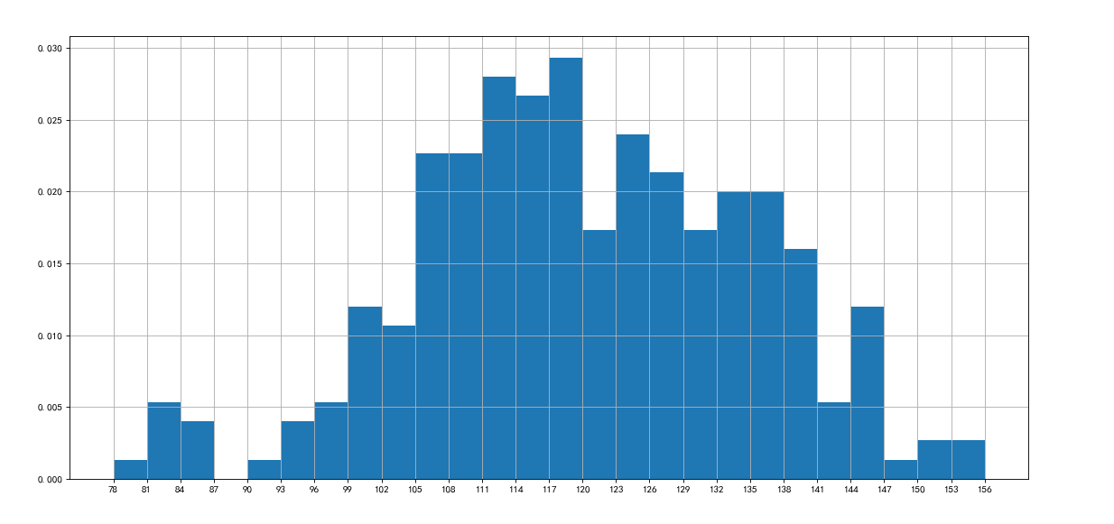
Suppose you have obtained the duration of 250 movies (in list a) and want to make statistics on the distribution status of the duration of these movies (such as the number and frequency of movies with a duration of 100 minutes to 120 minutes). How should you present these data?
import matplotlib
from matplotlib import pyplot as plt
from pylab import mpl
mpl.rcParams["font.sans-serif"]=["SimHei"]
mpl.rcParams["axes.unicode_minus"]=False
a=[131,  98, 125, 131, 124, 139, 131, 117, 128, 108, 135, 138, 131, 102, 107, 114, 119, 128, 121, 142, 127, 130, 124, 101, 110, 116, 117, 110, 128, 128, 115,  99, 136, 126, 134,  95, 138, 117, 111,78, 132, 124, 113, 150, 110, 117,  86,  95, 144, 105, 126, 130,126, 130, 126, 116, 123, 106, 112, 138, 123,  86, 101,  99, 136,123, 117, 119, 105, 137, 123, 128, 125, 104, 109, 134, 125, 127,105, 120, 107, 129, 116, 108, 132, 103, 136, 118, 102, 120, 114,105, 115, 132, 145, 119, 121, 112, 139, 125, 138, 109, 132, 134,156, 106, 117, 127, 144, 139, 139, 119, 140,  83, 110, 102,123,107, 143, 115, 136, 118, 139, 123, 112, 118, 125, 109, 119, 133,112, 114, 122, 109, 106, 123, 116, 131, 127, 115, 118, 112, 135,115, 146, 137, 116, 103, 144,  83, 123, 111, 110, 111, 100, 154,136, 100, 118, 119, 133, 134, 106, 129, 126, 110, 111, 109, 141,120, 117, 106, 149, 122, 122, 110, 118, 127, 121, 114, 125, 126,114, 140, 103, 130, 141, 117, 106, 114, 121, 114, 133, 137,  92,121, 112, 146,  97, 137, 105,  98, 117, 112,  81,  97, 139, 113,134, 106, 144, 110, 137, 137, 111, 104, 117, 100, 111, 101, 110,105, 129, 137, 112, 120, 113, 133, 112,  83,  94, 146, 133, 101,131, 116, 111,  84, 137, 115, 122, 106, 144, 109, 123, 116, 111,111, 133, 150]
plt.figure(figsize=(20,8),dpi=80)
d=3
num_bins=(max(a)-min(a))//d
plt.hist(a,num_bins,normed=True)#Normalized can change the frequency to a percentage
plt.xticks(range(min(a),max(a)+d,d))
plt.grid()
plt.show()
So here comes the question...
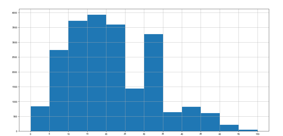
In the United States, the 2004 census found that 124 million s work far away from home. According to the time they need from home to work, the data in the following table are listed through sampling statistics (the last column). Can these data be drawn into a histogram?
The answer is no, because statistical data cannot be used to draw histogram, so bar graph can be used to replace histogram
interval = [0,5,10,15,20,25,30,35,40,45,60,90]
width = [5,5,5,5,5,5,5,5,5,15,30,60]
quantity = [836,2737,3723,3926,3596,1438,3273,642,824,613,215,47]
import matplotlib
from matplotlib import pyplot as plt
from pylab import mpl
mpl.rcParams["font.sans-serif"]=["SimHei"]
mpl.rcParams["axes.unicode_minus"]=False
interval = [0,5,10,15,20,25,30,35,40,45,60,90]
width = [5,5,5,5,5,5,5,5,5,15,30,60]
quantity = [836,2737,3723,3926,3596,1438,3273,642,824,613,215,47]
plt.figure(figsize=(20,9),dpi=80)
plt.bar(range(len(quantity)),quantity,width=1)
x=[i-0.5 for i in range(13)]#Adjust the scale of x
plt.xticks(x,interval+[150])
plt.show()