Previous: doughnut https://blog.csdn.net/zjw_python/article/details/98480632
Next: basic scatter https://blog.csdn.net/zjw_python/article/details/98483109
For the introduction of code structure and Chart object of initialization canvas, please see https://blog.csdn.net/zjw_python/article/details/98182540
The complete source code address of this figure: https://github.com/zjw666/D3_demo/tree/master/src/pieChart/nightingale
1 Chart effect
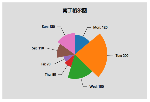
2 data
date,money
Mon,120
Tue,200
Wed,150
Thu,80
Fri,70
Sat,110
Sun,130
3 key code
Import data, convert to object array
d3.csv('./data.csv', function(d){
    return {
        date: d.date,
        money: +d.money
    };
}).then(function(data){
Some style parameter configurations, because the Nightingale graph uses the sector radius as the mapping point, so the sector outer radius is no longer a fixed value
const config = {
        margins: {top: 80, left: 80, bottom: 50, right: 80},
        textColor: 'black',
        title: 'Nightingale diagram',
        innerRadius: 0,
        textOffsetH: 10,
        lineColor: 'black',
        animateDuration: 1000
    }
Scale conversion, compared with the basic pie chart, adds a radius value conversion function
/* ----------------------------Scale conversion------------------------  */
    chart.arcAngle = d3.pie()
                    .sort((d,i) => i)
                    .value((d) => d.money);

    chart.scaleRadius = d3.scaleLinear()
                            .domain([0, d3.max(data.map((d) => d.money))])
                            .range([0, d3.min([chart.getBodyWidth(), chart.getBodyHeight()]) * 0.5])
Render sector. Compared with the basic pie chart, Nightingale chart adds a mapping point of sector radius. Here, our animation effect is characterized by the change of radius, and the code in the intermediate frame function is modified appropriately
/* ----------------------------Render fan------------------------  */
    chart.renderSlices = function(){
        const slices = chart.body().append('g')
                            .classed('pie', true)
                            .attr('transform', 'translate(' + chart.getBodyWidth()/2 + ',' + chart.getBodyHeight()/2 + ')')
                            .selectAll('.arc')
                            .data(chart.arcAngle(data));

              slices.enter()
                        .append('path')
                        .attr('class', (d,i) => 'arc arc-' + i)
                    .merge(slices)
                        .attr('fill', (d,i) => chart._colors(i))
                        .transition().duration(config.animateDuration)
                        .attrTween("d", arcTween)

              slices.exit()
                        .remove();

        function arcTween(d){
            let currentR = this._current;

            if (!currentR){
                currentR = 0
            }

            const interpolate = d3.interpolate(currentR, chart.scaleRadius(d.value));
            this._current = interpolate(1);   //When the pie chart is updated, from the current radius to the new radius

            return function(t){
                let arc = d3.arc()
                        .outerRadius(interpolate(t))
                        .innerRadius(config.innerRadius);

                return arc(d);
            }
        }
    }
When rendering text labels and lines, compared with the basic pie chart, it is worth noting that since the outer radius of each sector is different, the length of our lines should also be adjusted according to the corresponding radius size. Here we use the sqrt function. For the sector with large radius, the lines of text labels are shorter
/* ----------------------------Render text labels and lines------------------------  */
    chart.renderText = function(){

        // ----Render text labels-----

        const scaleTextDx = d3.scaleLinear()
                                .domain([0, Math.PI/2])
                                .range([config.textOffsetH, config.textOffsetH * 3]);

        const labels = d3.select('.pie')
                            .selectAll('.label')
                            .data(chart.arcAngle(data));

              labels.enter()
                        .append('text')
                        .classed('label', true)
                    .merge(labels)
                        .attr('stroke', config.textColor)
                        .attr('fill', config.textColor)
                        .attr('text-anchor', (d) => {
                            return (d.endAngle + d.startAngle)/2 > Math.PI ? 'end' : 'start';
                        })
                        .attr('dy', '0.35em')
                        .attr('dx', computeTextDx)
                        .transition().duration(0).delay(config.animateDuration)
                        .attr('transform', (d) => {
                            return 'translate(' + getArcCentorid(chart.scaleRadius(d.value)*2.5, d, true) + ')'
                        })
                        .text((d) => d.data.date+': '+d.data.money);

                labels.exit()
                        .remove();

        // ----Render label wire-----

        const points = getLinePoints();

        const generateLine = d3.line()
                                .x((d) => d[0])
                                .y((d) => d[1]);

        const  lines = d3.select('.pie')
                            .selectAll('.line')
                            .data(points);

               lines.enter()
                        .insert('path',':first-child')
                        .classed('line', true)
                    .merge(lines)
                        .transition().duration(0).delay(config.animateDuration)
                        .attr('fill', 'none')
                        .attr('stroke', config.lineColor)
                        .attr('d', generateLine);

                lines.exit()
                        .remove();

        function computeTextDx(d){                  //Calculate text horizontal offset
            const middleAngle = (d.endAngle + d.startAngle)/2;
            let dx = ''
            if (middleAngle < Math.PI){
                dx = scaleTextDx(Math.abs(middleAngle - Math.PI/2));
            }else{
                dx = -scaleTextDx(Math.abs(middleAngle - Math.PI*3/2));
            }
            return dx;
        }

        function getLinePoints(){                  //The point where the connection is generated
            return chart.arcAngle(data).map((d) =>{
                const radius = chart.scaleRadius(d.value);
                const line = [];
                const tempPoint = getArcCentorid(radius * 2.5, d, true);
                const tempDx = computeTextDx(d);
                const dx = tempDx > 0 ? tempDx - config.textOffsetH : tempDx + config.textOffsetH;
                line.push(getArcCentorid(radius, d));
                line.push(tempPoint);
                line.push([tempPoint[0] + dx, tempPoint[1]]);
                return line;
            })
        }

        function getArcCentorid(outerRadius, d, averageLength){       //Gets the center point of the specified radius arc and homogenizes the length
            if (averageLength) outerRadius = Math.sqrt(outerRadius*300);

            return d3.arc()
                        .outerRadius(outerRadius)
                        .innerRadius(config.innerRadius)
                        .centroid(d);
        }
    }
Finally, the mouse interaction event is bound. When hovering, the fan-shaped area slightly becomes larger
/* ----------------------------Binding mouse interaction events------------------------  */
    chart.addMouseOn = function(){
        d3.selectAll('.arc')
            .on('mouseover', function(d){
                const e = d3.event;

                d3.select(e.target)
                    .attr('d', generateArc(chart.scaleRadius(d.value)*1.1));
            })
            .on('mouseleave', function(d){
                const e = d3.event;

                d3.select(e.target)
                    .attr('d', generateArc(chart.scaleRadius(d.value)));
            });

        function generateArc(outerRadius){
            return d3.arc()
                        .outerRadius(outerRadius)
                        .innerRadius(config.innerRadius);
        }
    }

