Preface
In practice, when we get boss to do the following interface
There may be many such common interfaces, of course, we can achieve a unified effect by writing such a Topbar in each interface, but when we need to modify it, we should not scrap it. We're going to write custom-based View s that are encapsulated and used, so that when we modify them, we can save a lot of work.
So let's start our own View encapsulation
First step Define your own attributes and create atts.xml file in the values folder as follows:
<?xml version="1.0" encoding="utf-8"?>
<resources>

    <!--Step 1: Define attributes-->
    <declare-styleable name="Topbar">
        <attr name="titleName" format="string"/>
        <attr name="titleTextSize" format="dimension"/>
        <attr name="titleNameTextColor" format="color"/>
        <attr name="leftText" format="string"/>
        <attr name="leftBackground" format="reference|color"/>
        <attr name="leftTextColor" format="color"/>
        <attr name="rightText" format="string"/>
        <attr name="rightBackground" format="reference|color"/>
        <attr name="rightTextColor" format="color"/>
    </declare-styleable>

</resources>
The second step We customize our own View
/**
 * @author :huangxianfeng on 2017/3/14.
 * Step 2: Create your own View
 * Customize your own View,TopBar template, you can't modify this interface in every interface
 */
public class Topbar extends RelativeLayout {

    private Button leftButton,rightButton;
    private TextView tvTitle;

    private int leftTextColor;
    private Drawable leftBackground;
    private String leftText;

    private int rightTextColor;
    private Drawable rightBackground;
    private String rightText;

    private float titleTextSize;
    private int titleTextColor;
    private String title;

    private LayoutParams leftParams,rightParams,titleParams;

    private topbarClickListener listener;

    /**
     * Create an interface for empty external calls
     */
    public interface topbarClickListener{
        public void leftClick();
        public void rightClick();
    }

    public void setOnTopbarClickListener(topbarClickListener listener){
        this.listener = listener;
    }

    @TargetApi(Build.VERSION_CODES.JELLY_BEAN)
    public Topbar(final Context context, AttributeSet attrs) {
        super(context, attrs);

        //Contains all your own custom attributes
        TypedArray ta = context.obtainStyledAttributes(attrs, R.styleable.Topbar);
        //Extracting custom attributes from attributes
        leftTextColor = ta.getColor(R.styleable.Topbar_leftTextColor, 0);
        leftBackground = ta.getDrawable(R.styleable.Topbar_leftBackground);
        leftText = ta.getString(R.styleable.Topbar_leftText);

        rightTextColor = ta.getColor(R.styleable.Topbar_rightTextColor, 0);
        rightBackground = ta.getDrawable(R.styleable.Topbar_rightBackground);
        rightText = ta.getString(R.styleable.Topbar_rightText);

        titleTextSize = ta.getDimension(R.styleable.Topbar_titleTextSize, 0);
        titleTextColor = ta.getColor(R.styleable.Topbar_titleNameTextColor, 0);
        title = ta.getString(R.styleable.Topbar_titleName);

        ta.recycle();//Recycling

        //Create custom controls
        leftButton = new Button(context);
        rightButton = new Button(context);
        tvTitle = new TextView(context);

        //set a property
        leftButton.setTextColor(leftTextColor);
        leftButton.setBackground(leftBackground);
        leftButton.setText(leftText);

        rightButton.setTextColor(rightTextColor);
        rightButton.setBackground(rightBackground);
        rightButton.setText(rightText);

        tvTitle.setTextColor(titleTextColor);
        tvTitle.setTextSize(titleTextSize);
        tvTitle.setText(title);
        tvTitle.setGravity(Gravity.CENTER);

        setBackgroundColor(0xFFF59563);

        leftParams = new LayoutParams(ViewGroup.LayoutParams.WRAP_CONTENT, ViewGroup.LayoutParams.WRAP_CONTENT);
        leftParams.addRule(RelativeLayout.ALIGN_PARENT_LEFT, TRUE);//Add a rule to display the left side of the control
        addView(leftButton, leftParams);//At this point, the addition of a View control is completed and added to the ViewGroup.

        rightParams = new LayoutParams(ViewGroup.LayoutParams.WRAP_CONTENT, ViewGroup.LayoutParams.WRAP_CONTENT);
        rightParams.addRule(RelativeLayout.ALIGN_PARENT_RIGHT, TRUE);//Add a rule to display the right side of the control
        addView(rightButton, rightParams);//At this point, the addition of a View control is completed and added to the ViewGroup.

        titleParams = new LayoutParams(ViewGroup.LayoutParams.WRAP_CONTENT, ViewGroup.LayoutParams.MATCH_PARENT);
        titleParams.addRule(RelativeLayout.CENTER_IN_PARENT, TRUE);//Add a rule to center the control
        addView(tvTitle, titleParams);//At this point, the addition of a View control is completed and added to the ViewGroup.

        leftButton.setOnClickListener(new OnClickListener() {
            @Override
            public void onClick(View v) {
                //We can only use the method of exposure here.
                listener.leftClick();
            }
        });

        rightButton.setOnClickListener(new OnClickListener() {
            @Override
            public void onClick(View v) {
                listener.rightClick();
            }
        });
    }

    /**
     * Set whether the left button is displayed
     * @param flag
     */
    public void setLeftIsvisable(boolean flag){
        if (flag){
            leftButton.setVisibility(View.VISIBLE);
        }else{
            leftButton.setVisibility(View.GONE);
        }
    }

    /**
     * Set whether the right button is displayed
     * @param flag
     */
    public void setRightIsvisable(boolean flag){
        if (flag){
            rightButton.setVisibility(View.VISIBLE);
        }else{
            rightButton.setVisibility(View.GONE);
        }
    }
}
This View is very simple, just some simple function implementation, have their own way to add, you can change it by yourself.
The third step How to use the above content? It's actually simple, just add it to our activity_main.xml layout.
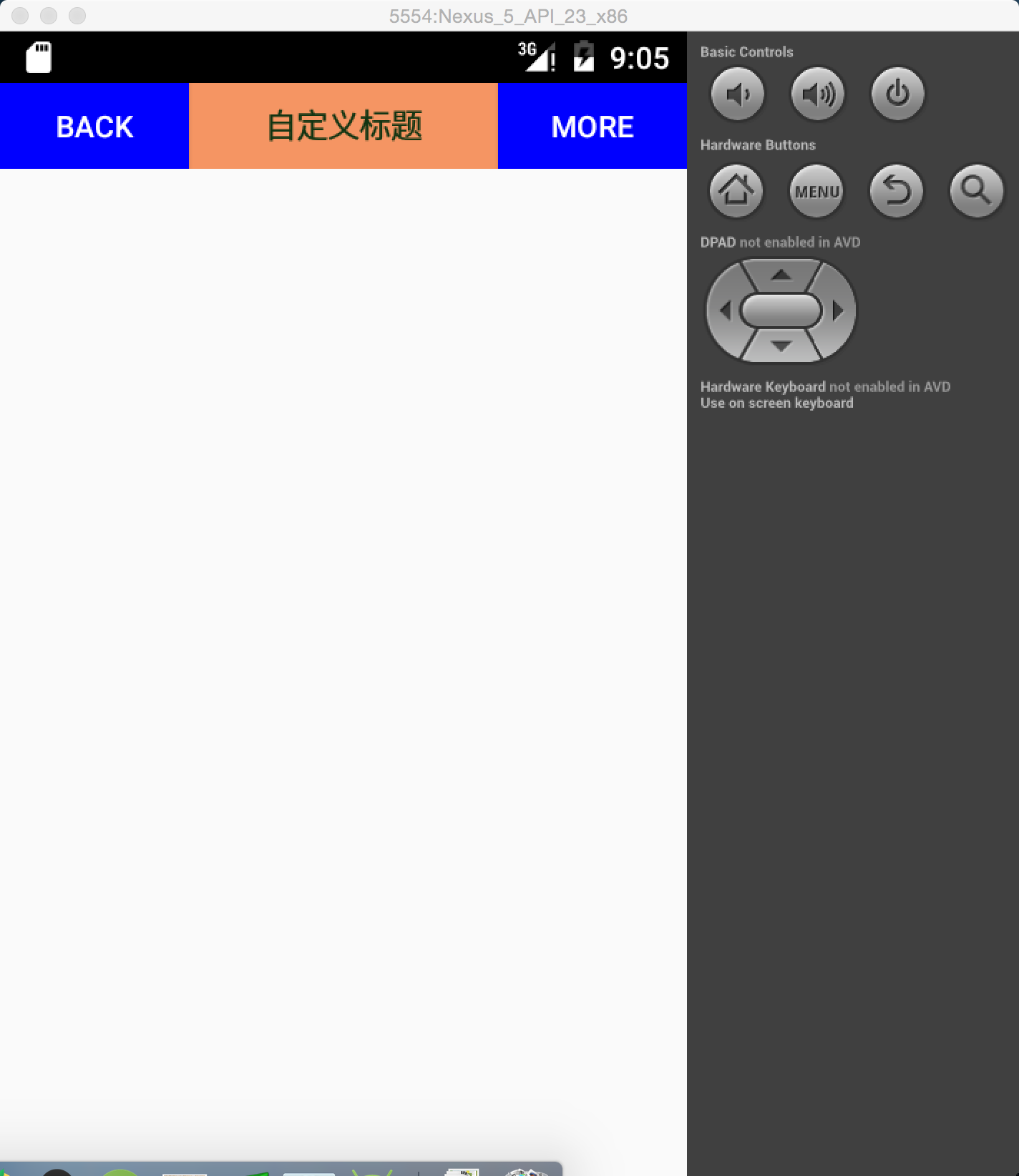
<?xml version="1.0" encoding="utf-8"?>
<RelativeLayout xmlns:android="http://schemas.android.com/apk/res/android"
    xmlns:custom="http://schemas.android.com/apk/res-auto"
    xmlns:tools="http://schemas.android.com/tools"
    android:layout_width="match_parent"
    android:layout_height="match_parent"
    android:padding="5dp"
    tools:context=".MainActivity">

    //To add your own custom attributes, add an xmln:custom="http://schemas.android.com/apk/res-auto"
    //To refer to your own attributes, the following scustom is the reference's own attributes
    <com.zhjy.hxf.hzui.Topbar
        android:id="@+id/topbar"
        android:layout_width="match_parent"
        android:layout_height="40dp"
        custom:leftBackground="#7CCE1C"
        custom:leftText="Back"
        custom:leftTextColor="#FFFFFF"
        custom:rightBackground="#7CCE1C"
        custom:rightText="More"
        custom:rightTextColor="#FFFFFF"
        custom:titleName="Custom Title"
        custom:titleNameTextColor="#123412"
        custom:titleTextSize="10sp"/>

</RelativeLayout>
In the above code, why is there a dependency on the package Cusm? In fact, it's a custom attribute dependency name, to distinguish it from android, but to add it to the outermost parent layout
xmlns:custom="http://schemas.android.com/apk/res-auto"
To depend on attribute categories.
The fourth step You can use our Topbar in our MainActivity
public class MainActivity extends AppCompatActivity {

    private Topbar mTopbar;

    @Override
    protected void onCreate(Bundle savedInstanceState) {
        super.onCreate(savedInstanceState);
        setContentView(R.layout.activity_main);
        initUI();
    }

    private void initUI() {
        mTopbar = (Topbar)findViewById(R.id.topbar);
        mTopbar.setOnTopbarClickListener(new Topbar.topbarClickListener() {
            @Override
            public void leftClick() {
                Toast.makeText(MainActivity.this,"leftClick",Toast.LENGTH_SHORT).show();
            }

            @Override
            public void rightClick() {
                Toast.makeText(MainActivity.this,"rightClick",Toast.LENGTH_SHORT).show();
            }
        });
        mTopbar.setLeftIsvisable(true);
    }
}
That's all about demo. Source download: http://download.csdn.net/download/huang3513/9780360 Welcome to leave a message and exchange