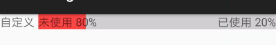
First look at the renderings
The practicability of this control is not considered here, mainly to learn the method of composition control.1. The first thing to do is to create a layout file
- testtest.xml
<?xml version="1.0" encoding="utf-8"?>
<LinearLayout xmlns:android="http://schemas.android.com/apk/res/android"
              android:layout_width="match_parent"
              android:layout_height="match_parent">

    <TextView
        android:id="@+id/tv_name"
        android:layout_marginTop="30dp"
        android:layout_width="50dp"
        android:layout_height="20dp"
        android:gravity="center_vertical"
        android:text="type:"
        android:textSize="15sp"/>

    <FrameLayout
        android:layout_marginTop="30dp"
        android:layout_width="match_parent"
        android:layout_height="wrap_content">

        <ProgressBar
            android:id="@+id/pb"
            style="?android:attr/progressBarStyleHorizontal"
            android:layout_width="match_parent"
            android:layout_height="20dp"
            android:progressDrawable="@drawable/pb_bg_style"/>

        <TextView
            android:id="@+id/tv_right"
            android:layout_width="wrap_content"
            android:layout_height="wrap_content"
            android:text="xxx Already used"
            android:textSize="15sp"/>

        <TextView
            android:id="@+id/tv_left"
            android:layout_width="wrap_content"
            android:layout_height="wrap_content"
            android:layout_gravity="right"
            android:text="xxx available"
            android:textSize="15sp"/>
    </FrameLayout>

</LinearLayout>- Modify progress bar style, Pb BG style.xml
<?xml version="1.0" encoding="utf-8"?>
<layer-list xmlns:android="http://schemas.android.com/apk/res/android" >
    <!-- background color  -->
    <item android:id="@android:id/background">
        <shape>
            <solid android:color="#D0CED1" />
        </shape>
    </item>
    <!-- Progress color -->
    <item android:id="@android:id/progress">
        <!-- clip We can't do without labels,Use it to distinguish from the background,Set progress -->
        <clip>
            <shape>
                <solid android:color="@android:color/holo_red_light" />
            </shape>
        </clip>
    </item>
</layer-list>
effect: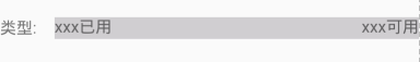
- 2. Create the root node of class inheritance layout
public class CustomProgress extends LinearLayout {
    public ProgressView2(Context context) {
        this(context,nul);
    }
    public CustomProgress (Context context, AttributeSet attrs) {
        super(context, attrs);
        //Note that the third parameter of using the air pump here is to use this, which is equivalent to passing the loaded view object to the parent class
        View.inflate(context, R.layout.testtest, this);
    }
}
- 3. Create your own attribute label
<?xml version="1.0" encoding="utf-8"?>
<resources>
 <!-- Progress bar properties -->
    <declare-styleable name="CustomProgress ">
        <attr name="pgText" format="reference|string" />
    </declare-styleable>
</resources>- 4. Use custom attribute labels in layout files
<LinearLayout
    xmlns:android="http://schemas.android.com/apk/res/android"
    xmlns:myPb="http://schemas.android.com/apk/res-auto"
    xmlns:tools="http://schemas.android.com/tools"
    android:layout_width="match_parent"
    android:layout_height="match_parent"
    android:orientation="vertical"
    tools:context="com.test.qrcode.view.TestActitivy">

    <com.test.qrcode.view.CustomProgress
        android:id="@+id/custom_pb"
        android:layout_width="match_parent"
        android:layout_height="wrap_content"
        myPb:pgText="custom"/>

</LinearLayout>- 5. Get the property value and provide the control with external methods and set the value
public CustomProgress(Context context, AttributeSet attrs) {
        super(context, attrs);
        View.inflate(context, R.layout.testtest, this);
        TypedArray ta = context.obtainStyledAttributes(attrs, R.styleable.ProgressView);
        String name = ta.getString(R.styleable.ProgressView_pgText);

        tv_name = (TextView) findViewById(R.id.view_psv_tv_title);
        tv_left = (TextView) findViewById(R.id.view_psv_tv_left);
        tv_right = (TextView) findViewById(R.id.view_psv_tv_right);
        pb = (ProgressBar) findViewById(R.id.view_psv_progress);

        tv_name.setText(name);
        ta.recycle();
    }
    // Set the information to the left of the progress bar
    public void setTextLeft(String text) {
        tv_left.setText(text);
    }
    // Set the information to the right of the progress bar
    public void setTextRight(String text) {
        tv_right.setText(text);
    }
    // Set progress bar maximum
    public void setPbMax(int max) {
        pb.setMax(max);
    }
    // Set progress bar progress value
    public void setProgress(int progress) {
        pb.setProgress(progress);
    }
Use
CustomProgress pb = (CustomProgress) findViewById(R.id.custom_pb);
pb.setPbMax(100);
pb.setProgress(20);
pb.setTextLeft("Used 20%");
pb.setTextRight("Not used 80%");