CSS 3 transition
css animation
Must: specify the name of the animation, specify the length of the animation
<!DOCTYPE html>
<html>
<head lang="en">
    <meta charset="UTF-8">
    <title></title>
    <style>
        div{
            width:100px;
            height:100px;
            background:red;
        }
        div:hover{
            animation:move 6s linear 2s infinite;//Specify the name and duration of the animation
            -webkit-animation: move 6s linear 2s infinite;
        }
       @keyframes move{
            0%{border-radius: 0}
            20%{border-radius: 50%;
                background: yellow;}
            50%{
                transform: translate(300px,0);
                background:yellowgreen;
            }
            80%{
                transform:translate(300px,300px);
                background: blue;
            }
            100%{
                border-radius: 0;
                background:red;
            }
        }
    </style>
</head>
<body>
<div></div>
</body>
</html>
Custom Animation
Steps:
Define animation:
@keyframes name{
0%{}
100%{}
}
Call:
animation:name 1s linear 2s infinite;
Name: Defined animation name
1s animation execution time
The Operation of linear Animation
2s represents animation delay time
infinite represents a loop
Grammar:
Animation: animation name runtime runtime runtime mode, delay time loop number, application style pause when not playing in reverse
Running mode: linear ease-in ease-in-out ease-out
Loop: Number or infinite (infinite loop)
Reverse or not: alternate
Apply Style When Not Playing: Stop the forward animation until the end of the animation (do not restore back)
Whether to pause: paused/running
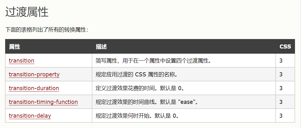
Transitional animation
Transition: transition: attribute time transition;
Attributes: Specific attribute values, transform,all (all)
Time: s seconds
Transitional mode:
linear
ease
ease-in starts slowly
ease-out ends slowly
ease-in-out begins and ends slowly
Deformation is used in combination:
Transform: rotate () translate () Note: Spacing between spaces is enough
2d conversion
<!DOCTYPE html>
<html>
<head lang="en">
    <meta charset="UTF-8">
    <title></title>
    <style>
        div{
            width:300px;
            height:200px;
            border:solid 1px red;
        }
        div.box1{
            -webkit-transform: translate(100px,50px);  //translate (horizontal x, vertical y)
            -moz-transform: translate(100px,50px);
            -ms-transform: translate(100px,50px);
            -o-transform: translate(100px,50px);
            transform: translate(100px,50px);
        }
        div.box2{
            -webkit-transform: rotate(45deg);//Rotating clockwise
            -moz-transform: rotate(45deg);
            -ms-transform: rotate(45deg);
            -o-transform: rotate(45deg);
            transform: rotate(45deg);
            -webkit-transform-origin: left bottom;  //starting point
            -moz-transform-origin: left bottom;
            -ms-transform-origin: left bottom;
            -o-transform-origin: left bottom;
            transform-origin: left bottom;
        }div.box3{
                     -webkit-transform: scale(2,0.5);//Zoom (x, y)
                     -moz-transform: scale(2,0.5);
                     -ms-transform: scale(2,0.5);
                     -o-transform: scale(2,0.5);
                     transform: scale(2,0.5);
                 }
        div.box4{
            -webkit-transform: skew(30deg,30deg);//Flip (x, y)
            -moz-transform: skew(30deg,30deg);
            -ms-transform: skew(30deg,30deg);
            -o-transform: skew(30deg,30deg);
            transform: skew(30deg,30deg);
        }

    </style>
</head>
<body>
<!--<div class="box1"></div>-->
<!--<div class="box2"></div>-->
<!--<div class="box3"></div>-->
<div class="box4"></div>

</body>
</html>
Transform: translate (horizontal displacement, vertical displacement)
Values are positive, horizontal to right, vertical downward, negative, horizontal to left, vertical upward.
Transform: rotate (angle)
transform-origin: Rotating reference point (left right top bottom percentage precise value)
Grammar:
transform-origin (x coordinates, y coordinates)
Transform: scale (value) is greater than 1, indicating that the magnification is reduced between 0 and 1, one value is scaled both horizontally and vertically, and two values are scaled both horizontally and vertically.
Transform: skew (value) represents the effect of tilting along the X and Y axes