On some advertising pages/single pages, UI design often uses gradient color or font shadows to beautify text, which can only be replaced by pictures, but sometimes in order to have better reusability, we use pure css to achieve today.
The final effect is as follows: Gradient + Text Shadow
First put up html and css, and then we'll talk about it in detail.
<div class="title">
	<h1 class="gradient">Activity headlines</h1>
	<span>Activity headlines</span>
</div>
.poster-top .title{position: absolute;top: 1.12rem;width: 100%;text-align: center;}
.poster-top .title .gradient-text{font-size: 1.04rem;background-image: linear-gradient(to bottom,#fffcfa,#ffefde,#ffe1c0,#ffd3a2,#ffc280);-webkit-background-clip: text;-webkit-text-fill-color: transparent;letter-spacing: 0.1rem;position: absolute;z-index: 2;left: 0.92rem;top: 0;}
.poster-top .title span{font-size: 1.04rem;text-shadow: 2px 3px 0 hsl(7,87%,57%),0px 5px 10px rgba(138,4,0,.75);color: #fb391f;letter-spacing: 0.1rem;font-weight: bold;}
1. The first is the gradual effect of words.
The first method is:
{
background-image: linear-gradient(to bottom,#fffcfa,#ffefde,#ffe1c0,#ffd3a2,#ffc280);
-webkit-background-clip: text;
-webkit-text-fill-color: transparent;
}
Note: Although the above attributes are easy to use, but the compatibility effect is poor. They are only applicable to webkit kernel browsers. This method is also applicable to hollow out and streamer effect.
(1) background-clip means background clipping. After using-webkit-background-clip: text, the text in the block is used as the clipping area. The background of the text is the background of the block, and the area outside the text will be clipped. Fill text with text clip background as color.
(2) Webkit-text-fill-color sets the fill color of the text in the object, similar to the effect of color. If you set both text-fill-color and color attributes, text-fill-color overrides the value of color.
The second method:
<div class="title">
	<h1 class="gradient-text" data-content="Activity headlines">Activity headlines</h1>
	<span>Activity headlines</span>
</div>
.poster-top .title .gradient-text{font-size: 1.04rem;color:#ffc280;letter-spacing: 0.1rem;position: absolute;z-index: 2;left: 0.92rem;top: 0;}
.poster-top .title .gradient-text[data-content]::after{content:attr(data-content);color:#fffcfa;-webkit-mask-image:-webkit-gradient(linear, 0 0, 0 bottom, from(yellow), to(rgba(0, 0, 255, 0)));position: absolute;width: 100%;height: 100%;left: 0;}
2. Shadow effect of font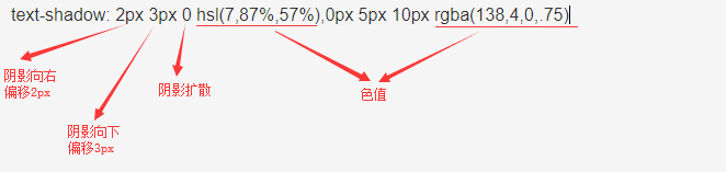
HSL refers to (H,S,L)
Value:
H: Hue. 0 (or 360) means red, 120 means green, 240 means blue, and other values can be used to specify the color. Value: 0 - 360
S: Saturation. The value is 0.0% - 100.0%.
L: Lightness. The value is 0.0% - 100.0%.
As shown in the figure below, the value of hsl is circled.
3. Because the use of text shadows with gradients is ineffective, I use hierarchy to do superposition effect.
This is the gradient effect.
This is the font shadow effect.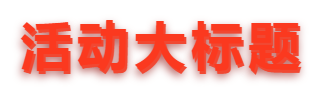
Overlay effect maps (with style codes for reference):