To achieve circular path movement, we mainly use the following two attributes:
animation-origin
rotate(1turn)
General CSS Style:
.round{
    width: 200px;
    height: 200px;
    border-radius: 100%;
    background: lightpink;
    padding: 20px;
}
.move{
    display: block;
    width: 50px;
    height: 50px;
    margin: 0 auto;
    border-radius: 50%;
    overflow: hidden;
    animation: spin 2.8s infinite linear;
    transform-origin: 50% 100px;
}
.move > img{
    display: block;
    width: inherit;
    height: inherit;
    animation: inherit;
    animation-direction: reverse;
}
@keyframes spin{
    to{transform: rotate(1turn);}
}
First of all, the middle picture will move along the circular track, but the picture itself is also rotating.
Don't talk too much, just go to the code:
<div class="round">
    <img class="move" src="img/12.jpg"/>
</div>
Exploded renderings: 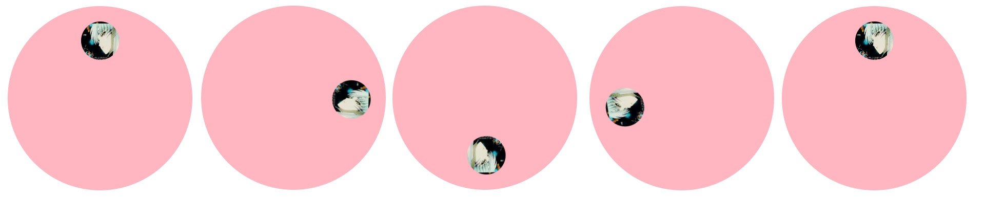
But what we need is to let the picture move along the circular track. We don't want the small picture in the middle to rotate. How can we solve this problem? We can eliminate the animation of the outer layer through the animation of the inner layer, that is, we can pack a layer of div for the img tag, the code is as follows:
<div class="round">
    <div class="move">
        <img src="img/12.jpg"/>
    </div>
</div>
The effect breakdown is as follows: 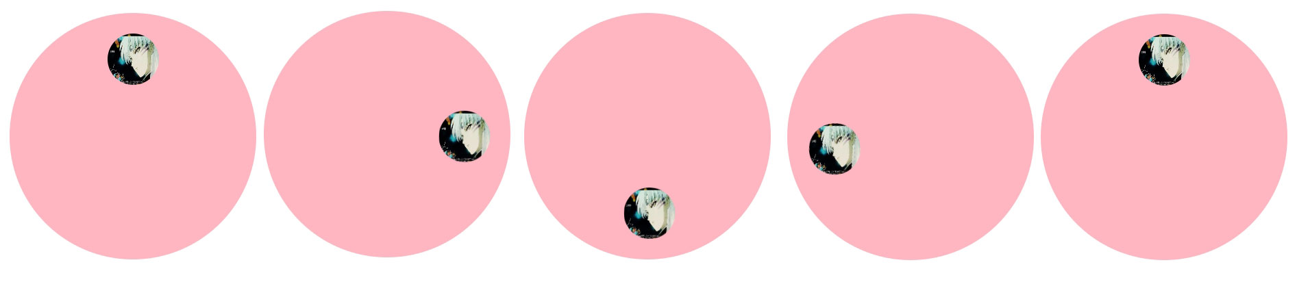
So, can we realize the rhythmic movement of multiple small pictures along the circular track? Tolerable. The style is still as follows, just change the HTML, and the code is as follows:
<div class="round">
    <div class="move">
        <img src="img/12.jpg"/>
    </div>
    <div class="move" style="animation-delay: 0.4s;margin-top: -50px;">
        <img src="img/12.jpg"/>
    </div>
    <div class="move" style="animation-delay: 0.8s;margin-top: -50px;">
        <img src="img/12.jpg"/>
    </div>
    <div class="move" style="animation-delay: 1.2s;margin-top: -50px;">
        <img src="img/12.jpg"/>
    </div>
    <div class="move" style="animation-delay: 1.6s;margin-top: -50px;">
        <img src="img/12.jpg"/>
    </div>
    <div class="move" style="animation-delay: 2.0s;margin-top: -50px;">
        <img src="img/12.jpg"/>
    </div>
    <div class="move" style="animation-delay: 2.4s;margin-top: -50px;">
        <img src="img/12.jpg"/>
    </div>
</div>
Pay attention to the time setting here.
The effect breakdown is as follows: 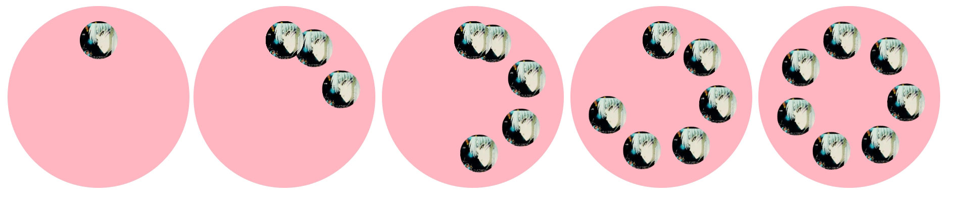
In fact, the above effects can also be realized through translate and rotate, because animation origin can be realized through translate. I won't talk about it in detail.