1.What is Media Query
Media Query is a new CSS3 syntax.
- Using the @media query, you can define different styles for different media types
- Multimedia queries are currently available for many Apple, Android and tablet devices
2.Media Query Syntax Specification
- Start with @media and note the @symbol
- mediatype: Media type
- Keyword and not only
- media feature media features must have parentheses containing
@media mediatype and|not|only (media feature) {
    CSS-Code;
}
- mediatype query type
Divide different terminal devices into different types, called media types
| value | interpretative statement |
|---|---|
| all | For all devices |
| For printers and print previews | |
| screen | For computer screens, tablets, smart watches, etc. |
Only a few media types are listed here
- Keyword
Keyword connects media types or multiple media attributes together as a condition for media queries.
- And: You can connect multiple media features together, which means "and".
- Not: Exclude a media type, equivalent to the meaning of "not", can be omitted.
- only: Specify a specific media type, which can be omitted.
-
Media characteristics
Each media type has its own specific characteristics and different display styles depending on the media characteristics of different media types. Note that they need to be enclosed in parentheses.
value interpretative statement width Define the width of the visible area of the page in the output device min-width Define the minimum visible area width of the page in the output device max-width Define the maximum visible area width of the page in the output device min-width: 540px;▶ Screen Width >=540px
max-width:540px;▶ Screen Width <=540px
These three media features are only part of the story.
3.Practical Use of Media Query
Dynamic rendering of pages according to page size
@media can be styled differently for different screen sizes, and when you reset the browser size, the page will be rendered again depending on the width and height of the browser
- Note: To prevent confusion, media queries are written from small to large or from large to small, but to make the code more concise, they are written from small to large.
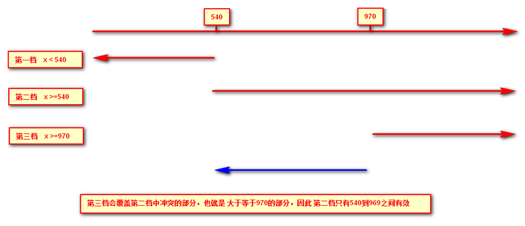
Case Code
  <style>
        /* 1. Media queries generally follow the order from large to small or from small to large */
        /* 2. Change background color to blue for pages less than 540px */
        @media screen and (max-width: 539px) {
            body {
                background-color: blue;
            }
        }
        /* 3. 540 ~ 970 Change our page color to green */
        /* @media screen and (min-width: 540px) and (max-width: 969px) {
            body {
                background-color: green;
            }
        } */

        @media screen and (min-width: 540px) {
            body {
                background-color: green;
            }
        }
        /* 4. Greater than or equal to 970 Change the color of our page to red */

        @media screen and (min-width: 970px) {
            body {
                background-color: red;
            }
        }
        /* 5. screen and must have something on it that cannot be omitted */
        /* 6. Our number must be followed by the unit 970px This PX cannot be omitted */
    </style>
<body></body>
(2) Media query + rem to achieve dynamic size change of elements
rem units follow html, with rem page elements to set different sizes, media queries can modify styles according to different device widths, media queries + rem can achieve different device widths, and achieve dynamic changes in page element size
Case Code
<style>
        @media screen and (min-width: 320px) {
            html {
                font-size: 50px;
            }
        }

        @media screen and (min-width: 640px) {
            html {
                font-size: 100px;
            }
        }

        .top {
            height: 1rem;
            font-size: .5rem;
            background-color: green;
            color: #fff;
            text-align: center;
            line-height: 1rem;
        }
    </style>
<body>
    <div class="top">Shopping Cart</div>
</body>
(3) Introducing resources
When there are many styles, we can use different stylesheets for different media. The principle is to directly determine the size of the device in the link and then reference different css files.
- grammatical norm
<head>
    <link rel="stylesheet" media="mediatype and|not|only (media feature)" href="mystylesheet.css">
    <link ...>
</head>
-
Example: Call different css files for different screen sizes
Case Code
-
style320.css
div { width: 100%; height: 100px; } div:nth-child(1) { background-color: pink; } div:nth-child(2) { background-color: purple; } -
style640.css
div { float: left; width: 50%; height: 100px; } div:nth-child(1) { background-color: pink; } div:nth-child(2) { background-color: purple; } -
html
<head>
    <!-- When screen is greater than or equal to 320 px Above, introduced style320.css -->
    <link rel="stylesheet" href="style320.css" media="screen and (min-width: 320px)">
        <!-- When screen is greater than or equal to 640 px Above, introduced style640.css -->
    <link rel="stylesheet" href="style640.css" media="screen and (min-width: 640px)">
</head>
<body>
    <div>1</div>
    <div>2</div>
</body>