css3 elastic layout and multi-column layout
Flexible Box is the flexible layout of the box model in css3, which adds a lot of flexibility to the traditional layout.
Elastic box foundation
Define an elastic box
Define the display attribute on the parent box:
#box{
  display: -webkit-flex;   //Compatibility settings for webkit kernel browsers, as follows
  display: flex;
}
Of course, there are flexible boxes with in-line layout.
#box{
  display: -webkit-inline-flex;
  display: inline-flex;
}
Note that the float, clear, and vertical-align attributes of child elements will fail when set to Flex layout.
Compatibility of Elastic Box
- Chrome 29+
- Firefox 28+
- Internet Explorer 11+
- Opera 17+
- Safari 6.1+ (prefixed with -webkit-)
- Android 4.4+
- iOS 7.1+ (prefixed with -webkit-)
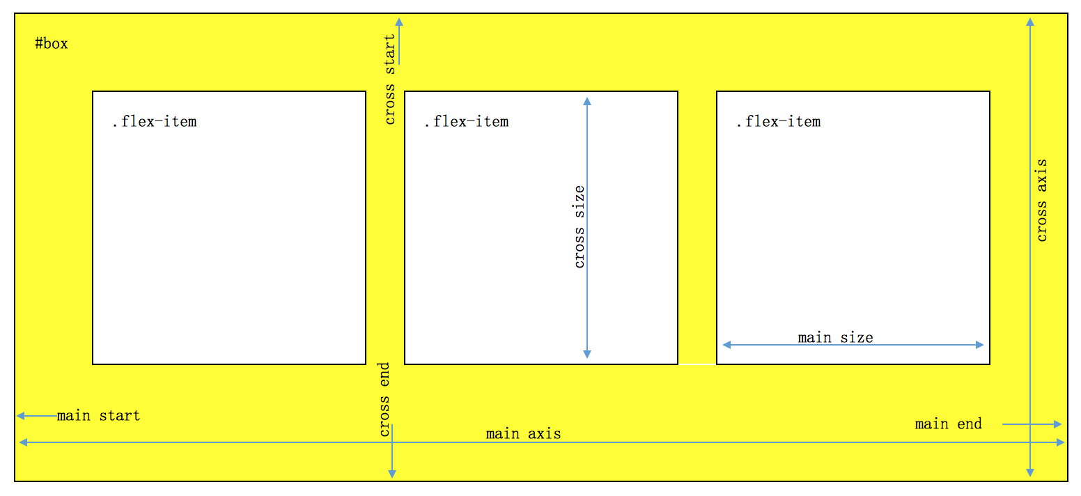
The concept of elastic box
The two axes of the elastic box are as follows:
- Main axis
- Cross axis
Elastic Box Properties
Before researching specific attributes, we first establish a basic template and modify some parameters if necessary.
<!-- html Part -->
<div id="flex-box">
  <div class="flex-item">1</div>
  <div class="flex-item">2</div>
  <div class="flex-item">3</div>
  <div class="flex-item">4</div>
  <div class="flex-item">5</div>
</div>
<!-- css Part -->
#flex-box{
  width: 200px;
  height: 200px;
  border: 1px solid #06f;
  display: flex;
  display: -webkit-flex;
}
.flex-item{
  height: 30px;
  width: 30px;
  color: #f00;
  font-size: 20px;
  line-height: 30px;
  text-align: center;
  background-color: #8f0;
  border: 1px solid #f00;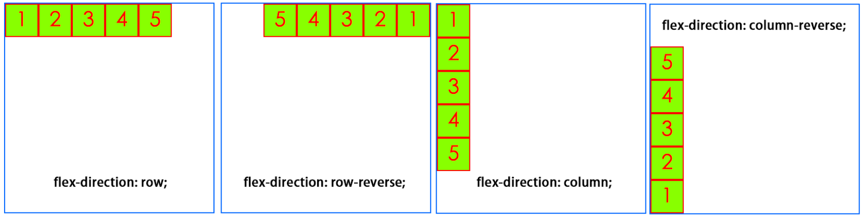
}- flex-direction
Arrangement direction setting
#flex-box{
  flex-direction: row | row-reverse | column | column-reverse;
  /* @value row From left to right (default)*/
  /* @value row-reverse From right to left*/
  /* @value column From top to bottom*/
  /* @value column-reverse From bottom to top*/
}
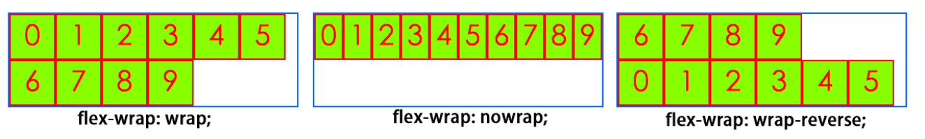
- flex-wrap
Line wrap settings
.box{
  flex-wrap: nowrap | wrap | wrap-reverse;
  /* @value nowrap No line change (default)*/
  /* @value wrap Line feed*/
  /* @value wrap-reverse Line-break inversion*/
}
- flex-flow
Abbreviation attributes of flex-direction and flex-wrap
.box {
  flex-flow: <flex-direction> || <flex-wrap>;
}- justify-content
Horizontal alignment
.box {
  justify-content: flex-start | flex-end | center | space-between | space-around;
}
/* value flex-start Left alignment (default)*/
/* value flex-end: Right alignment*/
/* value center:  Centered*/
/* value space-between: Alignment at both ends, equal spacing between projects*/
/* value space-around: The intervals on both sides of each project are equal. So, the interval between projects is twice as large as the interval between projects and borders.*/
- align-items
Vertical alignment
.box {
  align-items: flex-start | flex-end | center | baseline | stretch;
}
/* value flex-start Starting point alignment of cross axes*/
/* value flex-end Endpoint alignment of cross axes*/
/* value center Midpoint alignment of cross axes*/
/* value baseline Baseline alignment of the first line of text of the project*/
/* value stretch If the project is not set to height or auto, it will occupy the height of the entire container (default)*/
- align-content
Alignment of multiple axes
.box {
  align-content: flex-start | flex-end | center | space-between | space-around | stretch;
}
/* value flex-start Alignment with the starting point of the intersection axis*/
/* value flex-end Alignment with the end of the cross axis*/
/* value center Alignment with the midpoint of the intersection axis*/
/* value space-between Average distribution of spacing between axes aligned with the ends of cross axes*/
/* value space-around The spacing on both sides of each axis is equal. Therefore, the spacing between axes is twice as large as that between axes and frames.*/
/* value stretch Axis occupies the entire intersection axis (default value)*/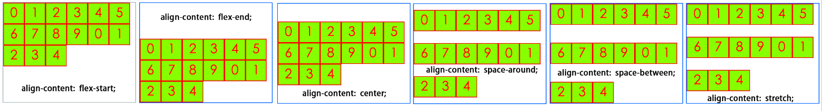
Subelement attributes
- Order: Attributes define the order of items. The smaller the number, the higher the ranking. The default is 0.
- Flex-growth: The attribute defines the magnification of the item by default of 0, i.e. if there is any space left, it will not be magnified.
- flex-shrink: The attribute defines the shrinkage ratio of the project, defaulting to 1, which means that if space is insufficient, the project will shrink.
- flex-basis: The attribute defines the spindle space occupied by the project before allocating the redundant space. Its default value is auto, which is the original size of the project.
- Flex: Attributes are short for flex-grow, flex-shrink and flex-base.
- align-self: Attributes allow individual items to be aligned differently from other items and override align-items attributes. The default value is auto, which means that the align-items attribute of the parent element is inherited, and if there is no parent element, it is equivalent to stretch.
Multiple columns
- column-count specifies the number of columns that elements should be separated
- column-fill specifies how to fill columns
- column-gap specifies the interval between columns
- Colum-rule sets abbreviated attributes for all column-rule-* attributes
- column-rule-color specifies the color of rules between columns
- column-rule-style specifies the style of rules between columns
- column-rule-width specifies the width of rules between columns
- column-span specifies the number of columns that elements should span
- column-width specifies the width of the column
- columns specifies the abbreviated properties of column-width and column-count

Example
dice
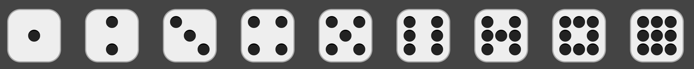
<!DOCTYPE html>
<html lang="en">
<head>
  <meta charset="UTF-8">
  <title>9 faces Dice</title>
</head>
<style>
  body{
    padding: 0;
    margin: 0;
  }
  #demo{
    display: flex;
    background-color: #444;
  }
  .dice{
    width: 90px;
    height: 90px;
    border-radius: 22px;
    margin: 20px;
    padding: 10px;
    box-sizing: border-box;
    border: 2px solid #aaa;
    background-color: #eee;

    display: flex;
    flex-direction: column;
    justify-content: space-between;
  }
  .dot{
    width: 20px;
    height: 20px;
    background-color: #222;
    border-top: 2px solid #000;
    box-sizing: border-box;
    /*box-shadow: 0px 0px 2px #000;*/
    border-radius: 20px;
  }
  .line{
    display: flex;
    justify-content: space-between;
  }

  #one{
    justify-content: center;
    align-items: center;
  }
  #two{
    align-items: center;
  }
  #three .line:nth-of-type(2){
    justify-content: center;
  }
  #three .line:nth-of-type(3){
    justify-content: flex-end;
  }
  #five .line:nth-of-type(2){
    justify-content: center;
  }
</style>
<body>
  <div id="demo">
    <div id="one" class="dice">
      <div class="line">
        <div class="dot"></div>
      </div>
    </div>
    <div id="two" class="dice">
      <div class="line">
        <div class="dot"></div>
      </div>
      <div class="line">
        <div class="dot"></div>
      </div>
    </div>
    <div id="three" class="dice">
      <div class="line">
        <div class="dot"></div>
      </div>
      <div class="line">
        <div class="dot"></div>
      </div>
      <div class="line">
        <div class="dot"></div>
      </div>
    </div>
    <div id="four" class="dice">
      <div class="line">
        <div class="dot"></div>
        <div class="dot"></div>
      </div>
      <div class="line">
        <div class="dot"></div>
        <div class="dot"></div>
      </div>
    </div>
    <div id="five" class="dice">
      <div class="line">
        <div class="dot"></div>
        <div class="dot"></div>
      </div>
      <div class="line">
        <div class="dot"></div>
      </div>
      <div class="line">
        <div class="dot"></div>
        <div class="dot"></div>
      </div>
    </div>
    <div id="six" class="dice">
      <div class="line">
        <div class="dot"></div>
        <div class="dot"></div>
      </div>
      <div class="line">
        <div class="dot"></div>
        <div class="dot"></div>
      </div>
      <div class="line">
        <div class="dot"></div>
        <div class="dot"></div>
      </div>
    </div>
    <div id="seven" class="dice">
      <div class="line">
        <div class="dot"></div>
        <div class="dot"></div>
      </div>
      <div class="line">
        <div class="dot"></div>
        <div class="dot"></div>
        <div class="dot"></div>
      </div>
      <div class="line">
        <div class="dot"></div>
        <div class="dot"></div>
      </div>
    </div>
    <div id="eight" class="dice">
      <div class="line">
        <div class="dot"></div>
        <div class="dot"></div>
        <div class="dot"></div>
      </div>
      <div class="line">
        <div class="dot"></div>
        <div class="dot"></div>
      </div>
      <div class="line">
        <div class="dot"></div>
        <div class="dot"></div>
        <div class="dot"></div>
      </div>
    </div>
    <div id="nine" class="dice">
      <div class="line">
        <div class="dot"></div>
        <div class="dot"></div>
        <div class="dot"></div>
      </div>
      <div class="line">
        <div class="dot"></div>
        <div class="dot"></div>
        <div class="dot"></div>
      </div>
      <div class="line">
        <div class="dot"></div>
        <div class="dot"></div>
        <div class="dot"></div>
      </div>
    </div>
  </div>
</body>
</html>
Waterfall flow graph
<!DOCTYPE html>
<html lang="zh-CN">
<head>
  <meta charset="UTF-8">
  <title>test</title>
  <style>
  ul{
    width: 1000px;
    margin: 0 auto;
    padding: 0;
    columns: 4;
    list-style: none;
    column-gap: 2px;
    column-fill: balance;
  }
  ul li {
    margin: 4px 0;
  }
  ul li img{
    width:240px;
  }
  </style>
</head>
<body>
<ul>
  <li><img src="img/1.jpeg" alt=""></li>
  <li><img src="img/2.jpeg" alt=""></li>
  <li><img src="img/3.jpeg" alt=""></li>
  <li><img src="img/4.jpeg" alt=""></li>
  <li><img src="img/5.jpeg" alt=""></li>
  <li><img src="img/6.jpeg" alt=""></li>
  <li><img src="img/7.jpeg" alt=""></li>
  <li><img src="img/8.jpeg" alt=""></li>
  <li><img src="img/9.jpeg" alt=""></li>
  <li><img src="img/10.jpeg" alt=""></li>
  <li><img src="img/11.jpeg" alt=""></li>
  <li><img src="img/12.jpeg" alt=""></li>
  <li><img src="img/13.jpeg" alt=""></li>
  <li><img src="img/14.jpeg" alt=""></li>
  <li><img src="img/15.jpeg" alt=""></li>
</ul>
</body>
</html>
grid

<!DOCTYPE html>
<html lang="zh-CN">
<head>
  <meta charset="UTF-8">
  <title>test</title>
  <style>
  #grid-demo{
    width: 1000px;
    margin: 0 auto;
  }
  .grid{
    display: flex;
    margin: 20px 0;
    height: 60px;
  }
  .grid .grid-item{
    flex-grow: 1;
    background-color: #eee;
    height: 60px;
    line-height: 60px;
    font-size: 26px;
    width: 5%;
    text-align: center;
    margin: 0 10px;
  }
  .grid .col-10{
    flex-basis: 83.3333%
  }
  .grid .col-8{
    flex-basis: 66.6666%;
  }
  .grid .col-6{
    flex-basis: 50%;
  }
  .grid .col-4{
    flex-basis: 33.3333%;
  }
  .grid .col-3{
    flex-basis: 25%;
  }
  .grid .col-2{
    flex-basis: 16.6667%;
  }
  </style>
</head>
  <body>
  <div id="grid-demo">
    <div class="grid">
      <div class="grid-item">1</div>
      <div class="grid-item">1</div>
      <div class="grid-item">1</div>
      <div class="grid-item">1</div>
      <div class="grid-item">1</div>
      <div class="grid-item">1</div>
      <div class="grid-item">1</div>
      <div class="grid-item">1</div>
      <div class="grid-item">1</div>
      <div class="grid-item">1</div>
      <div class="grid-item">1</div>
      <div class="grid-item">1</div>
    </div>
    <div class="grid">
      <div class="grid-item">2</div>
      <div class="grid-item">2</div>
      <div class="grid-item">2</div>
      <div class="grid-item">2</div>
      <div class="grid-item">2</div>
      <div class="grid-item">2</div>
    </div>
    <div class="grid">
      <div class="grid-item">3</div>
      <div class="grid-item">3</div>
      <div class="grid-item">3</div>
      <div class="grid-item">3</div>
    </div>
    <div class="grid">
      <div class="grid-item">4</div>
      <div class="grid-item">4</div>
      <div class="grid-item">4</div>
    </div>
    <div class="grid">
      <div class="grid-item">6</div>
      <div class="grid-item">6</div>
    </div>
    <div class="grid">
      <div class="grid-item col-8">8</div>
      <div class="grid-item col-4">4</div>
    </div>
    <div class="grid">
      <div class="grid-item">12</div>
    </div>
  </div>
</body>
</html>
Fixed bottom bar

<!DOCTYPE html>
<html lang="zh-CN">
<head>
  <meta charset="UTF-8">
  <title>test</title>
  <style>
  body{
    margin: 0;
    padding: 0;
  }
  #demo{
    display: flex;
    flex-direction: column;
    min-height: 100vh;
  }
  header, footer{
    height: 100px;
    background-color: darkblue;
    color: white;
    text-align: center;
    line-height: 100px;
  }
  .flex-body{
    flex-grow: 1;
  }
  </style>
</head>
<body>
  <div id="demo">
    <header>I am header!</header>
    <div class="flex-body">I am body!</div>
    <footer>I am footer!</footer>
  </div>
</body>
</html>