Code download address:
http://www.demodashi.com/demo/12482.html
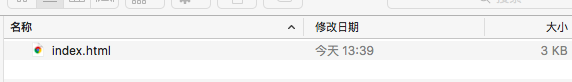
Screenshot of project file structure
Only one html file is needed:
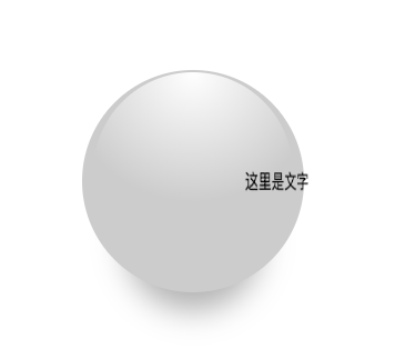
Project screenshot:
Code implementation principle:
The implementation process of this example is very simple, mainly using CSS3 perspective, 3D rotation, displacement, gradient, shadow, which can be said to be a relatively comprehensive exercise.
HTML section:
<div class="wrapper">
    <div class="ball"></div>
    <div class="stage">
        <div class="text">
            //Here is the text
        </div>
    </div>
</div>
CSS section:
CSS property usage used:
stage:
* {
    margin: 0;
    padding: 0;
}
.wrapper {
    width: 400px;
    height: 400px;
    margin: 200px;
    perspective: 800px;
    perspective-origin: 50% 50%;
    position: relative;
}
.stage {
    transform-style: preserve-3d;
    position: absolute;
    top: 50%;
    left: 50%;
    transform: translate3d(-50%, -50%, 0);
}
Sphere:
.ball {
    width: 200px;
    height: 200px;
    border-radius: 50%;
    background-color: #ccc;
    position: absolute;
    top: 50%;
    left: 50%;
    transform: translate3d(-50%, -50%, 0);
    box-shadow: 0px 55px 45px -38px rgba(0, 0, 0, .3);
}
.ball::before {
    content: "";
    position: absolute;
    top: 1%;
    left: 5%;
    width: 90%;
    height: 90%;
    border-radius: 50%;
    background: -webkit-radial-gradient(50% 0px, circle, #ffffff, rgba(255, 255, 255, 0) 58%);
    z-index: 2;
}
written words:
.text {
    width: 100px;
    height: 50px;
    line-height: 50px;
    text-align: center;
    white-space: nowrap;
    animation: rotate 5s linear infinite;
    backface-visibility: hidden;
}
Text animation:
@keyframes rotate {
    from {
        transform: rotateY(0deg) translateZ(100px);
    }
    to {
        transform: rotateY(360deg) translateZ(100px);
    }
}
Effect preview
Effect address: rotate-text-around-the-ball
Note: the copyright of this article belongs to the author and is publicized by the demo master. Please indicate the source for reprint http://www.demodashi.com/demo/12482.html