Vertical centering has always been a troublesome place, where you can share the methods you know
1. method 1
Set the display of the table to table code and the effect is as follows
//Part css
.table {
            display: table;
            vertical-align: middle;
            position: absolute;
            width: 100%;
            height: 100%;
            background: pink;
        }

        .cell {
            display: table-cell;
            vertical-align: middle;
        }
        .content {
            width: 100%;
            height: 100px;
            background: red;
            text-align:center;
            line-height: 100px;
            font-size: 80px;
            color: white;
        }
//
Defect: invalid under ie, need to nest label
Advantage: content dynamically changes the height without setting
2. method two
Use position: absolute to implement with top and marginop
        .container {
            position: absolute;
            display: table;
            width: 100%;
            height: 100%;
            background: lightgreen;
        }

        .box {
            position: absolute;
            top: 50%;
            width: 100%;
            height: 100px;
            margin-top: -50px;
            /* The height is the general height of the box */
            background: lightpink;
        }

        .content {
            width: 100%;
            height: 100px;
            text-align: center;
            line-height: 100px;
            font-size: 80px;
            color: white;
        }
Defect: content disappears when there is not enough height
A little bit: no nesting required, applicable to all browsing
3. method three
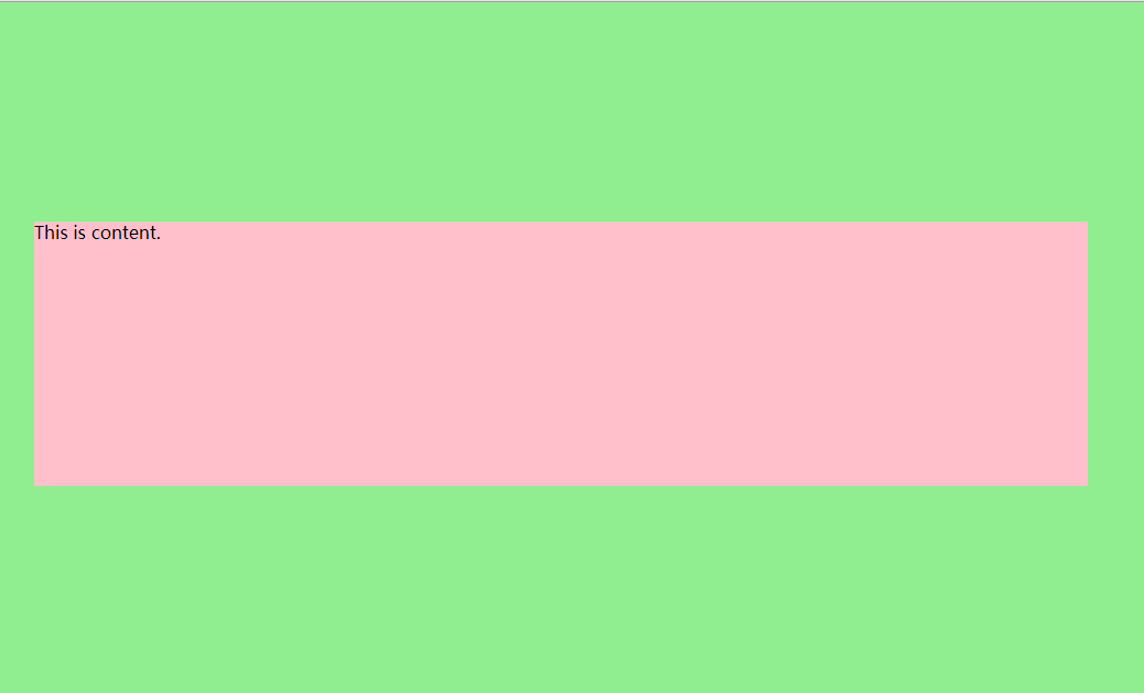
Use absolute and left0, margin: auto to directly realize vertical center
        .container {
            position: absolute;
            width: 100%;
            height: 100%;
            background: lightgreen;
        }

        .box{
            position: absolute;
            top:0;
            bottom:0;
            left:0;
            right:0;
            margin: auto;
            height: 240px;
            width: 70%;
            background: pink;
} 
Defect: ie is invalid (it's hard to be miserable), space is not enough and content is cut off..
A little: simple and rough!
4. method four
        .container {
            position: absolute;
            width: 100%;
            height: 100%;
            background: lightgreen;
        }

        .box {
            width: 50%;
            height: 40%;
            margin-top: 15%;
            /*=container Half the height of the box is subtracted and divided by two  */
            background: pink;
        }
Defect: trouble, not necessarily complete
Advantages: simple
Maybe it's just a few ways. I'm not very interested in layout. After all, I think it's more important to write logic
There are too many ways to implement layout