Today, we develop a VUE project to achieve a UI effect. It feels good. Record it. Look at the effect map first.
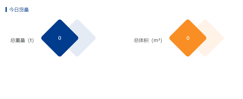
First of all, when I first saw the layout, I felt that it should be possible to rotate 45deg with a p tag, but after the rotation, the text also rotated. This problem is unacceptable; then div nests a span and P tag, P tag is prismatic, span tag is the input inside, set absolute positioning, and then achieve perfectly in the middle. Then, the shadow part is set, which was supposed to be implemented with a label. Later, the box-shadow attribute in css3 is found.
Upper code
 <div class="bottom-right">
        <div class="col-title">Volume today</div>
        <div style="display:flex;flex-direction:row">
          <div class="left-weight">
            <span>Total weight ( t)</span>
            <div>
              <p></p>
              <span>{{data.totalWeight||0}}</span>
            </div>
          </div>

          <div class="right-bulk">
            <span>Total volume ( m³)</span>
            <div>
              <p></p>
              <span>{{data.totalBulk||0}}</span>
            </div>
          </div>
        </div>
      </div>
scss implementation style
.base-flex {
  width: 100%;
  display: flex;
  flex-direction: row;
  padding: 16px;
  flex: 1;
}

.weight-div {
  display: flex;
  flex-direction: row;
  flex: 1;
  margin-top: 40px;
  align-items: center;
}
.weight-div-div {
  position: relative;
  margin-left: 30px;
}

.weight-div-div-p {
  width: 90px;
  height: 90px;
  background-color: #003c8d;
  transform: rotate(45deg);
  -ms-transform: rotate(45deg); /* Internet Explorer */
  -moz-transform: rotate(45deg); /* Firefox */
  -webkit-transform: rotate(45deg); /* Safari And Chrome */
  -o-transform: rotate(45deg);
  border-radius: 8px;
  box-shadow: 40px -40px 1px #e4ebf4;
}

.weight-div-div-span {
  height: 90px;
  width: 90px;
  font-size: 16px;
  font-family: PingFangSC;
  font-weight: 400;
  color: rgba(65, 68, 69, 1);
  line-height: 90px;
  position: absolute;
  top: 0;
  left: 0;
  color: white;
  display: inline-block;
  text-align: center;
}

.weight-div-span {
  font-size: 16px;
  font-family: PingFangSC;
  font-weight: 400;
  color: rgba(65, 68, 69, 1);
}


 .bottom-right {
    @extend .base-flex;
    flex-direction: column;
    .left-weight {
      @extend .weight-div;

      div {
        @extend .weight-div-div;

        p {
          @extend .weight-div-div-p;
        }

        span {
          @extend .weight-div-div-span;
        }
      }

      span {
        @extend .weight-div-span;
      }
    }

    .right-bulk {
      @extend .weight-div;

      div {
        @extend .weight-div-div;

        p {
          @extend .weight-div-div-p;
          background-color: #f98f24;
          box-shadow: 40px -40px 1px #fff3e8;
        }

        span {
          @extend .weight-div-div-span;
        }
      }

      span {
        @extend .weight-div-span;
      }
    }
  }