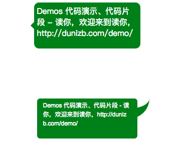
Message bubble styles are often required in front-end page development, such as:
In fact, the above two effects are not complicated, so let's fight for them.
1. Build message boxes
The body of the message box is simple, a div, set the background color, border-radius, and so on:
.message1,.message2 {
width: 200px;
height: 80px;
margin: 100px auto;
background-color: green;
border-bottom-color:green;/*For automatic inheritance of after pseudo elements*/
color: #fff;
font-size: 12px;
font-family: Arial;
line-height: 18px;
padding: 5px 12px 5px 12px;
box-sizing: border-box;
border-radius: 6px;
position: relative;
word-break: break-all;
}
<body>
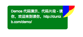
<div class="message1">
Demos Code demos, snippets - Read you, welcome to read you, http://dunizb.com/demo/
</div>
<div class="message2">
Demos Code demos, snippets - Read you, welcome to read you, http://dunizb.com/demo/
</div>
</body>

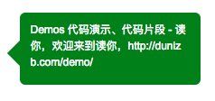
2 Triangle Arrow
Next, let's implement the first message bubble style in Figure 1, which is relatively simple: just insert an element before the body of the message box, rotate it 45 degrees, and insert another element before the existing one preferred before before
.message1::before {
  content: '';
  width: 20px;
  height: 20px;
  background-color: inherit;
  left: -10px; /*Extend half the width of the arrow box to the left outside*/
  position: absolute;
  transform: rotate(45deg); /*Rotate 45 degrees*/
  top:50%; /*Arrow centered in numeric direction*/
  margin-top: -5px;
}
3 Arc Arrow
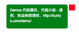
Arc arrow, slightly more complex.Since the radian part is involved, consider using border.First, we implement a rectangular box attached to the right of the message box by after:
.message2::after {
  content: '';
  position: absolute;
  width: 20px;
  height: 20px;
  right: -24px;
  top: 0px;
  background-color: red; /*For display purposes*/
} 
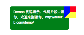
As mentioned earlier, what we really need is a border for the arc effect, so borders must be set here, but not in all directions, just the bottom and left:
.message2::after {
    content: '';
    position: absolute;
    width: 20px;
    height: 20px;
    right: -24px;
    top: 0px;
    background-color: red;
    border-width: 0 0 20px 20px;
    border-style: solid;
    border-left-color: blue;
    border-bottom-color: yellow;
} 
Next add the lower right radian:
.message2::after {
  ...
  border-bottom-right-radius: 60px;
} 
Now you can see that the basic form has come out and the next step is to reset the color.
.message2::after {
  content: '';
  position: absolute;
  width: 20px;
  height: 20px;
  right: -24px;
  top: 0px;
  border-width: 0 0 20px 20px;
  border-style: solid;
  border-left-color: transparent;
  border-bottom-color:inherit;
  border-bottom-right-radius: 60px;
} 
Be accomplished!