I happened to see such a problem in a thought, How to make part of a div transparent and other parts blurred? Finally, the effect is as follows
Furthermore, it can also realize the hollowing effect of any shape
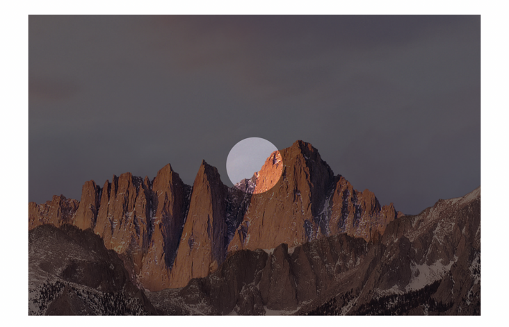
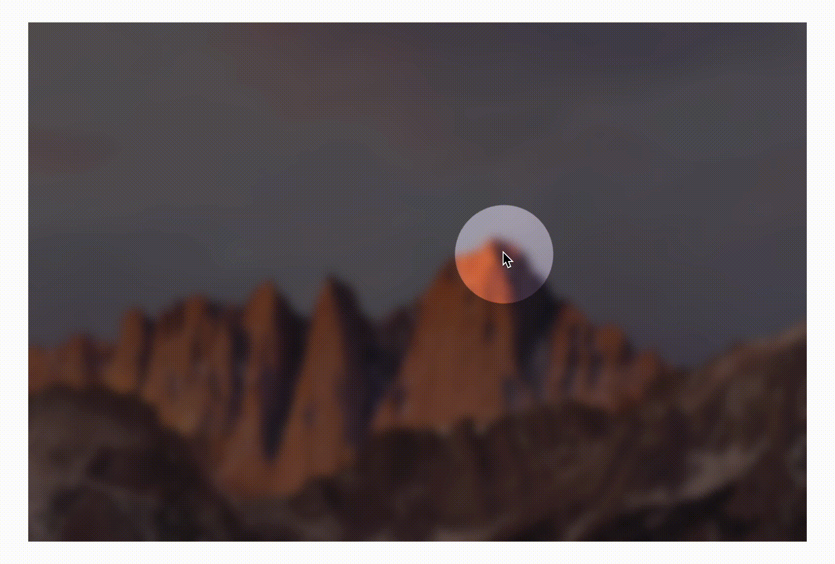
The place where the mouse passes is clearly visible, and other places are blurred.
It may be impossible to start at the beginning. Don't worry. You can start with simple and similar effects, try step by step, and have a look together.
1, Normal translucent effect
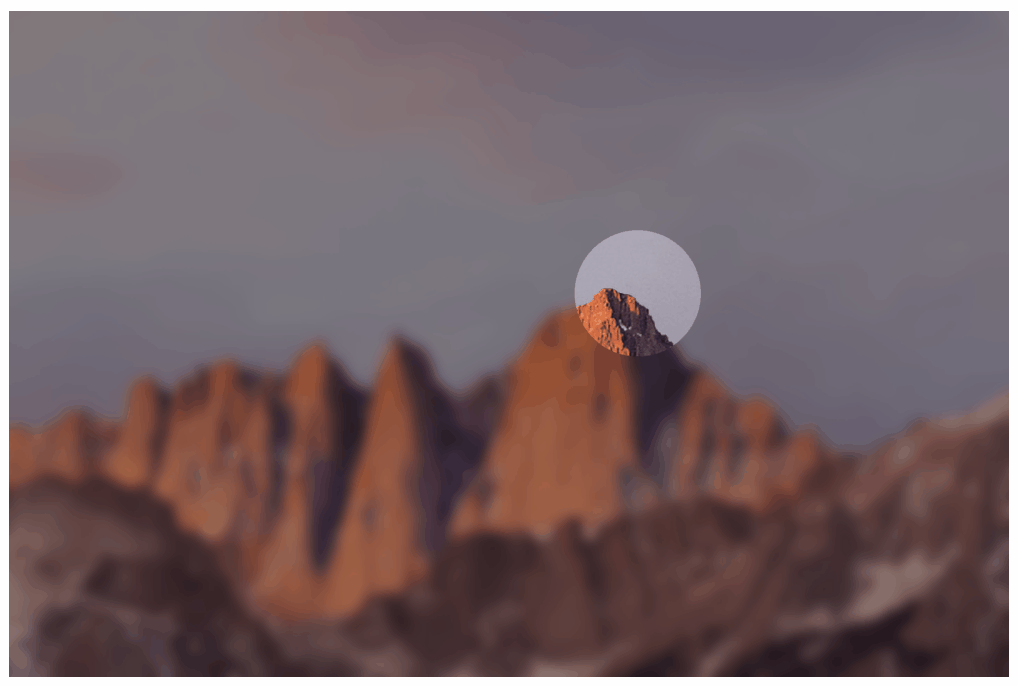
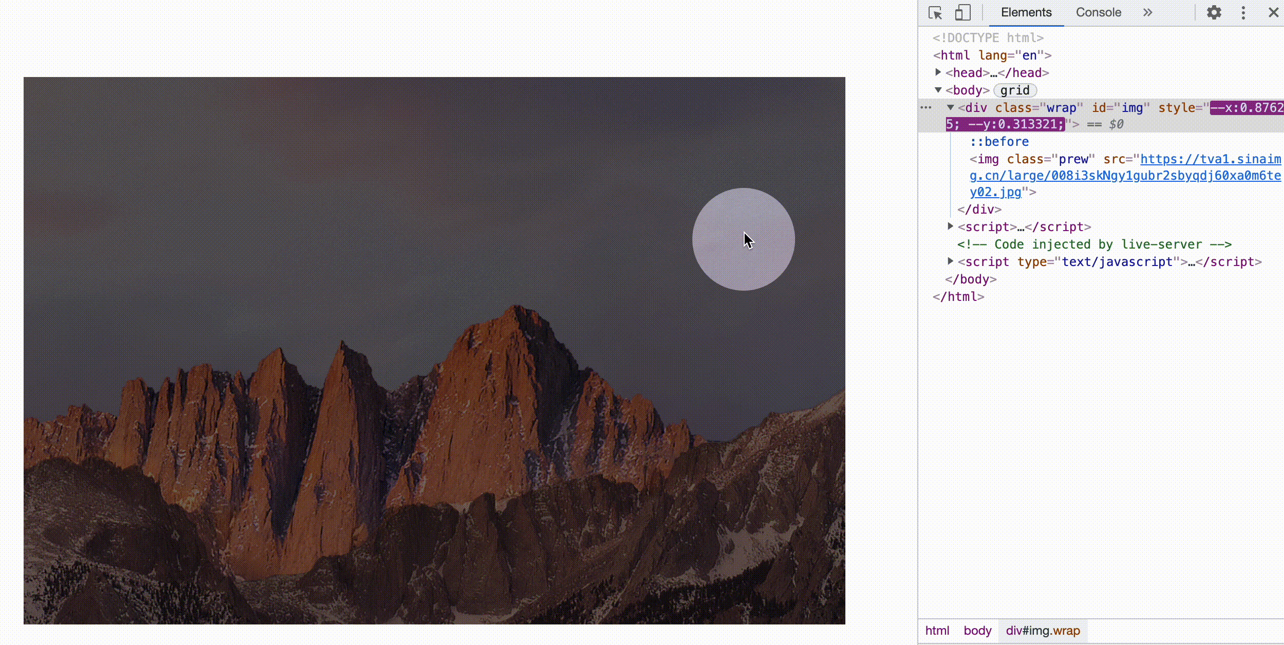
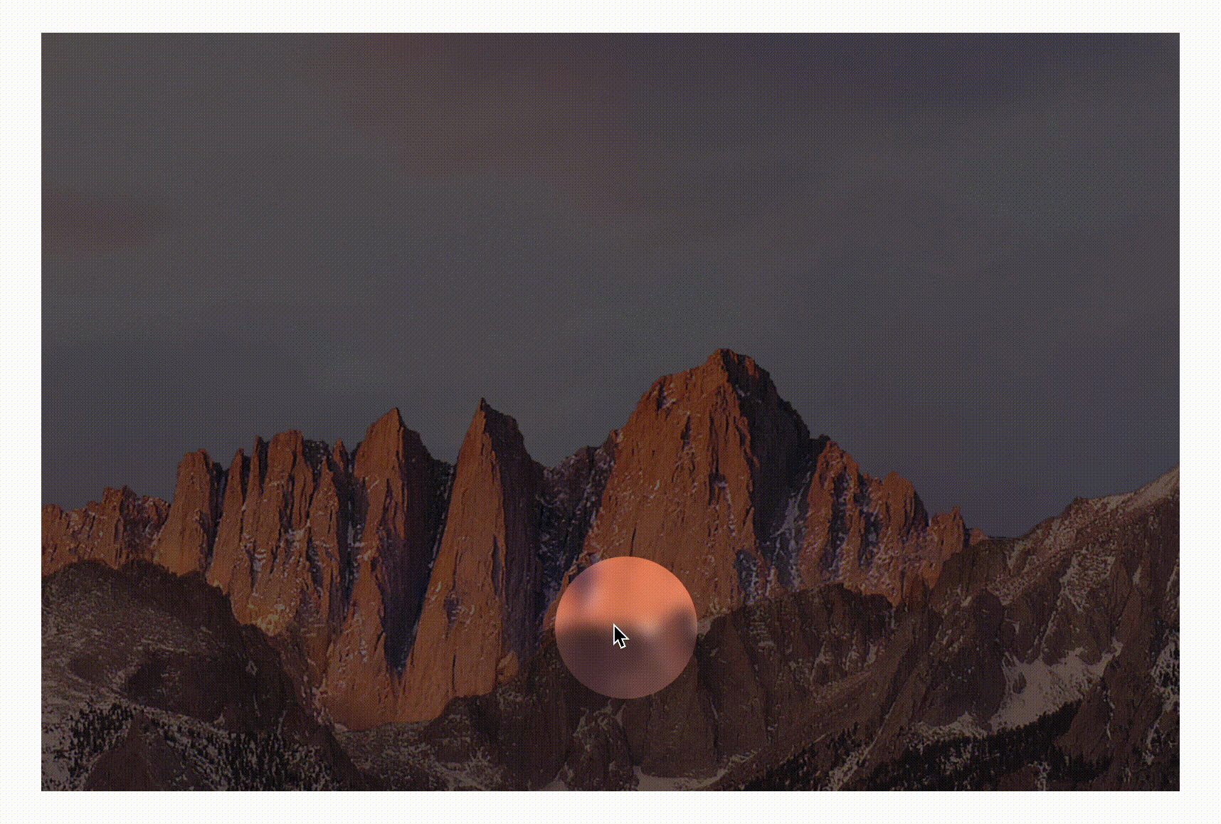
For example, the translucent effect may be encountered more often during development, which is a bit similar to a searchlight (the place outside the mouse is a translucent mask, which looks darker). As follows:
Let's start with this effect. Suppose there is such a layout:
<div class="wrap" id="img">
    <img class="prew" src="https://tva1.sinaimg.cn/large/008i3skNgy1gubr2sbyqdj60xa0m6tey02.jpg">
</div>
So how to draw a hollow circle? First introduce a method
In fact, it's very simple. You only need a large enough projection. The principle is as follows
The pseudo element:: before can be used to draw here, and the structure is more concise. Code implementation is
.wrap::before{
  content:'';
  position: absolute;
  width: 100px;
  height: 100px;
  border-radius: 50%;
  left: 50%;
  top: 50%;
  transform: translate(-50%,-50%); /*Default Center*/
  box-shadow: 0 0 0 999vw rgba(0, 0, 0, .5); /*Large enough projection*/
}
This effect can be obtained
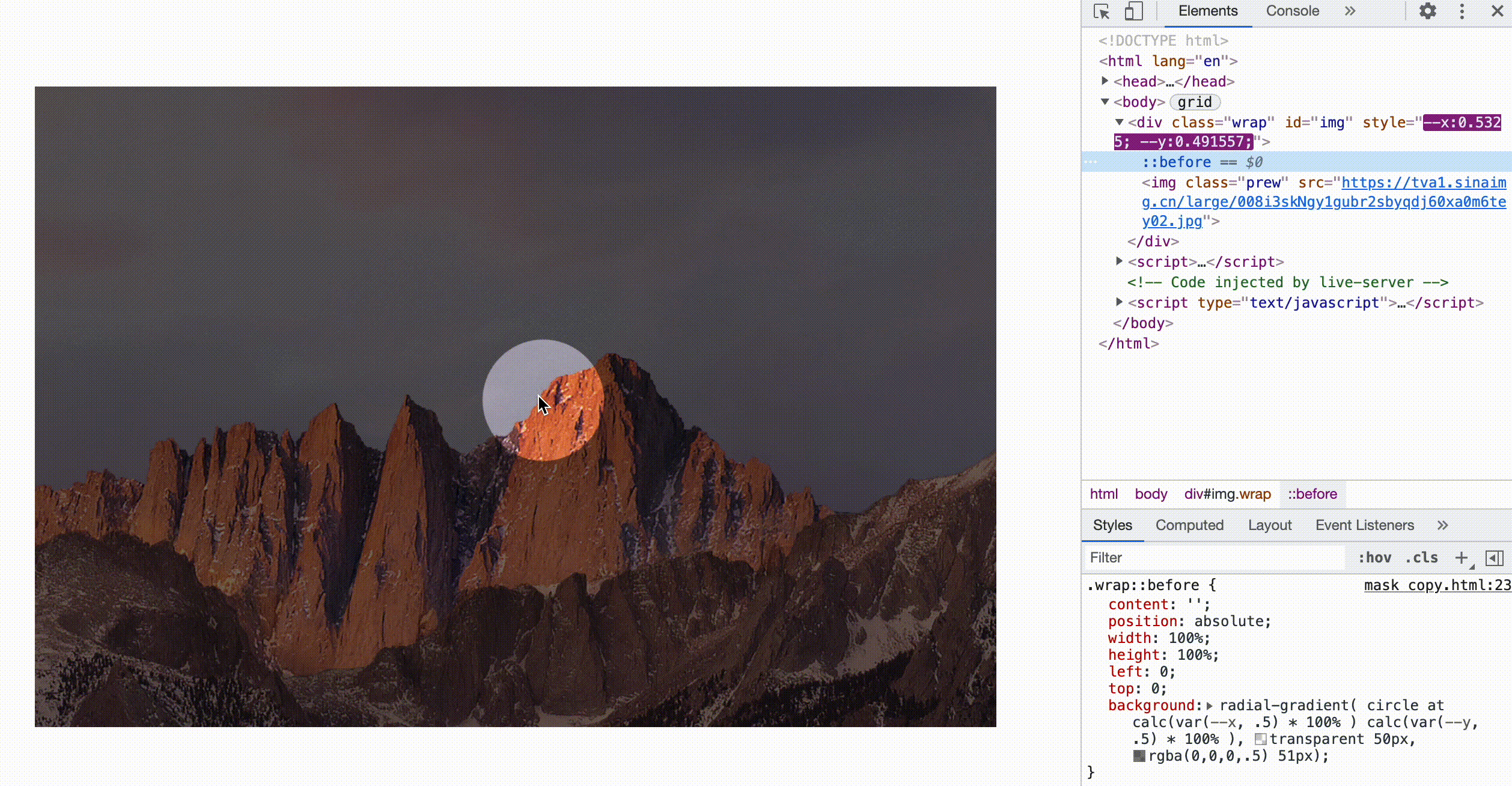
2, Passing mouse position with CSS variables
According to past experience, you may directly modify the style attribute of an element in js, like this
img.addEventListener('mousemove', (ev) => {
    img.style.left = '...';
    img.style.top = '...';
})
However, such interaction is mixed with business logic, which is not conducive to later maintenance. In fact, we only need the coordinates of the mouse, and we can fully realize the following effect in CSS.
With the help of CSS variables, everything will be easy to do! Assuming that the coordinates of the mouse are [-- X, - y] (the range is [0,1]), the coordinates of the mask can be calculated using calc
.wrap::before{
  left: calc(var(--x) * 100%);
  top: calc(var(--y) * 100%);
}
Then, the acquisition of mouse coordinates can be calculated using JS, which is also relatively easy, as shown below
img.addEventListener('mousemove', (ev) => {
    img.style.setProperty('--x', ev.offsetX / ev.target.offsetWidth);
    img.style.setProperty('--y', ev.offsetY / ev.target.offsetHeight);
})
In this way, the hollowing effect of translucent effect is completed
The complete code can be accessed: backdrop-shadow (codepen.io)
3, Gradients can also achieve translucent effects
In addition to the above shadow extension, CSS radial gradient can also achieve this effect
Draw a gradient from transparent to translucent, as follows
.wrap::before{
    content: '';
    position: absolute;
    width: 100%;
    height: 100%;
    left: 0;
    top: 0;
    background: radial-gradient( circle at center, transparent 50px, rgba(0,0,0,.5) 51px);
}
This effect can be obtained
Then, map the mouse coordinates. From here, we can see the benefits of CSS variables. There is no need to modify JS, just modify the position of the gradient center point in CSS
.wrap::before{
  background: radial-gradient( circle at calc(var(--x) * 100% )  calc(var(--y) * 100% ), transparent 50px, rgba(0,0,0,.5) 51px);
}
4, Try the effect of background blur
CSS has an attribute specific to the background (the area behind the element): backdrop-filter . The use method is exactly the same as that of filter!
backdrop-filter: blur(10px);
The following is a schematic effect in MDN
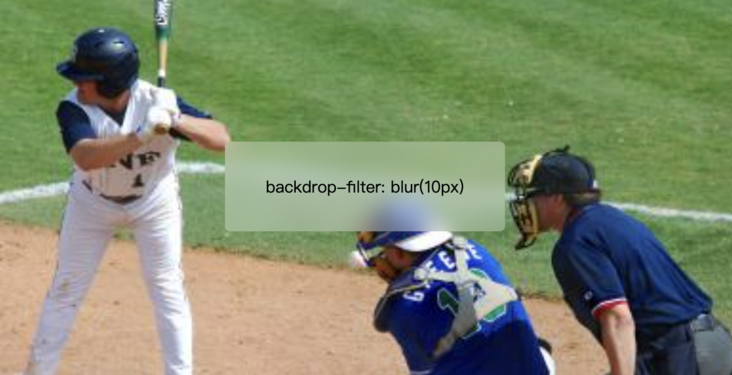
The backdrop filter blurs the content behind the area where the current element is located. To see the effect, the element itself needs to be translucent or completely transparent; The filter is to blur the current element itself. If you are interested, you can view this article: Introduction to CSS backdrop filter and apple iOS ground glass effect « Zhang Xinxu - Xin space - Xin life (zhangxinxu.com)
It should be noted that this blur has nothing to do with the semi transparency of the background. Even if the element itself is transparent, it will still have an effect. For example, the following is the effect after removing the background. The whole block is blurred
What if it were applied directly to the above example?
1. Shadow implementation
In the first example above, add a backdrop filter
.wrap::before{
  content:'';
  position: absolute;
  width: 100px;
  height: 100px;
  border-radius: 50%;
  left: 50%;
  top: 50%;
  transform: translate(-50%,-50%); /*Default Center*/
  box-shadow: 0 0 0 999vw rgba(0, 0, 0, .5); /*Large enough projection*/
  backdrop-filter: blur(5px)
}
The results are as follows
You can see that the circular area is blurred, just opposite to the desired effect. In fact, it's easy to understand that only the circular area is the real structure, and there are shadows outside, so the final scope of action is only the circular part
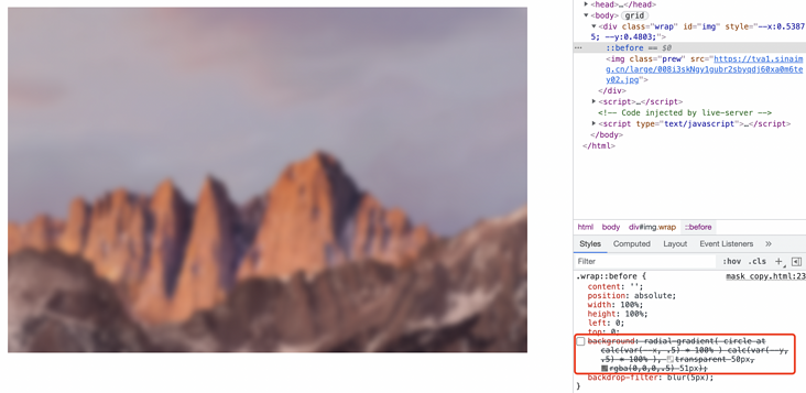
2. Gradient implementation
Now add a backdrop filter in the second example
.wrap::before{
    content: '';
    position: absolute;
    width: 100%;
    height: 100%;
    left: 0;
    top: 0;
    background: radial-gradient( circle at calc(var(--x) * 100% )  calc(var(--y) * 100% ), transparent 50px, rgba(0,0,0,.5) 51px);
      backdrop-filter: blur(5px)
}
The effect is as follows
It's all blurred, but it's darker outside the circular area. Because the size of:: before occupies the whole container, the whole back becomes blurred. The dark outside of the circle is due to the influence of translucent gradient.
In short, it still can not meet our needs, and we need to find new solutions.
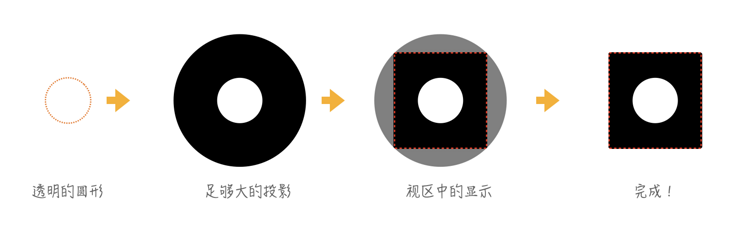
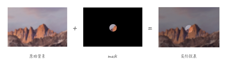
5, CSS MASK implementation hollowed out
Rather than making the circular area not blurred, it is better to hollow out the area. It's like a whole piece of frosted glass before, and then punch a round hole through CSS MASK, so that you can see the back clearly through the round hole.
The second example can be slightly modified to draw a transparent circle through radial gradient, and the rest is a solid color mask layer, as shown below
Code implementation is
.wrap::before{
    content: '';
    position: absolute;
    width: 100%;
    height: 100%;
    left: 0;
    top: 0;
    -webkit-mask: radial-gradient( circle at calc(var(--x, .5) * 100% )  calc(var(--y, .5) * 100% ), transparent 50px, #000 51px);
      background: rgba(0,0,0,.3);
      backdrop-filter: blur(5px)
}
This achieves the effect of the beginning of the article
The complete code can be viewed: backdrop-mask (codepen.io)
6, CSS MASK COMPOSITE enables richer hollowing out effects
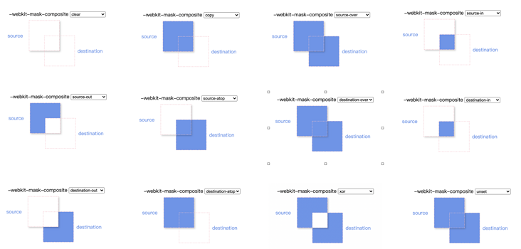
In addition to painting mask layers with radial gradients, you can also use CSS MASK COMPOSITE To achieve. The standard key values are as follows (supported by firefox):
/* Keyword values */
mask-composite: add; /* Overlay (default) */
mask-composite: subtract; /* Subtract and exclude the upper area */
mask-composite: intersect; /* Intersect, showing only where they overlap */
mask-composite: exclude; /* Exclude, display only non coincident places */
What does mask composition mean? It can be compared with shape synthesis in photoshop, which is almost one-to-one correspondence
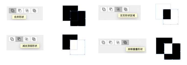
-webkit-mask-composite Different from the standard values, there are many attribute values, as follows (supported by chorme and safari)
-webkit-mask-composite: clear; /*Clear, no masks are displayed*/
-webkit-mask-composite: copy; /*Show only the upper mask, not the lower mask*/
-webkit-mask-composite: source-over;
-webkit-mask-composite: source-in; /*Show only coincident places*/
-webkit-mask-composite: source-out; /*Only the upper mask is displayed, and the overlapping places are not displayed*/
-webkit-mask-composite: source-atop;
-webkit-mask-composite: destination-over;
-webkit-mask-composite: destination-in; /*Show only coincident places*/
-webkit-mask-composite: destination-out;/*Only the lower mask is displayed, and the overlapping places are not displayed*/
-webkit-mask-composite: destination-atop;
-webkit-mask-composite: xor; /*Show only non coincident places*/
Do you look confused? Here is a corresponding rendering. If you are not proficient, you know that there is such a function when using it, and then look for it
Back here, you can draw a whole background and a circular background, and then punch a hole through mask composite: exclude. The implementation is as follows
.wrap::before{
    content: '';
    position: absolute;
    width: 100%;
    height: 100%;
    left: 0;
    top: 0;
    -webkit-mask: url("data:image/svg+xml,%3Csvg width='50' height='50' viewBox='0 0 50 50' fill='none' xmlns='http://www.w3.org/2000/svg'%3E%3Ccircle cx='25' cy='25' r='25' fill='%23C4C4C4'/%3E%3C/svg%3E"), linear-gradient(red, red);
      -webkit-mask-size: 50px, 100%;
      -webkit-mask-repeat: no-repeat;
      -webkit-mask-position: calc(var(--x, .5) * 100% + var(--x, .5) * 100px - 50px )  calc(var(--y, .5) * 100% + var(--y, .5) * 100px - 50px ), 0;
      -webkit-mask-composite: xor;   /*Only non coincident places are displayed, which is supported by chorem and safari*/
      mask-composite: exclude; /* Exclude and display only the non coincident places. firefox supports */
      background: rgba(0,0,0,.3);
      backdrop-filter: blur(5px)
}
You should pay attention to the calculation in - WebKit mask position, which can also achieve this effect
The complete code can be viewed: backdrop-mask-composite (codepen.io)
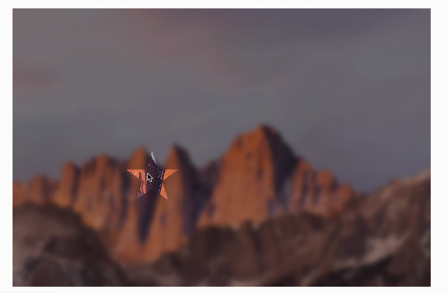
You may have found that the circle in the above example is drawn by svg and mask synthesis is used, which seems more cumbersome. In fact, this is a more versatile solution that can bring unlimited possibilities. For example, I need a star ⭐ The hollowing out effect is very simple. First draw one through a drawing software

Then escape this svg code. It is recommended to use Mr. Zhang Xinxu's SVG online compression merge tool

Just replace it with the example just now
.wrap::before{
    content: '';
    position: absolute;
    width: 100%;
    height: 100%;
    left: 0;
    top: 0;
    -webkit-mask: url("data:image/svg+xml,%3Csvg width='96' height='91' viewBox='0 0 96 91' fill='none' xmlns='http://www.w3.org/2000/svg'%3E%3Cpath d='M48 0l11.226 34.55h36.327l-29.39 21.352L77.39 90.45 48 69.098 18.61 90.451 29.837 55.9.447 34.55h36.327L48 0z' fill='%23C4C4C4'/%3E%3C/svg%3E"), linear-gradient(red, red);
      -webkit-mask-size: 50px, 100%;
      -webkit-mask-repeat: no-repeat;
      -webkit-mask-position: calc(var(--x, .5) * 100% + var(--x, .5) * 100px - 50px )  calc(var(--y, .5) * 100% + var(--y, .5) * 100px - 50px ), 0;
      -webkit-mask-composite: xor;   /*Only non coincident places are displayed, which is supported by chorem and safari*/
      mask-composite: exclude; /* Exclude and display only the non coincident places. firefox supports */
      background: rgba(0,0,0,.3);
      backdrop-filter: blur(5px)
}
The effect of star hollowing is as follows
The complete code can be viewed: backdrop-star (codepen.io)
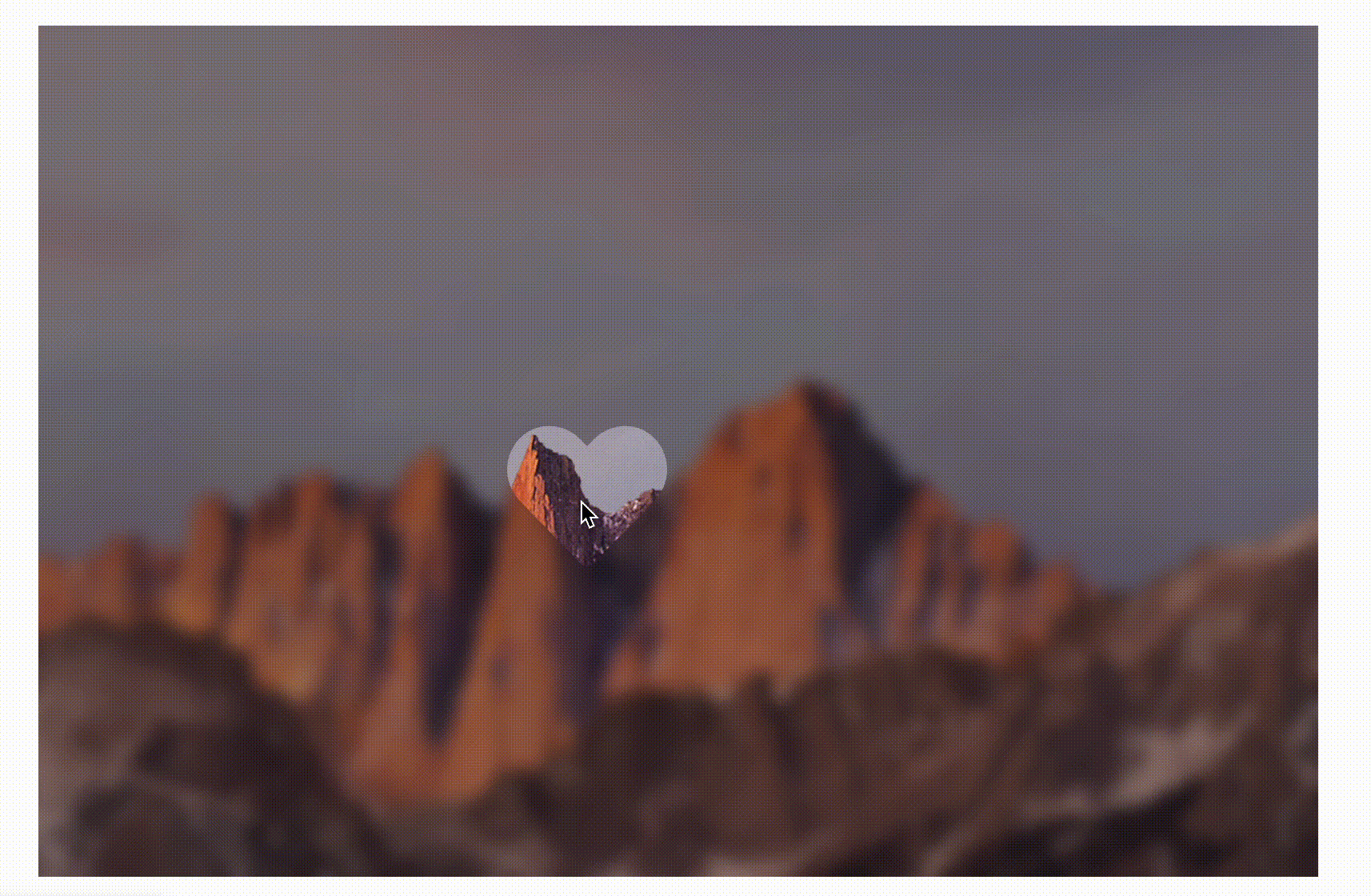
Another example is a heart ❤, The results are as follows
The complete code can be viewed: backdrop-heart (codepen.io)
Only unexpected, not impossible
7, Summary and description
The above realizes the effect of a mouse following the hollowed out, from simple to complex, from single to universal. Although a little JS is used, it is only the role of "tool man", and the interaction logic is completed by CSS. The following is a summary:
- Large enough shadow is a small skill to achieve circular hollowing effect
- CSS gradient can also easily draw a circular hollow background
- With CSS variables, you can easily use the mouse position to achieve the desired effect
- The backdrop filter can be imagined as a function of frosted glass
- CSS Mask can punch holes in frosted glass to achieve the effect of hollowing out
- With the help of mask synthesis and SVG, the hollowing effect of arbitrary shape can be realized
CSS MASK is still very powerful. It is necessary to master it more. Finally, if you think it's good and helpful to you, you're welcome to like, collect and forward ❤❤❤