For a hover transition animation, it should be from:
Normal state - > hover state - > normal state (three steps, two states)
Therefore, there must be a way to make the entry and exit of hover animation have two different effects, which can be realized:
State 1 - > hover state - > state 2 (three steps, three states)
html:
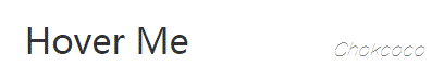
<div>Hover Me</div>
css:
body {
    padding: 50px;
}

div {
    position: absolute;
    width: 200px;
    height: 60px;
    line-height: 60px;
    font-size: 32px;
    cursor: pointer;
    color: #333;
    text-align: center;
    margin: 20px;
    top: 50%;
    left: 50%;
    transform: translate(-50%, -50%);
    transition: color .5s;
}

div::before {
    content: "";
    position: absolute;
    left: 0;
    bottom: 0;
    width: 0;
    height: 4px;
    background: blue;
    z-index: -1;
    transition: width .5s;
}

div:hover::before {
    width: 200px;
}
Design sketch: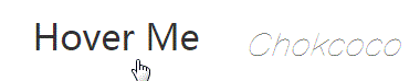
The CSS function scale() is used to modify the size of an element. You can zoom in or out of an element by scaling values defined in vector form, and you can set different scaling values in different directions.
body {
    padding: 50px;
}

div {
    position: absolute;
    width: 200px;
    height: 60px;
    line-height: 60px;
    font-size: 32px;
    cursor: pointer;
    color: #333;
    text-align: center;
    transition: color .5s;
    margin: 20px;
    top: 50%;
    left: 50%;
    transform: translate(-50%, -50%);
}

div::before {
    content: "";
    position: absolute;
    left: 0%;
    bottom: 0;
    width: 200px;
    transform: scaleX(0);
    height: 2px;
    background: deeppink;
    z-index: -1;
    transition: all .5s;
}

div:hover::before {
    transform: scaleX(1);
}
transform: scale() with transform origin, we can start to change the initial and end state of animation at will. Apply them to other effects, such as simple schematic effects: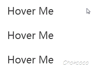
html:
<div>Hover Me</div>

<div class="two">Hover Me</div>

<div class="three">Hover Me</div>
css:
body {
    padding: 30px;
}

div {
    position: relative;
    width: 200px;
    height: 60px;
    line-height: 60px;
    font-size: 32px;
    cursor: pointer;
    color: #333;
    text-align: center;
    transition: color .5s;
    margin: 10px;
}

div::before {
    content: "";
    position: absolute;
    left: 0;
    width: 200px;
    height: 60px;
    background: deeppink;
    z-index: -1;
    transform: scale3d(0, 1, 1);
    transform-origin: 100% 50%;
    transition: transform .5s;
}

div:hover {
    color: #fff;

    &::before {
        transform: scale3d(1, 1, 1);
        transform-origin: 0% 50%;
        transition-timing-function: ease-in;
    }
}


.two::before {
    transform: scale3d(0, 0, 1);
    transform-origin: 100% 100%;
}

.two:hover {
    color: #fff;

    &::before {
        transform: scale3d(1, 1, 1);
        transform-origin: 0% 0%;
    }
}

.three::before {
    transform: scale3d(0, 0, 1);
    transform-origin: 50% 100%;
}

.three:hover {
    color: #fff;

    &::before {
        transform: scale3d(1, 1, 1);
        transform-origin: 50% 0%;
    }
}
Reference website: https://codepen.io/Chokcoco/pen/ELxmwE