1. Role of CSS
View the following code
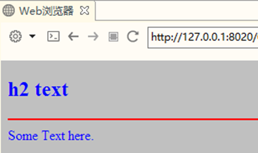
If you use attributes in HTML tags to define styles, each element has different attribute definitions for styles!
<body bgcolor="silver" text="bule">
 <h2>h2 text</h2>
 <hr color="red"/>
 Some Text here.
</body>
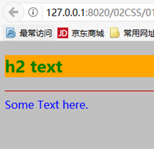
<style type="text/css">
	body{
		background-color: silver;
		color: blue;
	}
	h2{
		background-color: orange;
		color: green;
	}
	hr{
		color:red;
	}
</style>
</head>
<body>
	<h2>h2 text</h2>
	 <hr/>
	 Some Text here.
</body>
2. What is
CSS(CSS Cascading Style Sheets): cascading style sheets, also known as cascading style sheets, or style sheets for short
Style definitions for elements in HTML documents
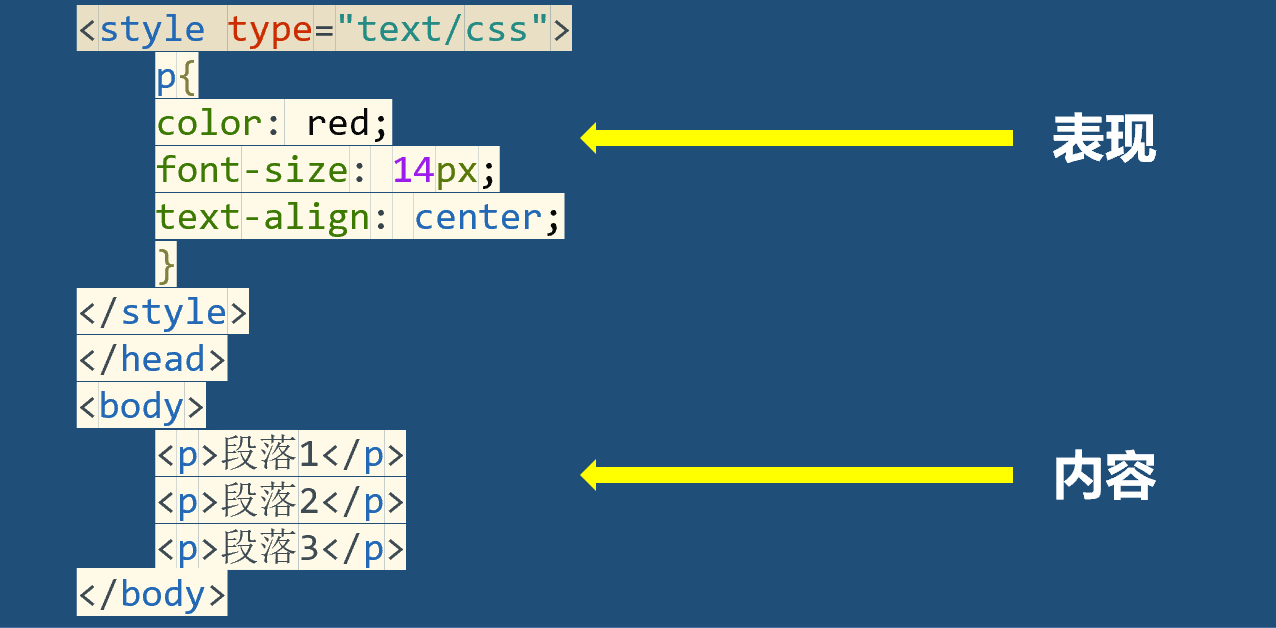
It realizes the separation of content and performance
Improve code reusability and maintainability
- Relationship between CSS and HTML
HTML is used to build the structure of web pages
CSS is used to build the style of HTML elements
HTML is the content of the page, and CSS is the performance of the page
3. Use CSS
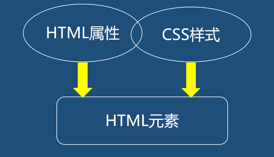
- Principles for using HTML attributes and CSS Styles
w3c recommends using CSS instead of HTML attributes as much as possible
Separation of content and presentation
If the attribute is unique to HTML, the HTML attribute is used
- How to use CSS Styles
Inline mode
Styles are defined in a single HTML element
Internal style sheet
The style is defined in the header element of the HTML page
External style sheet
Define styles in an external css file (. css file)
HTML page reference style sheet file
3.1 using CSS inline
- Styles are defined in the standard attribute style of HTML elements
- CSS syntax
As long as one or more attribute / value pairs separated by the hierarchy are used as the value of the style attribute of the element
Attribute and attribute value are connected by:
Multiple pairs of attributes are separated by:
<h1 style="background-color: silver; color: blue;">
text
</h1>
3.2 internal style sheet
The style sheet rule is located in the document header element<style>Within element
 At the end of the document<head>Add within element<style>element
 stay<style>Add style rule to element
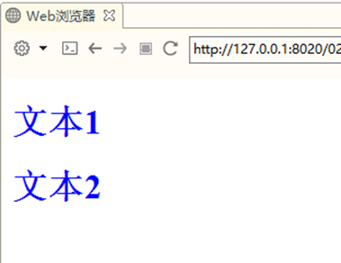
<head>
	<meta charset="UTF-8">
	<title></title>
	<style type="text/css">
	h1{
	color: blue;
	}
	</style>
</head>
<body>
	<h1>Text1</h1>
	<h1>Text2</h1>
</body>
- Add a style rule to the < style > element
You can define multiple style rules
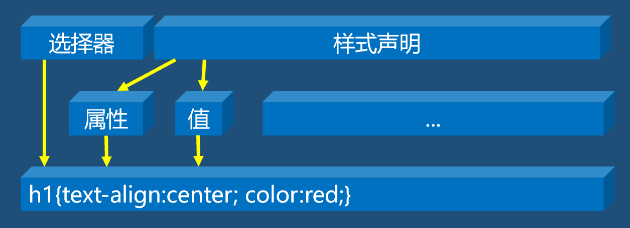
Each style rule has two parts: a selector and a style declaration
Selector: determines which elements use these rules
Style declaration: a pair of braces containing one or more attribute / value pairs

3.3 external style sheet
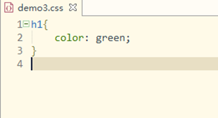
- Step 1: create a separate style sheet file to save style rules
A plain text file with the suffix. css
The file can only contain style rules
Style rules consist of selectors and style declarations
- Step 2: on the page that needs to use the style sheet file, use the element to link the required external style sheet file
Add an element within an element of the document
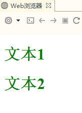
<head>
	<meta charset="UTF-8">
	<title></title>
	<link rel="stylesheet" href="css/demo3.css" />
</head>
<body>
	<h1>Text1</h1>
	<h1>Text2</h1>
</body>
It can realize the separation of content and performance
It can be reused by all pages in the power station
- practice
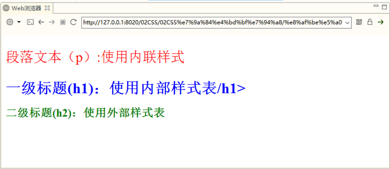
Use inline styles as<p>Element style
 Use internal style sheets for<h1>Element style
 Use an external style sheet to<h2>Element style
4.CSS syntax specification summary
- Inline style: consists of style declarations
<h1 style="background-color:silver; color: blue;">
Style sheets (internal or external)
Consists of multiple style rules
Each style rule has two parts: a selector and a style declaration
5.CSS style sheet features
Inheritance
Most CSS style rules can be inherited
Lamination
You can define multiple styles
When there is no conflict, styles in multiple style sheets can be cascaded into one
priority
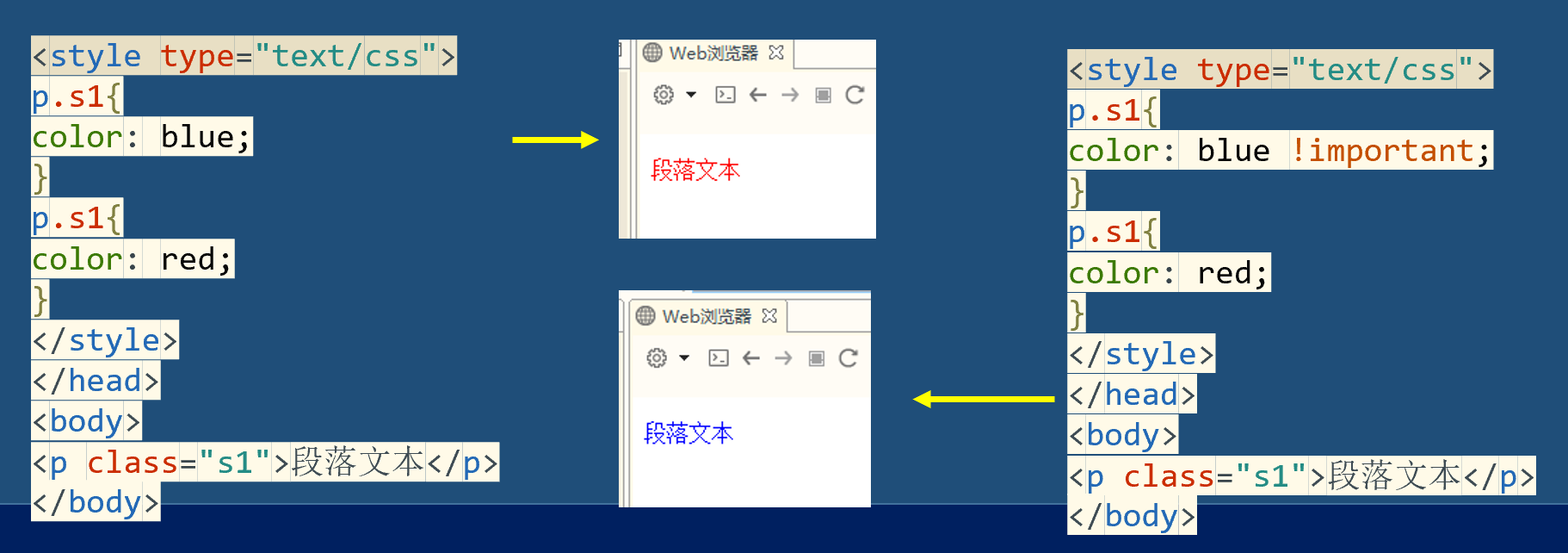
When style definitions conflict, styles are applied according to the priority of different style rules
- Browser default low
- External style sheet or internal style sheet
- Limited proximity
- Inline style high
If the same style is defined repeatedly, the last definition shall prevail
- practice:
- Test CSS style priority
Define styles for < H3 > elements
Use the inline style to define the font color for it as gray
In the internal style sheet, the font color defined for it is red and the font size is 30px
In the external style sheet demo.css, the font color is defined as yellow, the font size is 10px, and the background color is silver gray
View effect
Change the position of internal style sheet and external style sheet to see the effect
- ! important rule
! important can adjust the priority of style rules
Will! important is added after the style rule, separated by a space
Selector {property: property value! Important;}
6. Selector
6.1 universal selector
Universal selector, displayed as an asterisk (*)
Can match any element
It is often used to set some default styles, such as setting the default font and size of the whole document
<style type="text/css">
*{
color: red;
font-size: 39pt;
font-family: "Microsoft YaHei ";
}
</style>
6.2 element selector
html The element of the document is the selector
 such as<p>,<h1>etc.
h1{
	color: red;
}
p{
	color: green;
}
div{
	color: yellow;
}
Type 6.3 selector
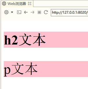
The syntax is:. className{color:red}
All elements that can be attached with a class attribute can be declared using this style
Set the value of the class attribute of the element to the style class name
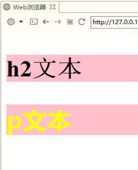
<style type="text/css">
.myClass{
background-color: pink;
font-size: 35pt;
}
</style>
</head>
<body>
	<h2 class="myClass">h2 text</h2>
	<p class="myClass">p text</p>
</body>
- Class selectors and element selectors can be used together to achieve subdivision control of different styles in an element (classification selector)
- Syntax: element selector. className {}
- Specify an element selector first
- Then use a dot (.) to indicate that the class selector will be used
- Then declare the name of a class
- Finally, a pair of braces is used to declare the style rule
- Match a style rule to an element with a class attribute
- The value of the class attribute of the element is the style class name specified in the classification selector
<style type="text/css">
.myClass{
background-color: pink;
font-size: 35pt;
}
.important{
font-weight: bold;
color: yellow;
}
p.important{
font-family: "Microsoft YaHei ";
}
</style>
</head>
<body>
	<h2 class="myClass">h2 text</h2>
	<p class="myClass important">p text</p>
</body>
6.4 id selector
- The id selector specifies the style in a way independent of the document elements
- It only works on the value of the id attribute
- The syntax is:
- The selector needs to be preceded by a # number
- The selector itself is the value of the id attribute of an element in the document
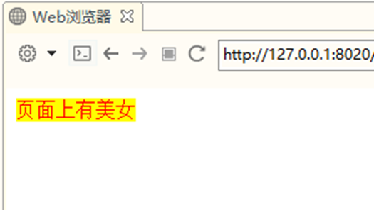
<style type="text/css">
#msg{
	color: red;
	background-color: yellow;
}
</style>
</head>
	<body>
	<span id="msg">There are beautiful women on the page</span>
</body>
6.5 group selector
Selectors are declared as a comma separated list of selectors
Apply some of the same rules to multiple elements
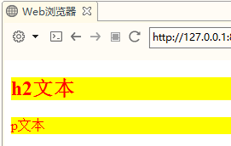
<style type="text/css">
h2,p{
background-color: yellow;
color: red;
}

</style>
</head>
<body>
	<h2 class="myClass">h2 text</h2>
	<p class="myClass important">p text</p>
</body>
6.6 offspring selector
- The style is defined according to the context of the element in its position
- Also known as an include selector, it is used to select elements that are descendants of an element
- A selector section consists of two or more selectors separated by spaces
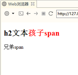
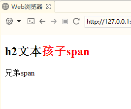
<style type="text/css">
h2 span{
	color:red;
}
</style>
</head>


<body>
	<h2 class="">h2 text
		<span>children myClassspan</span>
	</h2>
	<span>brother span</span>
</body>
6.7 offspring selector
- Child selectors require that only parent-child relationships exist between selectors
- Instead of selecting any descendant elements, you want to narrow the scope and select only the child elements of an element
- A special greater than sign (>) is used as the child binder
<style type="text/css">
h2>span{
color:red;
}
</style>
</head>
<body>
<h2 class="myClass">h2 text
	<span>children span</span>
	<p><span>grandson span</span></p>
</h2>
<span>brother span</span>
</body>
6.8 pseudo class selector
-
Pseudo classes are used to add special effects to some selectors
-
Use a colon (:) as a binder, with other selectors on the left and pseudo classes on the right
- Selectors: pseudo class selectors
-
CSS pseudo class selectors can be divided into
- Link pseudo class
- Dynamic pseudo class
- Target pseudo class
- Structural pseudo class
- Negative pseudo class
- Element state pseudo class
-
Link pseudo class
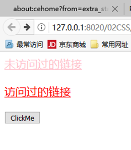
: linkfor links that have not been accessed
: visited for visited links -
Dynamic pseudo class used to render user actions
: hover, for hovering over HTML elements
: active, applicable when HTML elements are activated
: focus, applicable when HTML elements get focus
<style type="text/css">
a:link{
	color: black;
	font-size: 15pt;
}
a:visited{
	color: pink;
	font-size: 15pt;
}
a:hover{
	color: red;
}
input:active{
	background-color: yellow;
}
</style>
<a href="01 universal selector .html">Links not visited</a><br><br>
<a href="02 element selector .html">Visited links</a><br /><br>
<input type="button" value="ClickMe" />
<style type="text/css">
.txt{
color:gray;
font-size: 9pt;
}
.txt:focus{
color: black;
font-size: 11pt;
}
</style>
</head>
<body>
<input class="txt" type="text" value="user name" />
<input class="txt" type="text" value="address" />

6.9 selector priority
| Selector Type | Weight |
|---|---|
| element selector | 0,0,0,1 |
| Class selector | 0,0,1,0 |
| Pseudo class selector | 0,0,1,0 |
| ID Selector | 0,1,0,0 |
| inline style | 1,0,0,0 |
The weight of the selector is added together, and the large one takes precedence; If the weights are the same, the later defined values take precedence
7. Size and frame
7.1 dimension unit
%: percentage

in: inch

cm: centimeter

mm: millimeter

pt: Pounds (1) pt Equal to 1/72 Inch)

px:Pixel (a point on a computer screen)

em: 1em Equal to the current font size, 2 em Equal to twice the current font size
7.2 color units
rgb(x,x,x):RGB Value, such as rgb(255,0,0)

rgb(x%,x%,x%):RGB Percentage value, e.g rgb(100%,0%,0%)

#rrggbb:Hexadecimal number, such as#ff0000

#rgb:Abbreviated hexadecimal, such as#f00

English words for color, such as red
7.3 dimensional properties
Size attributes are used to set the width and height of an element
The units are usually pixels or percentages
-
Width attribute
width
max-width
min-width
-
Height attribute
height
max-height
min-heigth
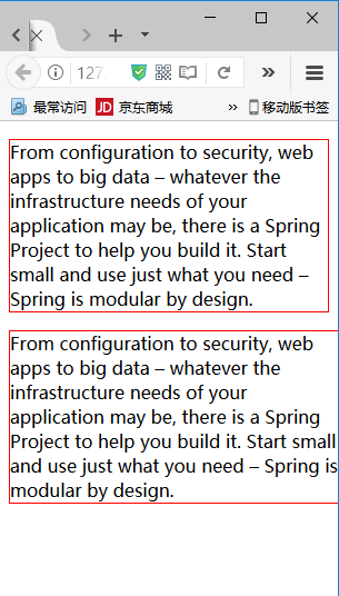
<style type="text/css">
p{
	border:
	1px
	solid
	red;

}
p.first{
	min-width:
	300px;
	max-width:
	500px;
}
</style>
</head>
<body>
<p>
	From configuration to security,
	web apps to big data – whatever
	the infrastructure needs of your
	application may be, there is a Spring
	Project to help you build it.
	Start small and use just
	what you need – Spring is modular by design.
</p>
<p class="first">
	From configuration to security,
	web apps to big data – whatever
	the infrastructure needs of your
	application may be, there is a Spring
	Project to help you build it.
	Start small and use just
	what you need – Spring is modular by design.
</p>
</body>

7.4 spillage
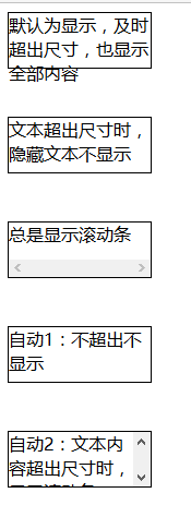
Use the size attribute to control the size of the box. If the space required by the content is greater than its own space, it will lead to content overflow
overflow: what happens when content overflows the element box
overflow-x:
overflow-y:
viside
hidden
scroll
auto
<style type="text/css">


div{

	width:
	130px;

	height:
	50px;

	border:
	1px
	solid
	black;

}

div.hidden{
	overflow:
	hidden;
}

div.scroll{
	overflow:
	scroll;
}

div.auto{
	overflow:
	auto;
}

</style>
<div>The default is display. If the size is exceeded, all contents will also be displayed
</div><br><br>
<div
class="hidden">Hidden text is not displayed when the text exceeds the size
</div><br><br>
<div
class="scroll">Always show scroll bar
</div><br><br>
<div
class="auto">Auto 1: no more than no display
</div><br><br>
<div
class="auto">Auto 2: when the text content exceeds the size, the scroll bar is displayed
</div><br><br>
7.5 which HTML elements can be sized
- Block level elements, such as
p
div
h1,h2,h3,h4,h5,h6
ul,ol,li,dl,dt,dd, etc - There are elements with width and height attributes
img
table et al
7.6 border properties
- Border abbreviation
border:width style color; - Unilateral definition
border-left/right/top/bottom:width style color;
border-width
border-left/right/top/bottom-width
border-style
border-left/right/top/bottom-style
border-color
border-left/right/top/bottom-color
Border color, which can be set to the value transparent (used to create an invisible border with width)
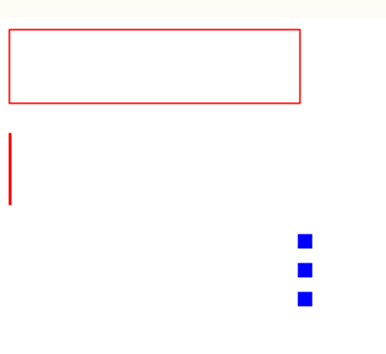
<style type="text/css">
div{
width: 200px;
height:50px;
}
#d1{
border: 1px solid red;
}
#d2{
border-left: 2px solid red;
}
#d3{
border-right-width: 10px;
border-right-color: blue;
border-right-style: dotted;
}
</style>
</head>
<body>
<div id="d1"></div><br>
<div id="d2"></div><br>
<div id="d3"></div><br>
</body>
7.7 corner chamfer
Border radius attribute
For short attributes, set four chamfers in clockwise order
The value is absolute or percentage
Individually defined
Border top left radius: top left corner of border
Border top right radius: top right corner of border
Border bottom left radius: bottom left corner of border
Border bottom right radius: bottom right corner of border
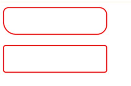
<style type="text/css">
div{
border: 2px solid red;
width: 200px;
height: 50px;
}
#d1{
	border-radius: 10px 15px 20px 25px;
}
#d2{
	border-radius: 5px;
}
</style>
</head>
<body>
<div id="d1"></div><br>
<div id="d2"></div>
</body>
7.8 border shadow
Box shadow: adds one or more shadows to a box
List with multiple attribute values
box-shadow:h-shadow v-shadow blur spread color inset;
among
h-shadow: must be the position of the horizontal shadow
v-shadow: must be the position of the vertical shadow
blur: optional, the size of the phantom shadow
Color: optional, the color of the shadow
inset: optional. Change the outer shadow to the inner shadow
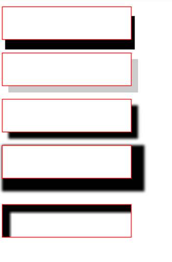
<style type="text/css">
div{
border: 1px solid red;
width: 200px;
height:50px;
}
#d1{box-shadow: 5px 15px;}
#d2{box-shadow: 10px 10px #ccc;}
#d3{box-shadow: 10px 10px 5px #000;}
#d4{box-shadow: 10px 10px 5px 10px #000<style type="text/css">;}
#d5{box-shadow: 10px 10px 5px 2px #000 inset;}
</style>
</head>
<body>
<div id="d1"></div><br>
<div id="d2"></div><br>
<div id="d3"></div><br>
<div id="d4"></div><br><br>
<div id="d5"></div><br>
</body>
<style type="text/css">
7.9 picture border
Border image attribute: Specifies the picture as a border surrounding the div element
border-image:source width repeat;
It can also be set separately
Border image source: the path of the picture
Border image width: the width of the picture border
Border image repeat: whether the image border should be tiled, round ed, or stretch ed
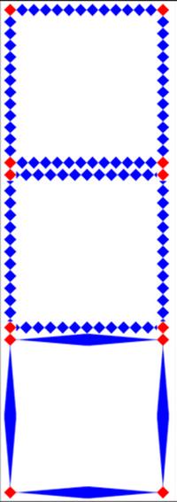
<style>
#d1,#d2,#d3{
border: 26px solid red;
width:300px;
height: 300px;
}
#d1{border-image: url(../img/border.png) 26 round;}
#d2{border-image: url(../img/border.png) 26 repeat;}
#d3{border-image: url(../img/border.png) 26 stretch;}
</style>
</head>
<body>
<div id="d1"></div><br>
<div id="d2"></div><br>
<div id="d3"></div><br>
7.10 profile
An outline is a line drawn around an element. It is located at the periphery of the border edge and can highlight the element
Abbreviation
outline:color style width;
Outline width: the width of the outline
Outline style: the style of the outline
Outlint color: the color of the outline
<style type="text/css">
input{
/*outline: blue solid 10;*/
outline-color: yellow;
outline-style: dotted;
outline-width: 1;
}
</style>
</head>
<body>
<input />
</body>

8. Frame model
The Box Model defines how the element box handles the element content, inner border, border and outer margin
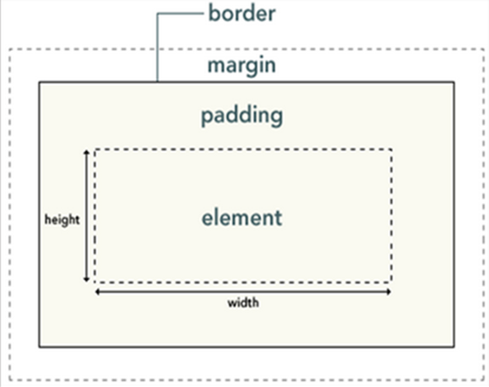
Width and height refer to the width and height of the content area
Increasing the inner margin, border and outer margin will not affect the size of the content area, but will increase the size of the element box
#box{
	width:70px;
	margin:10px;
	padding:5px;
}
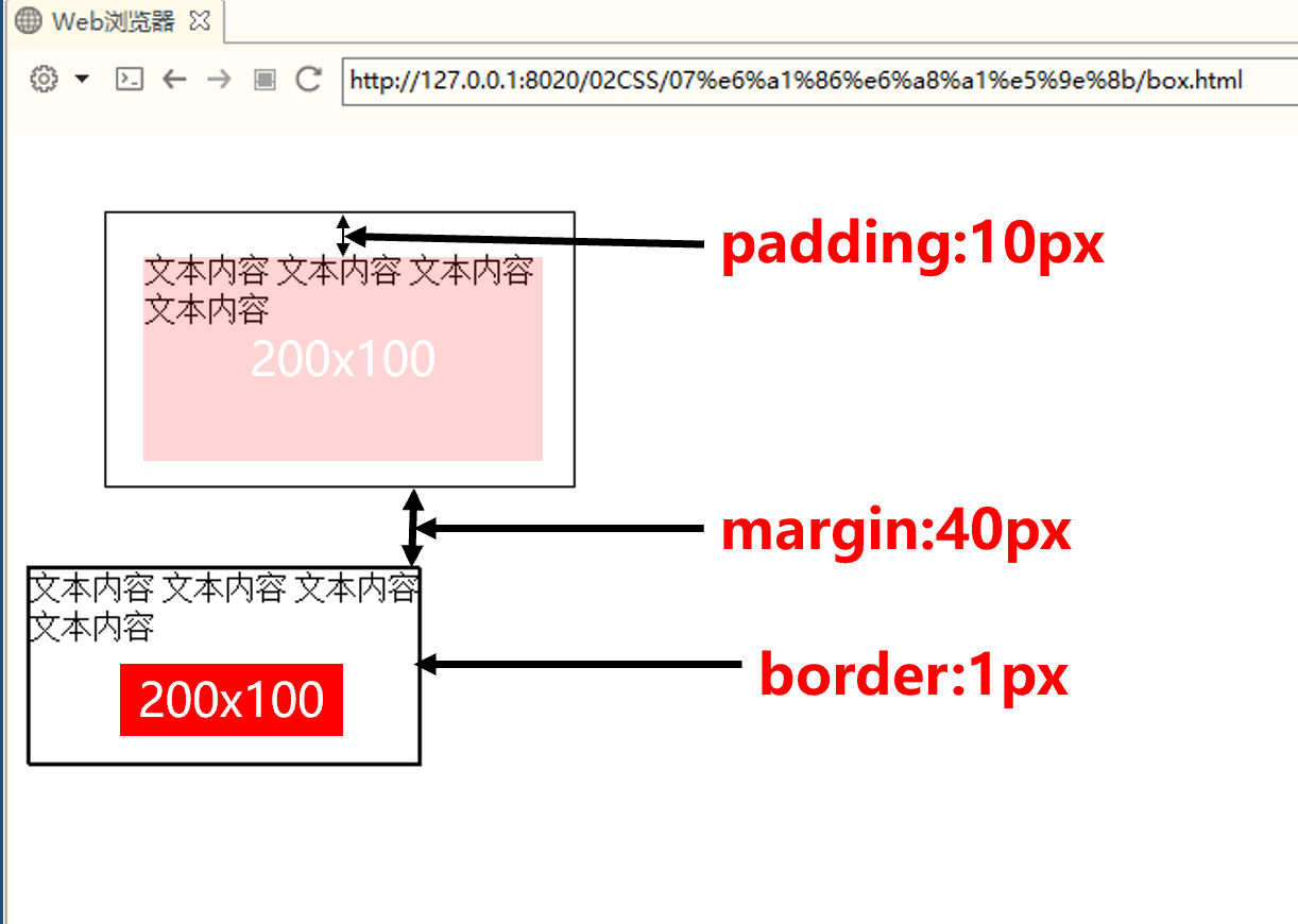
Actual width of object = left outer margin + left border + left inner margin + width + right inner margin + right border + right outer margin
css
<style type="text/css">
.box{
	border: 1px solid black;
	width: 200px;
	height: 100px;
	padding:20px;
	margin: 40px;
}
</style>
html
<body>
<div class="box">
	This is content.
	This is content.
	This is content.
</div>
</body>
8.1 outer margin
The white space around the element border is the outer margin
Extra white space is created outside the element
The outer margin is transparent
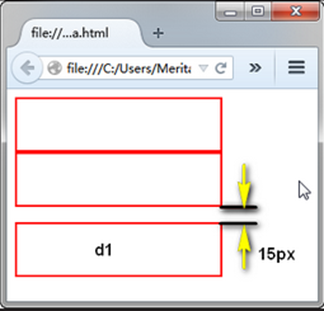
div{
border:2px solid red;
width:200px;
height:50px;
}
#d1{
margin-top:15px;
}
8.2 outer margin margin
Outer margin: the amount of space between and the next element
margin:value;
Unilateral setting
margin-top/right/bottom/left : value;
The attribute value of the outer margin may be px (pixels), percentage (%), or auto (auto), or negative
div{
	width:150px;
	height:150px;
	border:2px solid #0f0;
	margin-top:10xp;
	margin-right:20px;
	margin-left:40px;
}
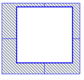
- By default, all HTML block level elements have outer margins
body
div
h1,h2,h3,h4,h5,h6
p... - You can override the default style by declaring the margin attribute
body,p,div,h1,h2,h3,h4,h5,h6,pre{
margin:0;
}
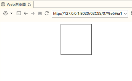
The value of margin can be auto, and the outer margin is calculated by the browser
Achieve horizontal center display effect
div{
		width:100px;
		heigth:100px;
		border:1px solid black;
		margin:auto;
}
Set horizontal center
Concise writing of outer margin
There are several simple ways to write the outer margin:
Margin: value (the four directions are the same);
margin: value (up and down) value (left and right);
margin: value (upper) value (left and right) value (lower);
margin: value (top) value (right) value (bottom) value (left)
div{
	width:150px;
	height:150px;
	border:2pxx solid #0f0;
	margin:10px 20px 30px 40px;
}
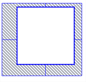
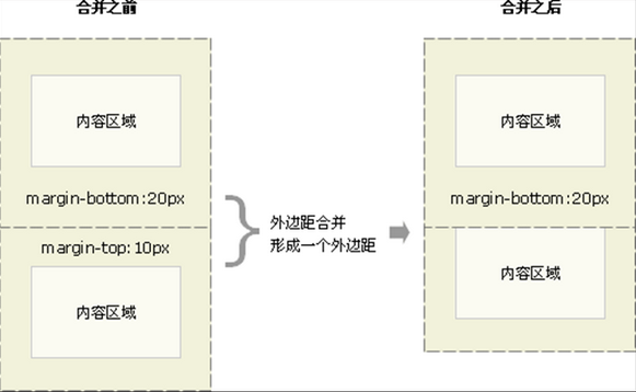
8.3 outer margin consolidation
When two vertical outer margins meet, they form an outer margin, which is called outer margin merging
The height of the merged outer margins is equal to the greater of the two merged outer margins
