10-26
Elastic box (display: flex)
An elastic box consists of a flex container and a flex item.
Elastic containers are defined as elastic containers by setting the value of the display property to flex or inline flex.
The elastic container contains one or more elastic child elements.
Note: the outside of the elastic container and the inside of the elastic sub element are rendered normally. The elastic box only defines how the elastic child elements are laid out in the elastic container.
<!DOCTYPE html>
<html>
<head>
<meta charset="utf-8">
<title>W3Cschool course(w3cschool.cn)</title>
<style>
body {
    direction: rtl;
}

.flex-container {
    display: -webkit-flex;
    display: flex;
    width: 400px;
    height: 250px;
    background-color: lightgrey;
}

.flex-item {
    background-color: cornflowerblue;
    width: 100px;
    height: 100px;
    margin: 10px;
}
</style>
</head>
<body>

<div class="flex-container">
  <div class="flex-item">flex item 1</div>
  <div class="flex-item">flex item 2</div>
  <div class="flex-item">flex item 3</div>
</div>

</body>
</html>
Operation results: 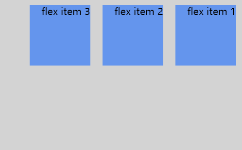
flex-direction
The flex direction order specifies the position of the elastic child element in the parent container.
grammar
flex-direction: row | row-reverse | column | column-reverse
The values of flex direction are:
-
row: horizontal arrangement from left to right (left alignment), the default arrangement.
-
Row reverse: reverse the horizontal arrangement (right alignment, from the back to the front, and the last item is in the front.
-
column: vertical arrangement.
-
Column reverse: reverse the vertical arrangement, from the back to the front, and the last item is at the top.
column Demo:
<!DOCTYPE html>
<html>
<head>
<style>
.flex-container {
    display: -webkit-flex;
    display: flex;
    -webkit-flex-direction: column;
    flex-direction: column;
    width: 400px;
    height: 250px;
    background-color: lightgrey;
}

.flex-item {
    background-color: cornflowerblue;
    width: 100px;
    height: 100px;
    margin: 10px;
}
</style>
</head>
<body>

<div class="flex-container">
  <div class="flex-item">flex item 1</div>
  <div class="flex-item">flex item 2</div>
  <div class="flex-item">flex item 3</div>
</div>

</body>
</html>
effect: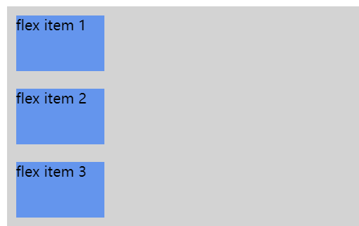
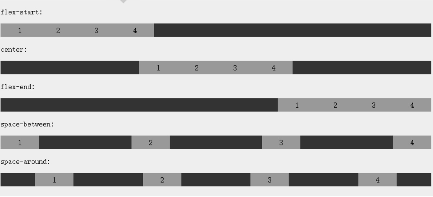
Justify content attribute
The justify content attribute is applied to the elastic container to align the elastic items along the main axis of the elastic container.
The syntax of justify content is as follows:
justify-content: flex-start | flex-end | center | space-between | space-around
Analysis of each value:
-
flex-start:
Elastic items are filled immediately at the beginning of the line. This is the default value. The main start outer margin edge of the first elastic item is placed on the main start edge of the line, and the subsequent elastic items are placed flush in turn.
-
flex-end:
The elastic item is filled next to the end of the line. The main end outer margin edge of the first elastic item is placed on the main end edge of the line, and the subsequent elastic items are placed flush in turn.
-
center:
The elastic item is centered next to the fill. (if the remaining free space is negative, the elastic item will overflow in both directions at the same time).
-
space-between:
Elastic items are evenly distributed on the row. If the remaining space is negative or there is only one elastic item, the value is equivalent to flex start. Otherwise, the outer margin of the first elastic item is aligned with the main start edge of the row, while the outer margin of the last elastic item is aligned with the main end edge of the row. Then the remaining elastic items are distributed on the row, and the spacing of adjacent items is equal.
-
space-around:
Elastic items are evenly distributed on the line, with half of the space between the two sides. If the remaining space is negative or there is only one elastic item, the value is equal to center. Otherwise, elastic items are distributed along the line, with equal spacing from each other (such as 20px), and half of the space between the first and last sides and the elastic container (1/2*20px=10px).
Rendering display:
Align items property
Align items sets or retrieves the alignment of elastic box elements in the direction of the side axis (vertical axis).
grammar
align-items: flex-start | flex-end | center | baseline | stretch
Analysis of each value:
- Flex start: the boundary of the starting position of the side axis (longitudinal axis) of the elastic box element is close to the starting boundary of the side axis of the row.
- Flex end: the boundary of the starting position of the side axis (longitudinal axis) of the elastic box element is close to the end boundary of the side axis of the row.
- center: the elastic box element is centered on the side axis (longitudinal axis) of the row. (if the size of the row is smaller than the size of the elastic box element, it will overflow the same length in both directions).
- Baseline: if the inner axis and side axis of the elastic box element are the same, this value is equivalent to 'flex start'. In other cases, this value will participate in baseline alignment.
- stretch: if the attribute value of the specified side axis size is' auto ', its value will make the size of the item's margin box as close as possible to the size of the row, but it will comply with the limit of the' min / max width / height 'attribute.
Flex wrap attribute
The flex wrap attribute specifies how the child elements of the elastic box wrap.
grammar
flex-wrap: nowrap|wrap|wrap-reverse|initial|inherit;
Analysis of each value:
- nowrap - by default, the elastic container is a single line. In this case, the elastic child may overflow the container.
- wrap - the elastic container is multi row. In this case, the overflow part of the elastic subitem will be placed in the new row, and the line break will occur inside the subitem
- Wrap reverse - reverses the wrap arrangement.
Align content attribute
The align content property is used to modify the behavior of the flex wrap property. It is similar to align items, but it does not set the alignment of elastic child elements, but sets the alignment of individual rows.
grammar
align-content: flex-start | flex-end | center | space-between | space-around | stretch
Analysis of each value:
- Stretch - default. Rows will stretch to take up the remaining space.
- Flex start - the rows are stacked to the starting position of the elastic box container.
- Flex end - each row is stacked to the end of the elastic box container.
- center - the rows are stacked in the middle of the elastic box container.
- Space between - the rows are evenly distributed in the elastic box container.
- Space around - the rows are evenly distributed in the elastic box container, and half of the spacing between child elements is reserved at both ends.
align-self
The align self attribute is used to set the alignment of the elastic element itself in the direction of the side axis (longitudinal axis).
grammar
align-self: auto | flex-start | flex-end | center | baseline | stretch
Analysis of each value:
- Auto: if the value of 'align self' is' auto ', the calculated value is the' align items' value of the parent element of the element. If it has no parent element, the calculated value is' stretch '.
- Flex start: the boundary of the starting position of the side axis (longitudinal axis) of the elastic box element is close to the starting boundary of the side axis of the row.
- Flex end: the boundary of the starting position of the side axis (longitudinal axis) of the elastic box element is close to the end boundary of the side axis of the row.
- center: the elastic box element is centered on the side axis (longitudinal axis) of the row. (if the size of the row is smaller than the size of the elastic box element, it will overflow the same length in both directions).
- Baseline: if the inner axis and side axis of the elastic box element are the same, this value is equivalent to 'flex start'. In other cases, this value will participate in baseline alignment.
- stretch: if the attribute value of the specified side axis size is' auto ', its value will make the size of the item's margin box as close as possible to the size of the row, but it will comply with the limit of the' min / max width / height 'attribute.
<!DOCTYPE html>
<html>
<head>
<meta charset="utf-8">
<title>W3Cschool course(w3cschool.cn)</title>
<style>
.flex-container {
    display: -webkit-flex;
    display: flex;
    width: 400px;
    height: 250px;
    background-color: lightgrey;
}

.flex-item {
    background-color: cornflowerblue;
    width: 60px;
    min-height: 100px;
    margin: 10px;
}

.item1 {
    -webkit-align-self: flex-start;
    align-self: flex-start;
}
.item2 {
    -webkit-align-self: flex-end;
    align-self: flex-end;
}

.item3 {
    -webkit-align-self: center;
    align-self: center;
}

.item4 {
    -webkit-align-self: baseline;
    align-self: baseline;
}

.item5 {
    -webkit-align-self: stretch;
    align-self: stretch;
}
</style>
</head>
<body>

<div class="flex-container">
  <div class="flex-item item1">flex-start</div>
  <div class="flex-item item2">flex-end</div>
  <div class="flex-item item3">center</div>
  <div class="flex-item item4">baseline</div>
  <div class="flex-item item5">stretch</div>
</div>

</body>
</html>
effect: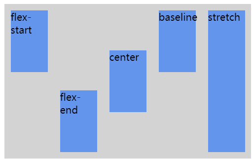
flex
The flex attribute is used to specify how elastic child elements allocate space.
grammar
flex: none | [ flex-grow ] || [ flex-shrink ] || [ flex-basis ]
Analysis of each value:
- None: the calculated value of the none keyword is: 0 0 auto
- [flex growth]: defines the expansion ratio of elastic box elements.
- [flex shrink]: defines the shrinkage ratio of elastic box elements.
- [flex basis]: defines the default reference value of the elastic box element.
summary
| attribute | describe |
|---|---|
| display | Specifies the type of HTML element box. |
| flex-direction | Specifies the arrangement of child elements in the elastic container |
| justify-content | Sets the alignment of elastic box elements in the direction of the main axis (horizontal axis). |
| align-items | Sets the alignment of elastic box elements in the direction of the side axis (longitudinal axis). |
| flex-wrap | Sets whether the child elements of the elastic box wrap when they exceed the parent container. |
| align-content | Modify the behavior of the flex wrap attribute, similar to align items, but not set the child element alignment, but set the row alignment |
| flex-flow | Abbreviations for flex direction and flex wrap |
| order | Sets the order in which the child elements of the elastic box are arranged. |
| align-self | Used on elastic child elements. Override the align items property of the container. |
| flex | Sets how the child elements of the elastic box allocate space. |