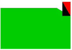
Step 1 - angle cutting
The angle can be arbitrary, according to personal preferences, personal choice 210deg
#div {
width: 200px;
height: 100px;
margin: 100px;
padding: 20px;
position: relative;
background: linear-gradient(210deg, transparent 1.5em, blue 0);
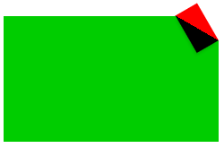
}//The background is cut from the upper right corner like 210 degrees, with a length of 1.5em and a size of 1.5x div font
Step 2 - add corner
#div::before {
     content: '';
     position: absolute;
     top: 0;
     right: 0;
     width: 3em;
     height: 1.73em;
     background: linear-gradient(210deg, red 50%, black 0);
}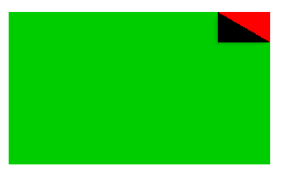
Step 3 - change the angle at which the corner is added
The red part in the figure above the desired corner is the symmetrical part with its hypotenuse as the symmetry axis, while the background: linear gradient (210deg, red 50%, black 0); in, no matter what the width and height in before are, they are more than 50% red. Therefore, in consideration of changing the width and height in before, the gradient angle + 30 is 240deg:
#div::before {
              content: '';
              position: absolute;
              top: 0;
              right: 0;
              width: 1.73em;
              height: 3em;
              background: linear-gradient(240deg, red 50%, black 0);
}
Step 4 - translate the added corner up
Move the added corner up to its bottom and coincide with the right bottom of the cut triangle, that is, move up 3-1.73 ~ = 1.3
#div::before {
              content: '';
              position: absolute;
              top: 0;
              right: 0;
              width: 1.73em;
              height: 3em;
              background: linear-gradient(240deg, red 50%, black 0);
              transform: translateY(-1.3em);
}
Step 5 - translate the added corner up and rotate it
Rotate 30deg anticlockwise with the lower right corner as the rotation center,
#div::before {
    content: '';
    position: absolute;
    top: 0;
    right: 0;
    width: 1.73em;
    height: 3em;
    background: linear-gradient(240deg, red 50%, black 0);
    transform: translateY(-1.3em) rotate(-30deg);
    transform-origin: bottom right;
}
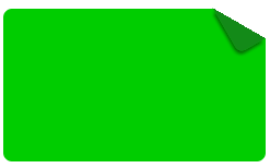
Step 6 - add shadow effect
Change red in background to transparent, and then add shadow effect
#div::before {
    content: '';
    position: absolute;
    top: 0;
    right: 0;
    width: 1.73em;
    height: 3em;
    background: linear-gradient(240deg, transparent 50%, #138a18 0);
    transform: translateY(-1.3em) rotate(-30deg);
    transform-origin: bottom right;
    border-bottom-left-radius: inherit;
    box-shadow: -0.2em 0.2em 0.3em -0.1em #065206;
}