In the process of development, front-end engineers encounter the most headache is the compatibility of browsers, often in order to achieve a compatible browser effect rack their brains. When we usually write front-end code, we also encounter various compatibility problems when typesetting, especially when the boss asks for compatibility with IE5, IE6 and IE7. Next, I will summarize several compatibility problems and solutions that I have encountered, which will be updated slowly in the future.
1. H5 Label Compatibility IE5, IE6 Incompatibility
H5 tags are not compatible with IE5 and IE6. To illustrate this problem, I will first write a small example, the code is as follows:
<!DOCTYPE html>
<html lang="en">
<head>
    <meta charset="UTF-8">
    <title>H5</title>
    <style>
        header{
            width:200px;
            height:200px;
            display: block;
            background-color: #34b1ff;
        }
        section{
            width:150px;
            height:150px;
            background-color: #ff54c5;
        }
        footer{
            width:100px;
            height: 100px;
            background-color: #73ff58;
        }
    </style>
</head>
<body>
    <header>header</header>
    <section>session</section>
    <footer>footer</footer>
</body>
</html>
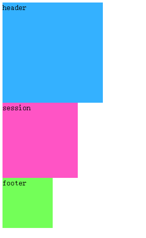
Because I don't have IE6 on my computer, I use IETester to test and display the results under IE6:

To solve this problem, we can create H5 tags manually, but if all H5 tags need to be created one by one, the process is troublesome, but here's how to create it. The Js code is as follows:
    <script>
        document.createElement("header");
        document.createElement("section");
        document.createElement("footer");
    </script>
Why is it that these three elements are not displayed according to the width and height I defined? This is because the elements created through js are considered as custom tags, the default is inline elements, and if you want to display them according to a fixed width and height, you must be block elements, so in order to achieve this effect, we can add display:block to the style of each element. The effect is achieved. The style code is modified as follows:
        header{
            width:200px;
            height:200px;
            display: block;
            background-color: #34b1ff;
        }
        section{
            width:150px;
            height:150px;
            display: block;
            background-color: #ff54c5;
        }
        footer{
            width:100px;
            height: 100px;
            display: block;
            background-color: #73ff58;
}<!DOCTYPE html>
<html lang="en">
<head>
<meta charset="UTF-8">
<title>H5</title>
<script src="js/html5shiv.js"></script>
<style>
header{
width:200px;
height:200px;
background-color: #34b1ff;
}
section{
width:150px;
height:150px;
background-color: #ff54c5;
}
footer{
width:100px;
height: 100px;
background-color: #73ff58;
}
</style>
</head>
<body>
<header>header</header>
<section>session</section>
<footer>footer</footer>
</body>
</html>What does this mean? Let's give an example to illustrate that I first write an html structure and the desired effect. Now we write the following structure. The effect we want to achieve is that two div s are displayed on the left and right sides respectively.
<div class="box">
    <div class="left">
        <h2>left</h2>
    </div>
    <div class="right">
        <h2>Right</h2>
    </div>
</div> .box{
width:400px;
border:1px solid #00A2E9;
overflow: hidden;
}
.left{
background-color: yellow;
float: left;
}
.right{
background-color: red;
float: right;
}
h2{
margin: 0;
height: 30px;
}
But I am foolish to see the effect of IE6. Didn't I set the left and right floats? Why is the result so?

Next, let's talk about the solution.
1) Width the element
Modify the code of h2 as follows:
        h2{
            margin: 0;
            height: 30px;
            width: 100px;
        }
2) If you want the width to be content-spanned, float the block elements inside it.
Now the problem arises. Sometimes I don't know how wide the h2 inside is. I need to expand it according to the content, so I can't set a uniform width. At this time, I can add floating to the h2 block element.
The modification code is as follows:
        h2{
            margin: 0;
            height: 30px;
            float: left;
        }
3. The first element floats, and the second element plus margin value equals the width of the first element. There will be gaps under IE6.
First of all, let me give you an example:
<div class="box">
    <div class="left"></div>
    <div class="right"></div>
</div> body{
margin: 0;
}
.box{
width: 500px;
}
.left{
width: 200px;
height: 200px;
background-color: #ff89d9;
float: left;
}
.right{
width: 200px;
height: 200px;
background-color: #34b1ff;
margin-left: 200px;
}
Why is there an extra gap between the two divs? Everyone will be curious about why, but I don't know the reason, because I have added a margin:0 in the front. But there will still be such a gap. Because the first div is floating, out of the document stream, and the second div is still in the document stream, so two in the same line, it is really an unexpected problem, generally do not recommend to write this, if we really want to do so, then we will add floating to the second element.
Modified code:
        .right{
            width: 200px;
            height: 200px;
            background-color: #34b1ff;
           /* margin-left: 200px;*/
            float: left;
        }
4. IE6's lower child elements exceed the width and height of the parent, which will stretch the width and height of the parent.
First, give an example:
<div class="box">
    <div class="content"></div>
</div> .box{
width: 100px;
height:100px;
background-color: #34b1ff;
border: 2px solid #ff2834;
}
.content{
width: 200px;
height: 200px;
background-color: #73ff58;
}
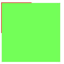
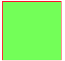
The effect under IE6:

The div of the child element actually extends the width and height of the parent element, so we must pay attention to not letting the width and height of the child element exceed the width and height of the parent element in the process of coding.
5. P contains nesting rules for block elements
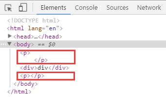
First of all, let me give you an example:
<p>
    <div>div</div>
</p>
There is no problem with the effect display, but when we look at the review elements, we find that the problem is solved automatically. The P tag ends automatically and adds a P tag. So in the process of writing code, we usually have a nested relationship in the tag. In addition to the problem of the P tag, there are two tags that will also have this problem: td, h:
