Common positioning schemes
Before talking about BFC, let's learn about common positioning schemes. Positioning schemes are the layout of control elements. There are three common schemes:
- Normal flow
In a normal stream, elements are arranged from top to bottom according to their positions in the HTML. In this process, the elements in the line are arranged horizontally until the line is filled and then wrapped. The block level elements will be rendered as a complete new line. Unless otherwise specified, all elements are positioned by the normal stream by default, that is to say, The position of an element in a normal stream is determined by its position in the HTML document.
- Float
In the floating layout, the elements first appear in the position of the normal flow, and then offset to the left or right as much as possible according to the floating direction. The effect is similar to the text wrapping in printing and typesetting.
- Absolute positioning
In the absolute positioning layout, the element will be separated from the normal flow as a whole, so the absolute positioning element will not affect its brother elements, and the specific position of the element is determined by the coordinates of the absolute positioning.
BFC concept
Formatting context is a concept in W3C CSS2.1 specification. It is a rendering area in the page, and has a set of rendering rules, which determine how its child elements will be located, as well as the relationship and interaction with other elements.
So what is BFC?
BFC is Block Formatting Contexts, which belongs to the common flow of the above positioning scheme.
Elements with BFC characteristics can be regarded as isolated independent containers. The elements in the container will not affect the external elements in layout, and BFC has some characteristics that ordinary containers do not have.
Generally speaking, BFC can be understood as a closed large box. The elements inside the box will not affect the outside no matter how many rivers and seas are overturned.
BFC trigger condition
The BFC characteristic can be triggered as long as the element meets any of the following conditions:
- HTML root element
- Floating elements: float values other than none
- Absolute positioning element: position (absolute, fixed)
- display is inline block, table cells and flex
- overflow values other than visible (hidden, auto, scroll)
- Grid layout elements
- The element attribute colum span is set to all
Trigger BFC with overflow (clear float)
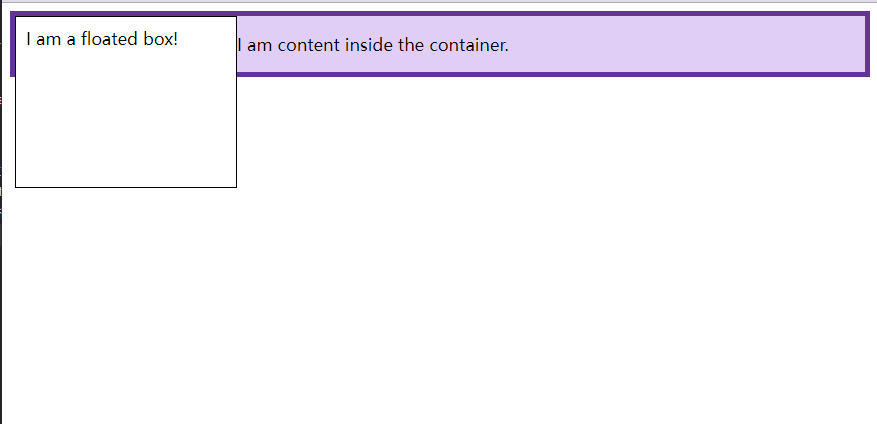
In the following example, we have a floating element in < div > with a border applied. The contents of the div float with the floating element. Because the content of float is higher than that next to it, the border of div now runs through float. Floating is out of the document flow, so the background and border of div contain only content, not floating.
<!--
 * @Date: 2021-11-22 14:03:18
 * @information: BFC
-->
<!DOCTYPE html>
<html>
  <head>
    <meta charset="UTF-8" />
    <meta http-equiv="X-UA-Compatible" content="IE=edge" />
    <meta name="viewport" content="width=device-width, initial-scale=1.0" />
    <title>Document</title>
    <style>
      .box {
        background-color: rgb(224, 206, 247);
        border: 5px solid rebeccapurple;
      }

      .float {
        float: left;
        width: 200px;
        height: 150px;
        background-color: white;
        border: 1px solid black;
        padding: 10px;
      }
    </style>
  </head>
  <body>
    <div class="box">
      <div class="float">I am a floated box!</div>
      <p>I am content inside the container.</p>
    </div>
  </body>
</html>
Creating a new BFC will contain the float. In the past, a typical method was to set overflow: auto or other values that were not overflow: visible.
<!DOCTYPE html>
<html>
  <head>
    <meta charset="UTF-8" />
    <meta http-equiv="X-UA-Compatible" content="IE=edge" />
    <meta name="viewport" content="width=device-width, initial-scale=1.0" />
    <title>Document</title>
    <style>
      .box {
        background-color: rgb(224, 206, 247);
        border: 5px solid rebeccapurple;
+       overflow: auto;
      }

      .float {
        float: left;
        width: 200px;
        height: 150px;
        background-color: white;
        border: 1px solid black;
        padding: 10px;
      }
    </style>
  </head>
  <body>
    <div class="box">
      <div class="float">I am a floated box!</div>
      <p>I am content inside the container.</p>
    </div>
  </body>
</html>

Setting overflow: auto automatically creates a new BFC with floats. Now, our DIV has become a mini layout in the layout. Any child elements will be included.
Create BFC using display: flow root display
Using display: flow root (or display: flow root list item) will create a new BFC without any other potential problem side effects.
<!DOCTYPE html>
<html>
  <head>
    <meta charset="UTF-8" />
    <meta http-equiv="X-UA-Compatible" content="IE=edge" />
    <meta name="viewport" content="width=device-width, initial-scale=1.0" />
    <title>Document</title>
    <style>
      .box {
        background-color: rgb(224, 206, 247);
        border: 5px solid rebeccapurple;
+       display: flow-root;
      }

      .float {
        float: left;
        width: 200px;
        height: 150px;
        background-color: white;
        border: 1px solid black;
        padding: 10px;
      }
    </style>
  </head>
  <body>
    <div class="box">
      <div class="float">I am a floated box!</div>
      <p>I am content inside the container.</p>
    </div>
  </body>
</html>

Using display: flow root on < div >, all contents in the container participate in the block format context of the container, and the float will not pop up from the bottom of the element.
The flow root keyword means that the created content is essentially similar to a new root element (such as < HTML >), and determines how the new context is created and how its flow layout is implemented.
Characteristics and application of BFC
The outer margin will collapse under the same BFC
<!DOCTYPE html>
<html>
  <head>
    <meta charset="UTF-8" />
    <meta http-equiv="X-UA-Compatible" content="IE=edge" />
    <meta name="viewport" content="width=device-width, initial-scale=1.0" />
    <title>Document</title>
    <style>
      div {
        width: 100px;
        height: 100px;
        background: lightblue;
        margin: 100px;
      }
    </style>
  </head>
  <body>
    <div></div>
    <div></div>
  </body>
</html>

In terms of effect, because the two div elements are under the same BFC container (here refers to the body element), the lower margin of the first div and the upper margin of the second div overlap, so the distance between the two boxes is only 100px, not 200px.
First of all, this is not a CSS bug. We can understand it as a specification. If you want to avoid the overlap of outer margins, you can put it in different BFC containers.
<!DOCTYPE html>
<html>
  <head>
    <meta charset="UTF-8" />
    <meta http-equiv="X-UA-Compatible" content="IE=edge" />
    <meta name="viewport" content="width=device-width, initial-scale=1.0" />
    <title>Document</title>
    <style>
      .container {
        overflow: hidden;
      }
      p {
        width: 100px;
        height: 100px;
        background: lightblue;
        margin: 100px;
      }
    </style>
  </head>
  <body>
    <div class="container">
      <p></p>
    </div>
    <div class="container">
      <p></p>
    </div>
  </body>
</html>

At this time, the margin between the two boxes becomes 200px
BFC can contain floating elements (clear floating)
As we all know, floating elements break away from the normal document flow. Let's take a look at the following example
<div style="border: 1px solid #000;">
  <div style="width: 100px;height: 100px;background: #eee;float: left;"></div>
</div>
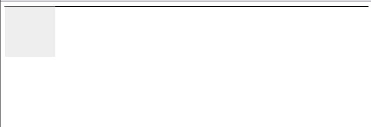
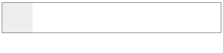
Because the elements in the container float away from the document flow, the container has only 2px margin height. If the BFC of the container is triggered, the container will be wrapped with floating elements.
<div style="border: 1px solid #000;overflow: hidden">
  <div style="width: 100px;height: 100px;background: #eee;float: left;"></div>
</div>
BFC can prevent elements from being overwritten by floating elements
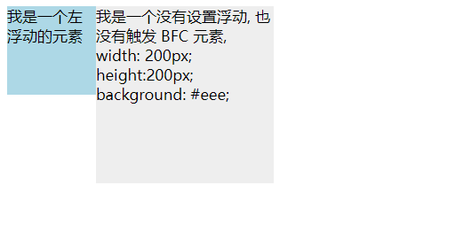
Let's start with a text wrapping effect:
<div style="height: 100px;width: 100px;float: left;background: lightblue">
  I am a left floating element
</div>
<div style="width: 200px; height: 200px;background: #eee">
  I am a floating without setting, No trigger BFC element, width: 200px; height:200px;
  background: #eee;
</div>

At this time, in fact, the second element is partially covered by floating elements (but the text information will not be covered by floating elements). If you want to avoid element coverage, you can touch the BFC feature of the second element and add overflow: hidden to the second element, which will become:
<div style="height: 100px;width: 100px;float: left;background: lightblue">
  I am a left floating element
</div>
<div style="width: 200px; height: 200px;background: #eee; overflow: hidden">
  I am a floating without setting, No trigger BFC element, width: 200px; height:200px;
  background: #eee;
</div>
This method can be used to realize two column adaptive layout. The effect is good. At this time, the width of the left is fixed and the content on the right is adaptive (excluding the width of the content on the right above).
reference resources: 10 minutes to understand BFC principle,Introduction to formatting contexts