Summary from Qianfeng HTML, CSS tutorial, original video website
https://www.bilibili.com/video/av52670599
Article directory
- start
- CSS Foundation
- basic style
- Length unit
- Type of style
- Color representation
- CSS background style
- CSS border style
- CSS text style
- CSS paragraph styles
- CSS composite style
- selector
- ID Selector
- CLASS selector
- tag chooser
- Group selector, general configuration selector
- Hierarchy selector
- attribute selectors
- Pseudo class selector
- Style inheritance
- Style priority
- Box model
- Label
- More styles
- Display box type
- Overflow hiding
- Transparency and gestures
- Minimum and maximum width and height
- CSS default style
- float floating
- position positioning
- CSS add ellipsis
- CSS Sprite
- CSS fillet
- CSS gradient
- Font Icon
- shadow
- Mask
- Inverted reflection in water
- Fuzziness and calculation
- BFC specification
- Geometry, animation and 3D effects
- Transition transition
- transform deformation
- Animation animation
- Extended usage of animation
- animate.css Library
- transform3D
- Flip using scale negative value
- layout
- Forum center and layout
- Layout of columns
- Contour layout
- Double wing layout
- Holy Grail layout
- Flex elastic box model
- Grid grid layout
- Pseudo class and pseudo element
- CSS Hack
- Gradual enhancement and elegant degradation
- Mobile terminal
- bootstrap
- CSS advanced and new features
- Sass and Less
- 1, notes
- 2. Variable, interpolation, scope
- 3. Selector nesting, pseudo class nesting, attribute nesting (sass)
- 4. Operation, unit, escape, color
- 5, function
- 6. Mix in, namespace (LESS), inherit
- 7. Merge, media query
- 8. Condition, cycle
- 9. Import
- PostCSS
- CSS architecture
- New features of CSS
- CSS architecture
- New features of CSS
start
Basic concepts of HTML
Website developer = UI Designer + front end engineer + back end Engineer
HTML (structure) + CSS (style) + JS (behavior)
XHTML is more strict than HTML syntax, mainly reflected in DOCTYPE writing, case sensitivity, attribute b Boolean value, attribute quotation mark, alt attribute, strict closure of tags, etc
HTML syntax
Meaning of labels and attributes
Common HTML Tags: http://www.xuanfengge.com/fortune/html5/element/
Typical structure of HTML document:
<!DOCTYPE html><!--Document declaration-->
<html lang="en"><!--Root tag-->
    <head><!--head-->
        <meta charset="UTF-8"><!--Meta information-->
        <title>Title</title><!--Title-->
    </head>
    <body><!--subject-->

    </body>
</html>
Note: <! --- >
HTML semantics: select the corresponding tags according to the semantics of the content in the web page
Common labels:
- Title and paragraph: h and p labels
- Text modification labels: strong, em, sub, sup, del, ins
- Reference label: blockquote, q, abbr, address, cite
- pre and code tags: for code output
- Image tag: img
- Properties: src, alt, width, height, title
- Jump:
- Label: a, base
- Attribute: href, target, name
- Anchor points: × + Id, × + name
- Special symbols: & nbsp; copy; reg; lt; gt; yen; DEG;
- List:
- Unordered list: ul/dir/menu, li
- Ordered list: ol, li
- Definition list: dl, dt, dd
- Form:
- Tags: table, tr, th, td, caption, thead, tbody, tfoot;
- Properties: border, cellpadding, callspacing, rowspan, colspan, align, valign
- Form:
- Tags: form, input, select and option, textarea, label
- Attributes: action, method, type, name, value
- Input type: text, radio, checkbox, password, file, submit, button, reset
- Block label: div, span
Both the strong and em tags indicate emphasis, and the presentation forms are bold and italicized text; the b and i tags also indicate bold and italicized text. The difference is that the former is semantic, while the latter is not.
br and wbr: br are line breaks. wbr soft line breaks are used for line breaks of long words
Extended learning
iframe nested pages:
- The iframe element creates an inline framework (that is, an inline framework) that contains another document
, import other html pages to display in this html page
-
attribute
- Frame border: Specifies whether to display the surrounding border
- Width: defines the width of iframe
- Height: defines the height of iframe
- scrolling: Specifies whether to display scrollbars in iframe
- src: Specifies the url introduced in iframe
- srcdoc: Specifies the page content to be displayed in iframe
-
Application scenarios: data transmission, shared code, local refresh, third-party intervention, etc
map and area
Role: define a client image map
Image mapping: an image with clickable areas
The area element is always nested inside the map element, which defines the area in the image map. The href attribute of the area element defines the url of the area, the shape attribute defines the shape of the area, and the coords attribute defines the coordinates of the hot area.
<img src="example.jpg" alt="" usemap="#star">
<map name="star">
    <!-- Rectangular area -->
	<area shape="rect" coords="0,0,100,100" href="#" alt="">
    <!-- Circular region -->
    <area shape="circle" coords="100,100,10" href="#" alt="">
    <!-- Polygonal region -->
    <area shape="poly" coords="0,0,0,100,100,100" href="#" alt="">
</map>
embed and object
Embedded some multimedia, such as flash animation, plug-ins, etc., basically there is not much difference in use, mainly for compatibility with different browsers. The object element needs to be completed together with the param element. Less use.
<embed src="example.swf">
<object>
    <param name="movie" value="example.swf">
</object>
audio and video Tags (html5)
Audio tag embeds audio file and video tag indicates intruded video file.
The default space is not displayed, and controls can be displayed through the controls property.
In order to support the compatibility support of multiple alternative files, you can use it with the source tag
<audio src="exmaple.mp3" controls loop autoplay></audio>
<video src="example.mp4" controls></video>

<video>
	<source src="example.ogv">
    <source src="example.mp4">
</video>
Text annotation and text label
Text annotation: ruby, rt
Text direction: bdo or direction css Style
Extension of link tag
Import css file
Add a small icon before the URL title bar
Analysis of introducing dns
<link href="/_css/tpl2/system.css" type="text/css" rel="stylesheet">
<link rel="icon" type="/image/x-icon" href="#">
<link rel="dns-prefetch" href="//s1.hdslb.com">
meta tags
Add some auxiliary information
<!-- Description of the website -->
<meta name="description" content="bilibili It is a well-known video barrage website in China. It has the most timely animation new generation and the best ACG Atmosphere, the most creative Up Lord. You can find a lot of joy here.">
<!-- Keywords for the site -->
<meta name="keywords" content="Bilibili,Beep,Bili Bili animation,bilibili for Android ,Barrage video,B station,Barrage,Subtitle,AMV,MAD,MTV,ANIME,Comic,Anime music,Game,Game commentary,Quadratic element,Game Video,ACG,galgame,animation,Fan group,New times,Initial voice,Luo Tianyi,vocaloid,Japanese anime,China-made cartoon,Mobile game,Network game,Electronic sports,ACG Burning song,ACG Divine Comedy,Catch up with new times,New animation,New fan Tucao,luka,Mirror and sound twin,Thousand cherry,Initial voice MIKU,Dance MMD,MIKUMIKUDANCE,Luo Tianyi's original music,Luo Tianyi's cover,Luotianyi throwing food song,Luo Tianyi MMD,vocaloid family,OST,BGM,Anime songs,Japanese anime music,Hayao Miyazaki Animation Music,Animation Music Recommendation,Combustion system mad,Cure line mad,MAD MOVIE,MAD mysee">
<!-- Select kernel -->
<meta name="renderer" content="webkit">
<!-- In the light of IE Browser, selecting Edge -->
<meta http-equiv="X-UA-Compatible" content="IE=edge">
<!-- Set refresh cycle -->
<meta http-equiv="refresh" content="3">
<!-- Cache processing -->
<meta http-equiv="expires" content="Web, 20 Jun 2019 22:33:00 GMT">
New semantic tags in HTML5
| Label | semantics |
|---|---|
| header | header |
| footer | footer |
| main | subject |
| hgroup | Title Combination |
| nav | Navigation |
| article | Subject independent content |
| aside | Auxiliary information |
| section | Chapter area |
| figure | Images and videos |
| figcaption | Description of pictures and videos |
| datalist | Smart options list |
| details/summary | Document details / Title |
| progress/meter | Define progress bar / define measurement range |
| time | Define date and time |
| mark | Tagged text |
Table extension
| function | Label / style |
|---|---|
| Add single line | border-collapse: collapse |
| Hide empty cells | empty-cells: hide |
| Slash classification | border / rotate |
| Column grouping | colgroup / col |
<table>
    <caption>This is a form</caption>
    <colgroup>
        <col span="2" style="">
        <col span="3" style="">
        ...
    </colgroup>
    <thead>...</thead>
    <tbody>...</tbody>
    <tfoot>...</tfoot>
</table>
Extended content of form
Beautify form control: 1. Pseudo class: checked 2. position + transparency
<!DOCTYPE html>
<html lang="en">
<head>
    <meta charset="UTF-8">
    <title>Title</title>
    <style>
        input{
            display: none;
        }

        input[name=file]+div{
            width:366px;
            height:40px;
            color: white;
            font:16px Microsoft YaHei,Arial;
            background:rgb(66,139,202);
            text-align: center;
            vertical-align: center;
            line-height: 40px;
            border-radius: 5px;
        }

        input[name=ok]+div{
            width:20px;
            height:20px;
            box-sizing: border-box;
            border:4px solid black;
        }

        input[name=ok]:checked+div{
            background: black;
        }


    </style>
</head>
<body>
<label>
    <input type="file" name="file" value="File upload">
    <div>upload</div>
</label>

<label>
    <input type="checkbox" name="ok">
    <div></div>
</label>

</body>
</html>
New form properties:
| attribute | function |
|---|---|
| autocomplete | Automatic completion, optional values on, off |
| autofocus | Get focus, optional values on and off |
| required | Can not be empty |
| pattern | Regular verification |
| method | Data transmission mode |
| enctype | Data transfer type |
| name,value | Key value pair of data |
Extension label:
| Label | function |
|---|---|
| fieldset | Group elements in the form |
| legend | Define a title for the fieldset element |
| optgroup | Define option groups |
[the external link image transfer failed. The source station may have anti-theft chain mechanism. It is recommended to save the image and upload it directly (img-vt1uxjdb-1578980584333) (basic concept of front end. assets/1578542553039.png))
<form method="post" action="#">
    <fieldset>
        <legend>Sign in</legend>
        <p>
            User name:<input type="text" name="username">
        </p>
        <p>
            Password:<input type="password" name="password">
        </p>
    </fieldset>

    <select name="" id="">
        <optgroup label="Fruits"></optgroup>
        <option value="">Apple</option>
        <option value="">Banana</option>
        <option value="">Kiwifruit</option>
        <optgroup label="Vegetables"></optgroup>
        <option value="">cucumber</option>
        <option value="">Chinese cabbage</option>
        <option value="">eggplant</option>
    </select>
</form>
CSS Foundation
Syntax:
Selector{
    Param1:Value1;
    Param2:Value2;
    ...
}
Browser prefix
CSS is compatible with different browsers. It is compatible with the old browser. The new browser basically does not need to add a prefix
| Browser | kernel | prefix |
|---|---|---|
| IE | Trident | -ms- |
| Firefox | Gecko | -moz- |
| Opera | Presto | -o- |
| Chrome | Webkit | -webkit- |
| Safari | Webkit | -webkit- |
| Opera,Chrome | Blink |
basic style
Length unit
Pixel px, percentage%, relative font length unit em
Type of style
Inline style, internal style, external style
Difference between link and @ import: https://www.cnblogs.com/my – sunshine/p/6872224.html)
<html>
    <head>
        <meta charset="UTF-8">
        <!-- The first way to introduce external styles -->
        <link rel="stylesheet" href="./hello.css">
        <title>Title</title>
        <style>
            /* Bring in interior styles */
            #a{
                color:red;
                background-color:blue;
            }
            /* The second way to introduce an external style is not recommended */
            @import url("./world.css")
        </style>
    </head>
    <body>
        <!-- Internal style -->
        <div id="a">
            This is a passage
        </div>
        <!-- inline style -->
        <div style="color:blue;background-color:red;">
            This is another paragraph
        </div>
        <!-- External style -->
        <div class="hello">
            This is the third paragraph
        </div>
    </body>
</html>
Color representation
-
Word representation: red, blue, green, violet
-
Hexadecimal representation: X 000000, X FF0000
-
RGB representation: rgb(255,0,0)
-
Transparent color: transparent
Extraction color tool FeHelper
CSS background style
- Background color: Red
- Background image: URL ("/ example. JPG")
- Background repeat: word, where word = repeat-x|repeat-y|repeat|no repeat
- Background position: x y, where x = value | left|right|center, y = value | top|bottom|center
- How the background image moves with the scroll bar: background attachment: attachment, where attachment=scroll|fixed
Use the background to achieve poor visual effect:
<!DOCTYPE html>
<html lang="en">
<head>
    <meta charset="UTF-8">
    <title>Title</title>
    <style>
        div{width:100%;height:768px;}
        .div1{background: url("./images/quanyecha.jpg") fixed;}
        .div2{background: url("./images/quanyecha2.jpg") fixed;}
        .div3{background: url("./images/quanyecha3.jpg") fixed;}
    </style>
</head>
<body>
<div class="div1"></div>
<div class="div2"></div>
<div class="div3"></div>
</body>
</html>
CSS3 background extension style:
Background size: the size of background map, cover, and contain
Background origin: the filling position, padding box (default), border box, content box of the background map
Background clip: background image cutting method, padding box, border box (default), content box
CSS border style
- Border style: solid, dashed, dotted
- Border width
- Border color
Set a single edge: border left style: solid;
Draw triangles:
width: 0;
height: 0;
border-right: solid red 100px;
border-left: solid transparent 100px;
border-top: solid transparent 100px;
border-bottom: solid transparent 100px;
CSS text style
- Font family: font type, Chinese, western, serif and non serif. Please add quotation marks appropriately
- Font size: font size, numeric value | x x small|, x-small|, small|, medium|, large|, x-large|, XX Large
- Font weight: font weight, normal bold
- Font style: font style, normal|||||||||||||||||||||||||
- Color: font color
CSS paragraph styles
- Text decoration: text decoration, underline|outline|line through|none
- Text transform: text case, lowercase|uppercase|capitalize
- Text indent: indent the first line, numerical representation, unit can be px, em, etc
- Text align: text alignment, left|right|center|justify
- Line height: defines row height, row height = top margin + font size + bottom margin, top margin = bottom margin, default row height is related to font size, absolute value (with unit) | scale value (without unit)
- Letter spacing: word spacing
- Word spacing: word spacing, for western
- Break line: word break: break all; or word wrap: break word; pay attention to the difference between the two
CSS composite style
background, font, border and border left are distinguished by spaces.
Font Format: other attribute values font size / line height font family
Compound style and single style should not be mixed. Compound style will overwrite the single style contained. If you have to mix them, you must write compound style first and then single style
selector
ID Selector
<style>
    #div1{color:red;}
    #div2{color:blue;}
</style>
...
<div id="div1">This is a piece</div>
<div id="div2">This is another piece</div>
The ID is unique within a page, which conforms to the identifier naming rules. You can choose hump, underline and short line, and follow the conventional naming conventions.
Shortcut key: div × AAA + Tab
CLASS selector
<style>
    .box{color:red;}
</style>

<div class="box">This is a piece</div>
Class can be reused or combined. The order in css file or style tag determines the priority (not the order in class). Class selector can be mixed with tag selector.
tag chooser
<style>
    div{color:red;}
</style>

<div>This is a piece</div>
Used to remove the label default style, used for complex level selector
Group selector, general configuration selector
div,p,span{}  /* Group selector */
*{}  /* universal selector  */
General configuration selector can remove the default style, generally do not use
Hierarchy selector
M N{} /* Descendant Selectors  */
M>N{} /* Parent child selector */
M~N{} /* Right brother selector */
M+N{} /* Adjacent right brother selector */
attribute selectors
M[expr]{}
M[expr]...[expr]{}
/*
	expr := param | param op val
	op:=
		*=  (Partial match)|
		=   (Exact match)|
		^=  (Prefix matching)|
		$=  (Suffix matching)
*/
Pseudo class selector
M:pseudo-classes{}
Pseudo classes:
-
:link,:visited,:hover,:active
- : link: only for a tag before access
- : visited: only applicable to a label after access
- : hover: mouse in
- : active: mouse down
Note the order (LVHA). Generally, only a {}, a:hover {} are used
-
:after,:before
- : After: add content (using the content attribute) and style after the target
- : before: add content and style before the target
-
Form elements related
- : checked: selected when the element has a checked attribute
- : disabled: selected when the element has the disabled attribute
- : focus: selected when the element gets the cursor
-
Structural pseudo class
-
: nth_of_type(param): select child elements of the same type of parent element by subscript, where param:=num|n|expr, Num is an integer starting from 1, expr is an expression composed of num and n
div:nth_of_type(1){} /* Select the first div */
div:nth_of_type(n){} /* Select all div s */
div:nth_of_type(2n){} /* Select even div */
div:nth_of_type(2n+1){} /* Select odd div */
div:nth_of_type(3n+1){} /* Selection module 3 is equal to 1 div */
-
: first of type,: last of type,: only of type: first, last, only one child element of the same type
-
: nth_child(param): select child elements of different types of parent elements by subscript
-
: first child,: last child,: only child: first, last, only one child of different types
-
The difference between of U type and child: the subscript of the former is to exclude the subscript of other types of child elements, and the subscript of the latter is not to exclude the subscript of other types of child elements
-
Style inheritance
By default, text related styles can inherit, layout related styles do not inherit, but inheritance properties can be set to inherit layout related styles.
div{
    border: red 10px;
}

/* div The p child tag of will inherit the border attribute of div */
div>p{
    border: inherit;
}
Style priority
Same style, post writing takes precedence.
The priority of the internal style is the same as that of the external style, and it will be introduced later.
Single style priority: style between lines (1000) > ID (100) > class (10) > tag (1) > * > inherit
! important has the highest promotion priority, non-standard is not recommended
General principle: accuracy principle + proximity principle
Hierarchy priority comparison: Weight Comparison and reduced score comparison
Box model
Box structure
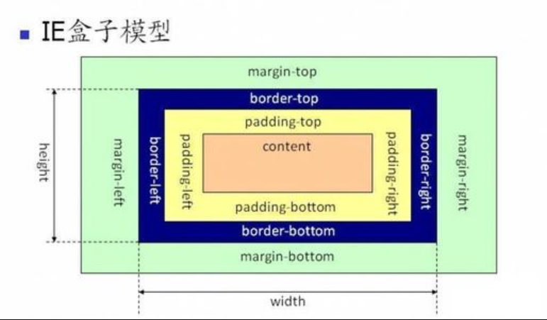
Form:
-
Content: content
-
Padding: inner padding
div{padding: 30px;/*Up and down*/}
div{padding: 30px 40px;/*Up, down, left and right*/}
div{padding: 30px 40px 50px 60px;/*Up, right, down, left*/}
-
border: border
-
margin: external padding (similar to padding)
Be careful:
Background color is filled in margin (excluding margin)
Child element in content area
padding cannot be negative and margin can be negative (this will cause box overlap)
box-sizing
Change the way the box is displayed
- Content box: size (width, height) is for content, default
- Border box: size for content+padding+border
- Padding box: size is for content+padding
Some problems of box model
margin superposition problem
-
Problem Description: the distance between the upper and lower boxes = max {the upper and lower box margins}
-
Solution: BFC specification, add spacing to only one element
margin delivery problem
-
Problem Description: in the nested structure, only in the margin top direction, the child element margin top will also affect the parent element
-
Solution: BFC, margin the parent container, and replace the child element margin with the parent element padding
body > div{
    background: red;
    width: 200px;
    height: 200px;
}

div > div{
    background: blue;
    width: 100px;
    height: 100px;
    margin-top: 200px; /* Only the margin top attribute is defined in the child element */
}
Adaptive centering of margin:
div{
    width:200px;
    height:200px;
    background: red;
}
/* Keep right */
div{margin-left: auto;}
/* Keep to the left */
div{margin-right: auto;}
/* Centered */
div{
    margin-left: auto;
    margin-right: auto;
}
div{
    margin: 0 auto;
}
The phenomenon of not setting content: if the size is not set, the div element will fill the content of the entire parent container; however, if the width or height is set to 100%, and the border or padding is added at the same time, the div element will exceed the content area of the parent container.
Label
Classification by type
- block: div,p,ul,li,h1 ......
- Monopolize one line
- Support all styles
- The width is the same as the parent container by default
- Occupy rectangular area
- inline: span,a,em,strong,img ......
- Close together
- Some styles, such as width, height, margin, padding, are not supported, but the img element supports width and height because it is a replacement element
- Width depends on content
- The occupied area is not necessarily a rectangle
- There will be gaps between inline labels, which is caused by line wrapping. Generally, span is used to decorate text rather than layout. If you have to solve this problem, you can set the blank font size to 0
- inline-block: input,select ......
- Close together, but supports width and height
- Occupy rectangular area
- There will be gaps between inline blocks
Browser developer tools can view label types
Classification by content
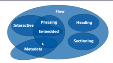
- FLow: most of the elements used within a body are summarized as FLow content
- Metadata: set the presentation or behavior of other content, set the relationship between documents, and transfer other "out of band data“
- Sectioning: content used to define title block and footer ranges
- Heading: defines the content of chapter headings
- Phrasing: text within paragraphs and elements that decorate and mark text
- Embedded: importing resources and embedding other content
- Interactive: interact with users
https://html.spec.whatwg.org/multipage/dom.html
Label by display
- Replace element: the browser determines the content displayed according to the attribute of the element, such as img, input
- Non replaceable elements: directly tell the content to the browser, such as h1-6
Label nesting specification
- List, table and row, cell label
- Blocks can be nested inline. Inline blocks cannot be nested in general (with some exceptions, for example, a label can nest blocks)
- Generally, blocks can be nested (with some exceptions, such as p cannot nest div)
More styles
Display box type
display: block, inline, inline block, none, where none is used to hide
display: none; non occupied hide, visibility: hidden; is occupied hide
Overflow hiding
overflow: visible,hidden,scroll,auto
overflow-x overflow-y
Transparency and gestures
opacity: 0 ~ 1, taking up space, will affect all the descendants' elements
rgba: color and transparency, will not affect the children's elements
Cursor: gesture, default is arrow, pointer, move, help , custom gesture cursor: url( ), auto;
Minimum and maximum width and height
min-width,max-width,min-height,max-height
Height of adaptive screen:
*{padding:0;margin:0;}
html,body{height: 100%;}
img{width: 100%;height: 100%;display: block;}
CSS default style
No default style: div, span
With default style:
- body: the default outer margin is 8px
- h1: upper and lower margin, font weight
- p: Up and down margin
- ul: upper and lower margin, padding left, list style
- a: text-decoration: underline;
Some default styles affect front-end development and require CSS reset
*{margin:0; padding:0;}/*It is not necessary to consider that those tags have default margin and padding, but slightly affect performance*/
ul{list-style: none;}
a{text-decoration: none; color:#999;}
a:hover{text-decoration: underline; color: red;}
img{display: block;}
/*
	Inline elements are aligned to the baseline, not the baseline
	vertical-align: baseline;
	Solution 1: vertical align: bottom;
	Solution 2: display: block;
*/
When writing a specific page or a layout effect:
1. Write structure
2. Write CSS Reset style
3. Specific writing style
float floating
Document flow: the position of objects in a document when they are arranged
float feature: the floating element will break away from the document flow and delay the parent container to arrange left or right. If there are floating elements before, they will be arranged next to the floating elements.
Value of float: left, right, none (default)
float notes:
- Only later elements will be affected
- By default, the content is promoted by half (the same as the text), which can realize the effect of mixed arrangement of text and text
- The default width is determined by content
- Flow layout
- Mainly for block elements, but also for inline elements
- clear tags only work on block tags, not inline Tags
Clear float:
- Arrange up and down: clear means to clear the influence of floating, left, right, both
- Nesting:
- Fixed width and height: the height of the parent element is not recommended
- Parent element floating: it also affects the following elements, not recommended
- overflow: hidden (BFC): if a child element wants to overflow, it will also be affected.
- Display: inline block (BFC): parent container will affect subsequent elements, not recommended
- Set empty label: add an empty label to the parent container and clear float. Not recommended, an extra tag will be added
- after pseudo class: an enhanced version of empty label, recommended by major companies
<!DOCTYPE html>
<html lang="en">
<head>
    <meta charset="UTF-8">
    <title>Title</title>
    <style>
        #box1{
            width: 200px;
            border: 1px solid black;
        }
        #box2{
            width:100px;
            height:200px;
            background: red;
            float: left;
        }
    </style>
</head>
<body>
<div id="box1"><div id="box2"></div></div>
</body>
</html>
Solution:
/* Write the height of the parent container to death */
#box1{height: 200px;}

/* Parent element float */
#box1{float: left;}

/* Hidden overflow */
#box1{overflow: hidden;}

/* Inline block display */
#box1{display: inline-block;}

/* Empty label, add another empty label in div × box1, div × box3 */
#box3{clear:left;}

/* Pseudo class */
#box1:after{content:'';display:block;clear:left;}
position positioning
position specifies how an element is positioned in the document
The top, right, bottom, left attributes determine the final location of the element
The z-index level specifies the order of overlap, with the direction outward.
Value:
- static: default
- Relative: relative positioning
- If no offset is defined, there is no effect on the element itself
- Element not detached from document flow
- Does not affect the layout of other elements
- left, right, top, bottom are offset relative to the element itself
- Absolute: absolute positioning
- Take the element completely out of the document flow
- Enable inline elements to support width and height (block property)
- Make the default width of the block element dependent on the content (make the block inline)
- If there is a locating ancestor element, it will be offset relative to the locating ancestor element; if there is no locating ancestor element, it will be offset relative to the whole document (absolute, relative, fixed)
- Fixed: fixed positioning
- Take the element completely out of the document flow
- Enable inline elements to support width and height (block property)
- Make the default width of the block element dependent on the content (make the block inline)
- Offset relative to the entire browser window, not affected by the browser scroll bar
- Sticky: sticky positioning and sticky operation (for example, the effect of search box on the home page of hao123)
- Use with offset, otherwise it will not work
Scene:
-
Using positioning and: hover pseudo class can achieve menu effect
-
Positioning enables child elements to be centered in the parent element
#box1{width:100px;height:100px;border:1px solid black;position:relative;}
#box2{width:100px;height:100px;background:red;position:absolute;left:50%;top:50%;margin:-50px 0 0 -50px;}
-
Using positioning and: before pseudo class to realize list decoration point
CSS add ellipsis
Practice:
- There must be a fixed width: width
- Do not allow content to wrap: white space: nowrap
- Hide overflow: overflow: hidden
- Add ellipsis: text overflow: ellipsis
Single line is supported. Multiple lines need other methods.
CSS Sprite
Features: also known as CSS Sprite, CSS Sprite, a web page image processing method, which allows you to include the scattered pictures involved in a page into a large image to load.
Advantages: reduce the quality of the picture, improve the loading speed; reduce the request speed of the picture, and speed up the opening speed of the page.
CSS fillet
Border radius: fillet labels
#box1{border-radius:20px;}                 /* The four fillets have the same radius */
#box2{border-radius:20px 10px;}            /* Sub diagonal fillet radius 20px, main diagonal fillet radius 10px */
#box3{border-radius:10px 20px 30px 40px;}  /* Start clockwise from the top left, with fillet radii of 10, 20, 30 and 40px respectively */
#box4{border-radius:10px/20px;}            /* Oval angle, half width 10px, half height 20px */

/* Semicircle effect */
#box5{
    width:200px;
    height:100px;
    background:darkviolet;
    border-radius: 100px 100px 0 0;
    margin:auto;
}
CSS gradient
1. Linear gradient: linear gradient is a value that needs to be added to the background image attribute.
eg:
background-image: linear-gradient(red,blue,green);
background-image: linear-gradient(to top,red,blue);
background-image: linear-gradient(to right top,red,blue);
/*Note that clockwise is positive, 0deg direction is vertical and downward*/
background-image: linear-gradient(45deg,red,blue);
/* From 25% to 75% */
background-image: linear-gradient(red 25%, blue 75%);
2. Radial gradient
Font Icon
Font face is a module in css3, which embeds custom web fonts into web pages.
Benefits: easy to change color and size, no distortion, reduce the number of requests, simplify the layout of web pages, add fonts not available in the system, etc
usage method:
@font-face { font-family:hello; src:url("https://at.alicdn.com/t/font_1404888168_2057645.eot"); src:url("https://at.alicdn.com/t/font_1404888168_2057645.eot?#iefix") format("embedded-opentype"), url("https://at.alicdn.com/t/font_1404888168_2057645.woff") format("woff"), url("https://at.alicdn.com/t/font_1404888168_2057645.ttf") format("truetype"), url("https://at.alicdn.com/t/font_1404888168_2057645.svg#uxiconfont") format("svg") } div{ font-family:hello; } .gouwuche:after{ content:""; }
Iconfont vector icon library: https://www.iconfont.cn/: a large number of free font icons are provided
Custom font Icon: https://iconmoon.io/app: generate Font Icon Online
shadow
1,text-shadow:
Optional values: x y, blur, color, multi shadow
Note that the color of the shadow is the same as the default color
Set up multiple shadows separated by commas
2,box-shadow
Optional values: x y, blur, spread, color, inset, multi shadow
The default color for box shadows is black
By default, it's the shadow of the vulva. Setting the outer set explicitly doesn't work
Use shadow to achieve floating effect:
ul{list-style:none;}
li{
    float:left;
    margin:50px;
    cursor:pointer;
    position:relative;
    top:0;
    transition: .5s;
    border-radius: 3px;
}
li:hover{
    top:-3px;
    box-shadow:0px 5px 10px 3px #ccc;
}
Mask
.mask{
    width:300px;
    height:300px;
    background:url("./img/girl.jpg");
    -webkit-mask:url("./img/love.png");
}

.mask2{
    width:300px;
    height:300px;
    background:url("./img/girl.jpg");
    /* x y / w h Indicates the location and size of the mask */
    -webkit-mask:url("./img/love.png") no-repeat center center/100px 100px;
    transition:.5s;
}

.mask2:hover{
    -webkit-mask:url("./img/love.png") no-repeat center center/200px 200px;
}
Note that the mask is not standardized yet, so you need to add a browser prefix
Multiple masks are added by commas.
Inverted reflection in water
-webkit-box-reflect:
Optional values: above, below, left, right, distance, mask | gradient
.box{
    margin: 50px auto;
    width: 300px;
    /* Mask */
    /* -webkit-box-reflect: below 20px url("./img/love.png"); */
    /* Transparency gradient */
    -webkit-box-reflect: below 20px linear-gradient(rgba(255,255,255,0),rgba(255,255,255,1))
}
Note that gradients only support transparency gradients.
Fuzziness and calculation
filter:blur(10px)
width:calc(100% - 100px)
BFC specification
Formatting context: a concept in the W3C CSS2.1 specification. It is a rendering area in the page, and has a set of rendering rules, which determines how its sub elements will be positioned, as well as the relationship and interaction with other elements.
BFC: Block Formatting Contexts, a block level formatting context, belongs to the above specification. The elements with BFC characteristics can be regarded as isolated independent containers. The elements inside the containers will not affect the elements outside in layout, and BFC has some characteristics that ordinary containers do not have.
Conditions for triggering BFC
1. Floating element: value other than none
2. Absolute positioning element: position (absolute, fixed)
3. display is inline block, table cells, flex
4. overflow values other than visible (hidden, auto, scroll)
BFC characteristics and Application
1. Solve the problem of margin superposition
css:
.div1 {
    width: 100px;
    height: 100px;
    background: red;
    margin-bottom: 50px;
}

.div2 {
    width: 100px;
    height: 100px;
    background: blue;
    margin-top: 50px;
}

.bfc {
    overflow: hidden; /* Trigger BFC */
}
html:
<div class="bfc">
    <div class="div1"></div>
</div>
<div class="bfc">
    <div class="div2"></div>
</div>
2. Solve the problem of margin delivery
CSS:
.div1 {
    width: 200px;
    height: 200px;
    background: red;
    overflow:hidden;/* Trigger bfc */
}

.div2 {
    width: 100px;
    height: 100px;
    background: blue;
    margin-top:50px;
}
HTML:
<div class="div1"><div class="div2"></div></div>
3. Solve the floating problem
CSS:
.div1 {
    width:200px;
    border: 1px solid black;
    overflow:hidden;/* Trigger bfc */
}

.div2 {
    width: 100px;
    height: 100px;
    background: blue;
    float:left;
}
HTML
<div class="div1"><div class="div2"></div></div>
4. Address coverage issues
CSS:
.div1 {
    width: 100px;
    height: 100px;
    background:red;
    float:left;
}

.div2 {
    height: 200px;
    background: blue;
    overflow: hidden;/*Trigger BFC*/
}
HTML
<div class="div1"></div>
<div class="div2">A single spark can start a prairie fire!</div>
Geometry, animation and 3D effects
Transition transition
Transition property: Specifies the name of the CSS property that sets the transition effect
Transition duration: Specifies the number of seconds or milliseconds to complete the transition effect
Transition delay: defines when the transition effect starts (a negative value indicates advance)
Transition timing function: Specifies the speed curve of speed effect, with optional values such as linear, ease (default), ease in, ease out, cubic Bezier
Composite style: Transition: Property duration delay transition timing function
transform deformation
| operation | usage |
|---|---|
| translate, displacement | translate(x,y) translateX(x) translateY(y) translateZ(z) |
| Scale, scale | scale(s) scale(x-scale,y-scale) scaleX(x-scale) scaleY(y-scale) scaleZ(z-scale) |
| Rotate, rotate | rotateZ(angle), unit: deg, rad, clockwise is positive rotateX(angle)(3d) rotateY(angle)(3d) |
| skew | skewX(x) skewY(y) Units are deg or rad, positive tilt left, negative tilt right |
matters needing attention:
1. The transform operation does not affect other elements
2. Deformation operations can only be added to block elements, not to inline elements
3. In composite writing, you can add multiple deformation operations at the same time, but you should pay attention to the order, and the later one should be executed first; translate will be affected by the other three operations in front of it
4. Transform origin: X, y; set the position of the base point
Animation animation
Animation name: name of the animation
Animation duration: duration of animation
Animation delay: the delay time of animation, infinite
Animation iteration count: animation repetition time
Animation timing function: motion form of animation
Be careful:
1. After the end of the movement, it will stay at the starting position by default
2. Composition: animation: myBox 4s 2s infinite linear
Practice:
1. Realize the moving effect of the block
.box1{
    width:300px;
    height:300px;
    border:1px black solid;
    margin:30px auto;
}

.box2{
    width:100px;
    height:100px;
    background:red;
    animation-name:myBox;
    animation-duration:4s;
}

/*@keyframes myBox{
    from{
        transform:translate(0,0);
    }
    to{
        transform:translate(200px,0);
    }
}*/

@keyframes myBox{
    0%{transform:translate(0,0);}
    25%{transform:translate(200px,0);}
    50%{transform:translate(200px,200px);}
    75%{transform:translate(0,200px);}
    100%{transform:translate(0,0);}
}
2. Achieve the effect of sliding in and out
.icon:hover{
    animation: ani .5s 0s;
}

@keyframes ani {
    0%,100%{transform:translate(0,0);opacity: 1;}
    60%{transform:translate(0,-800%);opacity: 0;}
    61%{transform:translate(0,200%);opacity: 1;}
}
3, The effect of loading
<!DOCTYPE html>
<html lang="en">
<head>
    <meta charset="UTF-8">
    <title>Title</title>
    <style>
        .m{
            width:100px;
            margin:30px auto;
            position:relative;
        }
        .container{
            width:100px;
            height:100px;
            position:absolute;
        }
        .circle{
            width:20px;
            height:20px;
            background:blue;
            border-radius:50%;
            position:absolute;
        }
        .container2{
            width:100px;
            height:100px;
            position:absolute;
            left:0;
            top:0;
            transform: rotate(45deg);
        }

        .m div.circle{
            animation: ani 1s 0s infinite;
        }

        div.container>div:nth-of-type(1){
            animation-delay: 0s;
        }
        div.container>div:nth-of-type(2){
            animation-delay: 250ms;
        }
        div.container>div:nth-of-type(3){
            animation-delay: 500ms;
        }
        div.container>div:nth-of-type(4){
            animation-delay: 750ms;
        }
        div.container2>div:nth-of-type(1){
            animation-delay: 125ms;
        }
        div.container2>div:nth-of-type(2){
            animation-delay: 375ms;
        }
        div.container2>div:nth-of-type(3){
            animation-delay: 625ms;
        }
        div.container2>div:nth-of-type(4){
             animation-delay: 875ms;
         }


        @keyframes ani{
            0%{
                transform:scale(1);
            }
            50%{
                transform:scale(.2);
            }
        }
    </style>
</head>
<body>
<div class="m">
    <div class="container">
        <div class="circle" style="left:0;top:0;"></div>
        <div class="circle" style="right:0;top:0;"></div>
        <div class="circle" style="right:0;bottom:0;"></div>
        <div class="circle" style="left:0;bottom:0;"></div>
    </div>
    <div class="container2">
        <div class="circle" style="left:0;top:0;"></div>
        <div class="circle" style="right:0;top:0;"></div>
        <div class="circle" style="right:0;bottom:0;"></div>
        <div class="circle" style="left:0;bottom:0;"></div>
    </div>
</div>
</body>
</html>
Extended usage of animation
Animation fill mode: Specifies whether the animation effect is visible before or after the animation is played
1. none: the default value. It returns to the initial state after the end of the movement. If there is a delay, let 0% take effect after the delay;
2. backwards: in case of delay, let 0% take effect before the delay;
3. forwards: stop at the end of the movement;
4. both: backwards and forwards take effect at the same time
Animation direction: the attribute defines whether the animation should take turns playing backwards.
1. alternate: once positive (0% - 100%), once reverse (100% - 0%)
2. reverse: always positive;
3. normal: the default value, always positive;
animate.css Library
Official website address: https://daneden.github.io/animate.css/
Basic use:
- animated: base class (basic style, each animation effect needs to be added)
- Infinite: infinite number of animations
transform3D
Related properties:
rotateX(): positive flip up
Rotate(): positive values flip right
translateZ(): positive forward, negative backward
scaleZ(): the thickness of a solid element
3d writing:
scale3d(): three values x y z
translate3d(): three values x y z
rotate3d(): four values 0| 1 (add rotation angle for x axis) 0| 1 (add rotation angle for y axis) 0| 1 (add rotation angle for z axis) deg
3d related attributes:
perspective: how far away from the screen to observe elements, the larger the value, the smaller the value
Perspective origin: depth of field base position, viewing angle of elements
transform-origin: x y z
Transform style: 3D space, flat (default 2d), preserve-3d (3D generates a 3D space)
Backface visibility: hidden, visible (default)
#box1{
    width:300px;
    height:300px;
    border:1px black solid;
    margin: 30px auto;
    perspective:200px;/* Set perspective on the parent container */
}

#box2 {
    width: 100px;
    height: 100px;
    background: red;
    margin:100px;
    transition:transform 1s;
    transform: rotateX(0);
}

#box1:hover>#box2{
    transform:rotateX(180deg);
}
Cube effect:
<!DOCTYPE html>
<html lang="en">
<head>
    <meta charset="UTF-8">
    <title>Title</title>
    <style>
        /* CSS RESET */
        * {
            margin: 0;
            padding: 0;
        }

        /* Cube */
        ul {
            list-style: none;
            transform-style: preserve-3d;/*Configure 3d space*/
            transition: 2s;/*Configuration distortion*/
        }

        div.box {
            width: 300px;
            height: 300px;
            border: 1px black solid;
            margin: 30px auto;
            perspective: 400px;/*Set depth of field*/
        }

        div.box ul {
            width: 100px;
            height: 100px;
            margin: 100px;
            position: relative;/*Set parent container relative positioning*/
            transform-origin:center center -50px;/*Set transform base point*/
        }

        div.box ul li {
            width: 100px;
            height: 100px;
            background: red;
            line-height: 100px;
            text-align: center;
            vertical-align: center;
            position: absolute;/*Set absolute positioning of sub containers*/
        }

        /*Left side facing backward*/
        div.box ul li:nth-of-type(2) {
            background: blue;
            transform: rotateY(-90deg);
            transform-origin: right;
            left: -100px;
        }

        /*Right side facing backward*/
        div.box ul li:nth-of-type(3) {
            background: green;
            transform: rotateY(90deg);
            transform-origin: left;
            left: 100px;
        }

        /*Upper side facing backward*/
        div.box ul li:nth-of-type(4) {
            background: yellow;
            transform: rotateX(90deg);
            transform-origin: bottom;
            top: -100px;
        }

        /*Lower side facing backward*/
        div.box ul li:nth-of-type(5) {
            background: magenta;
            transform: rotateX(-90deg);
            transform-origin: top;
            top: 100px;
        }

        /*Flip back and pan*/
        div.box ul li:nth-of-type(6) {
            background: cyan;
            transform: rotateY(180deg) translateZ(100px);
        }

        /*Rotation operation*/
        div.box:hover ul{
            transform:rotateX(360deg) rotateY(360deg) rotateZ(360deg);
        }

    </style>
</head>
<body>
<div class="box">
    <ul>
        <li>1</li>
        <li>2</li>
        <li>3</li>
        <li>4</li>
        <li>5</li>
        <li>6</li>
    </ul>
</div>
</body>
</html>
Choose Trojan effect:
<!DOCTYPE html>
<html lang="en">
<head>
    <meta charset="UTF-8">
    <title>Title</title>
    <style>
        /* CSS RESET */
        * {
            margin: 0;
            padding: 0;
        }

        /* Cube */
        ul {
            list-style: none;
            transform-style: preserve-3d;/*Configure 3d space*/
            transition: 2s;/*Configuration distortion*/
        }

        div.box {
            width: 300px;
            height: 300px;
            border: 1px black solid;
            margin: 30px auto;
            perspective: 400px;/*Set depth of field*/
        }

        div.box ul {
            width: 100px;
            height: 100px;
            margin: 100px;
            position: relative;/*Set parent container relative positioning*/
            /*transform-origin:center center -50px;*//*Set transform base point*/
        }

        div.box ul li {
            width: 100px;
            height: 100px;
            line-height: 100px;
            text-align: center;
            vertical-align: center;
            position: absolute;/*Set absolute positioning of sub containers*/
        }

        div.box ul li:nth-of-type(1) {
            background: red;
            transform:translateZ(100px);
        }

        div.box ul li:nth-of-type(2) {
            background: blue;
            transform:rotateY(60deg) translateZ(100px);
        }

        div.box ul li:nth-of-type(3) {
            background: green;
            transform:rotateY(120deg) translateZ(100px);
        }

        div.box ul li:nth-of-type(4) {
            background: yellow;
            transform:rotateY(180deg) translateZ(100px);
        }

        div.box ul li:nth-of-type(5) {
            background: magenta;
            transform:rotateY(240deg) translateZ(100px);
        }

        div.box ul li:nth-of-type(6) {
            background: cyan;
            transform:rotateY(300deg) translateZ(100px);
        }

        div.box:hover ul{
            transform:rotateY(-360deg);
        }
    </style>
</head>
<body>
<div class="box">
    <ul>
        <li>1</li>
        <li>2</li>
        <li>3</li>
        <li>4</li>
        <li>5</li>
        <li>6</li>
    </ul>
</div>
</body>
</html>
Flip effect:
<!DOCTYPE html>
<html lang="en">
<head>
    <meta charset="UTF-8">
    <title>Title</title>
    <style>
        /* CSS RESET */
        * {
            margin: 0;
            padding: 0;
        }

        img {
            width: 100%;
            height: 100%;
            display: block;
        }

        .container {
            width: 800px;
            height: 450px;
            border: 1px solid black;
            margin: 30px auto;
            position:relative;
            transform-style: preserve-3d;
            perspective: 1000px;
            backface-visibility: hidden;
        }

        .container > div {
            width:calc(100% - 50px);
            height:calc(100% - 50px);
            position:absolute;
            margin:25px;
            transition:1s;
        }

        .container > div:last-child{
            transform: rotateY(180deg);
        }

        .container:hover > div:first-child{
            transform: rotateY(-180deg);
        }

        .container:hover > div:last-child{
            transform: rotateY(0);
        }


    </style>
</head>
<body>
<div class="container">
    <div>
        <img src="./images/quanyecha.jpg">
    </div>
    <div>
        <img src="./images/quanyecha2.jpg">
    </div>
</div>
</body>
</html>
Flip using scale negative value
.box{
    margin:50px auto;
    transform: scale(-1);
}
layout
1. BFC specification
2, positioning
3,float
4. flex elasticity
Forum center and layout
Layout of columns
Column count: number of columns
Column width: width of columns
Column gap: spacing between columns
Column rule: the boundary of a column
Column span: merge columns
Note: the number of columns and the width of columns are mutually exclusive
Contour layout
Method: margin+padding+overflow
*{margin:0;padding:0;}
#parent{
    border:10px black solid;
    overflow:hidden;
}
#box1{
    float:left;
    width:100px;
    background:red;
    margin-bottom:-2000px;
    padding-bottom:2000px;
}
#box2{
    float:right;
    width:100px;
    background:blue;
    margin-bottom:-2000px;
    padding-bottom:2000px;
}
html
<div id="parent">
    <div id="box1">
		<p>111</p>
        <p>111</p>
        <p>111</p>
    </div>
    <div id="box2">
        <p>222</p>
        <p>222</p>
    </div>
</div>
Double wing layout
Effect: left and right fixed, middle adaptive
Practice:
*{
    margin:0;
    padding:0;
}

.header{
    height:100px;
    background:red;
}

.container .center{
    height:200px;
    width:100%;
    float:left;
}

.container .center p{
    background: yellow;
    height: 100%;
    margin: 0 150px 0 100px;
}

.container .left{
    float: left;
    width: 100px;
    height: 200px;
    background: blue;
    margin-left: -100%;
}

.container .right{
    float: right;
    width: 150px;
    height: 200px;
    background: green;
    margin-left: -150px;
}
html
<div class="header"></div>
<div class="container">
    <div class="center">
        <p>I am the son of the Chinese people. I love my motherland and people deeply.</p>
    </div>
    <div class="left"></div>
    <div class="right"></div>
</div>
Holy Grail layout
The layout of the Holy Grail is similar to the layout of the twin wings, but the layout of the twin wings needs to add content inside the center box, while the layout of the Holy Grail does not need to. Because of this, the implementation of the layout of the Holy Grail is a little more complicated.
*{
    margin:0;
    padding:0;
}

.header{
    height:100px;
    background:red;
}

.container{
    height: 200px;
    margin: 0 300px 0 200px;
    background:yellow;
}

.clear:after{
    content:"";
    display:block;
    clear:both;
}

.container .center {
    width:100%;
    height: 200px;
    float: left;
}

.container .left{
    float:left;
    width:200px;
    height:100%;
    background:blue;
    margin-left:-200px;
}

.container .right{
    float: right;
    width:300px;
    height:100%;
    background:purple;
    margin-right:-300px;
}
html
<div class="header"></div>
<div class="container clear">
    <div class="left"></div>
    <div class="center"></div>
    <div class="right"></div>
</div>
Flex elastic box model
Syntax:
| Acting on flex container | Act on flex children |
|---|---|
| flex-direction | order |
| flex-wrap | flex-grow |
| flex-flow | flex-shrink |
| justify-content | flex-basis |
| align-items | flex |
| align-content | align-self |
Flex direction: used to control the overall layout of sub items, from left to right, from right to left, from top to bottom, from bottom to top
| Value | Meaning | Effect |
|---|---|---|
| row | Default value, displayed as row. The direction is the current document horizontal flow direction, which is from left to right by default | 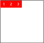 |
| row-reverse | Display as row. But the direction is the opposite of the row property value | 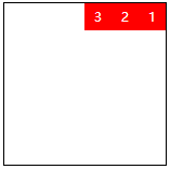 |
| column | Display as column | 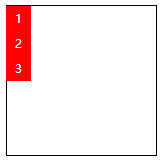 |
| column-reverse | Display as a column. But the direction is the opposite of the column property value | 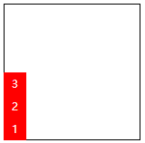 |
Flex Wrap: used to control whether a child's overall single line display or line feed display.
| Value | Meaning | Effect |
|---|---|---|
| nowrap | Default value, which means single line display without line wrapping |  |
| wrap | Insufficient width line feed |  |
| wrap-reverse | The width is not enough for line breaking display, but it starts from the bottom up, that is to say, the sub items originally line breaking at the bottom now run to the top |  |
Flex flow: abbreviation of flex direction and flex wrap, indicating the flow characteristics of flex layout. The first value represents the direction, the second value represents the line break, separated by commas.
Justify content: determines the alignment and distribution of children in the main axis direction.
| Value | Meaning | Effect |
|---|---|---|
| flex-start | Default, represented as start position alignment |  |
| flex-end | Show as end position alignment | 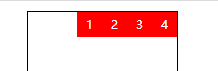 |
| center | Appears to be centered | 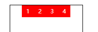 |
| space-between | It means that the extra space is only allocated in the middle of the element | 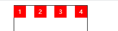 |
| space-around | around means that each flex sub item is surrounded by an equal width of blank space that does not interfere with each other. Finally, the blank space at both ends of the edge is only half of the width of the middle blank | 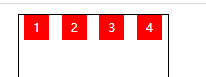 |
| space-evenly | evenly means symmetry and equality. That is to say, visually, the space between the two sides of each flex subitem is exactly the same. | 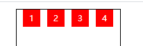 |
Align items: items refers to the flex children, so align items refers to the alignment of the flex children relative to the flex container in the side axis direction.
| Value | Meaning | Effect |
|---|---|---|
| stretch | Default, flex child stretch | 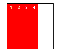 |
| flex-start | Represents top of container alignment | 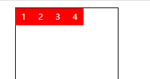 |
| flex-end | Appears as bottom of container alignment | 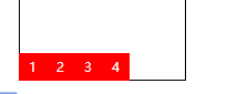 |
| center | Appears as vertical center alignment | 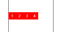 |
Align content: align content can be regarded as a similar and opposite attribute to justify content. If all flex subitems have only one line, the align content attribute has no effect.
| Value | Meaning | Effect |
|---|---|---|
| stretch | Default value. Each line of flex child elements is stretched equally. For example, if there are two flex subelements in total, the stretch height of each row is 50%. | 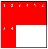 |
| flex-start | Appears as start alignment | 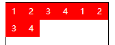 |
| flex-end | Show as end position alignment | 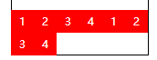 |
| center | Appears to be centered | 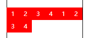 |
| space-between | Appears to be justified | 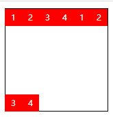 |
| space-around | Each row of elements has an independent and non overlapping space | 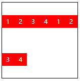 |
| space-evenly | Every element in a row can be completely divided up and down | 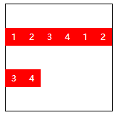 |
css attribute on flex child
| Value | Meaning |
|---|---|
| order | You can change the sorting position of a flex subitem by setting the order. The default order property value for all flex children is 0. |
| flex-grow | Growth in the attribute means extension, which is the width occupied by the flex subitem. The space occupied by extension is the remaining blank space except for the element. The default value is 0 |
| flex-shrink | The "shrink" in the attribute means "shrink". Flex shrink mainly deals with the shrinkage ratio of individual elements when the flex container is short of space. The default value is 1 |
| flex-basis | Flex basis defines the default size of the elements before allocating the remaining space. |
| flex | The flex attribute is a shorthand for flex growth, flex growth and flex basis. Note that flex takes precedence over width |
| align-self | Control the vertical alignment of a single flex subitem |
Grid grid layout
Grid is a two-dimensional layout method, which always exists in both vertical and horizontal directions.
Syntax:
| Act on container | Act on grid children |
|---|---|
| grid-template-columns | grid-column-start |
| grid-template-rows | grid-column-end |
| grid-template-areas | grid-row-start |
| grid-template | grid-row-end |
| grid-column-gap | grid–column |
| grid-row-gap | grid-row |
| grid-gap | grid-area |
| justify-items | justify-self |
| align-items | align-self |
| place-items | place-self |
| justify-content | |
| align-content | |
| place-content |
1. Grid template columns and grid template rows
The grid is divided horizontally and vertically to form a two-dimensional layout. The units can be pixel, percentage, adaptive, and fr units (scale units of the remaining space of the mesh).
Sometimes, we partition the grid regularly. If we need to add multiple horizontal and vertical networks, we can use repeat() syntax to simplify the operation. For example: repeat(3,1fr)
Note that when using fr units, if the total length set is insufficient, it will leave blank.
2. Grid template areas and grid template
Area means area. Grid template areas is used to divide our grid into areas. In this case, the grid sub item only needs to use the grid area attribute to specify which area it belongs to.
Grid template is a shorthand for grid template rows, grid template columns, and grid template areas attributes.
Note that special areas are not allowed to be divided, but only rectangular areas.
<html>
    <head>
        <style>
            .container{
                width:300px;
                height:300px;
                border:1px black solid;
                display:grid;
                grid-template-rows:repeat(3,1fr);
                grid-template-columns:repeat(3,1fr);
                grid-template-areas:
                    "a a a"
                    "b b c"
                    "b b c";
            }

            .box{
                background:red;
                border:1px black solid;
            }

            .box:nth-of-type(1){
                grid-area:a;
            }

            .box:nth-of-type(2){
                grid-area:b;
            }

            .box:nth-of-type(3){
                grid-area:c;
            }
        </style>
    </head>
    <body>
       	<div class="container">
            <div class="box"></div>
            <div class="box"></div>
            <div class="box"></div>
        </div>
    </body>
</html>
Composite writing method of grid template:
.container{
    /* ... */
    grid-template:
        "a a a" 1fr
        "b b c" 1fr
        "b b c" 1fr
        /1fr /1fr /1fr;
}
3. Grid template gap and grid row gap
Grid column gap and grid row gap attributes are used to define the size of grid gaps in a grid.
Grid gap attribute is the abbreviation of grid column gap and grid row gap attributes.
4. Justify items and align items
Justify items specifies how grid elements are rendered horizontally, horizontally stretched, or aligned left, middle, and right. Align items specifies how grid elements are rendered vertically, vertically stretched, or aligned up, middle, and down.
Place items allows the align items and justify items properties to be unloaded from a single declaration.
| Value | Meaning |
|---|---|
| stretch | Default, stretch. Appears as a horizontal or vertical fill. |
| start | Represents left or top alignment of the container. |
| end | Appears as a right or bottom alignment of the container. |
| center | Appears as horizontal or vertical center alignment. |
| space-between | Appears to be justified |
| space-around | Independent and non overlapping blank area |
| space-evenly | Evenly allocate blank space |
Note that the difference between stretch and start can only be seen when width or height is set to auto
5. css attributes on grid children
| Value | Meaning | Writing method |
|---|---|---|
| grid-column-start | Starting position occupied in horizontal direction | 2 |
| grid-column-end | End of position occupied in horizontal direction (span attribute) | 2 or span 2 |
| grid-row-start | Starting position occupied in vertical direction | 3 |
| grid-row-end | End position occupied vertically (span attribute) | 3 or span 3 |
| grid-column | Abbreviations for grid column start and grid column end | 2 / 4 or 2/span 2 |
| grid-row | Abbreviations for grid row start and grid row end | 2 / 4 or 2/span 2 |
| grid-area | Indicates the area occupied by the current grid. There are two ways to write the name and location | 2 / 1 / 4 / 3 or 2/1/span 2/span 2 |
| justify-self | Horizontal alignment of individual grid elements | Same as just content |
| align-self | Vertical alignment of individual grid elements | Same as align content |
| place-self | Abbreviations of align self and justify self | Same as place content |
(1) Grid column start, grid column end, grid row start and grid row end respectively specify the left, right, upper and lower boundaries of the grid, specifically the first few longitudes or latitudes, which are used together.
(2) The end positions of grid column end and grid row end can be changed to span blocks instead of end positions, similar to the writing method of "grid column end: span 2".
(3) Grid column and grid row can be divided into start position and end position by "/", for example, "2 / 3" marks from 2 to 3.
(4) Grid area is divided into left, top, right and bottom boundaries by "/".
Pseudo class and pseudo element
Pseudo class in CSS3
And pseudo elements are explained relatively clearly and grammatically
A clear distinction has also been made.
1. Syntax: pseudo class starts with a colon, then the name of the pseudo class; pseudo element starts with two colons, then the name of the pseudo element.
2. Concept:
-
Pseudo class: essentially to make up for the lack of regular CSS selectors, so as to get more information. Usually means to get information that does not exist in the DOM tree, or that cannot be obtained by regular CSS selectors.
eg: :hover,:focus,:empty.
-
Pseudo element: in essence, a virtual container is created, which does not contain any DOM elements, but can contain content. In addition, developers can customize styles for pseudo elements.
eg: ::selection,::first-line / first-letter,::before / after
CSS Hack
To solve browser compatibility problems
Classification:
1. CSS property prefix method
2. Selector prefix method
3. IE conditional annotation
CSS prefix notation
The property prefix method is to add some hack prefixes that can only be recognized by a specific browser before the CSS style property names, so as to achieve the desired page display effect
| Prefix mark | Compatible browser | usage |
|---|---|---|
| _ | IE6 | _background:red; |
| +,* | IE6,IE7 | +background:red; |
| \9 | IE6~9 | background:red\\9; |
| \0 | IE8~11 | background:red\\0; |
Selector prefix method
The selector prefix method is used to hack the CSS selectors by adding prefixes that can only be recognized by some specific browsers, aiming at some browsers that have inconsistent performance or need special treatment.
| Prefix mark | Compatible browser | usage |
|---|---|---|
| *html | IE6 | *html .box{} |
| *+html | IE7 | *+html .box{} |
| :root | IE9+ | :root .box{} |
IE condition comment
IE10 or above is no longer supported
| Prefix mark | Compatible browser |
|---|---|
| <!-- [if IE]>...<![endif]--> | IE |
| <!--[if IE 7]>...<![endif]--> | IE7 |
| <!--[if lte IE 7]>...<![endif]--> | IE7 below |
| <!--[if ! IE 7]>...<![endif]--> | Non IE7 |
Common bug s in IE low version
opacity is not supported under IE8
Bilateral distance phenomenon: "display:inline"
Minimum height bug: overflow:hidden
border: none;
Gradual enhancement and elegant degradation
Progressive enhancement: build the page for the browser to ensure the most basic functions, and then improve and add functions such as effect and interaction for the advanced browser to achieve a better user experience.
Elegant degradation: build full functionality at the beginning and then be compatible with lower versions of browsers.
Mobile terminal
Mobile emulator: after switching the platform, you usually need to refresh the page to access the mobile page.
viewport
Viewport: the browser displays the screen area of the page. There are two kinds of viewport in the viewport, which are visual viewport and layout viewport. The fixed size of visual viewport is the same as the screen size, on the top, while the layout viewport can change the size, on the bottom. The default size of layout viewport is 980px, which can be accessed through document. documentElement.clientWidth get. Modern web pages need to set the layout viewport to the same size as visual viewport, which is convenient for making web pages.
Viewport setting: set through the < meta > label, the name attribute specifies the viewport value, and the content attribute configures the viewport.
| Value | Meaning |
|---|---|
| width | Set the width specific value of layout viewport, device width means device width |
| height | Set the height specific value of layout viewport, generally not set |
| initial-scale | Set the initial zoom of the page |
| minimum-scale | Set the minimum zoom of the page |
| maximum-scale | Set the maximum zoom of the page |
| user-scalable | Set whether the page can be zoomed |
<meta name="viewport" content="width=device-width, initial-scale=1.0,user-scalable=no">
Mobile adaptation scheme
1. Percentage layout, also known as flow layout. Representative websites: Youku, Baidu, tmall, Tencent.
2. Scale the layout equally, also called rem layout. Representative websites: Netease, iqiyi, Taobao, meituan.
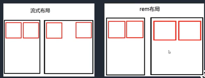
Flow layout
Benefits: more on the big screen
Disadvantage: there will be a slight imbalance in the ratio when the screen is wide.
rem layout
Company:
-
Em: relative unit, 1em is equal to the font size value of the current element or parent element
-
REM: relative unit. 1rem is equal to the font size value of the root element
-
vm/vh: divide the screen into 100 parts, 1vw is equal to 1% of the screen width
Dynamic setting font size:
- Through js
- Through vw
Please reset the body font size: 16px
Responsive layout
By using media queries, i.e. media queries, different styles can be defined for different media types to achieve responsive layout.
media type
| Value | Meaning |
|---|---|
| all | For all devices |
| For printer and print preview | |
| screen | For computer screen, tablet, Smartphone |
| speech | It is applied to screen reader and other sound generating devices |
Common options: media type, and, not, min width, max width, orientation:portrait, orientation:landscape, < link >
#box{
    width:100px;
    height:100px;
    background:red;
}
@media all
    and (min-width:1000px)
    and (max-width:1200px){
    #box{
        background:blue;
    }
}

/* Use not keyword to negate */
/*@media not all and (min-width:1200px){
    #box{
        background:blue;
    }
}*/

/* Under the condition of vertical screen */
/*@media all and (orientation: portrait){
    #box{
        background:blue;
    }
}*/
<link rel="stylesheet" href="base.css" media="all and (min-width:400px)">
<link rel="stylesheet" href="base2.css" media="all and (min-width:600px)">
Common modification styles: display, float, width
Reactive code should be written after the appropriate CSS
Two modes of operation:
*{margin:0;padding:0;}
.container{padding-left:15px;padding-right:15px;margin-left:auto;margin-right:auto;}
/* First mode of operation */
@media all and (min-width:768px){
    .container{max-width:720px;}
}
@media all and (min-width:992px){
    .container{max-width:960px;}
}
@media all and (min-width:1200px){
    .container{max-width:1140px;}
}

/* Second mode of operation */
.mt-50{
    margin-top:50px;
}

@media all and (min-width:768px){
    .mt-md-50{margin-top:50px;}
}
@media all and (min-width:992px){
    .mt-lg-50{margin-top:50px;}
}
@media all and (min-width:1200px){
    .mt-xl-50{margin-top:50px;}
}
bootstrap
bootstrap is the most popular HTML, CSS and JS framework for developing responsive layout and mobile device priority WEB projects.
Features: responsive layout, flex based grid system, rich component and tool methods, common interactive use
Official website: https://getbootstrap.com
CSS advanced and new features
Sass and Less
Sass and Less belong to CSS preprocessor. CSS preprocessor defines a new programming language. Its basic idea is to use a special programming language to add some programming features to CSS, such as: variables, statements, functions, inheritance and other concepts. Take CSS as the target generation file, and then developers just need to use this language to code CSS.
Official website of less: http://lesscss.org/
VSCode plug in: Easy LESS
Sass official website: https://sass-lang.com/
VSCode plug in: Easy Sass
1, notes
Single line comments will not be compiled, and multi line comments will be compiled
2. Variable, interpolation, scope
LESS
@number:200px;
@key:margin;
@i:2;
.box@{i}{
    width:@number;
    height:@number;
    @{key}:auto;
}

.box3{
    height:@number;//Match 456px
    @number:456px;
    width:@number;//Match 456px
}
SASS
$number:200px;
$key:margin;
$i:2;
.box#{$i}{
    width:$number;
    height:$number;
    #{$key}:auto;
}


/* Sass The scope of is sequential */
.box3{
    height:$number;//Match 200px
    $number:456px;
    width:$number;//Match 456px
}
3. Selector nesting, pseudo class nesting, attribute nesting (sass)
LESS
ul{
    list-style: none;
    li{
        float:left;
        div{
            margin:10px;
        }
        p{
            margin:20px;
        }
    }
    &:hover{
        color:red;
        font-size:10px;
        font-family:Song style;
        font-weight:bold;
    }

}
sass
ul{
    list-style: none;
    li{
        float:left;
        div{
            margin:10px;
        }
        p{
            margin:20px;
        }
    }

    &:hover{
        color:red;
        //Attribute nesting is a special property of sass
        font : {
            size:10px;
            family:Song style;
            weight:bold;
        }
    }
}
4. Operation, unit, escape, color
LESS
@num:100px;
.box4{
    width: @num * 3;
    height:@num+10em;//The unit is px.
    margin:10em+@num;//The unit is em.
    color:#020406 * 2; / / color calculation
    //padding:20px / 2.0; / / the result is 10px
    padding:~"20px / 2.0";//Escape symbol, resulting in 20px/2.0
}
SASS
$num:100px;
.box4{
    width: $num * 3;
    //height:$num+10em; / / different units cannot be calculated
    //margin:10em+$num; / / different units cannot be calculated
    //padding:20px / 2.0; / / the result is 10px
    padding:(20px / 2.0);//Default / split operation, add parentheses to indicate operation
}
5, function
LESS
.box{
    width:round(3.4px);
    height:percentage(0.2);
}
SASS
@function sum($n,$m){
    @return $n + $m;
}

.box{
    width:round(3.4px);
    height:percentage(0.2);
    margin:random();
    font-size: sum(2px,7px);
}
6. Mix in, namespace (LESS), inherit
LESS
.container{
    font-size:16px;
    font-family:'Times New Roman', Times, serif;
    color:red;
}

//Blend in only, no rendering
.hide(){
    display:none;
}

//You can also add parameters
.changeColor(@m,@n){
    color:@m;
    background:@n;
}

.box{
    width:100px;
    height:100px;
    background:blue;
    .container;
    .hide;
    .changeColor(white,black);
}

//Namespace
#nm(){
    .container{
        font-size:32px;
        font-family: Song style,serif;
        color:green;
    }
}

.box1{
    #nm.container;
}

//inherit
.line{
    display: inline;
}

.box2{
    &:extend(.line);
    text-align:center;
}

.box3{
    &:extend(.line);
    text-align:left;
}
SASS
@mixin show {
    display:block;
}

@mixin hide($color){
    display:none;
    color:$color;
}

.box{
    width:100px;
    height:100px;
    background:red;
    @include show;
    @include hide(red);
}

//inherit
.line{
    display:inline;
}
//Does not render to page
%valign{
    vertical-align: center;
}

.box2{
    @extend .line;
    @extend %valign;
    text-align:center;
}

.box3{
    @extend .line;
    @extend %valign;
    text-align:left;
}
7. Merge, media query
LESS
.box{
    background+ : url("a.png");
    background+ : url("b.png");
    transform+_ : scale(2);
    transform+_ : rotate(30deg);
}

.box1{
    width:200px;
    @media all and (min-width:768px){
        width:600px;
    }

    @media all and (min-width:1600px){
        width:900px;
    }
}
SASS
$background : (
    aaa:url("a.png"),
    bbb:url("b.png")
);

$transform : (
    ccc:scale(2),
    ddd:rotate(30deg)
);

.box{
    background: map-values($background);
    transform: zip(map-values($transform)...);
}

.box1{
    width:200px;
    @media all and (min-width:768px){
        width:600px;
    }

    @media all and (min-width:1600px){
        width:900px;
    }
}
8. Condition, cycle
LESS
//condition
.get(@cn) when ( @cn > 4 ){
    width: 100px + @cn;
}

.get(@cn) when ( @cn <= 4 ){
    width: 10px + @cn;
}

.box{
    .get(5);
}

//loop
.get2(@cn) when (@cn<3){
    .get2(@cn+1);
    .box-@{cn}{
        width:100px+@cn;
    }
}

.get2(0);
SASS
$count : 2;

.box{
    @if($count > 3){
        width:100px + $count;
    }
    @else{
        width:10px + $count;
    }
}

@for $i from 0 through 2{
    .box-#{$i}{
        width:100px+$i;
    }
};
9. Import
LESS
@import './reset.less';
SASS
@import './reset.scss';
PostCSS
PostCSS itself is a single tool. It provides a way to handle CSS with Javascript code. Some engineering operations can be realized by using PostCSS, such as automatically adding browser prefix, code merging, code compression, etc.
Official website: https://postcss.org/
Installation:
1. Install node environment;
2,npm install postcss-cli -g
3,-o,-w
4,postcss.config.js
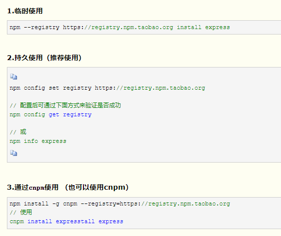
Configure npm image
Common plug-ins:
autoprefixer: batch add browser prefix
Postcss import: multiple css files merging
cssnano: compression of css files
Postcss cssnext: Handling advanced CSS syntax
stylelint: check css code for compliance
Post CSS sprites: auto generate Sprite
...
const autoprefixer = require('autoprefixer');
module.exports = {
    plugins:[
        autoprefixer({
            browsers:[' >0% ']
        })
    ]
};
CSS architecture
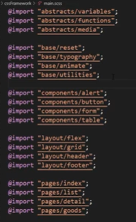
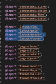
In a large project, CSS code is difficult to develop, maintain and develop because of too many pages. So CSS architecture can help us solve the problems of file management and file partition.
First of all, we need to modularize CSS, one module is responsible for one kind of operation behavior. It can be realized by Sass or Less.
| Folder | Meaning |
|---|---|
| base | Some initial general CSS, such as reset default style, animation, tools, printing, etc |
| components | All components used to build a page, such as buttons, forms, tables, pop ups, etc |
| layout | Used to layout different parts of the page, such as header, footer, elastic layout, grid layout, etc |
| pages | Place different styles between pages, such as special style of first page, special style of list page, etc |
| themes | When applying different theme styles, such as administrator, buyer, seller, etc. |
| abstracts | Place some auxiliary development parts, such as variables, functions, response, etc |
| vendors | Place some third-party independent CSS files, such as bootstrap, iconfont, etc |
main.scss
New features of CSS
Custom properties
:root{
    --color:red;
    --number:100px;
    --number2:100;
    --size:50px;
    --lheight:100px;
}

#box{
    --lheight:50px;
    color:var(--color);
    width:var(--number);
    height:calc(var(--number2)*1px);
    font-size:var(--size,40px);/* Default 40px */
    line-height:var(--lheight);/* The value is 50px */
}
shapes
- clip-path
- shape-outside
- shape-margin
Achieve irregular text surrounding effect, with floating
<html>
<head>
    <meta charset="UTF-8">
    <meta name="viewport" content="width=device-width,initial-scale=1.0">
    <meta http-equiv="X-UA-Compatible" content="ie=edge">
    <link rel="stylesheet" href="./plugins/css/bootstrap.css">
    <style>
        #parent{
            width:300px;
            height:300px;
            border:1px black solid;
            margin:20px;
        }
        #shape{
            width:100px;
            height:100px;
            padding:10px;
            margin:10px;
            border:10px black solid;
            float:left;
            border-radius: 50%;
            shape-outside: border-box;/* none,margin-box,border-box,padding-box */
        }
    </style>
</head>
<body>
<div id="parent">
    <div id="shape">
    </div>
    1 At about 17:36 on December 13, the road collapsed in front of the Great Wall hospital on South Street of our city. A No.17 bus (Qing A60015)Fall into it after the accident
    ,The city launched rescue as soon as possible, and timely informed the gas, water, power and other departments to take measures to stop gas, water and power supply, so as to ensure the smooth rescue on site.
</div>
</body>
</html>
Replace with triangle:
#shape{
    /* ... */
    background:red;
    clip-path: polygon(0 0,0 100px,100px 100px);
    shape-outside:polygon(0 0,0 100px,100px 100px);
    shape-margin:10px;/* Text and boundary are 10px apart */
scrollbar
For custom implementation of scroll bar styles
-
::-webkit-scrollbar
The height and width correspond to the "thickness" of the horizontal and vertical scroll bars respectively
-
::-webkit-scrollbar-thumb
"Bar" in scroll bar
-
::-webkit-scrollbar-track
Scroll bar "remaining" section
scroll snap
Scroll capture allows you to lock specific elements or positions after the user finishes scrolling.
- scroll-snap-type
- x
- mandatory
- scroll-snap-align
- start
- center
- end
snext: Handling advanced CSS syntax
stylelint: check css code for compliance
Post CSS sprites: auto generate Sprite
...
const autoprefixer = require('autoprefixer');
module.exports = {
    plugins:[
        autoprefixer({
            browsers:[' >0% ']
        })
    ]
};
CSS architecture
In a large project, CSS code is difficult to develop, maintain and develop because of too many pages. So CSS architecture can help us solve the problems of file management and file partition.
First of all, we need to modularize CSS, one module is responsible for one kind of operation behavior. It can be realized by Sass or Less.
| Folder | Meaning |
|---|---|
| base | Some initial general CSS, such as reset default style, animation, tools, printing, etc |
| components | All components used to build a page, such as buttons, forms, tables, pop ups, etc |
| layout | Used to layout different parts of the page, such as header, footer, elastic layout, grid layout, etc |
| pages | Place different styles between pages, such as special style of first page, special style of list page, etc |
| themes | When applying different theme styles, such as administrator, buyer, seller, etc. |
| abstracts | Place some auxiliary development parts, such as variables, functions, response, etc |
| vendors | Place some third-party independent CSS files, such as bootstrap, iconfont, etc |
main.scss
[external link picture transfer in storage (img-rrOmkaJv-1578980584345)]
[picture transfer in chain] (img-hkNP1JXd-1578980584347)]
New features of CSS
Custom properties
:root{
    --color:red;
    --number:100px;
    --number2:100;
    --size:50px;
    --lheight:100px;
}

#box{
    --lheight:50px;
    color:var(--color);
    width:var(--number);
    height:calc(var(--number2)*1px);
    font-size:var(--size,40px);/* Default 40px */
    line-height:var(--lheight);/* The value is 50px */
}
shapes
- clip-path
- shape-outside
- shape-margin
Achieve irregular text surrounding effect, with floating
<html>
<head>
    <meta charset="UTF-8">
    <meta name="viewport" content="width=device-width,initial-scale=1.0">
    <meta http-equiv="X-UA-Compatible" content="ie=edge">
    <link rel="stylesheet" href="./plugins/css/bootstrap.css">
    <style>
        #parent{
            width:300px;
            height:300px;
            border:1px black solid;
            margin:20px;
        }
        #shape{
            width:100px;
            height:100px;
            padding:10px;
            margin:10px;
            border:10px black solid;
            float:left;
            border-radius: 50%;
            shape-outside: border-box;/* none,margin-box,border-box,padding-box */
        }
    </style>
</head>
<body>
<div id="parent">
    <div id="shape">
    </div>
    1 At about 17:36 on December 13, the road collapsed in front of the Great Wall hospital on South Street of our city. A No.17 bus (Qing A60015)Fall into it after the accident
    ,The city launched rescue as soon as possible, and timely informed the gas, water, power and other departments to take measures to stop gas, water and power supply, so as to ensure the smooth rescue on site.
</div>
</body>
</html>
[external link picture transfer in storage (img-YL7BDs0g-1578980584350)]
Replace with triangle:
#shape{
    /* ... */
    background:red;
    clip-path: polygon(0 0,0 100px,100px 100px);
    shape-outside:polygon(0 0,0 100px,100px 100px);
    shape-margin:10px;/* Text and boundary are 10px apart */
[external link picture transfer in storage (img-3ufaLgJu-1578980584351)]
scrollbar
Used to customize the implementation of scrollbar styles
-
::-webkit-scrollbar
The height and width correspond to the "thickness" of the horizontal and vertical scroll bars respectively
-
::-webkit-scrollbar-thumb
"Bar" in scroll bar
-
::-webkit-scrollbar-track
Scroll bar "remaining" section
scroll snap
Scroll capture allows you to lock specific elements or positions after the user finishes scrolling.
- scroll-snap-type
- x
- mandatory
- scroll-snap-align
- start
- center
- end

