1. Realization Case with CSS border
The results are as follows (for real-time rendering):

How to use it?
Refer to CSS files, such as:
<link rel="stylesheet" href="./css-letters1.css">
Or direct CSS code to your project:
/* Global Style */
.letter {
    color: #2486ff;
    border-style: solid;
    border-width: .5em;
    display: inline-block;
    position: relative;
}
.letter:after {
    border-style: solid;
    border-width: .5em;
    content: '';
    position: absolute;
}
/* Single letter style */
.letter[data-char="A"] {
    border-bottom: none;
    border-radius: 1em 1em 0 0;
    height: 2.05em;
    margin-top: -.05em;
    width: 1em;
}
.letter[data-char="A"]:after {
    border-bottom: none;
    border-left: none;
    border-right: none;
    left: 0;
    right: 0;
    top: .75em;
}
.letter[data-char="B"] {
    border-radius: 0 1em 1em 0;
    height: .5em;
    width: 1em;
}
.letter[data-char="B"]:after {
    border-radius: 0 1em 1em 0;
    bottom: 100%;
    height: .5em;
    left: -.5em;
    width: .9em;
}
.letter[data-char="C"] {
    border-right: none;
    border-radius: 1em 0 0 1em;
    height: 1.5em;
    width: 1.5em;
}
.letter[data-char="C"]:after {
    border-bottom: none;
    border-left: none;
    border-top: none;
    height: .5em;
    right: 0;
    top: 0;
    width: .5em;
}
...
The HTML section is as follows:
<span class="letter" data-char="A"></span>
<span class="letter" data-char="B"></span>
<span class="letter" data-char="C"></span>
<span class="letter" data-char="D"></span>
<span class="letter" data-char="E"></span>
<span class="letter" data-char="F"></span>
<span class="letter" data-char="G"></span>
<span class="letter" data-char="H"></span>
<span class="letter" data-char="I"></span>
<span class="letter" data-char="J"></span>
<span class="letter" data-char="K"></span>
<span class="letter" data-char="L"></span>
<span class="letter" data-char="M"></span>
<span class="letter" data-char="N"></span>
<span class="letter" data-char="O"></span>
<span class="letter" data-char="P"></span>
<span class="letter" data-char="Q"></span>
<span class="letter" data-char="R"></span>
<span class="letter" data-char="S"></span>
<span class="letter" data-char="T"></span>
<span class="letter" data-char="U"></span>
<span class="letter" data-char="V"></span>
<span class="letter" data-char="W"></span>
<span class="letter" data-char="X"></span>
<span class="letter" data-char="Y"></span>
<span class="letter" data-char="Z"></span>
web Front-end development resources Q-q-u-n:  767273102 ,Sharing Development Tools, Zero Foundation, Advanced Video Tutorials, I hope novice less detours
2. border plus rounded corners and another style font
Or first look at the effect, real-time rendering:
How to use it?
Refer to CSS files, such as:
<link rel="stylesheet" href="./css-letters2.css">
Or copy the CSS code directly into your project. Because of space limitation, I only show the CSS style of the first few letters here.
.letter-a {
    position: relative;
    width: 30px;
    height: 40px;
    background: white;
    border-radius: 10px 10px 0 0;
    border-style: solid;
    border-color: currentColor currentColor transparent currentColor;
    border-width: 10px 10px 0 10px;
}
.letter-a::before {
    content: "";
    position: absolute;
    top: 10px;
    height: 10px;
    width: 30px;
    background: currentColor;
}

.letter-b {
    position: relative;
    width: 30px;
    height: 30px;
    border-width: 10px 10px 10px  10px;
    border-style: solid;
    border-color: transparent transparent transparent currentColor;
    background: transparent;
}
.letter-b::before {
    content: "";
    position: absolute;
    left: -10px;
    top: -10px;
    height: 10px;
    width: 30px;
    background: transparent;
    border-radius: 0 12.5px 12.5px 0;
    border: 10px solid currentColor;
}
.letter-b::after {
    content: "";
    position: absolute;
    left: -10px;
    bottom: -10px;
    height: 10px;
    width: 30px;
    background: transparent;
    border-radius: 0 12.5px 12.5px 0;
    border: 10px solid currentColor;
}
...
The HTML part code uses the schematic:
<span class="letter-a"></span>
<span class="letter-b"></span>
<span class="letter-c"></span>
<span class="letter-d"></span>
<span class="letter-e"></span>
<span class="letter-f"></span>
<span class="letter-g"></span>
<span class="letter-h"></span>
<span class="letter-i"></span>
<span class="letter-j"></span>
<span class="letter-k"></span>
<span class="letter-l"></span>
<span class="letter-m"></span>
<span class="letter-n"></span>
<span class="letter-o"></span>
<span class="letter-p"></span>
<span class="letter-q"></span>
<span class="letter-r"></span>
<span class="letter-s"></span>
<span class="letter-t"></span>
<span class="letter-u"></span>
<span class="letter-v"></span>
<span class="letter-w"></span>
<span class="letter-x"></span>
<span class="letter-y"></span>
<span class="letter-z"></span>
Each letter can be used independently.
But the disadvantage of this implementation is that the letters here are all implemented in px units, so it is not convenient to control the size of letters freely. Scaling control is required with the help of transform ation.
3. Generation of css-sans fonts by using transform s flexibly
Use CSS to generate 26 non-serif letters in English.
The real-time effect is as follows:
// zxx: There are some gaps in the seam because of the font zooming, which will not happen in the actual 1:1 rendering.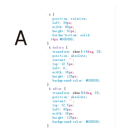

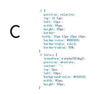
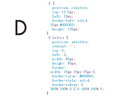
hover corresponding code can see the corresponding font components, very much using CSS graphics drawing learning, as shown in the following screenshots: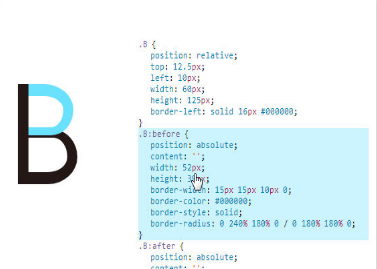
How to use it?
Copy the corresponding CSS code presented on the page, and then the HTML section is as follows:
<div class="A"></div>
<div class="B"></div>
<div class="C"></div>
<div class="D"></div>
<div class="E"></div>
<div class="F"></div>
<div class="G"></div>
<div class="H"></div>
<div class="I"></div>
<div class="J"></div>
<div class="K"></div>
<div class="L"></div>
<div class="M"></div>
<div class="N"></div>
<div class="O"></div>
<div class="P"></div>
<div class="Q"></div>
<div class="R"></div>
<div class="S"></div>
<div class="T"></div>
<div class="U"></div>
<div class="V"></div>
<div class="W"></div>
<div class="X"></div>
<div class="Y"></div>
<div class="Z"></div>
web Front-end development resources Q-q-u-n:  767273102 ,Sharing Development Tools, Zero Foundation, Advanced Video Tutorials, I hope novice less detours
To display which letter, copy the corresponding HTML to the page.
IV. Comments and Concluding remarks
The above three cases of generating 26 letters of CSS show the potential of CSS in graphics rendering, which is a very good learning material for CSS graphics rendering.
However, the specific practicability is not very high. It is like a paper in a top journal, which is powerful, but not suitable for real business practice, because the cost is very good and the pages for scenarios are limited.
The main problem is that all the letters and graphs are positioned using px. In practice, our font size is changeable. It is very troublesome for a fixed unit like PX to change the size of the font in real time. It can only be solved by zooming. However, when zooming into a double screen density display, the seam gap is easy to appear and the experience is not good.
Therefore, the font generation case above needs to be further optimized, the px positioning is all changed to em, so that the font size can be changed through the external font-size, so that the practicability is very strong! ___________
In addition, the above three cases are all capitalized letters. If lower-case letters are also supported, it will be really tough. It is very possible to apply them widely in practical projects. I have time to challenge this later.