Create and publish your own Vue UI component library
Preface
When using Vue for daily development, we often use some open source UI libraries, such as Element-UI, Vuetify, etc.
These libraries can be easily introduced into our current project with a single line of commands:
npm install vuetify
// or
yarn add vuetify
But what happens when we develop a UI Component ourselves and need to use it in multiple projects? The first thing we think about is probably copying a past directly, right?
This is very convenient, but there are two problems:
- When the component needs to be updated, we need to manually maintain all updates that use the component.
- Manual replication is too cumbersome when multiple component s need to be shared
So why don't we publish a library of UI components for our own use?
In this paper, the author will introduce how to create and publish their own Vue UI component library step by step.
Initialization project
Here we initialize a Vue project using the official vue-cli
npm install -g @vue/cli
# or
yarn global add @vue/cli
vue create personal-component-set
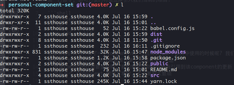
To enter our new project, let's look at the current project document:

Next let's write a simple Vue component. Here I write a simple top-bar control to display: page title, my personal information, github source links and other information.
The code is as follows:
<template>
    <v-toolbar>
        <v-toolbar-side-icon @click="toMainPage()"></v-toolbar-side-icon>
        <v-toolbar-title>Visual Explain</v-toolbar-title>
        <v-spacer></v-spacer>
        <v-toolbar-items class="hidden-sm-and-down">
            <v-btn flat @click="openMyGithub()">
                <v-avatar size=42>
                    <img src="https://avatars3.githubusercontent.com/u/10973821?s=460&v=4">
                </v-avatar>
                <span style="margin-left:8px;">About me: ssthouse</span>
            </v-btn>
            <v-tooltip bottom>
                <v-btn slot="activator" flat :href="sourceCodeLink">
                    <v-avatar size=42>
                        <img src="https://assets-cdn.github.com/images/modules/logos_page/GitHub-Mark.png">
                    </v-avatar>
                    Source Code
                </v-btn>
                <span class="top-bar-tooltip">Welcome to fork & star <br/> ; )</span>
            </v-tooltip>
        </v-toolbar-items>
    </v-toolbar>
</template>

<script>
export default {
  props: ['sourceCodeLink'],
  methods: {
    openMyGithub() {
      const a = document.createElement('a')
      a.target = '_blank'
      a.href = 'https://github.com/ssthouse'
      a.click()
    },
    toMainPage() {
      this.$emit('to-main-page')
    }
  }
}
</script>

<style scoped>
.top-bar-tooltip {
  font-size: 18px;
}

a {
  color: black;
}
</style>
The above code constitutes a very simple Vue component, which provides a props: sourceCodeLink to facilitate customized jump links, and an event: to-main-page to trigger callbacks for users to jump back to the home page.
The effect is as follows:

Configuration project
Let's configure the current project so that it can be published to npm.
First, we edit the entry file src/components/index.js to automatically register our Component in Vue when it is imported as a UI library:
import Vue from 'vue'
import TopBar from './TopBar.vue'
const Components = {
  TopBar
}

Object.keys(Components).forEach(name => {
  Vue.component(name, Components[name])
})

export default Components
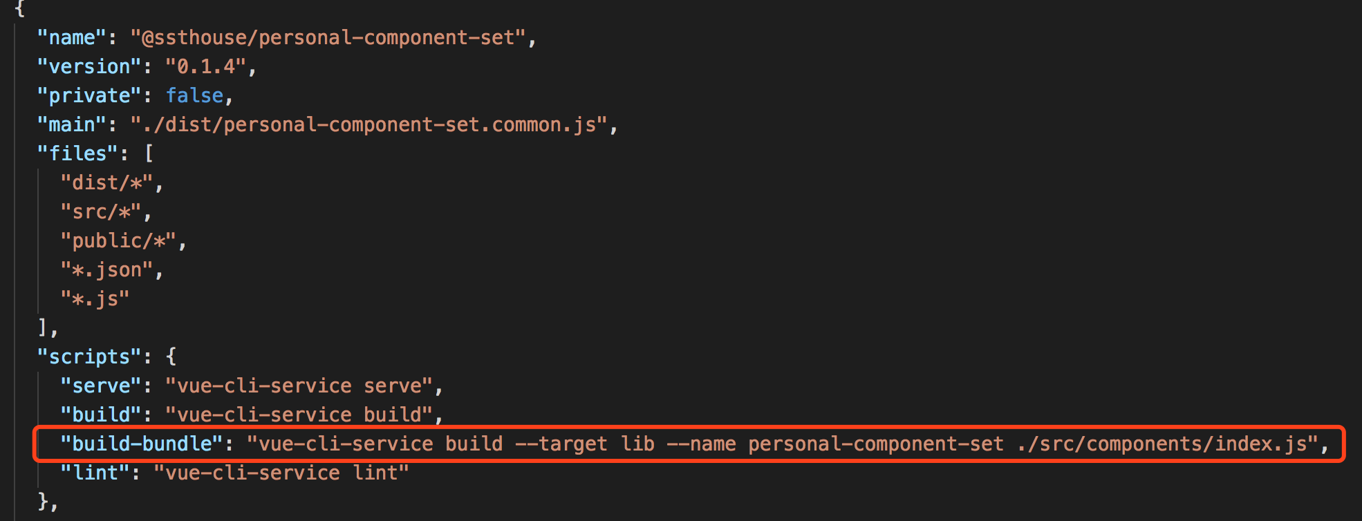
Next, we add the script of the build project to the scripts of package.json:

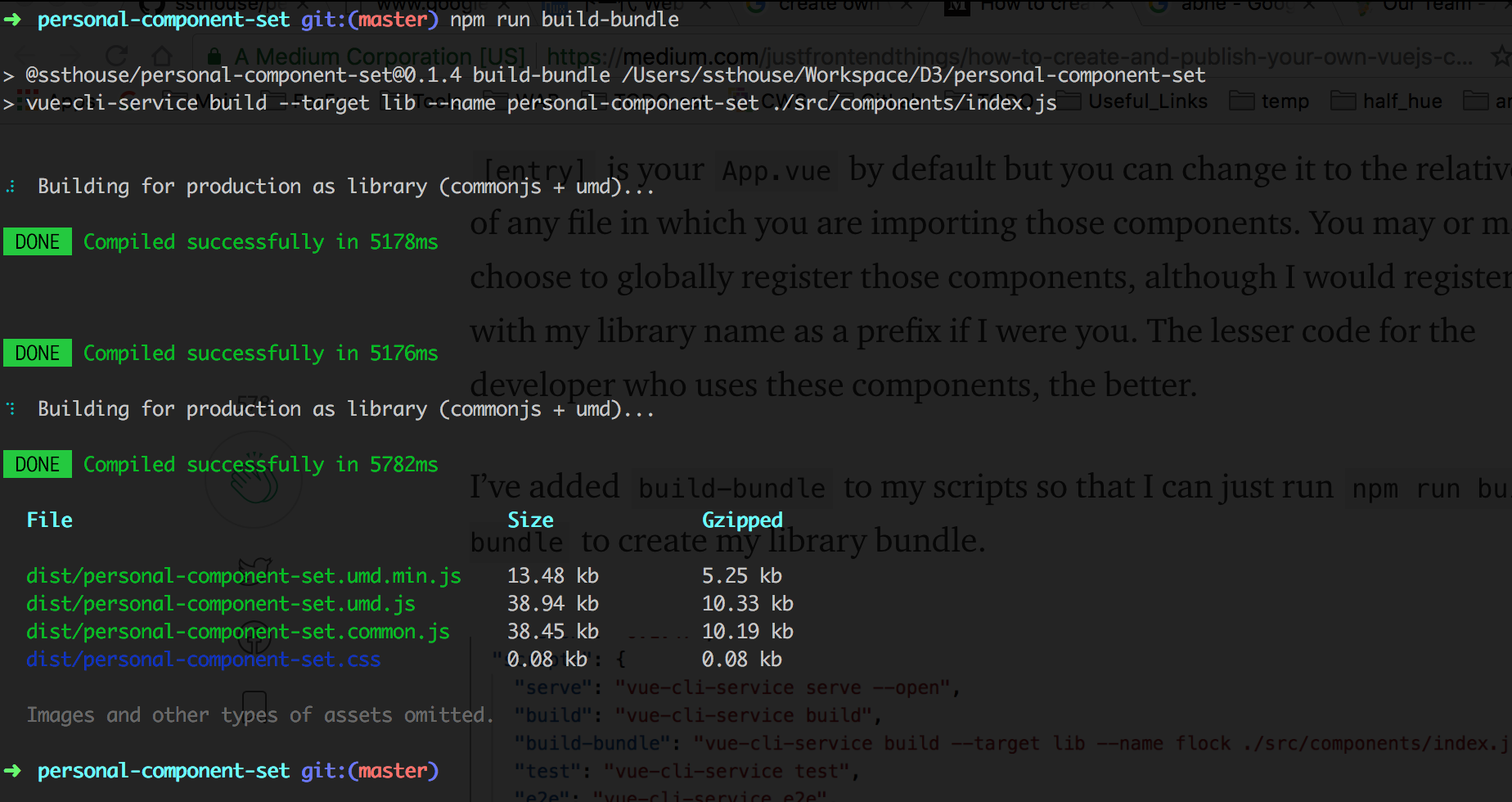
Where -- name libraryName specifies the name of Library to be published, we execute the new script added above:

You can see that build generates various versions of js files that can be used for publishing
Here we choose to publish our *. common.js_ file by default, so we add the main attribute to package.json.
When this property is specified, when we refer to the component library, the file specified in main is loaded by default.

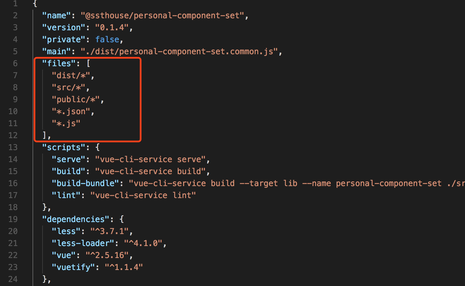
Finally, we configure the files attribute in package.json to configure the file path we want to publish to npm.
Here we put in all the files that users may use to refer to our component library:

npm release
First, we register an npm account (if we have an account, we can skip this step)
npm add user

// Enter username, mailbox, etc. as prompted.
Then use npm login to log in to the status of the registration number
After login, you can use npm whoami to view the login status
Before publishing, let's modify the name of the project (be careful not to conflict with the existing project name) and recommend the @username/projectName naming.

Next we can publish our UI component library. Before publishing, we compile it again and let the build file be our latest modification:
npm run build-bundleWe use the following commands to publish our project:
npm publish --access publicNote the version attribute specified in package.json: Every time we update our component library, we need to update version (after all, the code for the same version is different, and it's easy to be confused)
Test use
In this way, we have completed the release of our UI component library. Next, we can use it in any project that needs to use it:
npm install --save @ssthouse/personal-component-setThe component library is then introduced into index files (such as src/main.js):
import '@ssthouse/personal-component-set'Next we can use Component in the component library in the template of Vue:
<template>
  <v-app id="app">
    <top-bar :sourceCodeLink="sourceCodeLink"></top-bar>
    <router-view/>
  </v-app>
</template>
Last
After these steps, we have a component library of our own. We can update and publish our new version of the component library at any time.
Projects that depend on this component library can be updated with simple npm commands:)
Interested in data visualization and D3.js?
Here is my D3.js, github address for data visualization. Welcome to start & fork: tada: