My technology is not fine, just play, for reference only, and the complete source code is provided at the end of the article.
Personally, there are too many component libraries on the market. In fact, we don't need to build them ourselves. Any one can meet the basic development needs. If you want to play, you can try to build one yourself.
First, to be simple, use Vue cli to build a project structure.
In order to see the effect at any time, we use src as the entry of the reference component by default to debug the component effect; You also need to create a components folder to store components. The directory structure is as follows
├─node_modules
├─public
├─components //Storage components
├─src  //Reference component
    ├─components
    ├─assets
    ├─App.vue
    ├─router.js
    ├─index.js  //Self built file, import component library
    └─main.js
├─babel.config
├─package.json
└─README.md
Next, we will officially enter the process of building components
1. Create component directory
Let's take the button component as an example. In order to introduce the style on demand and make it easy for users to modify the style, we take out css and write it separately. Of course, if you just want to write a component for a few people to use, you can also write it directly in. vue. A component contains the following files:
├─components
  ├─style  // Style file
      ├─index.scss  //Global style
      ├─base.scss  //Common style
      └─button.scss  //Individual component styles
  └─button //Component file
      ├─index.js //Package files separately
      └─src
        ├─main.vue  //Write component
        └─myBtn.md //Display example
2. Write components
Write a component in main.vue. The code is as follows
<template>
  <button @click="btnClick" :class="['btn',`btn-${type}`]">
    <!-- slot  -->
    <slot></slot>
  </button>
</template>
<script>
export default {
  name:'myBtn',
  props:{
    // `medium` / `small` / `mini`
    size:{
      type:String,
      default:'medium'
    },
    // `primary` / `success`
    type:{
      type:String,
      default:'primary'
    }
  },
  methods:{
    btnClick(){
      // This is a click event
      this.$emit('click')
    }
  }
}
</script>
Change the style of different types of buttons passed in through: class="['btn',btn-${type}]"
Write some styles in the scss corresponding to the style folder. The code is as follows:
.btn{
    width:150px;
    height: 40px;
    border:none;
    font-size:16px;
    color:#fff;
}
.btn-primary{
    background:blue;
}
.btn-success{
    background:green;
}
Register the component in index.js. The code is as follows:
import Mybtn from "./src/main.vue"

Mybtn.install = function(Vue) {
  Vue.component(Mybtn.name, Mybtn);
};

export default Mybtn;
3. Use components
Now a component is completed. Let's use it to see the effect
Import components and styles in main.js (I can import them globally or on demand)
import Vue from 'vue'
import App from './App.vue'


import {Mybtn} from "./index.js"
import "../components/style/index.scss";

Vue.use(Mybtn)

Vue.config.productionTip = false

new Vue({
  render: h => h(App),
}).$mount('#app')
You can use it in App.vue
<template>
  <div id="app">
   <Mybtn >General button</Mybtn>
   <Mybtn type='success'>Success button</Mybtn>
  </div>
</template>

<script>
export default {
  name: 'App',
}
</script>

<style>

</style>
A button component comes out
4. Generate component library document
After the component is completed, you need to create a component document so that users can use it more intuitively. I use @ Vuese/cli, which is very simple and easy to use. For specific installation tutorials, please refer to the documentation @vuese/cli
After installation, execute vuese gen
At this time, the [website] directory will appear in the root directory, and your component documents will be generated. The directory is as follows
website
├── index.html
├── components
├──├── myBtn.md
├──├── HelloWorld.md
Here to mark the point!! In fact, I only built one myBtn component, but there are two directories. This is because vuese will automatically identify the. vue suffix file. We can specify its generation path
Official website: vuese will search the vuese.config.js or. vueserc or the vuese attribute of package.json file in the command running directory
So we create a new. vueserc in the root directory and configure it
{
  "include": [
    "./components/**/*.vue" //Specifies the generated. vue file
  ],
  "title": "Component documentation",  //Component title
  "genType": "docute"  //Component type
}
Delete the website (the existing files in the directory will not be automatically deleted when repackaged, so it is recommended to delete and regenerate one), execute vuese gen, and there will be only one myBtn at this time. After restarting, the component document will come out. It is very convenient. The page is as follows: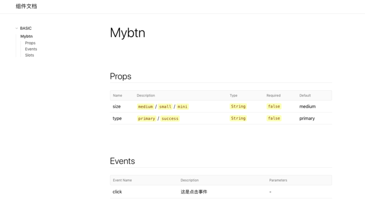
There is another problem to note: the generated document does not have a home page. If you click the title, you can see that the route becomes "/" and the page displays 404. At this time, we need to manually add a home page. Very simple, we manually write a README.md file in the website directory (the file name must be README!), When packaging the document, it will be automatically recognized as route '/', and the directory is as follows:
website
├── index.html
├── README.md
├── components
├──├── myBtn.md
README.md just write it casually
# Document description
 This is the home page
Look again at this time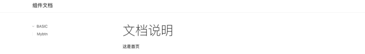
5. Preview the component document and package the whole component
vuese can only generate a pure document, only large pieces of text, no component preview effect, and use examples. We can only add them manually. Remember that we left a place for component preview at the beginning!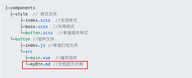
Preview implementation process:
- Because the content of the document will be regenerated every time it is packaged. Even if the preview code and event action are manually added to it, it will return to the original content after repackaging. This method is obviously not desirable ×
- Therefore, we reserve an md file with separate write preview function. When performing vuese gen document packaging, we use gulp to merge the two md files. At this time, there are both preview and components.
At the beginning, I didn't find all the reference materials, either lacking preview or packaging too casually, so when I did packaging and preview, I incorporated the contents of these two articles, Component preview function, Packaging function (you can click to see that the author's packaging process is very detailed) a relatively comprehensive component whole process is formed, because the article is very detailed, I won't introduce the implementation process here. As for how to do integration, you can poke my github at the bottom of the article.
- Events and styles are added to the document together
We can create a new index.html outside the website directory, introduce styles and js, and then replace the new index.html with the index.html in the website folder (the same gulp). At this time, the document function is complete.
Directory structure at this time
root directory
├── website
Click gulpfile.js / / add
document / / add a new directory
index.html / / create a new file
The document page starts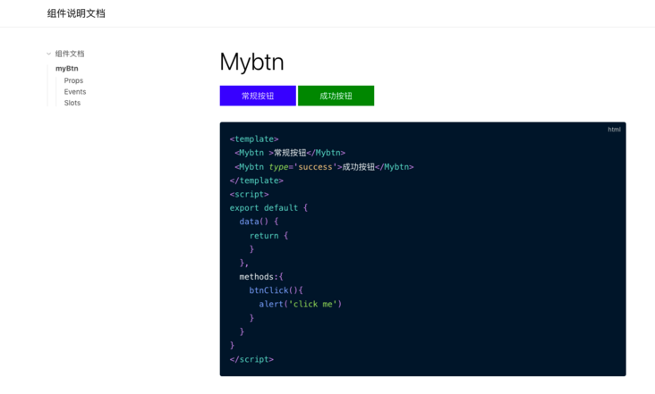
Up to now, a complete component function flow has come out
Packaging and publishing, I'll rewrite an article
Full example: github
github address