The third-party link of the wechat payment page needs 100 million advertising fees. The wechat payment page is very suitable for functional navigation. This article uses ListView and GridView to imitate the wechat payment page, and introduces how to decorate the background and edge style of a component.
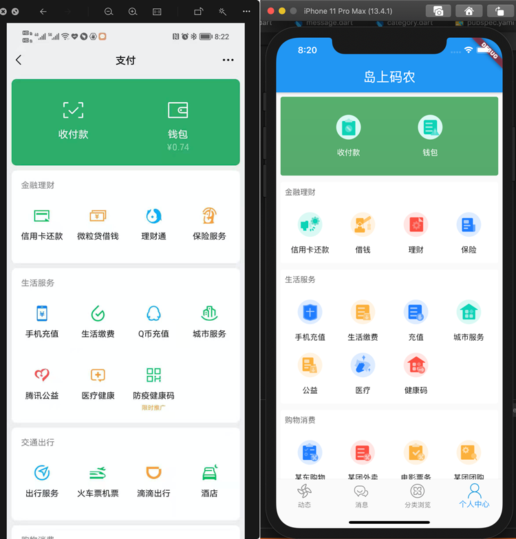
On the left is the wechat payment interface, on the right is the effect after development, and the icon is downloaded from iconfont. First, let's introduce the components involved in this article.
Container with decorative effect
In practice, we often encounter that a container needs additional styles, such as fillet, background color, etc. In fluent, there is a decoration attribute for various containers, which can be used to decorate containers. Typical usage includes setting background color, fillet, border and shadow, etc. gradient color can be used for background color. Decoration is a decoration object. BoxDecoration is the most commonly used. The properties of BoxDecoration are as follows:
const BoxDecoration({
    this.color,
    this.image,
    this.border,
    this.borderRadius,
    this.boxShadow,
    this.gradient,
    this.backgroundBlendMode,
    this.shape = BoxShape.rectangle,
  })
Where color is to fill the container with color, image is to use the picture as the background, border is the border, borderRadius is the border fillet, boxShadow is the container shadow, gradient uses the gradient as the background, backgroundBlendMode refers to the mixed model with the container, the default is coverage, shape is the background shape, and the default is rectangle. In the background part, we usually only choose one. Here, taking the green arc background above as an example, a little gradient is added (multiple gradient colors are supported and can be adjusted as needed). The example code is as follows:
return Container(
      //......
      decoration: BoxDecoration(
        borderRadius: BorderRadius.circular(4.0),
        gradient: LinearGradient(
            begin: Alignment.topCenter,
            end: Alignment.bottomCenter,
            colors: [
              Color(0xFF56AF6D),
              Color(0xFF56AA6D),
            ]),
      ),
  		//...
    );
Here, the edge angle is set as arc and the radius is 4. It is filled with gradient color. The gradient direction is from the top center to the bottom center. There are two gradient colors.
Row layout and Column layout
This was introduced in the previous list, where Row represents Row layout (i.e. child elements are arranged in one Row), and Column represents Column layout (i.e. child elements are arranged in one Column).
ListView list component
The list view is the same as the previous article, but the usage of this article is different. It is used to realize that the whole page can scroll in the way of list. Each part of the components can be directly put into the children attribute of the list instead of using an array to build list elements, which is a bit similar to the usage of scroll view.
GridView grid component
GridView is used to divide a container into rows and columns. You can specify the number of elements of the main axis (according to the rolling direction), and then automatically fill the grid according to the number of total elements. For example, when rolling vertically, you can specify how many grids there are in a row in the row direction, and one element for each grid. If the number of lines exceeds, another line will be automatically changed. The simplest usage is to use the GridView.count method to build a GridView. The usage is as follows:
GridView.count(
   crossAxisSpacing: gridSpace,
   mainAxisSpacing: gridSpace,
   crossAxisCount: crossAxisCount,
   //Set the following two parameters to prohibit the scrolling of GridView and prevent conflicts with ListView
   shrinkWrap: true,
   physics: NeverScrollableScrollPhysics(),
   children: buttons.map((item) {
      return _getMenus(item['icon'], item['name'], color: textColor);
    }).toList(),
);
Here, crossAxisSpacing is the spacing between elements perpendicular to the scrolling direction. If you scroll vertically (the default), it is the spacing between horizontal row elements. mainAxisSpacing is the spacing of elements with the same scroll direction. children are the elements in the grid. It should be noted here that in this example, the GridView is nested in the ListView, and the two components are scrolled vertically, which will cause conflicts and make the layout unable to meet the constraints. Therefore, set shrinkWrap to true and physics to NeverScrollableScrollPhysics here to prohibit the scrolling of GridView, so as to meet the constraint.
code implementation
- First, analyze the layout. In fact, all menu buttons have the same layout. You can use a unified column layout to complete the menu buttons and improve reusability. Menu buttons are icons, spacing (between icons and text) and menu names from top to next. The implementation code is as follows:
Column _getMenus(String icon, String name, {Color color = Colors.black}) {
  return Column(
    mainAxisAlignment: MainAxisAlignment.center,
    children: <Widget>[
      SizedBox(
        child: Image.asset(icon),
        width: 50,
        height: 50,
      ),
      SizedBox(
        height: 5,
      ),
      Text(name, style: TextStyle(fontSize: 14.0, color: color, height: 2)),
    ],
  );
A single menu is realized by transmitting an icon name, menu name and optional font color (the top area is different from other text colors).
- Next, look at the top area. There are only two buttons in the top area. The decorative container is used to realize the decoration and fillet of the background. Then, the row layout is adopted to evenly arrange the two menu buttons horizontally. At the same time, use the Center layout to Center the two menus. The height of the container is specified here because it is too short and uncoordinated in terms of aesthetics. The actual development should be determined according to the UI design draft.
Widget _headerGridButtons() {
    double height = 144;
    List<Map<String, String>> buttons = GridMockData.headerGrids();
    return Container(
      height: height,
      margin: EdgeInsets.fromLTRB(MARGIN, MARGIN, MARGIN, MARGIN / 2),
      decoration: BoxDecoration(
        borderRadius: BorderRadius.circular(4.0),
        gradient: LinearGradient(
            begin: Alignment.topCenter,
            end: Alignment.bottomCenter,
            colors: [
              Color(0xFF56AF6D),
              Color(0xFF56AA6D),
            ]),
      ),
      child: Center(
        child: Row(
            mainAxisAlignment: MainAxisAlignment.spaceEvenly,
            children: buttons
                .map((item) =>
                    _getMenus(item['icon'], item['name'], color: Colors.white))
                .toList()),
      ),
    );
  }
- Other menu layouts are the same, but the area title, menu quantity and menu content are different. Therefore, a general method can be encapsulated to build any form of menu, and set the font style, fillet background and other attributes of the area title. GridView is used to realize the grid format layout of menus. At the same time, due to the same menu layout, a general method can be encapsulated to specify the number of buttons in a row of grid, button font color and other attributes, so as to realize the reuse of code.
Widget _dynamicGridButtons(List<Map<String, String>> buttons, String title,
      {int crossAxisCount = 4}) {
    return Container(
      margin: EdgeInsets.fromLTRB(MARGIN, MARGIN, MARGIN, MARGIN / 2),
      padding: EdgeInsets.all(MARGIN),
      decoration: BoxDecoration(
        borderRadius: BorderRadius.circular(4.0),
        color: Colors.white,
      ),
      child: Column(
        mainAxisAlignment: MainAxisAlignment.center,
        crossAxisAlignment: CrossAxisAlignment.start,
        children: [
          Text(
            title,
            style: TextStyle(color: Colors.grey[700]),
          ),
          SizedBox(height: 20),
          _gridButtons(buttons, crossAxisCount, textColor: Colors.black),
        ],
      ),
    );
  }

GridView _gridButtons(List<Map<String, String>> buttons, int crossAxisCount,
      {Color textColor = Colors.white}) {
    double gridSpace = 5.0;
    return GridView.count(
      crossAxisSpacing: gridSpace,
      mainAxisSpacing: gridSpace,
      crossAxisCount: crossAxisCount,
      //Set the following two parameters to prohibit the scrolling of GridView and prevent conflicts with ListView
      shrinkWrap: true,
      physics: NeverScrollableScrollPhysics(),
      children: buttons.map((item) {
        return _getMenus(item['icon'], item['name'], color: textColor);
      }).toList(),
    );
  }
}
- ListView builds a complete page: the actual whole page is very simple. You only need to put each area into the children attribute of ListView. It can also be seen from here that refining the sub components as much as possible can not only improve the reusability of code, but also reduce the nesting level and improve the readability and maintainability of code.
@override
  Widget build(BuildContext context) {
    return Scaffold(
      body: ListView(
        children: [
          _headerGridButtons(),
          _dynamicGridButtons(GridMockData.financeGrids(), 'Financial management'),
          _dynamicGridButtons(GridMockData.serviceGrids(), 'Life service'),
          _dynamicGridButtons(GridMockData.thirdpartyGrids(), 'Shopping consumption'),
        ],
      ),
    );
  }
- Mock data preparation
The button data uses Mock data. Here, only a list < map < string, string > > array object is returned. In the object is the icon file name and menu name of each menu. The following is the menu Mock method of the financial service area.
static List<Map<String, String>> financeGrids() {
    return [
      {'name': 'Credit card payment ', 'icon': 'images/grid-buttons/grid-1-1.png'},
      {'name': 'borrow money', 'icon': 'images/grid-buttons/grid-1-2.png'},
      {'name': 'conduct financial transactions', 'icon': 'images/grid-buttons/grid-1-3.png'},
      {'name': 'Insurance', 'icon': 'images/grid-buttons/grid-1-4.png'},
    ];
  }
- Other areas to be improved: it can be seen from the code that when accessing the button, you use the key of the Map object. You need to use ['name '] or ['icon'] to access it. This method is very unfavorable to coding and is easy to misspell. Therefore, in actual use, the Json object (i.e. Map) should be converted into an entity class, so that the parameters of the menu can be set by accessing the properties of the entity class, which is more convenient for actual maintenance.
Conclusion: the basic UI component library provided by fluent can meet most complex page layouts, which can be completed through the combination of various layout components. Therefore, it is important to be familiar with the characteristics of the basic layout components. At the same time, attention should be paid to the splitting and separation of components to complete the packaging of sub components, improve the reusability and avoid the problem of too deep nesting level. The source code has been uploaded to: Getting started related source code.