1. In the module in django, create the user
class UserInfo(models.Model):
    name = models.CharField(max_length=20)
    email = models.CharField(max_length=50)
    power = models.IntegerField()
    phone = models.CharField(max_length=20)
    country = models.CharField(max_length=10)
    city = models.CharField(max_length=20)
    photo = models.CharField(max_length=40)
    pwd = models.CharField(max_length=80)
Went to look at other websites, registration is old simple, mobile phone number, verification code. After entering the website, you can't fill in the detailed user information... It makes sense that the more you register, the easier it is for you to give up.. So plan my registration page, it's so simple.
The migration was executed yesterday, and it is directly executed to the app today
python manage.py makemigrations myloveweb
Unexpectedly, the report was wrong.
RuntimeError: cryptography is required for sha256_password or caching_sha2_password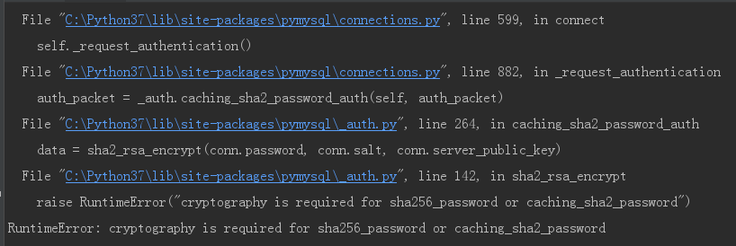
I went to the Internet to find out two solutions,
Scheme 1: add a plug-in
https://www.cnblogs.com/Hannibal-2018/p/11081143.html
Scheme 2: change the password in mysql to plaintext.....
https://blog.csdn.net/csl_compy/article/details/90728420
I feel that the scheme I is reliable, so I installed this plug-in.
pip install cryptography
Python 3 encryption and decryption module cryptography
I feel that after I log in, the password can be used for a while, and then I will continue to study. Continue execution
python manage.py makemigrations myloveweb
Okay! Back to the point, my data sheet is finally ready.
Migrations for 'myloveweb':
  myloveweb\migrations\0001_initial.py
    - Create model UserInfo
Re execution
python manage.py migrate myloveweb
2. Add mobile registration interface on the interface -- solve the problem of format
Using the pop-up login scheme learned yesterday, a mobile login interface is added. Learn from other websites, such as 360doc Library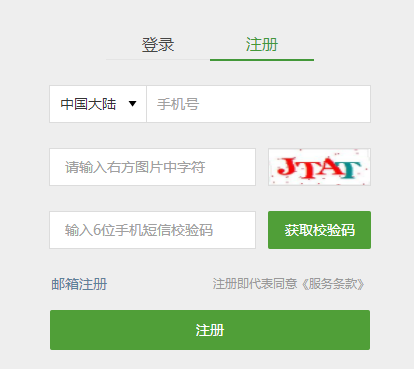
So first make a mobile login registration page
But I found that the format is not quite right when I did it. I went to study the fence system of bootstrap once and found that the format below should be used.
<form class="form-horizontal" role="form">
        <div class="form-group">
            <div class="col-sm-5">
            <div class="dropdown">
                <button class="col-sm-12 btn btn-default dropdown-toggle" type="button" id="countrydrop" data-toggle="dropdown"
                        aria-haspopup="true" aria-expanded="true">
                    Chinese Mainland
                    <span class="caret"></span>
                </button>
                <ul class="dropdown-menu" aria-labelledby="countrydrop">
                    <li><a href="#">Chinese Mainland  +86</a></li>
                    <li><a href="#">Hongkong, China  +852</a></li>
                    <li><a href="#">Macao China  +853</a></li>
                </ul>
            </div>
            </div>
            <div class="col-sm-7">
                <input type="text" class="form-control" id="account" placeholder="Please enter your mobile number">
            </div>
        </div>
        <div class="form-group">
            <div class="col-sm-7">
                <input type="password" class="form-control " id="password" placeholder="Please enter the verification code" disabled=True>
            </div>
            <div class="col-sm-5">
                <button  class="col-sm-12 btn btn-default">Send verification code</button>
            </div>
        </div>
        <div class="form-group">
            <div class="col-sm-4">
            <button  class="col-sm-12 btn btn-primary btn-sm">Sign in</button>
            </div>
    <div class="col-sm-8">
            <a href="#" class="col-sm-12 control-label">Account login</a>
        </div>
        </div>
    </form>
a. At first, we thought about adding row, but after looking at the bootstrap documentation, when there was a form group, it was already grouped, and there was no need to add row.
b. The total number of rows cannot exceed 12, otherwise another row will be started. In addition, different fences will be used to distinguish the sizes of different screens. For example, I used col-sm-4 and SM small screens. It seems that they can all be set up. Different fences will be used for different screens, similar to soy sauce.
<div class="col-xs-12 col-md-8">.col-xs-12 .col-md-8</div>
c. When setting fences, it is better to set them strictly according to the format of fences from the outside to the inside. For example, for the button in my example, in addition to the setting of col-sm-5 outside, the setting of col-sm-12 inside the button also limits the size. I guess it should be button's side. If you just use the external div, you can't limit it! So we have to add.... When I was watching chrome debugging, I found this feature.
        <div class="form-group">
            <div class="col-sm-7">
                <input type="password" class="form-control " id="password" placeholder="Please enter the verification code" disabled=True>
            </div>
            <div class="col-sm-5">
                <button  class="col-sm-12 btn btn-default">Send verification code</button>
            </div>
        </div>
Then the effect is soy sauce.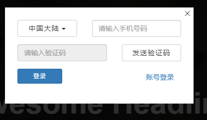
It looks much better than before.
OK, let's get here first, and we'll continue another day.

