Simply list and summarize the commonly used layout widget s.
Flutter has a rich library of layout components. Some of them are common libraries.
The following widget s fall into two categories: standard components and special components from Material Components.
Only Material App can use the components of Material Components.
Standard components - Standard widgets
- Container
- Add padding, margins, borders, background colors or other decorations to a component.
- GridView
- Place multiple widget s in a slidable table.
- ListView
- Place multiple widget s in a slidable list.
- Stack
- Cover one widget with another.
Material Components
- Card
- Put some similar information into a box with rounded corners and shadows.
- ListTile
- Load up to three lines of text in a Row; optionally add icons in front or at the end.
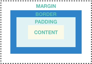
Container
Container is used freely. You can put the entire layout in the container and change the background color or picture.
Container summary:
- Add padding, margins, and borders
- Better background color and image
- Contains a single sub-widget, which can be a Row, Column, or root widget of a widget tree
container structure
Test code widgetdemo/container_page.dart
import 'package:flutter/material.dart';
import 'package:demo_flutter/widgetdemo/container_page.dart';
// Introduce custom packages...

void main() => runApp(new MyApp());

class MyApp extends StatelessWidget {
  @override
  Widget build(BuildContext context) {
    return new MaterialApp(
      title: 'Container demo 1',
      theme: new ThemeData(primarySwatch: Colors.brown),
      home: new ContainerDemoPage(), // Here's the interface you want to test
    );
  }
}
widgetdemo/container_page.dart code
import 'package:flutter/material.dart';

/// container sample interface
class ContainerDemoPage extends StatefulWidget {
  @override
  State<StatefulWidget> createState() => new _ContainerDemoPageState();
}

class _ContainerDemoPageState extends State<ContainerDemoPage> {
  @override
  Widget build(BuildContext context) {
    Expanded imageExpanded(String img) {
      return new Expanded(child: new Container(
        decoration: new BoxDecoration(
            border: new Border.all(width: 10.0, color: Colors.black38),
            borderRadius: const BorderRadius.all(
                const Radius.circular(8.0))),
        margin: const EdgeInsets.all(4.0),
        child: new Image.asset(img),
      ));
    }

    var container = new Container(
      decoration: new BoxDecoration(color: Colors.black26),
      child: new Column(
        children: <Widget>[
          new Row(children: <Widget>[
            imageExpanded('images/c1.jpg'),
            imageExpanded('images/c2.jpg'),
          ],),
          new Row(children: <Widget>[
            imageExpanded('images/d1.jpg'),
            imageExpanded('images/d2.jpg'),
          ],),
          new Row(children: <Widget>[
            imageExpanded('images/p1.jpg'),
          ],)
        ],
      ),
    );

    return new Scaffold(
      appBar: new AppBar(title: new Text('Container Page demo'),),
      body: new Center(
        child: container,
      ),
    );
  }
}
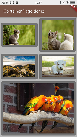
container example
GridView
Use GridView to place widget s in a two-dimensional list.
GridView provides two pre-assembled lists, or you can create your own custom lists.
GridView supports scrolling.
GridView summary:
- Put multiple widget s into a table
- Automatically provides scrolling when beyond rendering range
- You can customize the lattice, or you can use the following two
- GridView.count specifies the number of columns
- GridView. extension allows you to specify the maximum pixel width of subitems
Example 1 - Using GridView.extent
GridView. extension specifies the maximum width occupied by subitems
import 'package:flutter/material.dart';

/// gridView sample interface 1
class GridDemo1Page extends StatefulWidget {
  @override
  State<StatefulWidget> createState() => new _GridDemo1PageState();
}

class _GridDemo1PageState extends State<GridDemo1Page> {
  @override
  Widget build(BuildContext context) {
    return new Scaffold(
      appBar: new AppBar(title: new Text('Grid Page 1 demo'),),
      body: new Center(
        child: buildGrid(),
      ),
    );
  }

  List<Container> _buildGridTileList(int count) {
    return new List<Container>.generate(count, (int index) =>
    new Container(child: new Image.asset('images/pic${index + 1}.jpg'),));
  }

  Widget buildGrid() {
    return new GridView.extent(
      maxCrossAxisExtent: 150.0,
      padding: const EdgeInsets.all(4.0),
      mainAxisSpacing: 4.0,
      crossAxisSpacing: 4.0,
      children: _buildGridTileList(30),);
  }
}
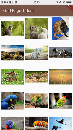
Using GridView.extent
Example 2 - Using GridView.count
Cross AxisCount is set to 2 and divided into two columns.
  Widget buildGrid() {
    var countGrid = GridView.count(
      crossAxisCount: 2,
      mainAxisSpacing: 4.0,
      crossAxisSpacing: 4.0,
      padding: const EdgeInsets.all(4.0),
      childAspectRatio: 1.3,
      children: _buildGridTileList(30),
    );
    return countGrid;
  }
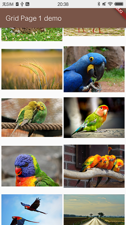
GridView.count example
ListView
ListView Can display data in column form. When the content exceeds the rendering range, it automatically provides the function of scrolling.
Summary of ListView
- Load subviews into lists
- Horizontal or vertical
- Supporting sliding
- Compared with Column, there are fewer optional configurations, but they are easier to use and support sliding.
There is little difference between ListView in Android and ListView
Example 1
Use ListTile as a subitem to load data.
import 'package:flutter/material.dart';

class ListViewPage extends StatefulWidget {
  @override
  State<StatefulWidget> createState() => new _ListViewPageState();
}

class _ListViewPageState extends State<ListViewPage> {

  @override
  Widget build(BuildContext context) {
    List<Widget> list = <Widget>[];
    for (int i = 0; i < 30; i++) {
      list.add(new ListTile(
        title: new Text('title$i', style: _itemTextStyle,),
        subtitle: new Text('A'),
        leading: i % 3 == 0
            ? new Icon(Icons.theaters, color: Colors.blue,)
            : new Icon(Icons.restaurant, color: Colors.blue,),
      ));
    }
    return new Scaffold(
      appBar: new AppBar(title: new Text('ListView Demo'),),
      body: new Center(child: new ListView(children: list,),),
    );
  }
}

TextStyle _itemTextStyle = new TextStyle(
    fontWeight: FontWeight.w500, fontSize: 14.0);
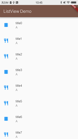
ListView Reference Effect Figure 1
You can also refer to it. https://github.com/flutter/flutter/blob/master/examples/flutter_gallery/lib/demo/colors_demo.dart
Stack
Use Stack Displaying other widgets on a widget is usually used to display pictures.
The display widget completely covers the bottom widget.
Stack summary:
- Used to cover the current widget with another layer of widget
- The first widget in Stack children is placed at the bottom, and the widget behind it is covered layer by layer.
- Stack content does not support scrolling
- Sub widget s that can be tailored beyond range
Stack example 1
Display a CircleAvatar
import 'package:flutter/material.dart';

class StackPage1 extends StatefulWidget {
  @override
  State<StatefulWidget> createState() => new _StackPage1State();
}

class _StackPage1State extends State<StackPage1> {

  @override
  Widget build(BuildContext context) {
    var stack = new Stack(
      alignment: const Alignment(0.6, 0.6),
      children: <Widget>[
        new CircleAvatar(
          backgroundImage: new AssetImage('images/android_1.jpg'),
          radius: 100.0,),
        new Container(decoration: new BoxDecoration(color: Colors.black45),
          child: new Text(
            'Android Avatar', style: new TextStyle(color: Colors.white70),),),
        new Container(decoration: new BoxDecoration(color: Colors.transparent),
          padding: const EdgeInsets.fromLTRB(0.0, 0.0, 100.0, 0.0),
          child: new CircleAvatar(
            backgroundImage: new AssetImage('images/p_box1.png'),
            backgroundColor: Colors.transparent,
            radius: 10.0,),),
      ],
    );
    return new Scaffold(
      appBar: new AppBar(title: new Text('Stack Demo 1'),),
      body: new Center(child: stack,),
    );
  }
}

Stack example 1
Card
Card comes from the Material component library and can contain some data, usually assembled with ListTile. Card has only one sub-widget, which can be column, row, list, grid or other combined widgets.
By default, Card reduces its size to zero pixels. Can use SizedBox To specify the size of the card.
Card in Flutter has rounded corners and shadow effects. Modifying elevation can change the shadow effect.
elevation range, reference Elevation and Shadows
If the value is set outside the range, the shadow effect will disappear.
Card summary:
- Realized Material Design card
- Used to display relevant data
- There is a child, which can be a column, row, list, grid, or other composite widget
- Has rounded corners and shadow effects
- Rolling is not supported.
Card example 1
Modify the previous ListView example
import 'package:flutter/material.dart';

class ListViewPage extends StatefulWidget {
  @override
  State<StatefulWidget> createState() => new _ListViewPageState();
}

class _ListViewPageState extends State<ListViewPage> {

  @override
  Widget build(BuildContext context) {
    List<Widget> list = <Widget>[];
    for (int i = 0; i < 30; i++) {
      list.add(new Card(child: new Column(
        children: <Widget>[
          new Image.asset(
            'images/pic${i + 1}.jpg',),
          new ListTile(
            title: new Text('title$i', style: _itemTextStyle,),
            subtitle: new Text('A'),
            leading: i % 3 == 0
                ? new Icon(Icons.theaters, color: Colors.blue,)
                : new Icon(Icons.restaurant, color: Colors.blue,),
          ),
        ],
      ),));
    }
    return new Scaffold(
      appBar: new AppBar(title: new Text('ListView Demo'),),
      body: new Center(child: new ListView(children: list,),),
    );
  }
}

TextStyle _itemTextStyle = new TextStyle(
    fontWeight: FontWeight.w500, fontSize: 14.0);
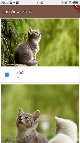
Card example 1
ListTile
Horizontal components from the Material component library. You can customize three lines of text and their optional head and tail icons.
This control is often used with Card or ListView.
ListTile summary:
- Customizable 3-line text with icons
- Less configuration, but easier to use than Row
Add a main interface
Place some buttons and click to jump to the appropriate interface.
Use Navigator.of(context).pushNamed(routeName) to jump.
import 'package:flutter/material.dart';
import 'package:demo_flutter/widgetdemo/container_page.dart';
import 'package:demo_flutter/widgetdemo/grid_page.dart';
import 'package:demo_flutter/widgetdemo/listview_demo.dart';
import 'package:demo_flutter/widgetdemo/stack_page1.dart';
import 'package:demo_flutter/widgetdemo/button_page.dart';

const String CONTAINER_DEMO_PAGE = '/a';

void main() {
  runApp(new MaterialApp(
    home: new HomePage(),
    routes: {
      CONTAINER_DEMO_PAGE: (BuildContext context) => new ContainerDemoPage(),
      '/b': (BuildContext context) => new GridDemo1Page(),
      '/c': (BuildContext context) => new ListViewPage(),
      '/d': (BuildContext context) => new StackPage1(),
      '/e': (BuildContext context) => new ButtonPage(),
    },
  ));
}

class HomePage extends StatefulWidget {
  @override
  State<StatefulWidget> createState() => new _HomePageState();
}

class _HomePageState extends State<HomePage> {

  @override
  Widget build(BuildContext context) {
    getGestureDetector(String routeName, String content) {
      return new GestureDetector (
        onTap: () {
          Navigator.of(context).pushNamed(routeName);
        },
        child: new Container (
            padding: EdgeInsets.all(20.0),
            child: new Center(child: new Text (content),)),
      );
    }
    return new Scaffold(
      appBar: new AppBar(title: new Text('Home'),),
      body: new Column(children: <Widget>[
        getGestureDetector(CONTAINER_DEMO_PAGE, 'Container Demo'),
        getGestureDetector('/b', 'Grid Demo 1'),
        getGestureDetector('/c', 'ListView Demo'),
        getGestureDetector('/d', 'Stack Demo'),
        getGestureDetector('/e', 'Button Page'),
      ],),
    );
  }

}
Author: RustFisher
Link: https://www.jianshu.com/p/fccb4c43c268
Source: brief book
The copyright of the brief book belongs to the author. For any form of reprinting, please contact the author for authorization and indicate the source.