Today, with the long tassel in hand, when will the dragon be bound Qingpingle Liupanshan
preface
This article continues to summarize the controls commonly used in Android, which is a further supplement to the previous common sense and basic articles, including image view, list view, dialog box, page turning view, video view, surface view and texture view. For the learning of control, we should first have a perceptual understanding, know what it looks like and what visual effect it will present the data to the user, and then learn its use method. The style of this article is similar to the previous articles. The way to summarize the control is still: "control function + control appearance + control usage". In addition, there is the final high-level article on controls, which mainly summarizes screen display, custom controls, graphic transformation control, fragments and so on. There are four articles from common sense to advanced, which comprehensively summarizes the GUI development of tool APP. Limited to space, this summary consists of 2P, P1 summary image view, list view, P2 summary dialog box, page turning view, video view, surface view and texture view.1, Image class view
1. Graphic Foundation
(1) Drawing file
Drawable (paintable) is an abstract class representing all graphics that can be displayed in Android. The graphics mentioned here include pictures and descriptive graphics in xml format. Pictures refer to well-known photos that are visible to the naked eye. Developers usually put graphics files in the res resource directory of the module. Through the file organization structure of the module, you can see that there are many folders with drawable in the res Directory:
① Descriptive graphics in xml format are generally stored in the \ res\drawable directory.
② The picture files with suffix format are generally placed in the \ res \ drawable XXX directory of the corresponding resolution. The developer can copy the picture files in ". PNG,. JPG,. GIF,. 9. PNG" and other formats to the specific drawable directory respectively. If the picture files with the same name appear in the drawable directory of different resolutions, when the APP runs, The Android system will automatically adapt the pictures according to the specific mobile phone screen resolution.
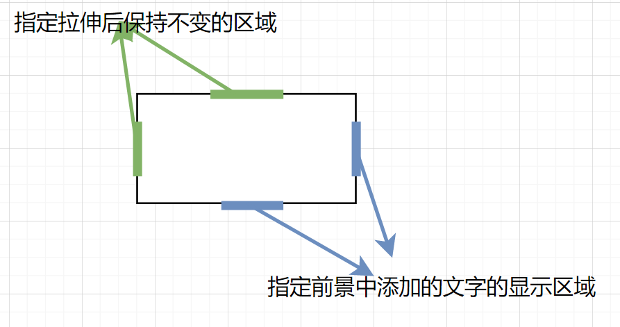
The above. 9.png format picture is a special png picture, called point nine picture. You can customize the stretching area to ensure that the picture is displayed clearly. AS integrates the tool for making point 9 pictures. Developers only need to right-click the original png picture and select the "Create 9-Patch file" option to start making. Point nine picture adds lines with a width of 1 pixel around the original picture, which determines the scaling rules of the picture and the display rules of foreground text. The lines on the left and upper sides determine the boundaries that remain unchanged during the stretching process of the picture, and the lines on the right and lower sides determine the boundaries of the text added to the foreground of the picture. The rules are shown in the figure below:
Here we summarize three xml format descriptive graphics: status list graphics, hierarchical graphics and shape graphics. They are subclasses of Drawable and have specific usage scenarios.
①StateListDrawable It is used to organize multiple drawable objects and switch different graphics according to the change of target component state. It is usually used as the background graphics of buttons, switches and other controls with state change. To create a status list graph, just right-click the drawable directory, select new - > drawable resource file, set the file name, and select the root tag as selector. The root tag selector generally contains two sub tag items. The attribute android:color or android:drawable of the sub tag item is used to specify the color or graphics represented by the sub tag, and android:state_xxx specifies a state represented by the sub tag, including: state_pressed, state_checked, state_focused, state_selected. If one child tag item specifies a state of the control, the other child tag item represents the opposite state of the control by default.
②Hierarchical graphics LayerDrawable Generally, it also contains two graphics, which are usually used to set bar display controls such as progress bar and drag bar. The creation method is the same as above. Just note that the root tag selects layer list, which generally contains two sub tag items. The android:drawable attribute of the sub tag item is used to specify the graphics file, and the android:id attribute is used to specify the ID of the target control. Usually, it takes the constant ID value provided by Android, such as @ android:id/background (setting the background of the control), @ android:id/progress (set the progress display graph of the control).
③ShapeDrawable Represents a basic geometric figure, which is usually used to set the background of controls with regular shape such as buttons and text boxes. The creation method is the same as above. Note that shape is selected as the root label. Its available properties and sub labels are as follows:
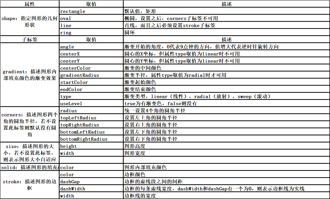
In actual development, the commonly used sub labels of shape graphics are corners, solid and stroke. The attribute shape can be kept as rectangle by default.
(2) Drawing reference method:
The Android SDK will automatically load various graphic files in the res directory and generate the index of the graphic file in the R resource list class. When developers want to reference the graphic file in the xml file, they use @ drawable/xxx to reference the graphic file in the code. There are two cases:
① If the parameter of the method is the int type of the specified resource ID, the graph is specified in the form of R.drawable.xxx.
② If the parameter of the method is Drawable or other types, you need to use the getDrawable method of the Resources class to generate a Drawable object from the graphics file with the specified resource ID, and then deal with the specific situation.
2. Image view
(1) Function and appearance
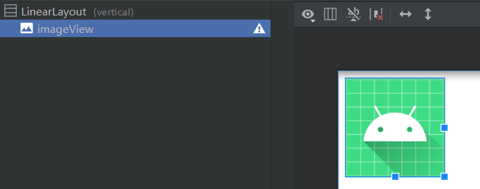
Image viewimageview Inherited from View, it is a special control for displaying graphics. It can load graphics from various sources (such as resources or content providers). If the src attribute is not specified, the appearance is a blank area. After specifying the graphics source, the appearance is as follows:
(2) Method of use
The common attributes of ImageView in xml files are:
① scaleType: Specifies the stretching rule type of the drawing. The value ranges are: fitXY (stretching the drawing to fill the whole image view), fitStart (maintaining the width height ratio, stretching the drawing and placing it on the left or upper side of the image view), fitCenter (maintaining the width height ratio, stretching the drawing and placing it in the middle of the image view), fitEnd (keep the width height ratio, stretch the graph and place it on the lower or right side of the image view), Center (keep the original graph unchanged and place it in the middle of the image view), centerCrop (stretch the graph until it fills the whole image view and displays it in the center), centerInside (when the size of the graph is larger than the image view, it is equivalent to fitCenter, and when it is smaller than, it is equivalent to center) .
② src: specify the source of the drawing and stretch the drawing according to scaleType.
③ Background: sets the background of the image view, but does not stretch the graph according to scaleType. Note that when src is set at the same time, it is equivalent to the relationship between background and foreground.
ImageView's common methods in code are:
① void setImageAlpha(int alpha): sets the transparency of the drawing.
② void setImageBitmap(Bitmap bm): sets the ImageView to display bitmap objects.
③ void setImageDrawable(Drawable drawable): set ImageView to display Drawable objects.
④ void setImageResource(int resId): sets the ImageView to display the graphics file with the specified ID.
⑤ Void setimageuri (Uri): set the contents of this ImageView to the graph specified by Uri.
⑥ void setScaleType(ImageView.ScaleType scaleType): controls how images are resized or moved to fit the ImageView.
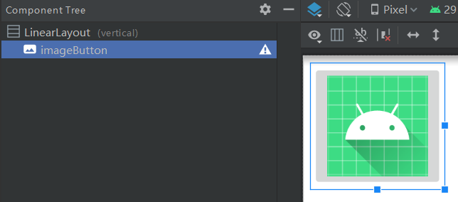
3. Image button
(1) Function, appearance, method of use
Image buttonimagebutton It inherits from ImageView, but has an additional button appearance. Just use it as a special button, and specify the src attribute @ mipmap / IC_ launcher_ Appearance diagram of round:
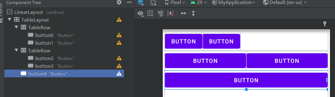
Supplement: table layout
(1) Function and appearance
Table layout Use rows and columns to manage child controls, but do not display the borders of their rows, columns, or cells. The typical layout is shown in the figure below:
(2) Method of use
TableLayout is composed of multiple TableRow sub tags. TableRow controls the number of rows and columns of the table layout: every time a TableRow is added, a row will be added, and every time a control is added to the TableRow, a column will be added. If a control is directly added to the TableLayout, it means that the control occupies a row alone.
The total width of TableLayout is defined by its parent layout. Whether in code or xml, the column number starts from zero. The column can be reduced and stretched. In this case, the column will change its width to occupy the remaining space of the parent layout. In the code, you can hide a column by calling the setColumnCollapsed method. The width of the column is determined by the width of the widest child control in the column. However, TableLayout can specify some columns as retractable or stretchable by calling the setColumnShrinkable or setColumnStretchable methods: if a column is marked as retractable, You can shrink the column width to fit the TableLayout to its parent layout, and if marked stretchable, you can expand the width to take up additional space. In the xml file, you can control the column width by setting the shrinkColumns, columnecolumns and stretchColumns attributes to specify the column number. To specify multiple columns at the same time, separate the column number with ",".
2, List class view
1. List view
(1) Function and appearance
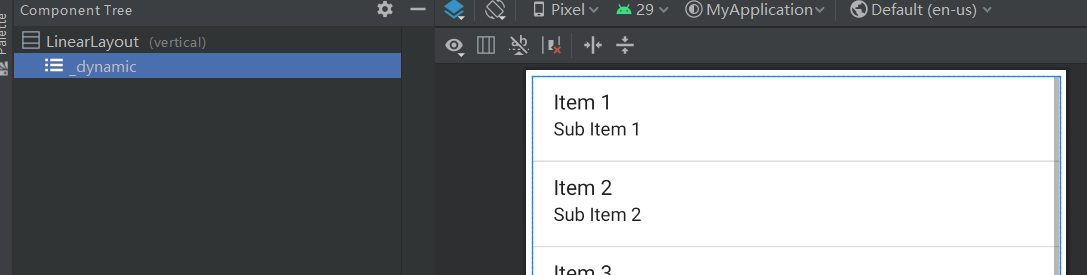
List viewlistview Inherited from AdapterView, it uses a unified layout to display each item of data. The data set to be displayed must be able to abstract the same feature, and the individual data under this feature can be different. For example, the common features, such as the ranking list of the whole class, are the names of students, photos of students, student numbers, grades of various subjects, etc. The default appearance of ListView is shown in the figure below:
(2) Method of use
Its common attributes are:
① divider: Specifies the split line shape.
② dividerHeight: the height of the split line graph.
③ Footerdividerenabled: whether to display the split line at the end of the list.
④ Headerdividerenabled: whether to display the split line at the beginning of the list.
Its common methods are:
① void setAdapter(ListAdapter adapter): sets the data adapter of ListView. Its adapter generally inherits from the basic adapter BaseAdapter.
② void setDivider(Drawable divider): sets the split line of the list.
③ void setDividerHeight(int height): sets the height of the separation line drawn between each list item in the list.
④ void setSelection(int position): sets the currently selected list item.
⑤ void setOnItemClickListener(AdapterView.OnItemClickListener listener): set the click listener of the list item.
⑥ Void setonitemlongclicklistener (AdapterView. Onitemlongclicklistener): sets the long press listener of the list item.
⑦ Void setonitemselectedlistener (AdapterView. Onitemselectedlistener): sets the listener when the list item is selected.
At first glance, the usage of the Spinner control is similar to that in the previous basic article, but three points should be paid attention to when using it:
① The height of the ListView is usually set to a specific height or match_parent, if the height of the ListView is set to wrap_content, only one line of list items will be displayed. If there are other controls below the ListView, the height of the ListView needs to be set to 0dp and the weight needs to be set to 1.
② The long press listener and context menu registered for the list item need to be handled separately, and the APP on the no side will flash back. The general step is to trigger the context menu after the long press event is processed to ensure that it will not respond at the same time.
③ If there are child controls with preemptive focus such as EditText and Button in the list item, set the descendantFocusability property of ListView to blocksdecedents to ensure that the list item handles the click event rather than the child controls in the list item.
Basic adapter BaseAdapter As an adapter base class, it can customize the child controls of list items to the greatest extent by inheriting. ArrayAdapter and SimpleAdapter summarized in the foundation chapter are its subclasses.
Subclasses that inherit BaseAdapter first need to implement the following methods:
① Constructor: pass in a Context object to specify the dataset to be displayed. The dataset is usually of ArrayList type.
② abstract int getCount(): get the number of data items.
③ abstract Object getItem(int position): get the data item at the specified location of the dataset.
④ abstract long getItemId(int position): gets the ID associated with the specified location data item.
⑤ abstract View getView(int position, View convertView, ViewGroup parent): get the page view of the list item at the specified location and fill the view with data.
Its secondary subclass also needs to define an internal class - ViewHolder, in which all child control types in the layout of the list item are declared, so as to reuse the layout view resources of the list item.
When the number of list items is large, the system will only load the list items located in the visible area of the screen, and other items will be loaded immediately only when the screen scrolls to them. In this way, the generated list item page layout can be reused. In the above getView method, the parameter convertView represents a list item layout. If it is null, the layout of the list item needs to be recreated from the layout file. If convertView is not empty, call the getTag method of convertView to obtain the ViewHolder object. Of course, whether you reuse the cached or recreated list item layout, you need to reset the display data of the controls in the list item.
The list view has been used many times in the previous articles. Let's get familiar with it again through a simple example. The example mainly displays several software icons, software names and software functions through a list:
First, create a bean class SoftwareBean for Software Description:
public class SoftwareBean {
    public int image;//Software icon
    public String name;//Software name
    public String desc;//Software description

    public SoftwareBean(int image, String name, String desc) {
        this.image = image;
        this.name = name;
        this.desc = desc;
    }

    private static int[] iconArray = {R.drawable.as, R.drawable.qq, R.drawable.browser,
            R.drawable.huya, R.drawable.keil5, R.drawable.ad19};
    private static String[] nameArray = {"as", "qq", "browser", "huya", "keil5", "ad19"};
    private static String[] descArray = {
            "Android Development integration tools",
            "Tencent chat tool",
            "Dual core browser",
            "Tiger tooth live broadcast software",
            "SCM development tool",
            "Circuit board design tool"
    };

    public static ArrayList<SoftwareBean> getDefaultList() {
        ArrayList<SoftwareBean> planetList = new ArrayList<>();
        for (int i = 0; i < iconArray.length; i++) {
            planetList.add(new SoftwareBean(iconArray[i], nameArray[i], descArray[i]));
        }
        return planetList;
    }
}
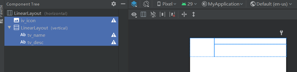
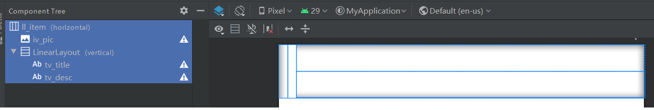
Secondly, create a layout file software_list.xml, representing the page layout of a list item, as shown in the figure:
Then create a subclass SoftwareAdapter inherited from BaseAdapter, click the list item, and long press the listening interface:
public class SoftwareAdapter extends BaseAdapter implements
        AdapterView.OnItemClickListener, AdapterView.OnItemLongClickListener {
    private Context mContext; // Declare a context object
    private ArrayList<SoftwareBean> mSoftwareList; // Declare a tool software queue

    // Constructor of tool software adapter, passing in context and tool software queue
    public SoftwareAdapter(Context context, ArrayList<SoftwareBean> software_list) {
        mContext = context;
        mSoftwareList = software_list;
    }

    // Gets the number of list items
    public int getCount() {
        return mSoftwareList.size();
    }

    // Gets the data of the list item
    public Object getItem(int arg0) {
        return mSoftwareList.get(arg0);
    }

    // Gets the number of the list item
    public long getItemId(int arg0) {
        return arg0;
    }

    // Gets the list item view at the specified location
    public View getView(final int position, View convertView, ViewGroup parent) {
        ViewHolder holder;
        if (convertView == null) { // The converted view is empty
            holder = new ViewHolder(); // Create a new view holder
            // According to the layout file item_list.xml generates a transformed view object
            convertView = LayoutInflater.from(mContext).inflate(R.layout.software_list, null);
            holder.iv_icon = convertView.findViewById(R.id.iv_icon);
            holder.tv_name = convertView.findViewById(R.id.tv_name);
            holder.tv_desc = convertView.findViewById(R.id.tv_desc);
            // Save the view holder to the converted view
            convertView.setTag(holder);
        } else { // Conversion view is not empty
            // Gets the previously saved view holder from the converted view
            holder = (ViewHolder) convertView.getTag();
        }
        //Note that whether the cache is reused or not, you need to reset the data for the control next
        SoftwareBean software = mSoftwareList.get(position);
        holder.iv_icon.setImageResource(software.image); // Displays a picture of the tool software
        holder.tv_name.setText(software.name); // Displays the name of the tool software
        holder.tv_desc.setText(software.desc); // Displays a description of the tool software
        return convertView;
    }

    // Define a view holder to reuse view resources for list items
    public final class ViewHolder {
        public ImageView iv_icon; // Declare the image view object of the tool software picture
        public TextView tv_name; // A text view object that declares the name of the tool software
        public TextView tv_desc; // Declare the text view object of the tool software description
    }

    // Handle the click event of the list item, which is triggered by the interface OnItemClickListener
    public void onItemClick(AdapterView<?> parent, View view, int position, long id) {
        String desc = String.format("You clicked page%d A tool software, its name is%s", position + 1,
                mSoftwareList.get(position).name);
        Toast.makeText(mContext, desc, Toast.LENGTH_LONG).show();
    }

    // Handle the long press event of the list item, which is triggered by the interface OnItemLongClickListener
    public boolean onItemLongClick(AdapterView<?> parent, View view, int position, long id) {
        String desc = String.format("You long pressed the second button%d A tool software, its name is%s", position + 1,
                mSoftwareList.get(position).name);
        Toast.makeText(mContext, desc, Toast.LENGTH_LONG).show();
        return true;
    }
}
Only one ListView is placed in the page layout of the activity. The initialization code of the list view is as follows:
    //Initialize list view
    private void initSoftwareList() {
        ArrayList<SoftwareBean> mSoftwareList = SoftwareBean.getDefaultList();
        // Build a list adapter for software queues
        SoftwareAdapter adapter = new SoftwareAdapter(this, mSoftwareList);
        // Get LV from layout view_ List view of software
        ListView lv_software = findViewById(R.id.lv_software);
        // To lv_software set software list adapter
        lv_software.setAdapter(adapter);
        // To lv_software sets the click listener for list items
        lv_software.setOnItemClickListener(adapter);
        // To lv_software sets the long press listener for list items
        lv_software.setOnItemLongClickListener(adapter);
    }
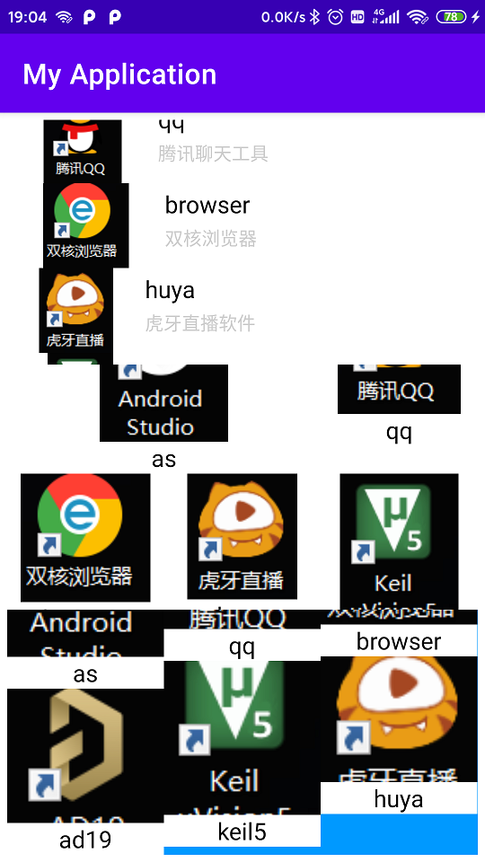
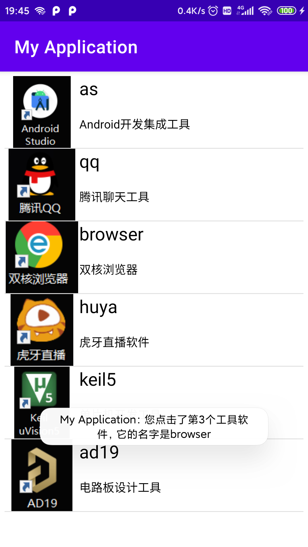
After entering the page and clicking the list item, the effect is as shown in the figure:
2. Expandable list view
(1) Function and appearance
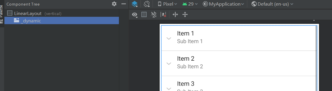
Expandable list view ExpandableListView It is a subclass of ListView. Each list item (Group) can be expanded into more sub list items. Users can click a group to expand the sub list items under the group. When they click the group again, the sub list will be retracted. Its default appearance is shown in the figure:
(2) Method of use
The common methods of ExpandableListView are:
① Void setadapter (expandablelistadapter): sets the adapter for expandable list view.
② boolean expandGroup(int groupPos): expand the specified group.
③ boolean collapseGroup(int groupPos): collapses the specified group.
④ boolean isGroupExpanded(int groupPosition): whether the given group is expanded.
⑤ void setSelectedGroup(int groupPosition): select the group at the specified location.
⑥ boolean setSelectedChild(int groupPosition, int childPosition, boolean shouldExpandGroup): select the specified child in the specified group.
⑦void setOnChildClickListener(ExpandableListView.OnChildClickListener onChildClickListener)
void setOnGroupClickListener(ExpandableListView.OnGroupClickListener onGroupClickListener)
void setOnGroupCollapseListener(ExpandableListView.OnGroupCollapseListener onGroupCollapseListener)
void setOnGroupExpandListener(ExpandableListView.OnGroupExpandListener onGroupExpandListener): see the name and meaning, set the group, click the listener of the sub item, and set the listener for group expansion and folding.
⑧void setChildIndicator(Drawable childIndicator)
void setGroupIndicator(Drawable groupIndicator): sets the graph to be drawn on the left of the group and sub items.
Expandable list adapter Is an interface. Its subclass usually implements five methods:
① public int getGroupCount(): get the number of groups.
② public int getChildrenCount(int groupPosition): gets the number of sub items in the specified group.
③ public View getGroupView(int groupPosition, boolean isExpanded, View convertView, ViewGroup parent): get the grouped layout view and set data for the controls in the layout.
④ public View getChildView(final int groupPosition, final int childPosition, boolean isLastChild, View convertView, ViewGroup parent): get the layout view of each child in the specified group and set data for the controls in the layout.
⑤ public boolean isChildSelectable(int groupPosition, int childPosition): whether to select the specified sub item in the specified group.
From the above methods, the use method of ExpandableListAdapter is similar to that of BaseAdapter, except that BaseAdapter only configures one list, while the other configures two lists at the same time: Group and Child lists.
Limited to space, there are no more examples here.
3. Circular view
(1) Function and appearance
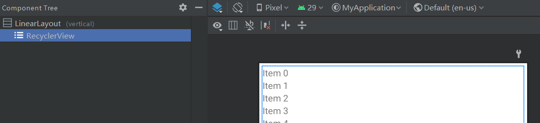
Circular viewrecyclerview It is a powerful and widely used control. It can display data in list layout or grid layout. If you use this control for the first time in the module, you need to click RecyclerView to download it in the GUI design interface, or add implementation 'Android. RecyclerView: RecyclerView: 1.0.0' in the dependencies node in the build.gradle file. Its default appearance is shown in the figure below:
(2) Method of use
Common methods of RecyclerView are:
① void setAdapter(Adapter adapter): to set an adapter, you usually need to inherit RecyclerView.Adapter.
② void setLayoutManager(RecyclerView.LayoutManager layout): sets the layout manager that RecyclerView will use. The value ranges are: LinearLayoutManager (list linear layout manager), GridLayoutManager (grid layout manager), StaggeredGridLayoutManager (waterfall flow grid layout manager).
③ void addItemDecoration(RecyclerView.ItemDecoration decor): adds a dividing line between data items.
④ void removeItemDecoration (RecyclerView.ItemDecoration decor): deletes the split line between data items.
⑤ void setItemAnimator(RecyclerView.ItemAnimator animator): add data item addition and deletion to display animation effects. If you do not customize the animation, you can use the default animation DefaultItemAnimator.
⑥ void addOnItemTouchListener(RecyclerView.OnItemTouchListener listener): a touch listener for adding data items. Developers need to distinguish click and long press events here.
⑦ void removeOnItemTouchListener(RecyclerView.OnItemTouchListener listener): remove the touch listener.
⑧ void scrollToPosition(int position): scroll to the data item at the specified position.
Circular view adapter RecyclerView.Adapter Three methods need to be implemented to complete the layout view of data items and set the data content in child controls:
① abstract int getItemCount(): returns the total number of data items held by the adapter.
② abstract VH onCreateViewHolder(ViewGroup parent, int viewType): create and save the view holder of the entire layout.
③ abstract void onBindViewHolder(VH holder, int position): bind the view holder and set the display content of child controls.
The combination of methods ② and ③ is equivalent to the getView method of BaseAdapter. When the parameter convertView of getView is empty, the re creation process is processed in method ② onCreateViewHolder, and the code for binding data for child controls is implemented by ③ onBindViewHolder.
When the data held by the adapter is added or deleted, the following methods of the adapter can be used to notify the adapter to update the page:
① final void notifyItemInserted(int position): notifies the adapter that a new data item has been inserted in position.
② final void notifyItemMoved(int fromPosition, int toPosition): notifies the adapter that the data item in the specified range has been deleted.
③ final void notifyDataSetChanged(): notifies the adapter that the data set held by the adapter has changed.
④ final void notifyItemChanged(int position): notifies the adapter that the data item at position has changed.
The view holder of the loop view RecyclerView.ViewHolder It is also an abstract class. Its subclasses also need to declare all child controls in the layout of data items, and pass in a specific layout view in the constructor to instantiate these controls.
Circular view layout manager RecyclerView.LayoutManager Is the core of circular view, which determines how data items are displayed, and setLayoutManager method can dynamically change the original layout.
LinearLayoutManager (list linear layout manager) Common methods are:
① Linearlayoutmanager (context, int orientation, Boolean reverselayout): constructor that specifies the direction of the list and whether to layout from the opposite direction.
② void setOrientation(int orientation): sets the orientation of the layout: HORIZONTAL or VERTICAL.
③ void setReverseLayout(boolean reverseLayout): whether to layout from the opposite direction. The default is false.
GridLayoutManager (grid layout manager) Common methods are:
① Gridlayoutmanager (context, int spancount): constructor that specifies the number of columns in the grid.
② void setSpanCount(int spanCount): sets the number of columns in the grid layout.
③ void setSpanSizeLookup(GridLayoutManager.SpanSizeLookup spanSizeLookup): sets the column occupancy rules of the grid. By default, one data item occupies one column. The developer can implement his abstract int getSpanSize(int position) method by inheriting SpanSizeLookup to customize the occupancy rules, identify a specific position data item and return the number of columns it needs to occupy.
StaggeredGridLayoutManager (waterfall flow grid layout manager) The layout of different sizes can be displayed according to specific data items. As long as the height of each grid is dynamically set in the adapter, the system will display data items of different sizes in a waterfall on the page. Its common methods are:
① StaggeredGridLayoutManager(int spanCount, int orientation): creates an instance of StaggeredGridLayoutManager with a given number and direction of columns.
② void setSpanCount(int spanCount): sets the number of columns in the grid layout.
③ void setOrientation(int orientation): sets the orientation of the layout: HORIZONTAL or VERTICAL.
Next, familiarize yourself with the use process by using these three different layout examples. First, place three circular views in the page. The data items are displayed in list linear layout, grid layout and waterfall flow grid layout respectively:
Then, the appearance of data items in different layouts can be customized according to different layout methods:
Appearance of data items in list like linear layout item_linear.xml is as follows:
Appearance of data item in grid layout item_grid.xml is as follows:

Appearance of data item in waterfall flow grid layout item_ Tagged.xml is as follows:

The above page layout related to the display of data items is designed. Next, you need to define adapters for different layouts to provide data sources of data items. Of course, the only difference between the three adapters is to create and bind different layouts according to the appearance of data items, and then set the display content.
Customize a list like linear layout adapter RecyclerLinearAdapter:
public class RecyclerLinearAdapter extends RecyclerView.Adapter<ViewHolder> {
    private Context mContext; // Declare a context object
    private ArrayList<SoftwareBean> mSoftwareList;

    public RecyclerLinearAdapter(Context context, ArrayList<SoftwareBean> software_list) {
        mContext = context;
        mSoftwareList = software_list;
    }

    // Gets the number of list items
    @Override
    public int getItemCount() {
        return mSoftwareList.size();
    }

    // The type of each item is returned here. The developer can customize the header type and general type,
    //Then, in the onCreateViewHolder method, different layouts are loaded according to the type, so as to realize the grid layout with head
    @Override
    public int getItemViewType(int position) {
        return 0;
    }

    // Gets the sequence number of the list item
    @Override
    public long getItemId(int position) {
        return position;
    }

    // Create the view holder for the list item
    @Override
    public ViewHolder onCreateViewHolder(ViewGroup vg, int viewType) {
        // According to the layout file item_ Generating view objects using linear.xml
        View v = LayoutInflater.from(mContext).inflate(R.layout.item_linear, vg, false);
        return new ItemHolder(v);
    }

    // Bind the view holder of the list item
    @Override
    public void onBindViewHolder(ViewHolder vh, final int position) {
        ItemHolder holder = (ItemHolder) vh;
        holder.iv_pic.setImageResource(mSoftwareList.get(position).image);
        holder.tv_title.setText(mSoftwareList.get(position).name);
        holder.tv_desc.setText(mSoftwareList.get(position).desc);
        // Implement the click event of the list item
        holder.ll_item.setOnClickListener(v -> {
            String desc = String.format("You clicked page%d Item named%s", position + 1,
                    mSoftwareList.get(position).name);
            Toast.makeText(mContext, desc, Toast.LENGTH_SHORT).show();
        });
        // Implement long press event of list item
        holder.ll_item.setOnLongClickListener(v -> {
            String desc = String.format("You long pressed the second button%d Item named%s", position + 1,
                    mSoftwareList.get(position).name);
            Toast.makeText(mContext, desc, Toast.LENGTH_SHORT).show();
            return true;
        });
    }

    // Defines the view holder for the list item
    public class ItemHolder extends ViewHolder {
        public LinearLayout ll_item; // Declares the linear layout of list items
        public ImageView iv_pic; // Image view for declaring list item icons
        public TextView tv_title; // Declares a text view of the list item title
        public TextView tv_desc; // Declare a text view of the list item description
        public ItemHolder(View v) {//The layout view of the grid item needs to be passed in the constructor
            super(v);
            ll_item = v.findViewById(R.id.ll_item);
            iv_pic = v.findViewById(R.id.iv_pic);
            tv_title = v.findViewById(R.id.tv_title);
            tv_desc = v.findViewById(R.id.tv_desc);
        }
    }
}
Adapter for custom grid layout RecyclerGridAdapter:
public class RecyclerGridAdapter extends RecyclerView.Adapter<ViewHolder> {
    private Context mContext; // Declare a context object
    private ArrayList<SoftwareBean> mSoftwareList;

    public RecyclerGridAdapter(Context context, ArrayList<SoftwareBean> software_list) {
        mContext = context;
        mSoftwareList = software_list;
    }

    // Gets the number of grid items
    @Override
    public int getItemCount() {
        return mSoftwareList.size();
    }

    // Get the type of grid item without processing
    @Override
    public int getItemViewType(int position) {
        return 0;
    }

    // Gets the sequence number of the grid item
    @Override
    public long getItemId(int position) {
        return position;
    }

    // Creating the view holder of the grid item is equivalent to the processing of null convertView of BaseAdapter
    @Override
    public ViewHolder onCreateViewHolder(ViewGroup vg, int viewType) {
        // Layout file item according to grid items_ Grid.xml generates view objects
        View v = LayoutInflater.from(mContext).inflate(R.layout.item_grid, vg, false);
        return new ItemHolder(v);
    }

    // Binding the view holder of grid items is the same as that of BaseAdapter, but you need to bind the event listener yourself
    @Override
    public void onBindViewHolder(ViewHolder vh, final int position) {
        ItemHolder holder = (ItemHolder) vh;
        holder.iv_pic.setImageResource(mSoftwareList.get(position).image);
        holder.tv_title.setText(mSoftwareList.get(position).name);
        // Implement the click event of grid items
        holder.ll_item.setOnClickListener(v -> {
            String desc = String.format("You clicked page%d Item named%s", position + 1,
                    mSoftwareList.get(position).name);
            Toast.makeText(mContext, desc, Toast.LENGTH_SHORT).show();
        });
        // Implement the long press event of grid items
        holder.ll_item.setOnLongClickListener(v -> {
            String desc = String.format("You long pressed the second button%d Item named%s", position + 1,
                    mSoftwareList.get(position).name);
            Toast.makeText(mContext, desc, Toast.LENGTH_SHORT).show();
            return true;
        });
    }

    // Defines the view holder for the grid item
    public class ItemHolder extends ViewHolder {
        public LinearLayout ll_item; // Declares the linear layout of grid items
        public ImageView iv_pic; // Image view for declaring grid item icons
        public TextView tv_title; // Declare a text view of the grid item title
        public ItemHolder(View v) {//The layout view of the grid item needs to be passed in the constructor
            super(v);
            ll_item = v.findViewById(R.id.ll_item);
            iv_pic = v.findViewById(R.id.iv_pic);
            tv_title = v.findViewById(R.id.tv_title);
        }
    }
}
Adapter for customizing waterfall flow grid layout RecyclerStaggeredAdapter:
public class RecyclerStaggeredAdapter extends RecyclerView.Adapter<ViewHolder> {
    private Context mContext; // Declare a context object
    private ArrayList<SoftwareBean> mSoftwareList; // Declare a tool software queue

    public RecyclerStaggeredAdapter(Context context, ArrayList<SoftwareBean> software_list) {
        mContext = context;
        mSoftwareList = software_list;
    }

    // Gets the number of waterfall flow grid items
    @Override
    public int getItemCount() {
        return mSoftwareList.size();
    }

    // Gets the type of the waterfall flow grid item
    @Override
    public int getItemViewType(int position) {
        return 0;
    }

    // Gets the sequence number of the waterfall flow grid item
    @Override
    public long getItemId(int position) {
        return position;
    }

    // Create the view holder for the waterfall flow grid item
    @Override
    public ViewHolder onCreateViewHolder(ViewGroup vg, int viewType) {
        // According to the layout file item_ Generate view objects using tagged.xml
        View v = LayoutInflater.from(mContext).inflate(R.layout.item_staggered, vg, false);
        return new ItemHolder(v);
    }

    // Bind the view holder of the waterfall flow grid item
    @Override
    public void onBindViewHolder(ViewHolder vh, final int position) {
        ItemHolder holder = (ItemHolder) vh;
        holder.iv_pic.setImageResource(mSoftwareList.get(position).image);
        holder.tv_title.setText(mSoftwareList.get(position).name);
        // Implement the click event of waterfall flow grid item
        holder.ll_item.setOnClickListener(v -> {
            String desc = String.format("You clicked page%d Item named%s", position + 1,
                    mSoftwareList.get(position).name);
            Toast.makeText(mContext, desc, Toast.LENGTH_SHORT).show();
        });
        // Implement the long press event of waterfall flow grid item
        holder.ll_item.setOnLongClickListener(v -> {
            String desc = String.format("You long pressed the second button%d Item named%s", position + 1,
                    mSoftwareList.get(position).name);
            Toast.makeText(mContext, desc, Toast.LENGTH_SHORT).show();
            return true;
        });
    }

    // Defines the view holder of the waterfall flow grid item
    public class ItemHolder extends ViewHolder {
        public LinearLayout ll_item; // Declare the linear layout of waterfall flow grid items
        public ImageView iv_pic; // Image view that declares the waterfall flow grid item icon
        public TextView tv_title; // A text view that declares the waterfall flow grid item title
        public ItemHolder(View v) {//The layout view of the grid item needs to be passed in the constructor
            super(v);
            ll_item = v.findViewById(R.id.ll_item);
            iv_pic = v.findViewById(R.id.iv_pic);
            tv_title = v.findViewById(R.id.tv_title);
        }
    }
}
Finally, configure three loop views in Activity respectively, and the configured processes are the same:
    // Initializes a circular view of a linear layout
    private void initRecyclerLinear() {
        // Get RV from layout file_ Loop view of linear
        RecyclerView rv_linear = findViewById(R.id.rv_linear);
        // Create a vertical linear layout manager
        LinearLayoutManager manager = new LinearLayoutManager(this, RecyclerView.VERTICAL, false);
        // Sets the layout manager for the loop view
        rv_linear.setLayoutManager(manager);
        // Adapter for building linear layout
        RecyclerLinearAdapter adapter = new RecyclerLinearAdapter(this, SoftwareBean.getDefaultList());
        // Set up adapter
        rv_linear.setAdapter(adapter);
        // Set default animation effects
        rv_linear.setItemAnimator(new DefaultItemAnimator());
    }

    // Initializes the circular view of the grid layout
    private void initRecyclerGrid() {
        // Get RV from layout file_ Circular view of grid
        RecyclerView rv_grid = findViewById(R.id.rv_grid);
        // Create a vertical grid layout manager with 3 columns per row
        GridLayoutManager manager = new GridLayoutManager(this,3);
        // Set occupancy rules
        manager.setSpanSizeLookup(new GridLayoutManager.SpanSizeLookup() {
            @Override
            public int getSpanSize(int position) {
                if (position == 0) { // The first item occupies two columns
                    return 2;
                } else { // Occupy a column for other items
                    return 1;
                }
            }
        });
        // Sets the layout manager for the loop view
        rv_grid.setLayoutManager(manager);
        // Build a grid adapter
        RecyclerGridAdapter adapter = new RecyclerGridAdapter(this, SoftwareBean.getDefaultList());
        // Give it to rv_grid setup adapter
        rv_grid.setAdapter(adapter);
        // Set RV_ Default animation effect of grid
        rv_grid.setItemAnimator(new DefaultItemAnimator());
    }

    // Initializes the loop view of the waterfall flow layout
    private void initRecyclerStaggered() {
        // Get RV from layout file_ Stacked loop view
        RecyclerView rv_staggered = findViewById(R.id.rv_staggered);
        // Create a vertical waterfall flow layout manager
        StaggeredGridLayoutManager manager = new StaggeredGridLayoutManager(
                3, RecyclerView.VERTICAL);
        // Sets the layout manager for the loop view
        rv_staggered.setLayoutManager(manager);
        // Build a waterfall flow adapter
        RecyclerStaggeredAdapter adapter = new RecyclerStaggeredAdapter(this, SoftwareBean.getDefaultList());
        // Give it to RV_ Cascaded set waterfall flow adapter
        rv_staggered.setAdapter(adapter);
        // Set RV_ Default animation effect for stacked
        rv_staggered.setItemAnimator(new DefaultItemAnimator());
    }
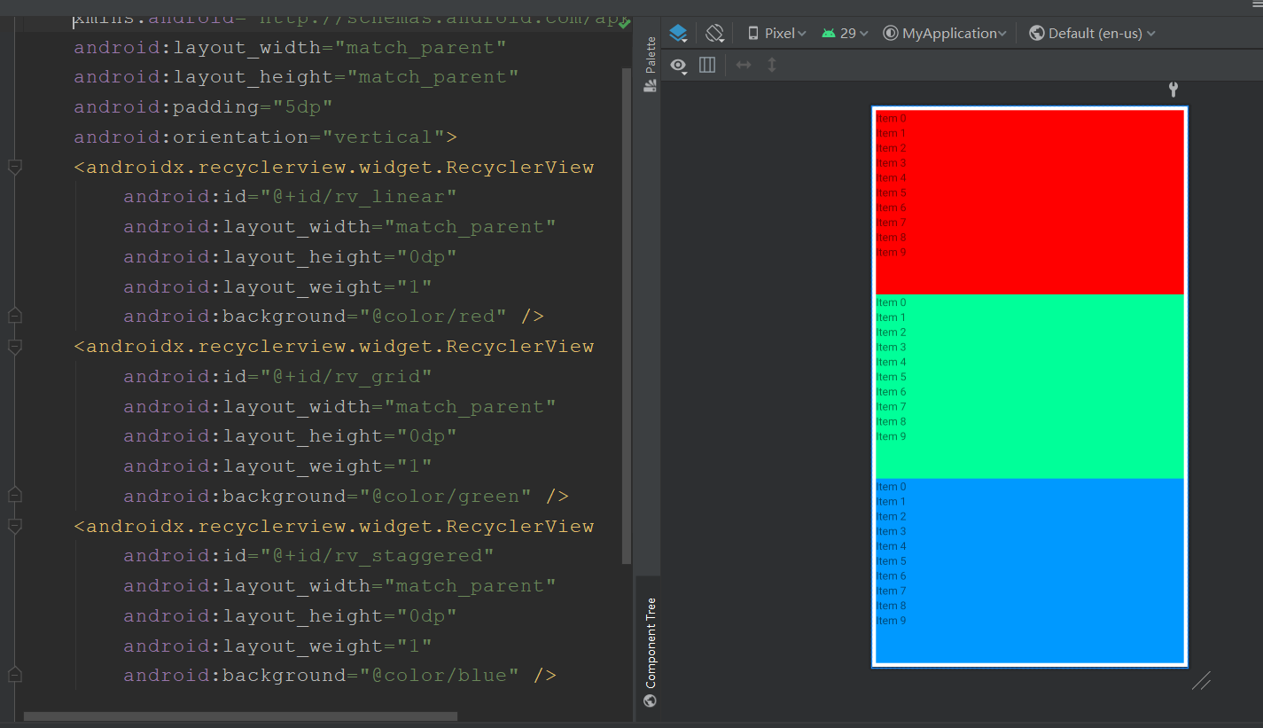
In this example, the effect diagram of circular view with three different layouts is as follows: