I really like the effect of folding toolbars in Material Design, which is the design used in Bilbili Android Client Video Details Page. In the second part of this article, we will learn about the use of Collapsing Toolbar Layout by simply emulating the implementation of Bilbili Video Details Page. The third part of the article introduces the combination of Collapsing Toolbar Layout and TabLayout.
Basic friends can skip the first part directly.
I. Introduction of Related Basic Attributes
There is an Activity template in Android studio called Scrolling Activity, which implements a simple foldable toolbar, and we add this template to the project.
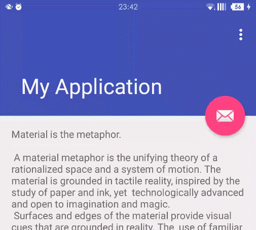
The layout code for Scrolling Activity is as follows
<?xml version="1.0" encoding="utf-8"?>
<android.support.design.widget.CoordinatorLayout xmlns:android="http://schemas.android.com/apk/res/android"
xmlns:app="http://schemas.android.com/apk/res-auto"
xmlns:tools="http://schemas.android.com/tools"
android:layout_width="match_parent"
android:layout_height="match_parent"
android:fitsSystemWindows="true">

<android.support.design.widget.AppBarLayout
    android:id="@+id/app_bar"
    android:layout_width="match_parent"
    android:layout_height="@dimen/app_bar_height"
    android:fitsSystemWindows="true"
    android:theme="@style/AppTheme.AppBarOverlay">

    <android.support.design.widget.CollapsingToolbarLayout
        android:id="@+id/toolbar_layout"
        android:layout_width="match_parent"
        android:layout_height="match_parent"
        android:fitsSystemWindows="true"
        app:contentScrim="?attr/colorPrimary"
        app:layout_scrollFlags="scroll|exitUntilCollapsed">

        <android.support.v7.widget.Toolbar
            android:id="@+id/toolbar"
            android:layout_width="match_parent"
            android:layout_height="?attr/actionBarSize"
            app:layout_collapseMode="pin"
            app:popupTheme="@style/AppTheme.PopupOverlay" />

    </android.support.design.widget.CollapsingToolbarLayout>
</android.support.design.widget.AppBarLayout>
<android.support.v4.widget.NestedScrollView
        android:layout_width="match_parent"
        android:layout_height="match_parent"
        app:layout_behavior="@string/appbar_scrolling_view_behavior"
        >
    <TextView
            android:layout_width="wrap_content"
            android:layout_height="wrap_content"
            android:layout_margin="@dimen/text_margin"
            android:text="@string/large_text" />
</android.support.v4.widget.NestedScrollView>

<android.support.design.widget.FloatingActionButton
    android:id="@+id/fab"
    android:layout_width="wrap_content"
    android:layout_height="wrap_content"
    android:layout_margin="@dimen/fab_margin"
    android:src="@android:drawable/ic_dialog_email"
    app:layout_anchor="@id/app_bar"
    app:layout_anchorGravity="bottom|end" />

</android.support.design.widget.CoordinatorLayout>
AppBarLayout is an app bar layout that supports scrolling gestures (such as toolbars rolling out or rolling into the screen), while Collapsing Toolbar Layout is a layout that specifically implements scrolling details for different elements in a sub-layout.
The rolling layout combined with AppBarLayout (Recyclerview, NestedScrollView, etc.) requires app:layout_behavior="@string/appbar_scrolling_view_behavior" (set by the NestedScrollView control in the code above). Without settings, AppBarLayout will not respond to scrolling events in the scrolling layout.
Collapsing Toolbar Layout and ScrollView have sliding bug s when used together. Be careful to use NestedScrollView instead of ScrollView.
AppBarLayout's sub-layout has five scrolling identifiers (that is, the app:layout_scrollFlags attribute configured in the above code CollapsingToolbarLayout):
- Scroll: Associate this layout with scroll time. This logo should be set before other logos. Without this logo, the layout will not scroll and other logo settings will not be valid.
- enterAlways: Any scrolling down will make this layout visible. This logo is often referred to as the Quick Return mode.
- EnterAlways Collapsed: Suppose you define a minimum height and enterAlways also defines it, then view will start to show when it reaches that minimum height and start to unfold slowly from that time, and when it scrolls to the top, it will unfold.
- Existent Until Collapsed: When you define a minHeight, the layout folds when the scroll reaches this minimum height.
- snap: When a scrolling event ends, if the view is partially visible, it will be scrolled to shrink or expand. For example, if the view is only displayed at the bottom 25%, it will collapse. On the contrary, if its bottom is 75% visible, it will expand completely.
Collapsing Toolbar Layout can set the color of the toolbar layout when folded by app:contentScrim, and the color of the status bar when folded by app: status BarScrim. The default contentScrim is the color value of color Primary, and status BarScrim is the color value of color Primary Dark. This will be used later.
Collapsing Toolbar Layout's sub-layout has three folding modes (app: layout_collapse mode set in Toolbar)
- off: This is the default property. The layout will be displayed properly without folding.
- pin: After Collapsing Toolbar Layout folds, the layout will be fixed at the top.
- Parallax: When Collapsing Toolbar Layout folds, this layout also has parallax folding effect.
When the sub-layout of Collapsing Toolbar Layout sets the parallax mode, we can also set the parallax scroll factor by app: layout_collapseParallax Multiplier with the value of: 0-1.
The Floating Action Button control is anchored below AppBarLayout through the app:layout_anchor setting. There is a Behavior method in the Floating Action Button source code, and when AppBarLayout shrinks, Floating Action Button changes accordingly. About Coordinator Layout and Behavior, my next article will be with you.
This list of attributes looks a little annoying, you can create a new Scrolling Activity template to experiment and play.
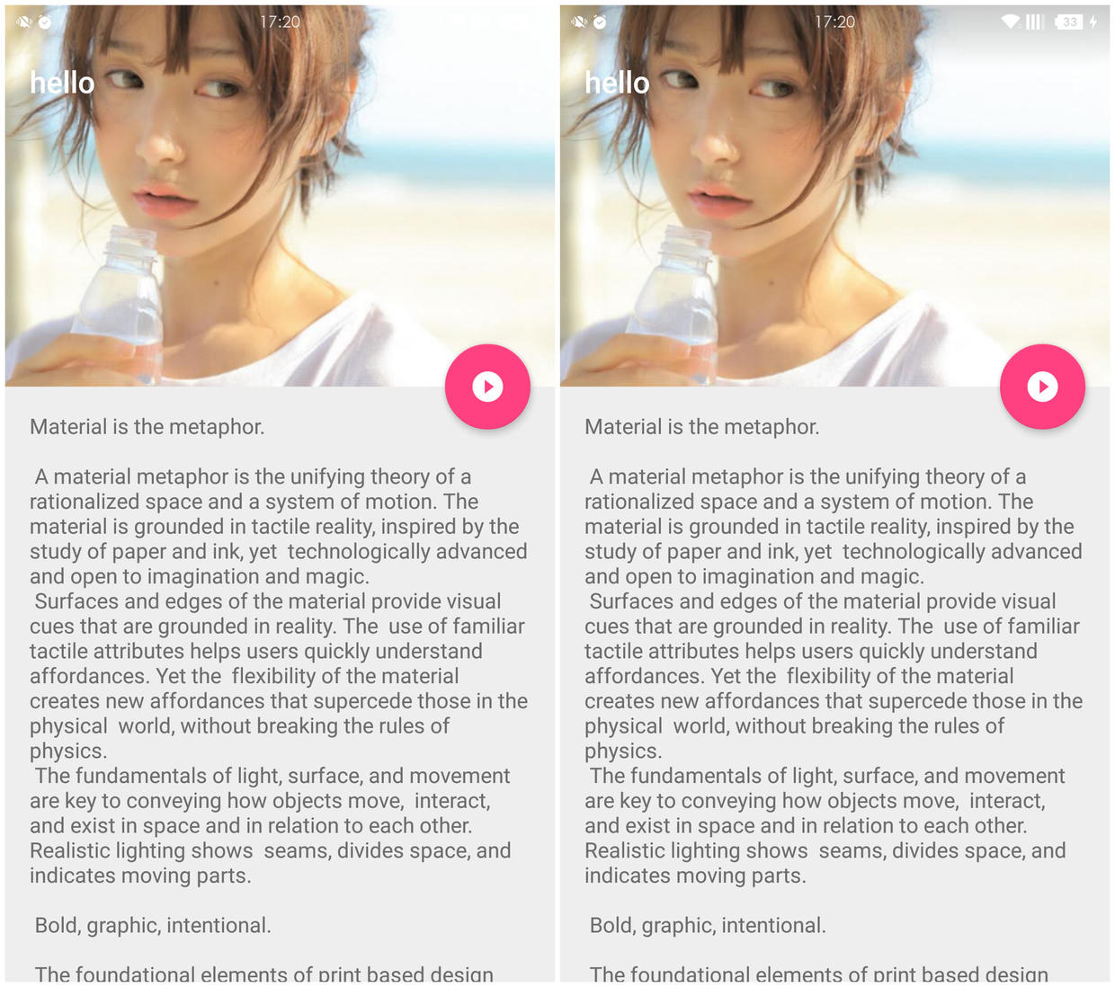
II. Imitate Bilbili Client Video Details Page
Let's first analyze the original interface.

At the beginning of the interface, Collapsing Toolbar Layout is in the unfolded state, showing the video cover. We scroll up the interface and Collapsing Toolbar Layout shrinks. When AppBarLayout is fully folded, the Video av number is hidden, a small TV icon and "Play Now" are displayed, and clicking makes AppBarLayout fully unfolded. The Collapsing Toolbar Layout sublayout is switched from ImageView to a video bullet player.
Er.... Ballistic Screen Player...
Station B has opened a bomb screen engine very early, and has a fantastic name of "Flame Bomb Curtain Envoy" (see the works of secondary program apes), the source code is on github, the project name is "Flame Bomb Envoy". DanmakuFlameMaster.
Let's first look at the revised layout.
<?xml version="1.0" encoding="utf-8"?>
<android.support.design.widget.CoordinatorLayout xmlns:android="http://schemas.android.com/apk/res/android"
xmlns:app="http://schemas.android.com/apk/res-auto"
android:id="@+id/coordinatorLayout"
android:layout_width="match_parent"
android:layout_height="match_parent">

<android.support.design.widget.AppBarLayout
    android:id="@+id/app_bar"
    android:layout_width="match_parent"
    android:layout_height="@dimen/app_bar_height"
    android:fitsSystemWindows="true"
    android:theme="@style/AppTheme.AppBarOverlay">

    <android.support.design.widget.CollapsingToolbarLayout
        android:id="@+id/toolbar_layout"
        android:layout_width="match_parent"
        android:layout_height="match_parent"
        app:contentScrim="?attr/colorPrimary"
        app:statusBarScrim="@android:color/transparent"
        app:layout_scrollFlags="scroll|exitUntilCollapsed|snap">

        <!--cover photo-->
        <ImageView
            android:id="@+id/imageview"
            android:layout_width="match_parent"
            android:layout_height="match_parent"
            android:scaleType="centerCrop"
            android:src="@drawable/diqiu"
            app:layout_collapseMode="parallax"
            app:layout_collapseParallaxMultiplier="0.7"
            android:fitsSystemWindows="true"/>

        <!--Video and Barrage Control-->
        <FrameLayout
            android:id="@+id/video_danmu"
            android:layout_width="match_parent"
            android:layout_height="match_parent"
            app:layout_collapseMode="parallax"
            app:layout_collapseParallaxMultiplier="0.7"
            android:fitsSystemWindows="true"
            android:visibility="gone">
            <VideoView
                android:id="@+id/videoview"
                android:layout_width="match_parent"
                android:layout_height="match_parent" />

            <!--Open Source Bullet Curtain Control for Dali Dali-->
            <master.flame.danmaku.ui.widget.DanmakuView
                android:id="@+id/danmaku"
                android:layout_width="match_parent"
                android:layout_height="match_parent" />
        </FrameLayout>

        <android.support.v7.widget.Toolbar
            android:id="@+id/toolbar"
            android:layout_width="match_parent"
            android:layout_height="?attr/actionBarSize"
            app:layout_collapseMode="pin"
            app:popupTheme="@style/AppTheme.PopupOverlay" >

            <!--Custom Immediate Play Button with Pictures-->
            <android.support.v7.widget.ButtonBarLayout
                android:id="@+id/playButton"
                android:layout_width="match_parent"
                android:layout_height="match_parent"
                android:gravity="center"
                android:visibility="gone">
                <ImageView
                    android:layout_width="wrap_content"
                    android:layout_height="match_parent"
                    android:layout_gravity="center_horizontal"
                    android:src="@mipmap/ic_play_circle_filled_white_48dp"/>

                <TextView
                    android:layout_width="wrap_content"
                    android:layout_height="wrap_content"
                    android:textColor="#ffffff"
                    android:text="Play now"
                    android:layout_gravity="center_vertical"
                   />
            </android.support.v7.widget.ButtonBarLayout>

        </android.support.v7.widget.Toolbar>
    </android.support.design.widget.CollapsingToolbarLayout>
</android.support.design.widget.AppBarLayout>

<include layout="@layout/content_scrolling" />

<android.support.design.widget.FloatingActionButton
    android:id="@+id/fab"
    android:layout_width="wrap_content"
    android:layout_height="wrap_content"
    android:layout_margin="@dimen/fab_margin"
    android:src="@mipmap/ic_play_circle_filled_white_48dp"
    app:layout_anchor="@id/app_bar"
    app:layout_anchorGravity="bottom|end" />

</android.support.design.widget.CoordinatorLayout>
I changed the color value of color Primary to "Girl Powder" in Station B, and the playing icons were found on the Internet.
<color name="colorPrimary">#FA7199</color>Because we want to achieve an immersive status bar, we need to first set the entire activity to the status bar transparent mode. Then in the layout file, set android:fitsSystemWindows="true" to the immersive control in Collapsing Toolbar Layout. If not, the sub-layout will be located below the status bar and not extended to the status bar.
The layout is not complicated. Next, the function of playing without bullet screen is realized.
We need to monitor the folding and unfolding state of Collapsing Toolbar Layout. Alas, the authorities did not provide ready-made methods.
Looking at the source code, you can see that Collapsing ToolbarLayout implements the disparity movement of sub-layout and title and the display of ContentScrim and Status BarScrim by implementing the OnOffset ChangedListener interface of AppBarLayout, and according to the offset of AppBarLayout. Then we can also determine the status of CollapsingToolbarLayout by calling the add OnOffsetChangedListener method of AppBarLayout to monitor the displacement of AppBarLayout.
Write an enumeration to define Collapsing Toolbar Layout expansion, folding, and intermediate states.
 private CollapsingToolbarLayoutState state;

 private enum CollapsingToolbarLayoutState {
    EXPANDED,
    COLLAPSED,
    INTERNEDIATE
}
Next, AppBarLayout is monitored to determine the status of Collapsing Toolbar Layout and to implement the corresponding logic.
In order to make the status more intuitive, I modified the title together when modifying the status value.
When using Collapsing Toolbar Layout, it should be noted that it will not work to call setTitle() of Toolbar after completing the Collapsing Toolbar Layout settings. We need to call setTitle() of Collapsing Toolbar Layout to modify the toolbar. (See the Collapsing Toolbar Layout source code for specific reasons.)
    AppBarLayout  app_bar=(AppBarLayout)findViewById(R.id.app_bar);
    app_bar.addOnOffsetChangedListener(new AppBarLayout.OnOffsetChangedListener() {
        @Override
        public void onOffsetChanged(AppBarLayout appBarLayout, int verticalOffset) {

            if (verticalOffset == 0) {
                if (state != CollapsingToolbarLayoutState.EXPANDED) {
                    state = CollapsingToolbarLayoutState.EXPANDED;//Modify the status token to expand
                    collapsingToolbarLayout.setTitle("EXPANDED");//Set title to EXPANDED
                }
            } else if (Math.abs(verticalOffset) >= appBarLayout.getTotalScrollRange()) {
                if (state != CollapsingToolbarLayoutState.COLLAPSED) {
                    collapsingToolbarLayout.setTitle("");//Set title not to display
                    playButton.setVisibility(View.VISIBLE);//Hide Play Button
                    state = CollapsingToolbarLayoutState.COLLAPSED;//Modified status marked as folded
                }
            } else {
                if (state != CollapsingToolbarLayoutState.INTERNEDIATE) {
                    if(state == CollapsingToolbarLayoutState.COLLAPSED){
                        playButton.setVisibility(View.GONE);//Hide Play Button When Changed from Folding to Intermediate State
                    }
                    collapsingToolbarLayout.setTitle("INTERNEDIATE");//Set title to INTERNEDIATE
                    state = CollapsingToolbarLayoutState.INTERNEDIATE;//Modify the status tag to the middle
                }
            }
        }
    });
Then set the listener for the play button, and click to call AppBarLayout's setExpanded(true) method to expand the toolbar.

The title of the clientele is fixed and can be implemented by calling the setTitleEnabled(false) method of CollapsingToolbarLayout.
When the video is playing, calling NestedScrollView's setNestedScrolling Enabled (false) method can make AppBarLayout not respond to scrolling events.
Careful friends may find that the Client has added a gradient opacity layer to avoid the shallow color of the video cover image affecting the display of status bar information.
Implementing a gradient mask layer is simple. First, a new xml file named gradient is created under the res/drawable folder. The code is as follows:
<?xml version="1.0" encoding="utf-8"?>
<shape xmlns:android="http://schemas.android.com/apk/res/android">

    <gradient
        android:startColor="#33000000"
        android:endColor="#00000000"
        android:angle="270" />

</shape>
In the shape node, the shape can be set by android:shape, which is rectangular by default. The value of angle in gradient node is 270 from top to bottom, 0 from left to right, and 90 from bottom to top. The starting color peptone 000 is black with 20% opacity, and peptone 000 is transparent.
Then add a custom view under the ImageView code in Collapsing Toolbar Layout, setting the background to the gradient effect above.
<View
   android:layout_width="match_parent"
   android:layout_height="40dp"
   android:background="@drawable/gradient"
   android:fitsSystemWindows="true"
/>
In general, the height of the status bar is about 20 dp. In order to make the gradient effect more natural, and without more influence maps (mei) slices (zi), I set the height to 40 dp. (The status bar can see clearly, and the face of my sister is not black. It's very good (q. _____________
I omitted the relevant implementation of the screen play. Next, as long as the cover picture hiding, video and screen control display initialization and playback logic are written in the play button listening, other corresponding logic can be written according to whether the video is playing in the three state monitoring of AppBarLayout. Interested friends can download the source code of "Flame Bomb Curtain Enabling" of the beep mile. DanmakuFlameMaster Just some fun.
Site B will have a Snackbar-like prompt control after chasing or coining, which can be seen in my last article. No time to explain, use Snackbar! - Android Snackbar Fancy Guide To achieve this, you are welcome to visit interested friends.

It's really not that I'm too lazy to code, really... Jiyou: Hurry up, it's dark. Me: Wait for me, come at once! (><)/)
Collapsing Toolbar Layout and Tab Layout
The combination of Collapsing Toolbar Layout and TabLayout also works well.

Take a look at the code in Collapsing Toolbar Layout
<?xml version="1.0" encoding="utf-8"?>
<android.support.design.widget.CoordinatorLayout xmlns:android="http://schemas.android.com/apk/res/android"
xmlns:app="http://schemas.android.com/apk/res-auto"
xmlns:tools="http://schemas.android.com/tools"
android:layout_width="match_parent"
android:layout_height="match_parent"
android:fitsSystemWindows="true">

<android.support.design.widget.AppBarLayout
    android:id="@+id/app_bar"
    android:layout_width="match_parent"
    android:layout_height="250dp"
    android:fitsSystemWindows="true"
    android:theme="@style/AppTheme.AppBarOverlay">

    <android.support.design.widget.CollapsingToolbarLayout
        android:id="@+id/toolbar_layout"
        android:layout_width="match_parent"
        android:layout_height="match_parent"
        app:titleEnabled="false"
        android:fitsSystemWindows="true"
        app:contentScrim="@color/colorPrimary"
        app:statusBarScrim="@android:color/transparent"
        app:layout_scrollFlags="scroll|exitUntilCollapsed|snap">
        <ImageView
            android:id="@+id/imageview"
            android:layout_width="match_parent"
            android:layout_height="match_parent"
            android:scaleType="centerCrop"
            android:adjustViewBounds="true"
            app:layout_collapseMode="parallax"
            app:layout_collapseParallaxMultiplier="0.7"
            android:fitsSystemWindows="true"
            android:src="@drawable/girl2"/>
        <View
            android:layout_width="match_parent"
            android:layout_height="40dp"
            android:background="@drawable/gradient"
            android:fitsSystemWindows="true" />
        <android.support.v7.widget.Toolbar
            android:id="@+id/toolbar"
            android:layout_width="match_parent"
            android:layout_height="96dp"
            android:minHeight="?attr/actionBarSize"
            android:gravity="top"
            app:layout_collapseMode="pin"
            app:title="hello"
            app:popupTheme="@style/AppTheme.PopupOverlay"
            app:titleMarginTop="15dp"
            />
        <android.support.design.widget.TabLayout
            android:id="@+id/tablayout"
            android:layout_width="match_parent"
            android:layout_height="45dp"
            android:layout_gravity="bottom" />
    </android.support.design.widget.CollapsingToolbarLayout>
</android.support.design.widget.AppBarLayout>


<android.support.v4.view.ViewPager
    android:id="@+id/viewpage"
    android:layout_width="match_parent"
    android:layout_height="wrap_content"
    app:layout_behavior="@string/appbar_scrolling_view_behavior">
</android.support.v4.view.ViewPager>

  </android.support.design.widget.CoordinatorLayout>
TabLayout does not set app:layout_collapseMode, which will not disappear when Collapsing Toolbar Layout shrinks.
Collapsing Toolbar Layout shrinks at the height of the Toolbar, so we need to increase the height of the Toolbar and leave a place for the TabLayout so that the TabLayout does not overlap the Toolbar after shrinking.
As the height of the Toolbar increases, the title moves down accordingly. The android:gravity="top" method places the title of the Toolbar above the Toolbar, and then adjusts the height of the title to the top through app: Title MarginTop, so that the Toolbar is exactly the same as it used to be.
Collapsing Toolbar Layout can also be used with Palette, but I feel there are some pits in the actual use, because the picture in Collapsing Toolbar Layout is uncertain, and the color Palette gets from the picture is probably not what you want.
Interested friends can check Palette's usage by themselves.