Read this chapter to understand: 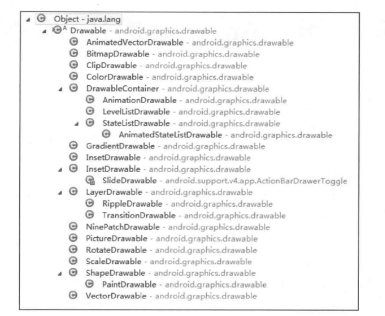
Drawable has no concept of size. When used as the background of view, Drawable is stretched to the same size as view.
6.2. Classification of Drawable
There are many kinds of Drawable, such as Bitmap Drawable, ShapeDrawable, Layer Drawable, StateList Drawable.
6.2.1, BitmapDrawable: The simplest drawable
We can go through it. xml The common attributes to describe it are:
<bitmap  xmlns:android="http://schemas.android.com/apk/res/android"
//Resource id of picture
    android:src="@drawable/drawable_resource"
//Anti-aliasing, smoothing pictures
    android:antialias=["true" | "false"]
//The jitter effect is better displayed on different resolutions.
    android:dither=["true" | "false"]
//Filtration effect, when the picture is stretched or compressed, normal display
    android:filter=["true" | "false"]
//Picture location
    android:gravity=["top" | "bottom" | "left" | "right" | "center_vertical" |
    "fill_vertical" | "center_horizontal" | "fill_horizontal" |
    "center" | "fill" | "clip_vertical" | "clip_horizontal"]
//Flat mode (default closes, gravity property is invalid when the flats are opened)
    android:tileMode=["disabled" | "clamp" | "repeat" | "mirror"] />
Now let's see the effect. 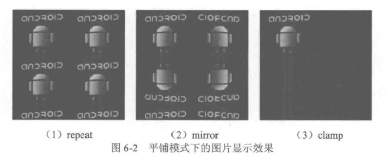
Note: To have a tiling effect, your controls must be larger than the size of the image you refer to.
NinePatch Drawable, which represents A. 9 image, is used in the same way as Bitmap Drawable.
6.2.2,ShapeDrawable
Construct graphics by color
Common attributes are:
<?xml version="1.0" encoding="utf-8"?>
<shape
xmlns:android="http://schemas.android.com/apk/res/android"
//Rectangle oval elliptic line ring ring
android:shape=["rectangle" | "oval" | "line" | "ring"] >
<corners //Use when shape is rectangle
android:radius="integer" //The radius value is overwritten by the following single radius attribute, defaulting to 1dp
android:topLeftRadius="integer"
android:topRightRadius="integer"
android:bottomLeftRadius="integer"
android:bottomRightRadius="integer" />
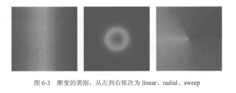
<gradient //Gradual change
//From a gradient point of view, the default is 0. The value must be a multiple of 45. 0 means left to right, 90 means top to bottom.
android:angle="integer"
//Abscissa of gradient Center
android:centerX="integer"
//Longitudinal coordinates of gradient centers
android:centerY="integer"
//Gradient Initial Color
android:startColor="color"
//Gradual Intermediate Color
android:centerColor="integer"
//Gradient end color
android:endColor="color"
//Gradient radius, valid only if android: type = redial
android:gradientRadius="integer"
//Gradient category: linear: linear gradient, radial: radial gradient, sweep: scan line gradient
android:type=["linear" | "radial" | "sweep"]
//Generally false
android:useLevel=["true" | "false"] />
<padding //padding
android:left="integer"
android:top="integer"
android:right="integer"
android:bottom="integer" />
<size //Specify size, commonly used in imageview with scaleType attributes
android:width="integer"
android:height="integer" />
<solid //fill color
android:color="color" />
<stroke //Frame
android:width="integer"
android:color="color"
android:dashWidth="integer"
android:dashGap="integer" />
</shape>Specific explanations are as follows:
android: shape: the shape of a graph
 <corners>: Four angles, only for rectangular shape s
 < gradient >: it is mutually exclusive with < solid >, < solid > for pure color, < gradient > for gradient
<solid>: Pure color filling, through andorid:color you can specify the filling color in shape s
 <stroke>: Shape's description edge
 android:width: The wider the edge, the thicker the border.
android:color: the color of the edge
 android:dishWidth: Width of line segments that make up dotted lines
 android:dishGap: The gap between each line segment that makes up the dashed line
<?xml version="1.0" encoding="utf-8"?>
<shape xmlns:android="http://schemas.android.com/apk/res/android"
    android:shape="rectangle" >

    <solid android:color="#ff0000" />

    <stroke
        android:dashGap="2dp"
        android:dashWidth="10dp"
        android:width="2dp"
        android:color="#00ff00" />

</shape>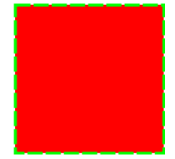
<padding>: Represents the distance between the view containing it and its padding
 <size>: The inherent width and height of shape are not significant when used as the background of view.
6.2.3,LayerDrawable
The corresponding xml tag is: overlapping placement to achieve the effect, similar to FramLayout
One can contain more than one item. The following item overrides the above item. The common attributes of each item are:
andorid:top = ""
andorid:bottom = ""
andorid:left = ""
andorid:right = ""
The offset representing the upper and lower parts of the relative view
andorid:drawable = "@drawable/ic_est"
Representatives refer to drawable resources
A small example of the code is as follows:
<?xml version="1.0" encoding="utf-8"?>
<layer-list xmlns:android="http://schemas.android.com/apk/res/android" >

    <item>
        <shape android:shape="rectangle" >
            <solid android:color="#0ac39e" />
        </shape>
    </item>

    <item android:bottom="6dp">
        <shape android:shape="rectangle" >
            <solid android:color="#ffffff" />
        </shape>
    </item>

    <item
        android:bottom="1dp"
        android:left="1dp"
        android:right="1dp">
        <shape android:shape="rectangle" >
            <solid android:color="#ffffff" />
        </shape>
    </item>

</layer-list>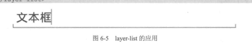
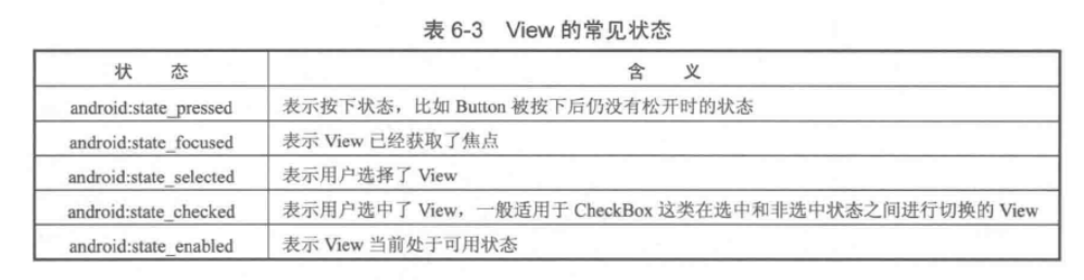
6.2.4,StateListDrawable
StateListDrawable corresponds to our commonly used tags. The common attributes are as follows:
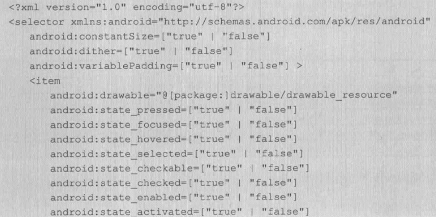
android:constanSize: defaults to false, indicating whether the inherent size changes with the change of the included View
 android:dither: Whether to turn on the jitter effect, default true, so that the low-quality screen has a better effect
 Android: Variable Padding: Whether it changes with the change of its state, the default is false. It is not recommended to turn this option on.
The < item > tag represents a specific Drawable
 android:drawable denotes the resource ID and other states of drawable
If we use more, we will not give any examples.
6.2.5,LevelListDrawable
level List Drawable corresponds to the label, which also represents a drawable set. According to different levels, it will switch to the corresponding drawable.
The basic usage is as follows:
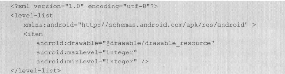
Levels are set by minLevel and maxLevel, ranging from 0 to 10,000
Use scenarios:
Sometimes, in order to display different pictures in an Image View, we often use:
if (condition1)
{
        image.setBackground(R.id.xxx1);
}
else if (condition2)
{
        image.setBackground(R.id.xxx2);
} ...
The same functionality can be achieved in another simple way
First, create an xml file under res/drawable, which reads as follows
<level-list xmlns:Android="http://schemas.android.com/apk/res/android">
    <item android:maxLevel="0" android:drawable="@drawable/battery_0" />
    <item android:maxLevel="1" android:drawable="@drawable/battery_1" />
    <item android:maxLevel="2" android:drawable="@drawable/battery_2" />
    <item android:maxLevel="3" android:drawable="@drawable/battery_3" />
    <item android:maxLevel="4" android:drawable="@drawable/battery_4" />
</level-list>
Then set the src of image view to the xml file created in layout
When transforming pictures in the program, you only need to use it
imageview.getDrawable().setImageLevel(1);...
Android automatically selects the corresponding image based on the level value. This is the way mobile phones display the remaining power to display different pictures.
6.2.6,TransitionDrawable
Transition Drawable corresponds to the label. Transition means transition.
Fade-in and fade-out effects in andnorid
The basic uses are as follows: 
Represents the upper and lower offsets relative to the included view
Specific use is as follows: linear gradient to radial gradient
<TextView
    android:id="@+id/test_transition"
    android:layout_width="100dp"
    android:layout_height="100dp"
    android:background="@drawable/transition_drawable"
    android:gravity="center"
    android:text="" />

<?xml version="1.0" encoding="utf-8"?>
<transition xmlns:android="http://schemas.android.com/apk/res/android" >

    <item android:drawable="@drawable/shape_drawable_gradient_linear"/>
    <item android:drawable="@drawable/shape_drawable_gradient_radius"/>

</transition>

<?xml version="1.0" encoding="utf-8"?>
<shape xmlns:android="http://schemas.android.com/apk/res/android"
    android:shape="rectangle" >

    <gradient
        android:centerColor="#00ff00"
        android:endColor="#0000ff"
        android:startColor="#ff0000"
        android:centerX="0.5"
        android:centerY="0.5"
        android:angle="0"
        android:type="linear" />

</shape>

<?xml version="1.0" encoding="utf-8"?>
<shape xmlns:android="http://schemas.android.com/apk/res/android"
    android:shape="rectangle" >

    <gradient
        android:centerColor="#00ff00"
        android:endColor="#0000ff"
        android:startColor="#ff0000"
        android:gradientRadius="60"
        android:type="radial" />

</shape>
Usage method:
View v = findViewById(R.id.test_transition);
TransitionDrawable drawable = (TransitionDrawable) v.getBackground();
drawable.startTransition(1000);
Expand:
Android Transition Framwork is mainly used for three things:
1. Transition animation between Activities;
2. Sharing elements between different activities or fragments to make interaction more coherent;
3. Some View transformation animations between the same Activity.
See also: http://www.jianshu.com/p/0af52be90ae6
6.2.7,InsetDrawable
Insert Drawable corresponds to the tag, which can embed other Drawables into itself. It can also be applied to Layer Drawable when a view er wants his background to be smaller than himself.
The basic usage is as follows:
These four attributes represent the spacing between the left and right concaves, respectively.
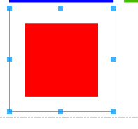
<?xml version="1.0" encoding="utf-8"?>
<inset xmlns:android="http://schemas.android.com/apk/res/android"
    android:insetBottom="15dp"
    android:insetLeft="15dp"
    android:insetRight="15dp"
    android:insetTop="15dp" >

    <shape android:shape="rectangle" >
        <solid android:color="#ff0000" />
    </shape>
</inset>
As shown in the figure
6.2.8,ScaleDrawable
The corresponding label, according to its own level, scale s a certain proportion
The basic usage is as follows:
Android: scale Gravity represents location
android:scaleHeight and android:scaleWidth denote the ratio of height to width of a specified drawable (that is, android:drawable = ""), in percentages.
For example:
android:scaleHeight = 20%
The following example shows how to reduce a picture to 30% of its original size.
At res/drawable/scale.xml
<?xml version="1.0" encoding="utf-8"?>
<scale xmlns:android="http://schemas.android.com/apk/res/android"
    android:drawable="@drawable/image1"
    android:scaleHeight="70%"
    android:scaleWidth="70%"
    android:scaleGravity="center" />
<TextView
    android:id="@+id/test_scale"
    android:layout_width="100dp"
    android:layout_height="100dp"
    android:background="@drawable/scale"
    android:gravity="center"
    android:text=""
    android:textColor="#ffffff" />
It's not possible to use drawable resources directly. You also need to use code to set values with levels greater than 0 and less than 10,000.
// test scale
View testScale = findViewById(R.id.test_scale);
ScaleDrawable testScaleDrawable = (ScaleDrawable) testScale.getBackground();
testScaleDrawable.setLevel(10);
6.2.8,ClipDrawable
ClipDrawable corresponding label, you can tailor a drawable according to the current level
The tailoring direction is set by android:clipOritation and andorid:grarity
The basic usage is as follows:
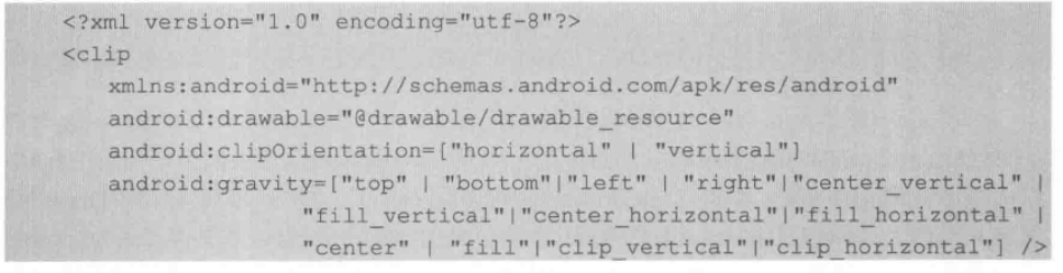
android:clipOritation and LineaLayout have similar attributes, vertical and horizontal
andorid:grarity represents the direction of cropping
For example: bottom means top-down tailoring
Here is an example of how to cut a picture from top to bottom.
First, in res/drawable/clip.xml
<?xml version="1.0" encoding="utf-8"?>
<clip xmlns:android="http://schemas.android.com/apk/res/android"
    android:clipOrientation="vertical"
    android:drawable="@drawable/image1"
    android:gravity="bottom" />
Then set the view as the background
<ImageView
    android:id="@+id/test_clip"
    android:layout_width="100dp"
    android:layout_height="100dp"
    android:gravity="center"
    android:src="@drawable/clip" />
Then set the level in the code. Similarly, the level is between 0 and 10,000. 0 means complete tailoring (nothing else), and 10,000 means no tailoring (just like no tailoring).
// test clip
ImageView testClip = (ImageView) findViewById(R.id.test_clip);
ClipDrawable testClipDrawable = (ClipDrawable) testClip.getDrawable();
testClipDrawable.setLevel(8000);
We set the level of 8000 here, which means keeping 8000 and cutting 2000, or 20% of the area.
6.3. Custom Drawable
Draable is used singularly, as image view's image display and as view's background display.
In Chapter 5, we know that the system will call drawable method to draw the background of view, so we can also rewrite drawable method to customize drawable.
Usually we don't need to customize drawable, because custom drawable can't be used directly in xml
In special cases, we want to customize drawable as well.
Now let's customize drawable to draw a circular drawable, and the radius changes with view.
The steps are as follows:
1. Inheriting drawable classes
2. draw, setAlpha, SetColor Filter, getOpacity, these methods must be implemented. draw is the main method.
The complete code is as follows:
package com.ryg.chapter_6.ui;

import android.graphics.Canvas;
import android.graphics.ColorFilter;
import android.graphics.Paint;
import android.graphics.PixelFormat;
import android.graphics.Rect;
import android.graphics.drawable.Drawable;

public class CustomDrawable extends Drawable {
    private Paint mPaint;

    public CustomDrawable(int color) {
        mPaint = new Paint(Paint.ANTI_ALIAS_FLAG);
        mPaint.setColor(color);
    }

    @Override
    public void draw(Canvas canvas) {
        final Rect r = getBounds();
        float cx = r.exactCenterX();
        float cy = r.exactCenterY();
        canvas.drawCircle(cx, cy, Math.min(cx, cy), mPaint);
    }

    @Override
    public void setAlpha(int alpha) {
        mPaint.setAlpha(alpha);
        invalidateSelf();

    }

    @Override
    public void setColorFilter(ColorFilter cf) {
        mPaint.setColorFilter(cf);
        invalidateSelf();
    }

    @Override
    public int getOpacity() {
        // not sure, so be safe
        return PixelFormat.TRANSLUCENT;
    }

}