Preface
CardView as a card control was introduced in Android 5.0 system, inherited from the effect of adding rounded shadows in FragmentLayout layout. Google introduced MD design Elevation and Z-axis displacement in 5.0. The purpose is to highlight the hierarchical relationship between different elements and to be more cool when displaying lists or grids. S Go!
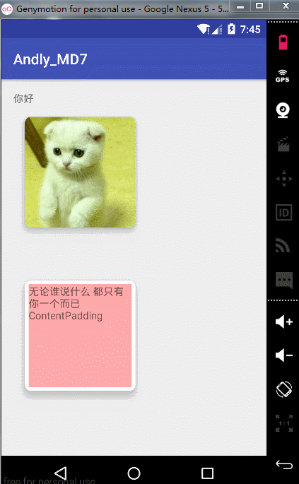
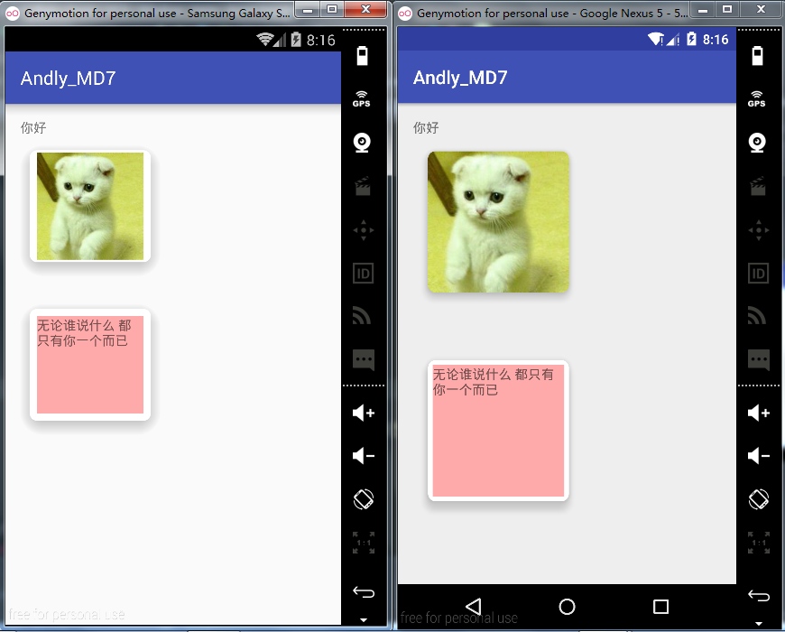
Effect ~
The Simple Application of Part 1 CardView Card
To configure
-
dependencies {
-
compile fileTree(include: ['*.jar'], dir: 'libs')
-
androidTestCompile('com.android.support.test.espresso:espresso-core:2.2.2', {
-
exclude group: 'com.android.support', module: 'support-annotations'
-
})
-
compile 'com.android.support:cardview-v7:25.0.1'
-
}
Code:
-
<android.support.v7.widget.CardView
-
android:id="@+id/cardview"
-
android:layout_width="150dp"
-
android:layout_height="150dp"
-
app:cardCornerRadius="8dp"
-
app:cardElevation="10dp">
-
-
<ImageView
-
android:layout_width="wrap_content"
-
android:layout_height="wrap_content"
-
android:src="@drawable/pic2"/>
-
-
</android.support.v7.widget.CardView>
-
-
<Space
-
android:layout_width="match_parent"
-
android:layout_height="20dp"/>
-
-
<android.support.v7.widget.CardView
-
android:layout_width="150dp"
-
android:layout_height="150dp"
-
app:cardCornerRadius="8dp"
-
app:cardElevation="10dp">
-
-
<TextView
-
android:layout_width="wrap_content"
-
android:layout_height="150dp"
-
android:background="#5f00"
-
android:singleLine="false"
-
android:text="Whoever says it You're the only one."
-
/>
-
-
</android.support.v7.widget.CardView>
tips:
1. Space: Space control
2. App: card Corner Radius=": Set the radius of the card roundness
3. App: cardElevation=": Value of Z-axis
Effect ~
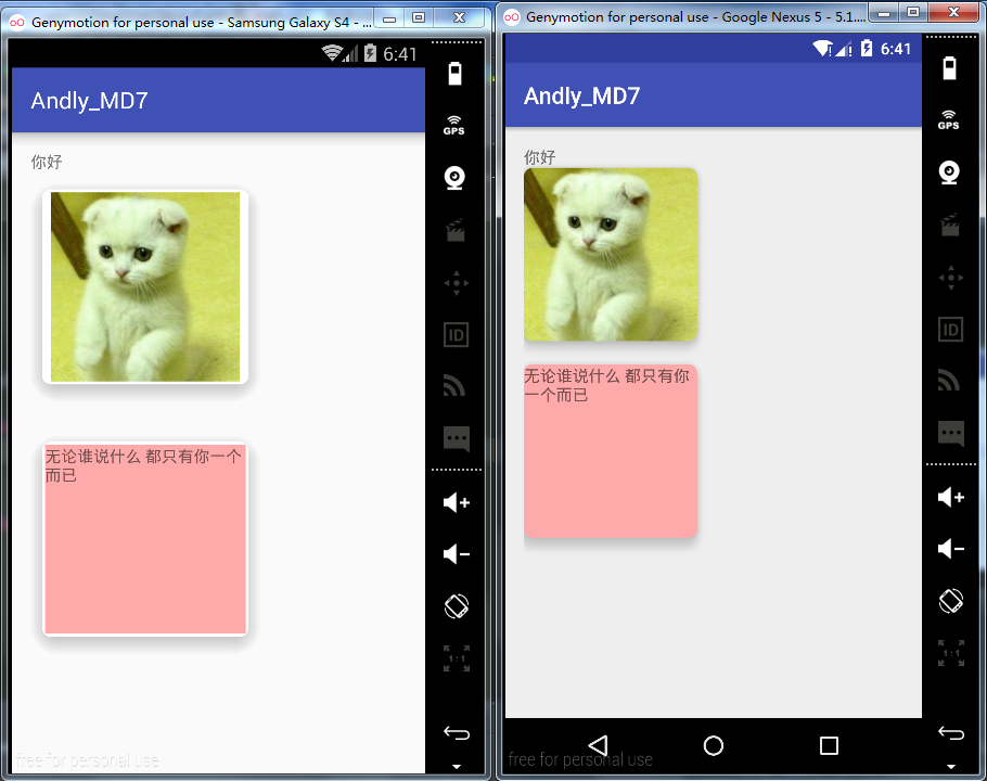
Upper pit:
1. Shadow effect 4.4 is stronger than 5.1 for the same cardElevation value.
In 2 and 5.1, the characters are close to rounded corners and not beautiful.
Solution:
1. After setting up CardElevation in the lower version, CardView will automatically leave space for shadow display, while Lollipop will need to manually set Margin margin to reserve space. Here we define two layouts (of course, you can also write two dimen.xml).
Low version settings
-
android:layout_margin="0dp"
High version settings (generally the same size as CardElevation shadows)
-
android:layout_margin="16dp"
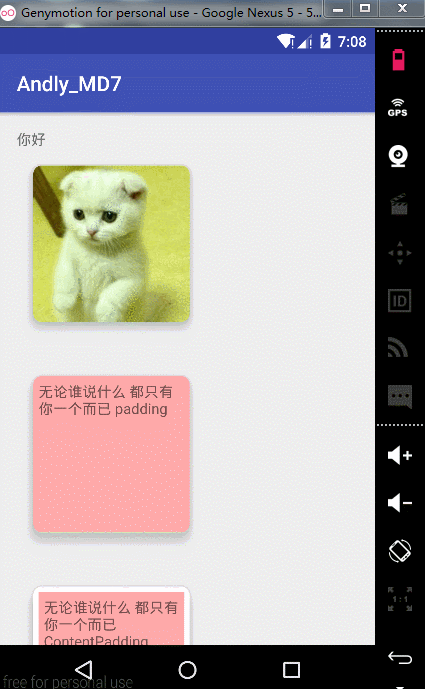
2. For the problem of text close to rounded corners, we need to set the padding Content attribute to be compatible. Here we compare the effects of setting android:padding and android: content Padding. The difference is obvious, so no explanation is given.
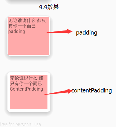
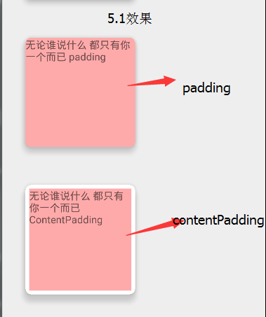
From the above, we can see that we need to set content Padding, but here we should pay attention to the fact that more than 5.0 will automatically clip pictures. It is beautiful that we do not need to set content Padding.
Next, set the ripple effect for CardView
-
android:clickable="true"
-
android:foreground="?attr/selectableItemBackground"
Of course, you can also use ripple to define water ripple. The above code is only valid after 5.0, but it was not valid before. Don't forget to set clickable here.
Finally, set the animation for CardView (just click here to make its shadow bigger)
-
android:stateListAnimator="@drawable/state_animator"
state_animator.xml:
-
<selector
-
xmlns:android="http://schemas.android.com/apk/res/android">
-
<item
-
android:state_pressed="true">
-
<objectAnimator
-
android:duration="@android:integer/config_shortAnimTime"
-
android:propertyName="translationZ"
-
android:valueTo="15dp"
-
android:valueType="floatType"
-
></objectAnimator>
-
</item>
-
<item>
-
<objectAnimator
-
android:duration="@android:integer/config_shortAnimTime"
-
android:propertyName="translationZ"
-
android:valueTo="0dp"
-
android:valueType="floatType"></objectAnimator>
-
</item>
-
</selector>
Effect ~
Attach Setting Basic Properties
app:cardBackgroundColor This is setting the background color.
App: card Corner Radius This is to set the rounded corner size.
App: card Elevation, which is the shadow of setting the z axis.
App: cardMax Elevation This is the maximum height of the z axis.
App: cardUse CompatPadding or not
App: card Prevent Corner Overlap whether to use Prevent Corner Overlap
app:contentPadding Sets the content padding
App: content Padding Left sets the left padding of content
app:contentPaddingTop Sets Upper padding of Content
App: ContentPadding Right Sets the Right padding of Content
app:contentPaddingBottom sets the bottom padding of the content
Part 2, CardView Source Code Analysis
-
public class CardView extends FrameLayout {
CardView inherits FrameLayout and has the characteristics of FrameLayout hierarchy.
-
private static final CardViewImpl IMPL;
-
-
static {
-
if (Build.VERSION.SDK_INT >= 21) {
-
IMPL = new CardViewApi21();
-
} else if (Build.VERSION.SDK_INT >= 17) {
-
IMPL = new CardViewJellybeanMr1();
-
} else {
-
IMPL = new CardViewGingerbread();
-
}
-
IMPL.initStatic();
-
}
Once initialized, versions are judged to define different implementation classes
-
final Rect mContentPadding = new Rect();
-
-
final Rect mShadowBounds = new Rect();
Looking at the corresponding fields, we can see that one is to set the content margin, and the other is to set the size of the shadow.
And then into the construction method
-
private void initialize(Context context, AttributeSet attrs, int defStyleAttr) {
-
TypedArray a = context.obtainStyledAttributes(attrs, R.styleable.CardView, defStyleAttr,
-
R.style.CardView);
-
ColorStateList backgroundColor;
-
if (a.hasValue(R.styleable.CardView_cardBackgroundColor)) {
-
backgroundColor = a.getColorStateList(R.styleable.CardView_cardBackgroundColor);
-
} else {
-
-
final TypedArray aa = getContext().obtainStyledAttributes(COLOR_BACKGROUND_ATTR);
-
final int themeColorBackground = aa.getColor(0, 0);
-
aa.recycle();
Here it determines if you have cardBackgroundColor set, and if not, gets the android.R.attr.colorBackground attribute from the topic.
View the onMesure method
-
@Override
-
protected void onMeasure(int widthMeasureSpec, int heightMeasureSpec) {
-
if (!(IMPL instanceof CardViewApi21)) {
-
final int widthMode = MeasureSpec.getMode(widthMeasureSpec);
-
switch (widthMode) {
-
case MeasureSpec.EXACTLY:
-
case MeasureSpec.AT_MOST:
-
final int minWidth = (int) Math.ceil(IMPL.getMinWidth(mCardViewDelegate));
-
widthMeasureSpec = MeasureSpec.makeMeasureSpec(Math.max(minWidth,
-
MeasureSpec.getSize(widthMeasureSpec)), widthMode);
-
break;
-
}
-
-
final int heightMode = MeasureSpec.getMode(heightMeasureSpec);
-
switch (heightMode) {
-
case MeasureSpec.EXACTLY:
-
case MeasureSpec.AT_MOST:
-
final int minHeight = (int) Math.ceil(IMPL.getMinHeight(mCardViewDelegate));
-
heightMeasureSpec = MeasureSpec.makeMeasureSpec(Math.max(minHeight,
-
MeasureSpec.getSize(heightMeasureSpec)), heightMode);
-
break;
-
}
-
super.onMeasure(widthMeasureSpec, heightMeasureSpec);
-
} else {
-
super.onMeasure(widthMeasureSpec, heightMeasureSpec);
-
}
-
}
It is judged here that if the API is greater than 5.0, it will not be processed, and if it is less than, it will reserve a shadow space.
Here we enter the CardView Api21 class
-
class CardViewApi21 implements CardViewImpl {
-
-
@Override
-
public void initialize(CardViewDelegate cardView, Context context,
-
ColorStateList backgroundColor, float radius, float elevation, float maxElevation) {
-
final RoundRectDrawable background = new RoundRectDrawable(backgroundColor, radius);
-
cardView.setCardBackground(background);
-
-
View view = cardView.getCardView();
-
view.setClipToOutline(true);
-
view.setElevation(elevation);
-
setMaxElevation(cardView, maxElevation);
-
}
The purpose of this class is to highlight the unique features of API version 21. Since setting shadows is bound to set padding, and then look at it.
-
@Override
-
public void updatePadding(CardViewDelegate cardView) {
-
if (!cardView.getUseCompatPadding()) {
-
cardView.setShadowPadding(0, 0, 0, 0);
-
return;
-
}
-
float elevation = getMaxElevation(cardView);
-
final float radius = getRadius(cardView);
-
int hPadding = (int) Math.ceil(RoundRectDrawableWithShadow
-
.calculateHorizontalPadding(elevation, radius, cardView.getPreventCornerOverlap()));
-
int vPadding = (int) Math.ceil(RoundRectDrawableWithShadow
-
.calculateVerticalPadding(elevation, radius, cardView.getPreventCornerOverlap()));
-
cardView.setShadowPadding(hPadding, vPadding, hPadding, vPadding);
-
}
Calculate the corresponding padding value and send it back to CardView Delegate object CardView, but CardViewDelegate is an interface. By looking at CardView, CardViewDelegate is the inner class of CardView.
-
private final CardViewDelegate mCardViewDelegate = new CardViewDelegate() {
-
private Drawable mCardBackground;
Enter the setShadowPadding method
-
public void setShadowPadding(int left, int top, int right, int bottom) {
-
mShadowBounds.set(left, top, right, bottom);
-
CardView.super.setPadding(left + mContentPadding.left, top + mContentPadding.top,
-
right + mContentPadding.right, bottom + mContentPadding.bottom);
-
}
There are margins for mShadowBounds and for parent View, so if you set content Padding, the margins will show the background of CardView.
So why is padding ineffective?
-
@Override
-
public void setPadding(int left, int top, int right, int bottom) {
-
-
}
-
-
public void setPaddingRelative(int start, int top, int end, int bottom) {
-
-
}
You can see that CardView's setPadding doesn't do anything so it doesn't show. So far, the analysis has been completed.