CardView is a new control added to Android 5.0 (API 21). Of course, it can also be used below API 21, and the next line can be added to build.gradle dependencies.
compile 'com.android.support:cardview-v7:23.1.1'
To do a card browsing program in the project, the card needs 5dp rounded corners. The rounded corners effect CardView can be supported by its own attributes. Add the app: card Corner Radius attributes, just as follows:
<android.support.v7.widget.CardView
  xmlns:android="http://schemas.android.com/apk/res/android"
  xmlns:app="http://schemas.android.com/apk/res-auto"
  android:layout_width="match_parent"
  android:layout_height="wrap_content"
  app:cardUseCompatPadding="true"
  app:cardCornerRadius="5dp">
  ...
</android.support.v7.widget.CardView>
The machine above API 21 (including) achieves perfect rounded corner effect. The effect is as follows:
But there are some problems in the machine below API 21. The following is the implementation effect of API 19:
At first glance, although the rounded corner attribute is added, the edge of the picture is square. Take a closer look at the lower left corner and the upper left corner.


As you can see, CardView itself is rounded, but the content inside is still square, and there are redundant white edges.
A closer look at the CardView documentation reveals that it has an attribute, cardPreventCorner Overlap.
<!-- Add padding to CardView on v20 and before to prevent intersections between the Card content and rounded corners. -->
<! - Add an inner margin to v20 and previous versions to prevent overlapping of card content and corners - >
 <attr name="cardPreventCornerOverlap" format="boolean" />
CardPreventCorner Overlap defaults to true, meaning to prevent the corners and internal elements of API 20 or previous CardView from overlapping. No overlap produces the upper effect, with a white edge. So add the CardView attribute app in the xml layout file: card PreventCorner Overlap= "false". The lower left corner and upper left corner have the following effects:


As you can see, the elements in CardView already overlap with CardView, but the elements themselves do not have rounded corners, so the vertex extends out. The idea here is very simple. The elements inside are treated as rounded corners separately.
New shape_radius.xml file under drawable, code as follows:
<?xml version="1.0" encoding="utf-8"?>
<shape xmlns:android="http://schemas.android.com/apk/res/android" android:shape="rectangle">
    <corners android:radius="5dp" />
    <solid android:color="@color/f2f2f2"></solid>
</shape>
The element LinearLayout in CardView with the backgroud attribute
<LinearLayout android:layout_width="match_parent"
    android:layout_height="match_parent"
    android:orientation="vertical"
    android:background="@drawable/shape_radius" >
    <ImageView
      android:id="@+id/iv_header"
      android:layout_width="match_parent"
      android:layout_height="wrap_content"
      android:layout_gravity="center_horizontal"
      android:adjustViewBounds="true"
      android:scaleType="fitCenter"
      android:src="@drawable/ic_person_default"/>
</LinearLayout>
The lower left corner is normal and the upper left corner is still normal.


Pictures also need to be rounded individually. The effect here is that the top two corners of the picture need rounded corners, and the bottom two corners need right angles.
Custom UpRoundImageView class, inherited from ImageView, specializes in drawing rounded corners. The code is as follows:
public class UpRoundImageView extends ImageView {

    private float mRadus = 5 * SystemUtils.getDensity(CampusApplication.getCampusApplicationContext());

    /*The radius of the corner is in turn the xy radius of the upper left corner, the upper right corner, the lower right corner and the lower left corner.*/
    private float[] rids = {mRadus, mRadus, mRadus, mRadus, 0.0f,0.0f,0.0f,0.0f};

    public UpRoundImageView(Context context) {
        super(context);
    }

    public UpRoundImageView(Context context, AttributeSet attrs) {
        super(context, attrs);
    }

    public UpRoundImageView(Context context, AttributeSet attrs, int defStyleAttr) {
        super(context, attrs, defStyleAttr);
    }


    /**
     * Drawing
     * @param canvas
     */
    protected void onDraw(Canvas canvas) {
        Path path = new Path();
        int w = this.getWidth();
        int h = this.getHeight();
        /*Add a rounded rectangle to the path. The radii array defines the x,y radii of four rounded corners of a rounded rectangle. The radii length must be 8*/
        path.addRoundRect(new RectF(0,0,w,h),rids,Path.Direction.CW);
        canvas.clipPath(path);
        super.onDraw(canvas);
    }
}
Replace ImageView with UpRound ImageView, which achieves all rounded corners.
Additionally, you can add the app:cardElevation="3dp" attribute to CardView, which can form a shadow after CardView, with the feeling of cards floating up, more in line with the Material Design style. The properties of CardView in xml are set to
<android.support.v7.widget.CardView
    xmlns:android="http://schemas.android.com/apk/res/android"
    xmlns:app="http://schemas.android.com/apk/res-auto"
    android:layout_width="match_parent"
    android:layout_height="wrap_content"
    app:cardUseCompatPadding="true"
    app:cardCornerRadius="5dp"
    app:cardPreventCornerOverlap="false"
    app:cardElevation="3dp">
    ...
</android.support.v7.widget.CardView>
Finally, the effect is consistent in different platforms:
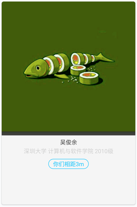
api 19 implementation effect

api 19 implementation effect
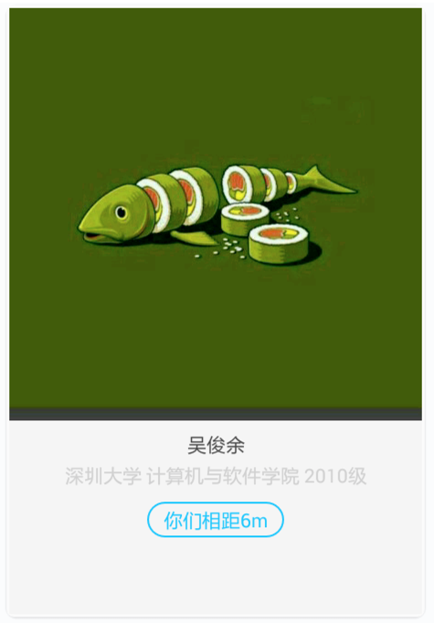
api 22 implementation effect

api 22 implementation effect