LZ-Says: Everything, always after experience, will gain more. Sometimes what we want is really simple, but we gradually forget the original intention in the pursuit process. May you all forgive your first thoughts and go ahead with your best wishes on the way forward!!!!!!!!!!!!!!!!!!!!!!!!!!!

Preface
Material Design, the conscience of Google, goes deep into it, and it's interesting.
Today I'll bring you CardView. Let's look at it together 65507

Hey hey hey, get up and get ready to drive.
Brief Introduction to CardView
CardView, as its name, card View, similar to small cards, simple to cite a small example

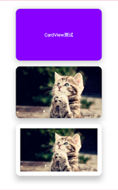
Does it feel dazzling?
Firstly, the basic attributes of CardView are introduced.

Here's a brief introduction.
CardView Practice
Step 1: Introducing dependencies
implementation 'com.android.support:cardview-v7:26.0.2'Step 2: Add CardView and set Content for it
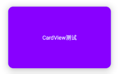
First, we implement the first effect, that is, filling a TextView in CardView, with the source code attached below:
    <android.support.v7.widget.CardView
        android:layout_width="300dp"
        android:layout_height="180dp"
        android:layout_gravity="center_horizontal"
        android:layout_marginTop="30dp"
        app:cardBackgroundColor="#80f"
        app:cardCornerRadius="15dp"
        app:cardElevation="15dp"
        app:contentPadding="15dp">

        <TextView
            android:layout_width="wrap_content"
            android:layout_height="wrap_content"
            android:layout_gravity="center"
            android:text="CardView test"
            android:textColor="#fff"
            android:textSize="16sp" />

    </android.support.v7.widget.CardView>
The results are as follows:

Next, to achieve the second effect, CardView sets up ImageView as follows:
    <android.support.v7.widget.CardView
        android:layout_width="300dp"
        android:layout_height="180dp"
        android:layout_gravity="center_horizontal"
        android:layout_marginTop="20dp"
        app:cardBackgroundColor="#fff"
        app:cardCornerRadius="15dp"
        app:cardElevation="15dp">

        <ImageView
            android:layout_width="match_parent"
            android:layout_height="match_parent"
            android:background="@drawable/img"
            android:scaleType="centerCrop" />

    </android.support.v7.widget.CardView>
The results are as follows:

Finally, we achieve the effect of the third picture:
    <android.support.v7.widget.CardView
        android:layout_width="300dp"
        android:layout_height="180dp"
        android:layout_gravity="center_horizontal"
        android:layout_marginTop="20dp"
        app:cardBackgroundColor="#fff"
        app:cardCornerRadius="15dp"
        app:cardElevation="15dp"
        app:contentPadding="15dp">

        <ImageView
            android:layout_width="match_parent"
            android:layout_height="match_parent"
            android:background="@drawable/img"
            android:scaleType="centerCrop" />

    </android.support.v7.widget.CardView>
What's the effect? Here's how it works uuuuuuuuuuu

Use easy to see if the source code is also nice uuuuuuuuuuuu
CardView Source
First, let's look at where CardView inherits from.
public class CardView extends FrameLayoutSo why can we put controls in CardView? A reasonable explanation is perfect.
Then look down:
    static {
        if (Build.VERSION.SDK_INT >= 21) {
            IMPL = new CardViewApi21Impl();
        } else if (Build.VERSION.SDK_INT >= 17) {
            IMPL = new CardViewApi17Impl();
        } else {
            IMPL = new CardViewBaseImpl();
        }
        IMPL.initStatic();
    }
Firstly, the current system version is judged in the static block, and different instances are instantiated according to different states, as follows:
1. If the Android API is based on more than 21, instantiate CardView Api21Impl;

2. If the Android API is based on less than 17, instantiate CardView Api17Impl;

3. If the Android API is based on below 17, instantiate CardViewBaseImpl.
Finally, an IMPL initialization is performed.
So what are the three?
Let's have a look.
CardView Api21Impl
    @Override
    public void initialize(CardViewDelegate cardView, Context context,
                ColorStateList backgroundColor, float radius, float elevation, float maxElevation) {
        final RoundRectDrawable background = new RoundRectDrawable(backgroundColor, radius);
        cardView.setCardBackground(background);

        View view = cardView.getCardView();
        view.setClipToOutline(true);
        view.setElevation(elevation);
        setMaxElevation(cardView, maxElevation);
    }
The instantiation content is as follows. First, it instantiates an object of RoundRectDrawable. What is this thing and what is its function? Look at it together.
    RoundRectDrawable(ColorStateList backgroundColor, float radius) {
        mRadius = radius;
        mPaint = new Paint(Paint.ANTI_ALIAS_FLAG | Paint.DITHER_FLAG);
        setBackground(backgroundColor);

        mBoundsF = new RectF();
        mBoundsI = new Rect();
    }
See this content, you are familiar with, ya, this is not the drawing part of custom View.
Receive and set the rounded arc value, initialize the brush, set the background color and rectangular area, in one go.
And what about CardView Api17Impl?
CardView Api17 Impl
    @Override
    public void initStatic() {
        RoundRectDrawableWithShadow.sRoundRectHelper =
                new RoundRectDrawableWithShadow.RoundRectHelper() {
                    @Override
                    public void drawRoundRect(Canvas canvas, RectF bounds, float cornerRadius,
                            Paint paint) {
                        canvas.drawRoundRect(bounds, cornerRadius, cornerRadius, paint);
                    }
                };
    }
See here, you will have a question, why different versions of the system, initialization is different?
If you've read LZ's last blog post on Immersive compatibility development, you'll see why we're compatible. Next, let's take a look at how api17 is implemented.
    RoundRectDrawableWithShadow(Resources resources, ColorStateList backgroundColor, float radius,
            float shadowSize, float maxShadowSize) {
        mShadowStartColor = resources.getColor(R.color.cardview_shadow_start_color);
        mShadowEndColor = resources.getColor(R.color.cardview_shadow_end_color);
        mInsetShadow = resources.getDimensionPixelSize(R.dimen.cardview_compat_inset_shadow);
        mPaint = new Paint(Paint.ANTI_ALIAS_FLAG | Paint.DITHER_FLAG);
        setBackground(backgroundColor);
        mCornerShadowPaint = new Paint(Paint.ANTI_ALIAS_FLAG | Paint.DITHER_FLAG);
        mCornerShadowPaint.setStyle(Paint.Style.FILL);
        mCornerRadius = (int) (radius + .5f);
        mCardBounds = new RectF();
        mEdgeShadowPaint = new Paint(mCornerShadowPaint);
        mEdgeShadowPaint.setAntiAlias(false);
        setShadowSize(shadowSize, maxShadowSize);
    }
These contents set some related attributes, such as color, radian and color.
Ultimately, drawRoundRect() method in Canvas class is called to draw in the callback, as follows:
    /**
     * Draw the specified round-rect using the specified paint. The roundrect will be filled or
     * framed based on the Style in the paint.
     *
     * @param rect The rectangular bounds of the roundRect to be drawn
     * @param rx The x-radius of the oval used to round the corners
     * @param ry The y-radius of the oval used to round the corners
     * @param paint The paint used to draw the roundRect
     */
    public void drawRoundRect(@NonNull RectF rect, float rx, float ry, @NonNull Paint paint) {
        super.drawRoundRect(rect, rx, ry, paint);
    }
With regard to CardViewBaseImpl, the following is true.
CardViewBaseImpl
    @Override
    public void initStatic() {
        // Draws a round rect using 7 draw operations. This is faster than using
        // canvas.drawRoundRect before JBMR1 because API 11-16 used alpha mask textures to draw
        // shapes.
        RoundRectDrawableWithShadow.sRoundRectHelper =
                new RoundRectDrawableWithShadow.RoundRectHelper() {
            @Override
            public void drawRoundRect(Canvas canvas, RectF bounds, float cornerRadius,
                    Paint paint) {
                final float twoRadius = cornerRadius * 2;
                final float innerWidth = bounds.width() - twoRadius - 1;
                final float innerHeight = bounds.height() - twoRadius - 1;
                if (cornerRadius >= 1f) {
                    // increment corner radius to account for half pixels.
                    float roundedCornerRadius = cornerRadius + .5f;
                    mCornerRect.set(-roundedCornerRadius, -roundedCornerRadius, roundedCornerRadius,
                            roundedCornerRadius);
                    int saved = canvas.save();
                    canvas.translate(bounds.left + roundedCornerRadius,
                            bounds.top + roundedCornerRadius);
                    canvas.drawArc(mCornerRect, 180, 90, true, paint);
                    canvas.translate(innerWidth, 0);
                    canvas.rotate(90);
                    canvas.drawArc(mCornerRect, 180, 90, true, paint);
                    canvas.translate(innerHeight, 0);
                    canvas.rotate(90);
                    canvas.drawArc(mCornerRect, 180, 90, true, paint);
                    canvas.translate(innerWidth, 0);
                    canvas.rotate(90);
                    canvas.drawArc(mCornerRect, 180, 90, true, paint);
                    canvas.restoreToCount(saved);
                    //draw top and bottom pieces
                    canvas.drawRect(bounds.left + roundedCornerRadius - 1f, bounds.top,
                            bounds.right - roundedCornerRadius + 1f,
                            bounds.top + roundedCornerRadius, paint);

                    canvas.drawRect(bounds.left + roundedCornerRadius - 1f,
                            bounds.bottom - roundedCornerRadius,
                            bounds.right - roundedCornerRadius + 1f, bounds.bottom, paint);
                }
                // center
                canvas.drawRect(bounds.left, bounds.top + cornerRadius,
                        bounds.right, bounds.bottom - cornerRadius , paint);
            }
        };
    }

    @Override
    public void initialize(CardViewDelegate cardView, Context context,
            ColorStateList backgroundColor, float radius, float elevation, float maxElevation) {
        RoundRectDrawableWithShadow background = createBackground(context, backgroundColor, radius,
                elevation, maxElevation);
        background.setAddPaddingForCorners(cardView.getPreventCornerOverlap());
        cardView.setCardBackground(background);
        updatePadding(cardView);
    }

    private RoundRectDrawableWithShadow createBackground(Context context,
                    ColorStateList backgroundColor, float radius, float elevation,
                    float maxElevation) {
        return new RoundRectDrawableWithShadow(context.getResources(), backgroundColor, radius,
                elevation, maxElevation);
    }

    @Override
    public void updatePadding(CardViewDelegate cardView) {
        Rect shadowPadding = new Rect();
        getShadowBackground(cardView).getMaxShadowAndCornerPadding(shadowPadding);
        cardView.setMinWidthHeightInternal((int) Math.ceil(getMinWidth(cardView)),
                (int) Math.ceil(getMinHeight(cardView)));
        cardView.setShadowPadding(shadowPadding.left, shadowPadding.top,
                shadowPadding.right, shadowPadding.bottom);
    }
First, in the initStatic() method, the RoundRectDrawableWithShadow object is still instantiated and set in the callback to make separate settings for the system version. Finally, the final effect is achieved by calling canvas.drawRect.
It's about judging the radian and when the developer doesn't add the default radian settings, I won't go into details here.
The initialize() method focuses on setting and updating background s and padding values.
And finally, let's look at what will be instantiated at the end of the first time.
CardViewImpl
/**
 * Interface for platform specific CardView implementations.
 */
interface CardViewImpl {
    void initialize(CardViewDelegate cardView, Context context, ColorStateList backgroundColor,
            float radius, float elevation, float maxElevation);

    void setRadius(CardViewDelegate cardView, float radius);

    float getRadius(CardViewDelegate cardView);

    void setElevation(CardViewDelegate cardView, float elevation);

    float getElevation(CardViewDelegate cardView);

    void initStatic();

    void setMaxElevation(CardViewDelegate cardView, float maxElevation);

    float getMaxElevation(CardViewDelegate cardView);

    float getMinWidth(CardViewDelegate cardView);

    float getMinHeight(CardViewDelegate cardView);

    void updatePadding(CardViewDelegate cardView);

    void onCompatPaddingChanged(CardViewDelegate cardView);

    void onPreventCornerOverlapChanged(CardViewDelegate cardView);

    void setBackgroundColor(CardViewDelegate cardView, @Nullable ColorStateList color);

    ColorStateList getBackgroundColor(CardViewDelegate cardView);
}
Here are some key external interfaces and so on. At the same time, the practice is more in line with our development practice.
Finally, let's return to our CardView.
Unveiling the Mystery of CardView
    public CardView(Context context) {
        super(context);
        initialize(context, null, 0);
    }

    public CardView(Context context, AttributeSet attrs) {
        super(context, attrs);
        initialize(context, attrs, 0);
    }

    public CardView(Context context, AttributeSet attrs, int defStyleAttr) {
        super(context, attrs, defStyleAttr);
        initialize(context, attrs, defStyleAttr);
    }
Customize View and instantiate it. There's nothing to say.
That's it!!!
GitHub View Address
End
Easy things, or to see more, as long as you see, slowly there will be harvest 65507
Come on, guys.