When you see the above effect, you will think of letting the artist cut a round corner picture with imageview, which is also a way to achieve, it is more convenient to achieve, and do not need to do any compatible adaptation; in fact, android system provides CardView control, which is also very convenient to achieve, but also can achieve some other effects.
CardView is a Material Design style control in Android 5.0, which can be used as a layout container.
CardView is an android.support.v7.widget that needs to refer to dependency libraries when used.
1. Citation Dependency Library
compile 'com.android.support:cardview-v7:25.3.1'2. Direct use in layout
<?xml version="1.0" encoding="utf-8"?>
<RelativeLayout xmlns:android="http://schemas.android.com/apk/res/android"
    xmlns:tools="http://schemas.android.com/tools"
    xmlns:app="http://schemas.android.com/apk/res-auto"
    android:id="@+id/activity_main"
    android:layout_width="match_parent"
    android:layout_height="match_parent"
    tools:context="com.mdcradview.MainActivity">
    <android.support.v7.widget.CardView
        android:layout_width="300dp"
        android:layout_height="200dp"
        app:cardCornerRadius="20dp"
        app:cardElevation="10dp"
        android:layout_margin="16dp"
        android:foreground="?attr/selectableItemBackground"
        android:clickable="true"
        >
        <ImageView
            android:id="@+id/iv"
            android:layout_width="match_parent"
            android:layout_height="wrap_content"
            android:scaleType="centerCrop"
            android:src="@mipmap/tulips2" />
    </android.support.v7.widget.CardView>
</RelativeLayout>
The system provides a number of attributes that can be set up:
//background
app:cardBackgroundColor
//Fillet size
app:cardCornerRadius
//z axis shadow
app:cardElevation
//Maximum height of z axis
app:cardMaxElevation
//Whether to use CompadPadding
app:cardUseCompatPadding
//Whether to use PreventCorner Overlap
app:cardPreventCornerOverlap
//Content padding
app:contentPadding
//padding on the left side of the content
app:contentPaddingLeft
//padding at the top of the content
app:contentPaddingTop
//padding on the right side of the content
app:contentPaddingRight
//padding at the bottom of the content
app:contentPaddingBottom
//Minimum width
app:android_minWidth
//Minimum height
app:android_minHeight
Operation effect: 
Setting the following two properties will have a ripple effect when clicking on the card.
android:foreground="?attr/selectableItemBackground"
android:clickable="true"
However, the effect of Android 6.0 above, and CardView only appeared after Android 5.0, so the new features of CardView will not work on mobile phones under Android 5.0, so it needs to be compatible with high and low versions when using CardView, and create new layout files according to needs under the res directory;
Layout - > layout below Android 5.0
 Layout-v21 - - > Android 5.0 + layout
Android 5.0 + layout file:
<?xml version="1.0" encoding="utf-8"?>
<RelativeLayout xmlns:android="http://schemas.android.com/apk/res/android"
    xmlns:tools="http://schemas.android.com/tools"
    xmlns:app="http://schemas.android.com/apk/res-auto"
    android:id="@+id/activity_main"
    android:layout_width="match_parent"
    android:layout_height="match_parent"
    tools:context="com.mdcradview.MainActivity">
    <android.support.v7.widget.CardView
        android:layout_width="300dp"
        android:layout_height="200dp"
        app:cardCornerRadius="20dp"
        app:cardElevation="10dp"
        android:layout_margin="16dp"
        android:foreground="?attr/selectableItemBackground"
        android:clickable="true"
        >
        <ImageView
            android:id="@+id/iv"
            android:layout_width="match_parent"
            android:layout_height="wrap_content"
            android:scaleType="centerCrop"
            android:src="@mipmap/tulips2" />
    </android.support.v7.widget.CardView>
</RelativeLayout>
Android 5.0 Layout file:
<?xml version="1.0" encoding="utf-8"?>
<RelativeLayout xmlns:android="http://schemas.android.com/apk/res/android"
    xmlns:tools="http://schemas.android.com/tools"
    xmlns:app="http://schemas.android.com/apk/res-auto"
    android:id="@+id/activity_main"
    android:layout_width="match_parent"
    android:layout_height="match_parent"
    tools:context="com.mdcradview.MainActivity">

    <android.support.v7.widget.CardView
        android:layout_width="300dp"
        android:layout_height="200dp"
        app:cardCornerRadius="20dp"
        app:cardElevation="10dp"
        android:layout_alignParentTop="true"
        android:layout_alignParentLeft="true"
        android:layout_alignParentStart="true">
        <com.mdcradview.RoundAngleImageView
            android:id="@+id/iv"
            android:layout_width="match_parent"
            android:layout_height="wrap_content"
            android:scaleType="centerCrop"
            android:src="@mipmap/tulips2" />
    </android.support.v7.widget.CardView>
</RelativeLayout>
Android 5.0 + works the same as above, and the following is below the Android 5.0:
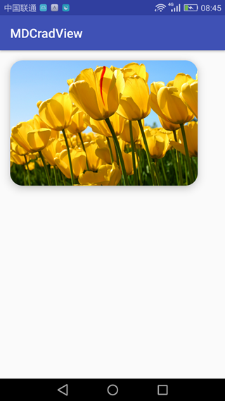
Android 5.0 runs as follows: 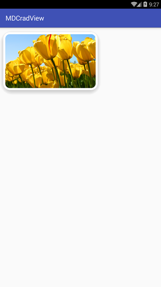
This is the effect on the Night God simulator 4.4.2, which can be run to the real machine to see what the effect is.
Source address:
http://download.csdn.net/download/wangwo1991/9940932