Course notes Day47
- BootStrap quick start
- BootStrap grid system
- BootStrap common styles
Chapter 1 BootStrap quick start
Section 01 basic theory
1. Concept introduction
1. What is? BootStrap ?
	BootStrap It is a front-end frame, be based on HTML CSS and JavaScript Developed, At present, it is continuously updated

2. BootStrap What's the use?
	Can quickly build web pages, Many styles and effects have been developed internally,You can take it directly for quick use.

3. BootStrap What are the characteristics?
	Responsive layout is supported.
	Responsive layout: We can show different effects according to the screen size.
	for example: On the computer screen, display the effect according to the size of the computer screen,
	If it is on the tablet, it will be displayed according to the size of the tablet. If it is on the mobile phone screen, the effect will be displayed according to the screen size of the mobile phone.
	Simply put: Is to support the adaptation of different screen sizes.
2. Two websites
1. BootStrap Official website of:    https://v3.bootcss.com/
2. BootStrap Rookie tutorial:    https://www.runoob.com/bootstrap/bootstrap-tutorial.html
Section 02 getting started
1. Operation steps
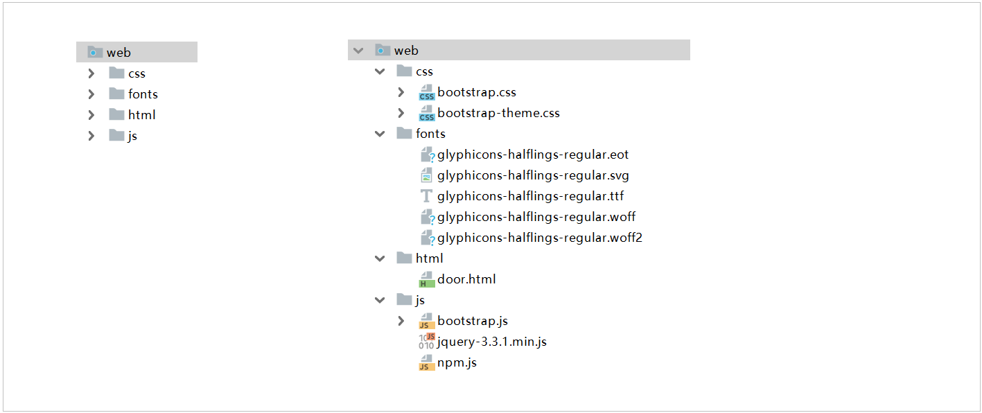
Download the BootStrap resource pack
Resource package structure:
	css
		bootstrap.css
		bootstrap.min.css
		bootstrap-theme.css
		bootstrap-theme.min.css
		bootstrap.css.map
		bootstrap.min.css.map
		bootstrap-theme.css.map
		bootstrap-theme.min.css.map
	fonts
		glyphicons-halflings-regular.eot
		glyphicons-halflings-regular.svg
		glyphicons-halflings-regular.ttf
		glyphicons-halflings-regular.woff
		glyphicons-halflings-regular.woff2
	js
		bootstrap.js
		bootstrap.min.js
		npm.js
step
1. Import the resource package above
2. You also need to add jquery.js File
3. Import template framework
Template
<!doctype html>
<html lang="zh-CN">
  <head>
    <meta charset="utf-8">
    <meta http-equiv="X-UA-Compatible" content="IE=edge">
    <meta name="viewport" content="width=device-width, initial-scale=1">
    <!-- Above 3 meta label*must*Put it first, anything else*must*Follow! -->
    <title>Bootstrap 101 Template</title>

    <!-- Bootstrap -->
    <link rel="stylesheet" href="https://stackpath.bootstrapcdn.com/bootstrap/3.4.1/css/bootstrap.min.css" integrity="sha384-HSMxcRTRxnN+Bdg0JdbxYKrThecOKuH5zCYotlSAcp1+c8xmyTe9GYg1l9a69psu" crossorigin="anonymous">

    <!-- HTML5 shim and Respond.js To make IE8 support HTML5 Element and media query( media queries)function -->
    <!-- Warning: Pass file:// Response.js does not work when the protocol (that is, directly drag the html page into the browser) accesses the page -- >
    <!--[if lt IE 9]>
      <script src="https://cdn.jsdelivr.net/npm/html5shiv@3.7.3/dist/html5shiv.min.js"></script>
      <script src="https://cdn.jsdelivr.net/npm/respond.js@1.4.2/dest/respond.min.js"></script>
    <![endif]-->
  </head>
  <body>
    <h1>Hello, world!</h1>

    <!-- jQuery (Bootstrap All of JavaScript All plug-ins depend on jQuery,So it must be put in front) -->
    <script src="https://cdn.jsdelivr.net/npm/jquery@1.12.4/dist/jquery.min.js" integrity="sha384-nvAa0+6Qg9clwYCGGPpDQLVpLNn0fRaROjHqs13t4Ggj3Ez50XnGQqc/r8MhnRDZ" crossorigin="anonymous"></script>
    <!-- load Bootstrap All of JavaScript Plug ins. You can also load only a single plug-in as needed. -->
    <script src="https://stackpath.bootstrapcdn.com/bootstrap/3.4.1/js/bootstrap.min.js" integrity="sha384-aJ21OjlMXNL5UyIl/XNwTMqvzeRMZH2w8c5cRVpzpU8Y5bApTppSuUkhZXN0VxHd" crossorigin="anonymous"></script>
  </body>
</html>
2. Case code
directory structure
HTML code
<!doctype html>
<html lang="zh-CN">
<head>
    <meta charset="utf-8">
    <meta http-equiv="X-UA-Compatible" content="IE=edge">
    <meta name="viewport" content="width=device-width, initial-scale=1">
    <!-- Above 3 meta label*must*Put it first, anything else*must*Follow! -->
    <title>Bootstrap 101 Template</title>

    <!-- Bootstrap -->
    <link rel="stylesheet" href="../css/bootstrap.min.css">
</head>
<body>
<h1>Hello, world!</h1>

<!-- jQuery (Bootstrap All of JavaScript All plug-ins depend on jQuery,So it must be put in front) -->
<script src="../js/jquery-3.3.1.min.js"></script>
<!-- load Bootstrap All of JavaScript Plug ins. You can also load only a single plug-in as needed. -->
<script src="../js/bootstrap.min.js"></script>
</body>
</html>
Section 03 container layout
1. Location
Official website:  https://v3.bootcss.com/css/#overview-container
 Locate the layout container.
2. Code
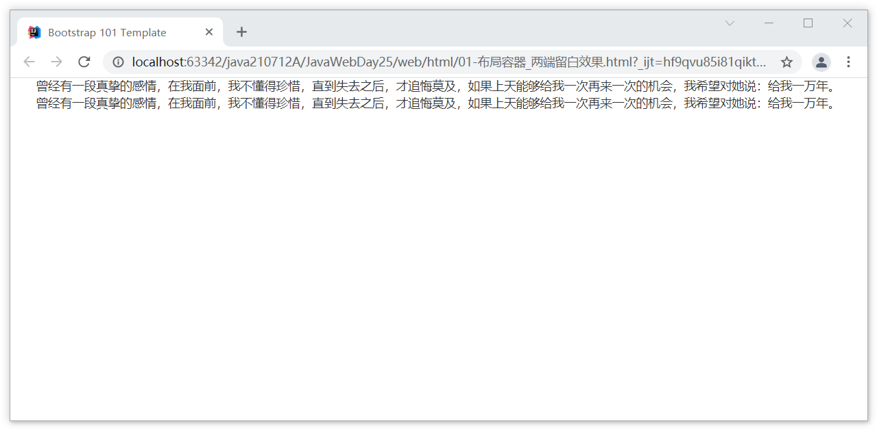
Effect of leaving blank at both ends
case
<div class="container">
    Once there was a sincere feeling. In front of me, I didn't know how to cherish it. I didn't regret it until I lost it. If God could give me a chance to do it again, I hope to say to her: give me 10000 years.
    Once there was a sincere feeling. In front of me, I didn't know how to cherish it. I didn't regret it until I lost it. If God could give me a chance to do it again, I hope to say to her: give me 10000 years.
</div>
effect
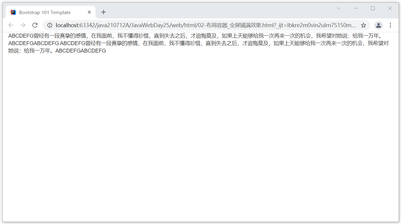
Full effect
code
<div class="container-fluid">
    ABCDEFG Once there was a sincere feeling. In front of me, I didn't know how to cherish it. I didn't regret it until I lost it. If God could give me a chance to do it again, I hope to say to her: give me 10000 years.
    ABCDEFG Once there was a sincere feeling. In front of me, I didn't know how to cherish it. I didn't regret it until I lost it. If God could give me a chance to do it again, I hope to say to her: give me 10000 years.
</div>
effect
Chapter 2 BootStrap grid system
Section 01 basic theory
1. Location
website:  https://v3.bootcss.com/css/#overview-container
Find grid system
2. Concept
The grid system is to divide the screen into 12 areas and see how many areas the elements occupy.
Section 02 case demonstration
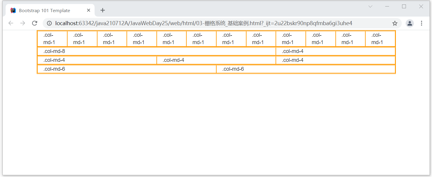
1. Basic case
code
<div class="container">

    <div class="row">
        <div class="col-md-1">.col-md-1</div>
        <div class="col-md-1">.col-md-1</div>
        <div class="col-md-1">.col-md-1</div>
        <div class="col-md-1">.col-md-1</div>
        <div class="col-md-1">.col-md-1</div>
        <div class="col-md-1">.col-md-1</div>
        <div class="col-md-1">.col-md-1</div>
        <div class="col-md-1">.col-md-1</div>
        <div class="col-md-1">.col-md-1</div>
        <div class="col-md-1">.col-md-1</div>
        <div class="col-md-1">.col-md-1</div>
        <div class="col-md-1">.col-md-1</div>
    </div>
    <div class="row">
        <div class="col-md-8">.col-md-8</div>
        <div class="col-md-4">.col-md-4</div>
    </div>
    <div class="row">
        <div class="col-md-4">.col-md-4</div>
        <div class="col-md-4">.col-md-4</div>
        <div class="col-md-4">.col-md-4</div>
    </div>
    <div class="row">
        <div class="col-md-6">.col-md-6</div>
        <div class="col-md-6">.col-md-6</div>
    </div>
</div>
design sketch
2. Precautions
1. In a class="row" The number of columns and,What if it's more than 12?
	The excess will wrap

2. In a class="col-md-13" What happens when 13 is directly defined here?
	He will monopolize the line, according to the standard of 12.
3. Screen size
| Ultra small screen mobile phone (< 768px) | Small screen flat panel (≥ 768px) | Medium screen desktop display (≥ 992px) | Large screen large desktop display (≥ 1200px) | |
|---|---|---|---|---|
| Grid system behavior | Always arranged horizontally | At first it was stacked together, When it is greater than these thresholds, it will change to horizontal arrangement C | ||
| . container maximum width | None (automatic) | 750px | 970px | 1170px |
| Class prefix | .col-xs- | .col-sm- | .col-md- | .col-lg- |
| Number of column s | 12 | |||
| Maximum column width | automatic | ~62px | ~81px | ~97px |
| Slot width | 30px (15px on the left and right of each column) | |||
| Nested | yes | |||
| Offsets | yes | |||
| Column sorting | yes |
Note: the size order of the columns
Size order:
	lg > md > sm > xs

If we specify md So as long as it is 970 px The above sizes will be in accordance with md According to the standard.
But if it doesn't reach 970 px The previous original style will be changed. (970) px refer to md (critical value of)

If we specify sm So as long as it's 750 px Size above,Will follow sm According to the standard.
But if it doesn't reach 750 px The previous original style will be changed. (750) px refer to sm (critical value of)

If we specify xs Then as long as the size of any type, Will follow xs According to the standard.
Case code
<div class="container">

    <div class="row">
        <div class="col-lg-1">.col-lg-1 1</div>
        <div class="col-lg-1">.col-lg-1 2</div>
        <div class="col-lg-1">.col-lg-1 3</div>
        <div class="col-lg-1">.col-lg-1 4</div>
        <div class="col-lg-1">.col-lg-1 5</div>
        <div class="col-lg-1">.col-lg-1 6</div>
        <div class="col-lg-1">.col-lg-1 7</div>
        <div class="col-lg-1">.col-lg-1 8</div>
        <div class="col-lg-1">.col-lg-1 9</div>
        <div class="col-lg-1">.col-lg-1 10</div>
        <div class="col-lg-1">.col-lg-1 11</div>
        <div class="col-lg-1">.col-lg-1 12</div>
    </div>
    <div class="row">
        <div class="col-md-8">.col-md-8 1</div>
        <div class="col-md-4">.col-md-4 2</div>
    </div>
    <div class="row">
        <div class="col-sm-4">.col-sm-4 1</div>
        <div class="col-sm-4">.col-sm-4 2</div>
        <div class="col-sm-4">.col-sm-4 3</div>
    </div>
    <div class="row">
        <div class="col-xs-6">.col-xs-6 1</div>
        <div class="col-xs-6">.col-xs-6 2</div>
    </div>
</div>
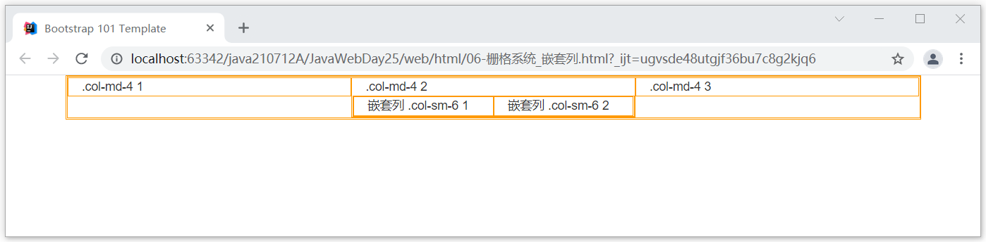
4. Nested column
Case code
<div class="container">

    <div class="row">
        <div class="col-md-4">.col-md-4 1</div>
        <div class="col-md-4">.col-md-4 2
            <div class="row">
                <div class="col-sm-6"> Nested column .col-sm-6 1 </div>
                <div class="col-sm-6"> Nested column .col-sm-6 2 </div>
            </div>
        </div>
        <div class="col-md-4">.col-md-4 3</div>
    </div>
</div>
design sketch
Section 03 column offset
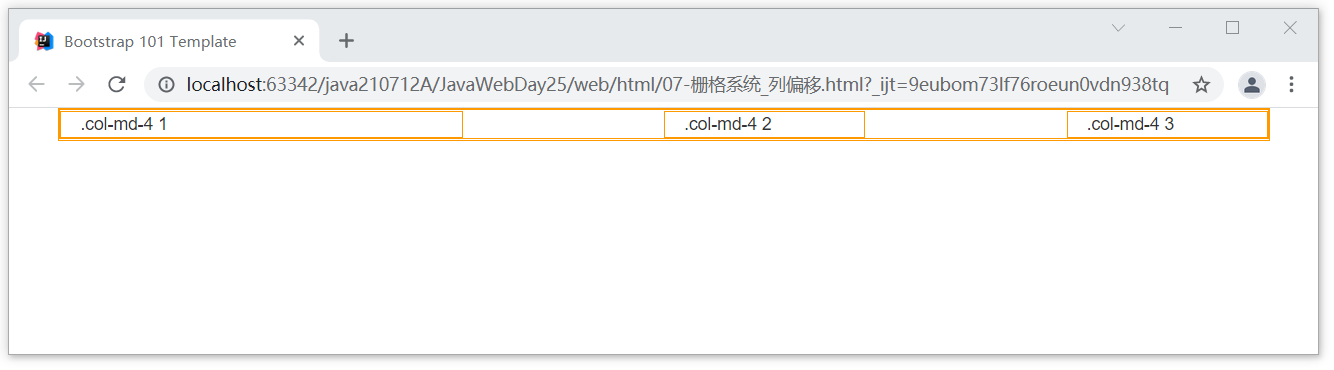
1. Basic description
1. What is column offset?
	Column offset means that in the left area,How much space is reserved. The left side will automatically occupy how much space.

2. Syntax format:
	.col-Level of screen size-offset-Size of occupied space

3. Grammatical examples:
	.col-lg-offset-3
	.col-md-offset-5
	.col-sm-offset-4
	.col-xs-offset-2
2. Case code
code
<div class="container">
    <div class="row">
        <div class="col-md-4">.col-md-4 1</div>
        <div class="col-md-2 col-sm-offset-2">.col-md-4 2</div>
        <div class="col-md-2 col-xs-offset-2">.col-md-4 3</div>
    </div>
</div>
design sketch
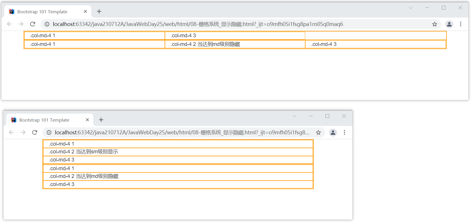
Section 04 show hide
1. Basic description
We can set some columns to display and some columns to hide under different screen sizes.

Basic grammar:
	.visiable-Screen size     	 effect:Display column
	.hidden-Screen size		effect:Hide column
2. Case code
code
<div class="container">
    <div class="row">
        <div class="col-md-4">.col-md-4 1</div>
        <div class="col-md-4 visible-sm">.col-md-4 2 When reached sm Level display</div>
        <div class="col-md-4">.col-md-4 3</div>
    </div>
    <div class="row">
        <div class="col-md-4">.col-md-4 1</div>
        <div class="col-md-4 hidden-md">.col-md-4 2 When reached md Level hiding</div>
        <div class="col-md-4">.col-md-4 3</div>
    </div>
</div>
effect
Chapter 3 common styles of BootStrap
Section 01 list
1. Location
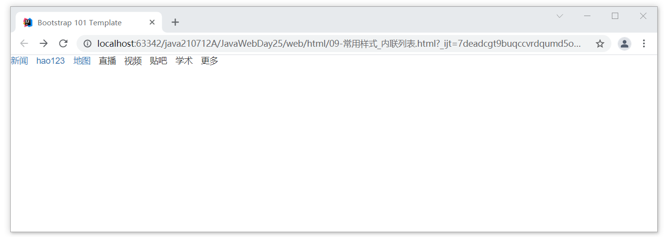
https://v3.bootcss.com/css/#type-lists

Mainly to view the inline list
2. Code
Case code
<ul class="list-inline">
    <li><a href="http://Www.baidu.com "> News</a></li>
    <li><a href="http://www.baidu.com">hao123</a></li>
    <li><a href="http://Www.baidu.com "> map</a></li>
    <li>live broadcast</li>
    <li>video</li>
    <li>Post Bar</li>
    <li>learning</li>
    <li>more</li>
</ul>
design sketch
Section 02 buttons
1. Location
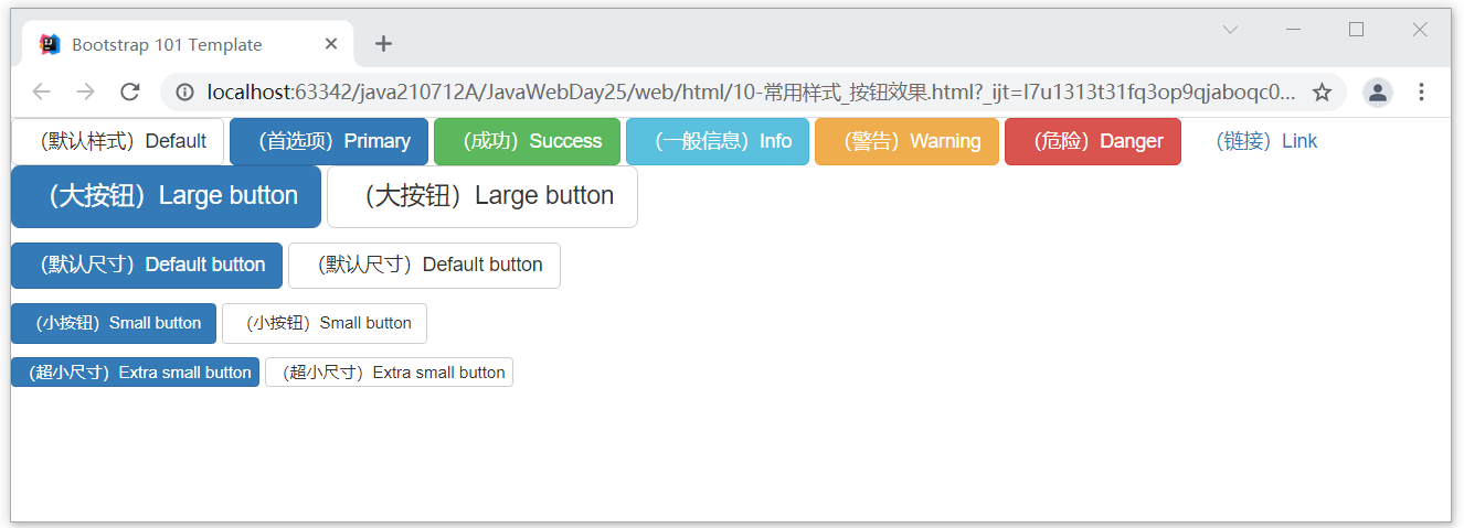
https://v3.bootcss.com/css/#buttons

Mainly the view button
2. Code
Button style
<!-- Standard button -->
<button type="button" class="btn btn-default">((default style) Default</button>

<!-- Provides extra visual weight and identifies the primary action in a set of buttons -->
<button type="button" class="btn btn-primary">((preferences) Primary</button>

<!-- Indicates a successful or positive action -->
<button type="button" class="btn btn-success">((successful) Success</button>

<!-- Contextual button for informational alert messages -->
<button type="button" class="btn btn-info">((general information) Info</button>

<!-- Indicates caution should be taken with this action -->
<button type="button" class="btn btn-warning">((warning) Warning</button>

<!-- Indicates a dangerous or potentially negative action -->
<button type="button" class="btn btn-danger">((danger) Danger</button>

<!-- Deemphasize a button by making it look like a link while maintaining button behavior -->
<button type="button" class="btn btn-link">((link) Link</button>


<p>
    <button type="button" class="btn btn-primary btn-lg">((large button) Large button</button>
    <button type="button" class="btn btn-default btn-lg">((large button) Large button</button>
</p>
<p>
    <button type="button" class="btn btn-primary">((default size) Default button</button>
    <button type="button" class="btn btn-default">((default size) Default button</button>
</p>
<p>
    <button type="button" class="btn btn-primary btn-sm">((small button) Small button</button>
    <button type="button" class="btn btn-default btn-sm">((small button) Small button</button>
</p>
<p>
    <button type="button" class="btn btn-primary btn-xs">(Ultra small size) Extra small button</button>
    <button type="button" class="btn btn-default btn-xs">(Ultra small size) Extra small button</button>
</p>
design sketch
Section 03 pictures
1. Location
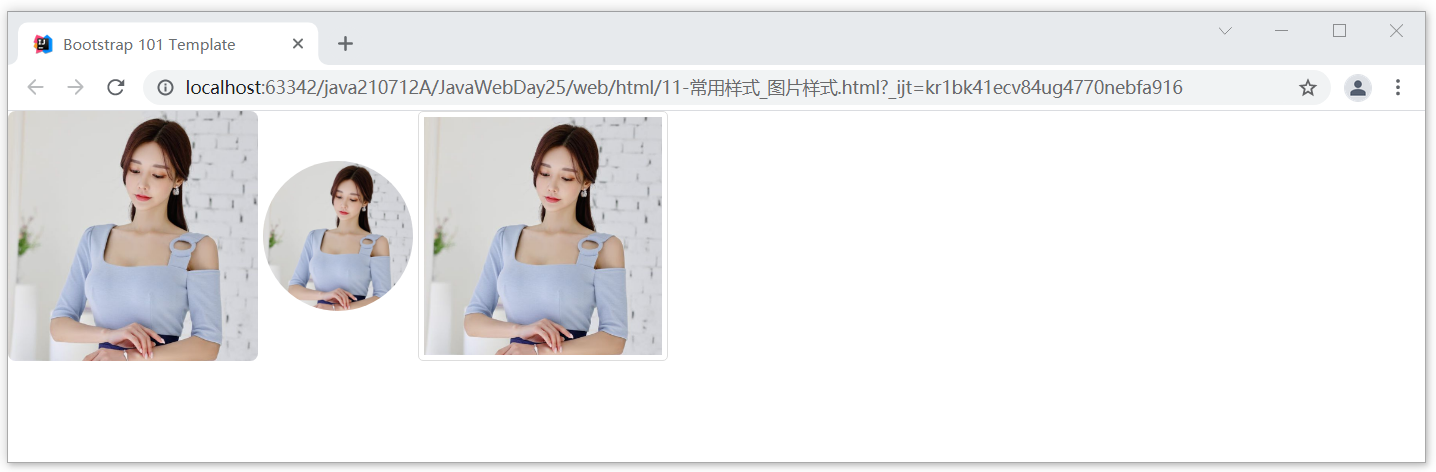
https://v3.bootcss.com/css/?#images

Mainly to view the picture shape
2. Code
Case code
<img src="../images/meinv.png" alt="..." class="img-rounded" style="width: 200px;height: 200px">
<img src="../images/meinv.png" alt="..." class="img-circle" style="width: 120px;height: 120px">
<img src="../images/meinv.png" alt="..." class="img-thumbnail" style="width: 200px;height: 200px">
design sketch
Section 04 text
1. Location
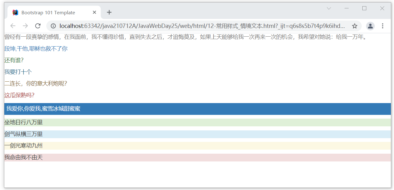
https://v3.bootcss.com/css/?#helper-classes

It is mainly used to view auxiliary context text
2. Code
Case code
<p class="text-muted">Once there was a sincere feeling. In front of me, I didn't know how to cherish it until I lost it...</p>
<p class="text-primary">Duan Kun,Fuck him,Jesus can't save you</p>
<p class="text-success">Who else?</p>
<p class="text-info">I'll call ten</p>
<p class="text-warning">Second company commander, where's your Italian gun?</p>
<p class="text-danger">Is this melon cooked?</p>

<p class="bg-primary" style="padding: 5px">I love you!,You love me,Honey snow ice city sweet honey</p>
<p class="bg-success">Sit on the ground and travel 80000 miles a day</p>
<p class="bg-info">The sword Qi stretches thirty thousand miles</p>
<p class="bg-warning">A sword moves Kyushu</p>
<p class="bg-danger">My life depend on myself not the fate.</p>
design sketch
Section 05 navigation bar
1. Location
https://v3.bootcss.com/components/#navbar

Find navigation bar
2. Code
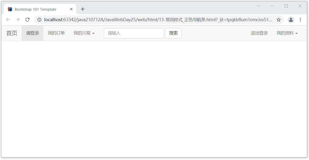
Case code (positive color navigation bar)
<nav class="navbar navbar-default">
    <div class="container-fluid">
        <!-- Brand and toggle get grouped for better mobile display -->
        <div class="navbar-header">
            <button type="button" class="navbar-toggle collapsed" data-toggle="collapse" data-target="#bs-example-navbar-collapse-1" aria-expanded="false">
                <span class="sr-only">Toggle navigation</span>
                <span class="icon-bar"></span>
                <span class="icon-bar"></span>
                <span class="icon-bar"></span>
            </button>
            <a class="navbar-brand" href="#"> Home Page</a>
        </div>

        <!-- Collect the nav links, forms, and other content for toggling -->
        <div class="collapse navbar-collapse" id="bs-example-navbar-collapse-1">
            <ul class="nav navbar-nav">
                <li class="active"><a href="#"> please log in to < span class =" SR only "> (current) < / span ></a></li>
                <li><a href="#"> my order</a></li>
                <li class="dropdown">
                    <a href="#"Class =" dropdown toggle "data toggle =" dropdown "role =" button "aria haspopup =" true "aria expanded =" false "> my brother Sichuan < span class =" caret "> < / span ></a>
                    <ul class="dropdown-menu">
                        <li><a href="#"> learn java</a></li>
                        <li><a href="#"> together, harpy</a></li>
                        <li><a href="#"> play outside</a></li>
                        <li role="separator" class="divider"></li>
                        <li><a href="#"> happy holidays</a></li>
                        <li role="separator" class="divider"></li>
                        <li><a href="#"> everyone is really good</a></li>
                    </ul>
                </li>
            </ul>
            <form class="navbar-form navbar-left">
                <div class="form-group">
                    <input type="text" class="form-control" placeholder="Please enter">
                </div>
                <button type="submit" class="btn btn-default">search</button>
            </form>
            <ul class="nav navbar-nav navbar-right">
                <li><a href="#"> log out</a></li>
                <li class="dropdown">
                    <a href="#"Class =" dropdown toggle "data toggle =" dropdown "role =" button "aria haspopup =" true "aria expanded =" false "> My Profile < span class =" caret "> < / span ></a>
                    <ul class="dropdown-menu">
                        <li><a href="#"> my study plan</a></li>
                        <li><a href="#"> my life goals</a></li>
                        <li><a href="#"> my future vision</a></li>
                        <li role="separator" class="divider"></li>
                        <li><a href="#"> My XXXX</a></li>
                    </ul>
                </li>
            </ul>
        </div><!-- /.navbar-collapse -->
    </div><!-- /.container-fluid -->
</nav>
Rendering (positive color navigation bar)
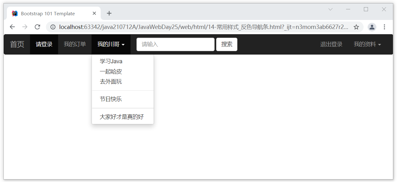
If it is the setting of the reverse color navigation bar, you only need to modify the properties. Navbar reverse can complete the effect of reverse color navigation bar
Part code:
<!-- The point is navbar-inverse After setting, the navigation bar turns black -->
<nav class="navbar navbar-inverse">
    <div class="container-fluid">
        <!-- Brand and toggle get grouped for better mobile display -->
        <div class="navbar-header">
design sketch:
Section 06 rotation chart
1. Location
JavaScript Plug in,find Carousel

https://v3.bootcss.com/javascript/#carousel
2. Code
Case code
<div id="carousel-example-generic" class="carousel slide" data-ride="carousel">
    <!-- Indicators -->
    <ol class="carousel-indicators">
        <li data-target="#carousel-example-generic" data-slide-to="0" class="active"></li>
        <li data-target="#carousel-example-generic" data-slide-to="1"></li>
        <li data-target="#carousel-example-generic" data-slide-to="2"></li>
        <li data-target="#carousel-example-generic" data-slide-to="3"></li>
    </ol>

    <!-- Wrapper for slides -->
    <div class="carousel-inner" role="listbox">
        <div class="item active">
            <img src="../images/lunbotu01.jpg" alt="...">
            <div class="carousel-caption">
                The world is like our generation
            </div>
        </div>
        <div class="item">
            <img src="../images/lunbotu02.jpg" alt="...">
            <div class="carousel-caption">
                Once you enter the Jianghu, the years urge you
            </div>
        </div>
        <div class="item">
            <img src="../images/lunbotu03.jpg" alt="...">
            <div class="carousel-caption">
                Huang Tu is talking and laughing
            </div>
        </div>
        <div class="item">
            <img src="../images/lunbotu04.jpg" alt="...">
            <div class="carousel-caption">
                It's a drunken life
            </div>
        </div>
    </div>

    <!-- Controls -->
    <a class="left carousel-control" href="#carousel-example-generic" role="button" data-slide="prev">
        <span class="glyphicon glyphicon-chevron-left" aria-hidden="true"></span>
        <span class="sr-only">Previous</span>
    </a>
    <a class="right carousel-control" href="#carousel-example-generic" role="button" data-slide="next">
        <span class="glyphicon glyphicon-chevron-right" aria-hidden="true"></span>
        <span class="sr-only">Next</span>
    </a>
</div>
design sketch

Section 07 typesetting effect
1. Location
overall situation CSS style  ---->  Typesetting  ----> alignment

https://v3.bootcss.com/css/#type-alignment
2. Code
Case code
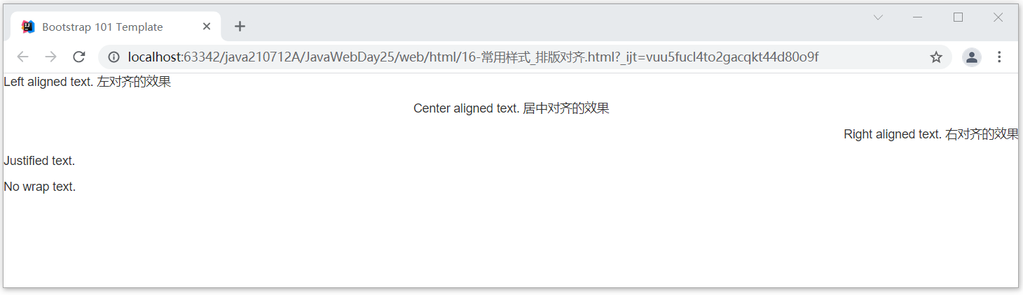
<p class="text-left">Left aligned text. Effect of left alignment</p>
<p class="text-center">Center aligned text. Centering effect</p>
<p class="text-right">Right aligned text. Right aligned effect</p>
<p class="text-justify">Justified text.</p>
<p class="text-nowrap">No wrap text.</p>
design sketch
Section 08 forms
1. Location
Location: Global CSS Style table

https://v3.bootcss.com/css/#tables
2. Code
Case code
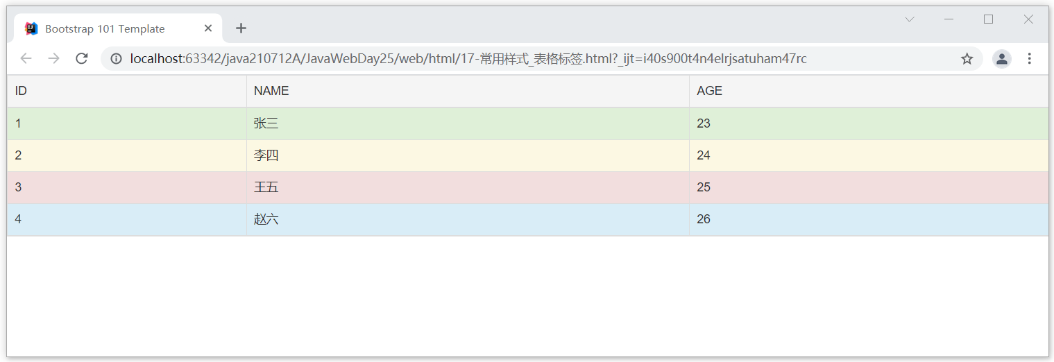
<table class="table table-hover table-bordered">
    <tr class="active">
        <td>ID</td>
        <td>NAME</td>
        <td>AGE</td>
    </tr>
    <tr class="success">
        <td>1</td>
        <td>Zhang San</td>
        <td>23</td>
    </tr>
    <tr class="warning">
        <td>2</td>
        <td>Li Si</td>
        <td>24</td>
    </tr>
    <tr class="danger">
        <td>3</td>
        <td>Wang Wu</td>
        <td>25</td>
    </tr>
    <tr class="info">
        <td>4</td>
        <td>Zhao Liu</td>
        <td>26</td>
    </tr>
</table>
design sketch
Section 09 forms
1. Location
overall situation CSS Style form

https://v3.bootcss.com/css/#forms
2. Code
Case code (normal form)
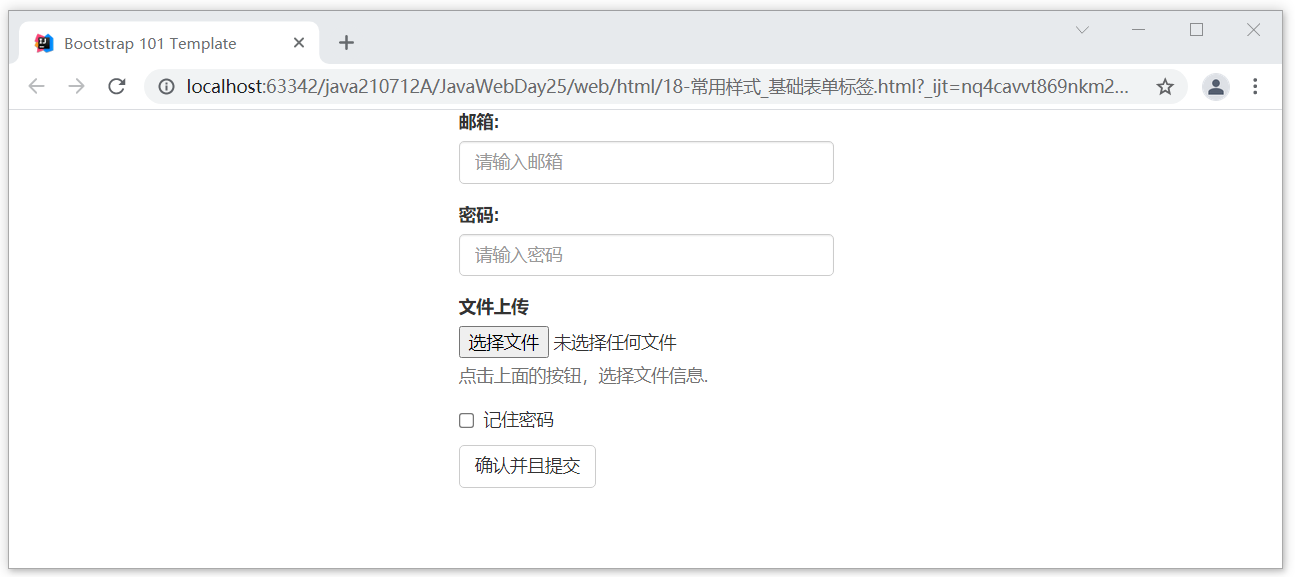
<form style="width: 300px; margin: auto">
    <div class="form-group">
        <label for="emial">mailbox:</label>
        <input type="email" class="form-control" id="emial" name="emial" placeholder="Please enter email address">
    </div>
    <div class="form-group">
        <label for="password">password:</label>
        <input type="password" class="form-control" id="password" name="password" placeholder="Please input a password">
    </div>
    <div class="form-group">
        <label for="file">File upload</label>
        <input type="file" id="file" name="file">
        <p class="help-block">Click the button above to select file information.</p>
    </div>
    <div class="checkbox">
        <label>
            <input type="checkbox" name="remember" value="remember"> Remember password
        </label>
    </div>
    <button type="submit" class="btn btn-default">Confirm and submit</button>
</form>
Effect drawing (ordinary form)
Case code (styled form)
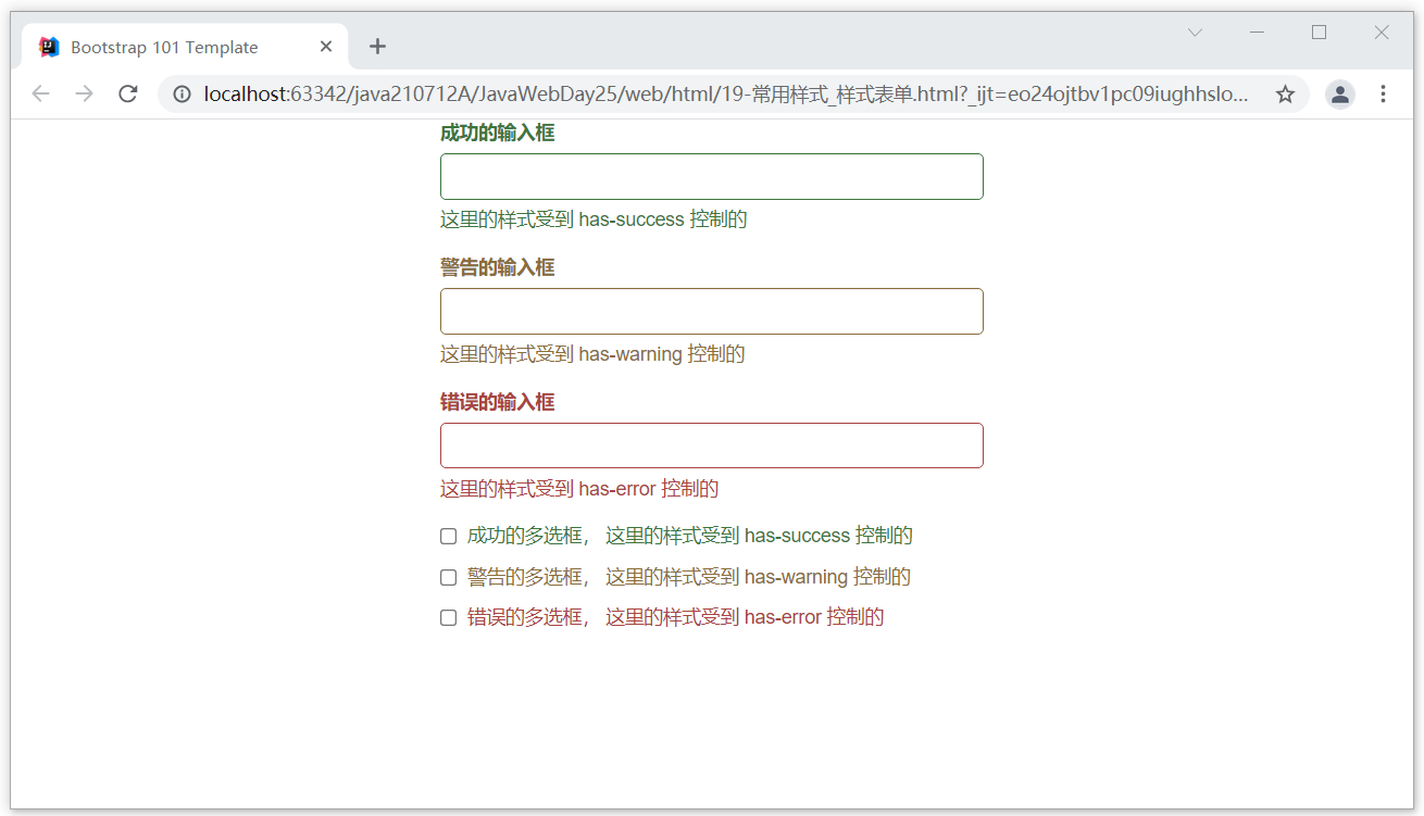
<div style="width: 400px; margin: auto">
    <div class="form-group has-success">
        <label class="control-label" for="inputSuccess1">Successful input box</label>
        <input type="text" class="form-control" id="inputSuccess1" aria-describedby="helpBlock2">
        <span id="helpBlock2" class="help-block"> The style here is affected has-success Controlled  </span>
    </div>
    <div class="form-group has-warning">
        <label class="control-label" for="inputWarning1"> Warning input box </label>
        <input type="text" class="form-control" id="inputWarning1">
        <span id="helpBlock3" class="help-block"> The style here is affected has-warning Controlled  </span>
    </div>
    <div class="form-group has-error">
        <label class="control-label" for="inputError1"> Wrong input box </label>
        <input type="text" class="form-control" id="inputError1">
        <span id="helpBlock4" class="help-block"> The style here is affected has-error Controlled  </span>
    </div>
    <div class="has-success">
        <div class="checkbox">
            <label>
                <input type="checkbox" id="checkboxSuccess" value="option1">
                Successful multi selection box, where the style is affected has-success Controlled
            </label>
        </div>
    </div>
    <div class="has-warning">
        <div class="checkbox">
            <label>
                <input type="checkbox" id="checkboxWarning" value="option1">
                Warning box, where the style is restricted has-warning Controlled
            </label>
        </div>
    </div>
    <div class="has-error">
        <div class="checkbox">
            <label>
                <input type="checkbox" id="checkboxError" value="option1">
                Wrong multi selection box. The style here is restricted has-error Controlled
            </label>
        </div>
    </div>
</div>
Renderings (styled forms)
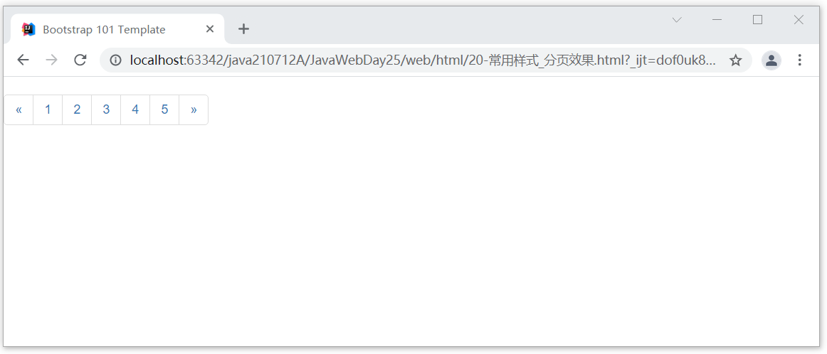
Section 10 Pagination
1. Location
assembly  ---> paging

https://v3.bootcss.com/components/#pagination
2. Code
Case code
<nav aria-label="Page navigation">
<ul class="pagination">
<li>
<a href="#" aria-label="Previous">
<span aria-hidden="true">«</span>
</a>
</li>
<li><a href="#">1</a></li>
<li><a href="#">2</a></li>
<li><a href="#">3</a></li>
<li><a href="#">4</a></li>
<li><a href="#">5</a></li>
<li>
<a href="#" aria-label="Next">
<span aria-hidden="true">»</span>
</a>
</li>
</ul>
</nav>
design sketch